Here’s a short guide to getting started with and using component properties in Figma, so you can begin experimenting yourself.

Used correctly, faceted filtering far outweighs any perceived issues around complexity and interaction cost.

From Google Docs to dark mode toggles, segmented controls are everywhere. Here’s sharing all I know about toggle button design and how to use it effectively with real-world examples, UX principles, and fav design tools.

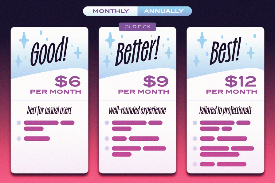
Subscription pages are meant for users and businesses, and they should work well for both parties. This blog is a thorough discussion of what’s best and what’s not when it comes to designing subscription pages.

The first interaction sets the tone for the entire experience — get it right, and you’ve hooked your users from the start. So as a UX designer, you need to know how to put the primacy effect of UX design to good use.

Here are some of the most noteworthy AI tools for UX writing, including their strengths, quirks, and price tags.

While traditionally serving designers, there’s a growing anticipation that Figma will soon broaden its horizons. Learn more here.

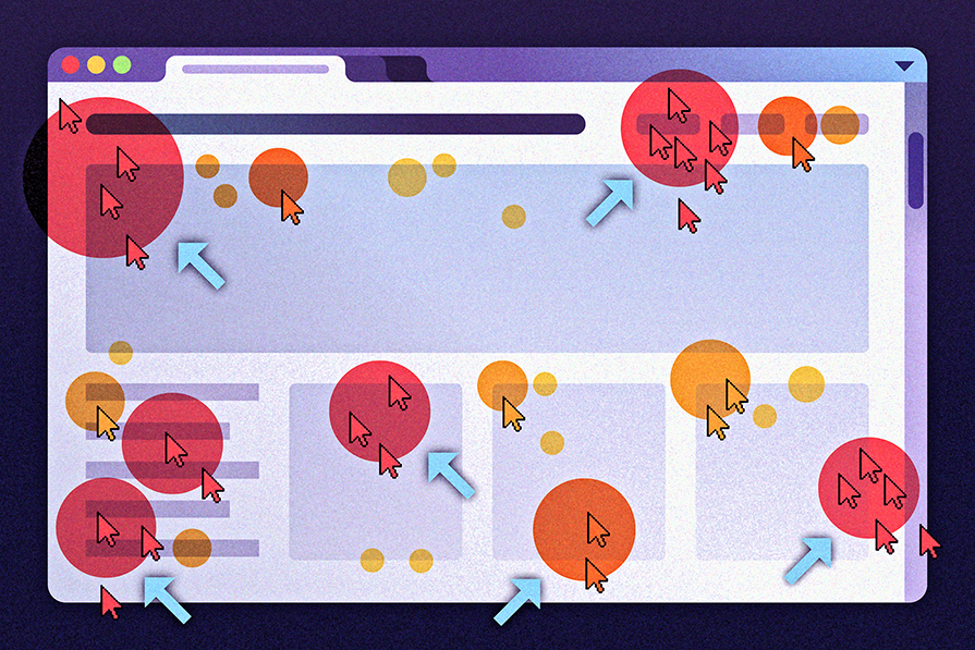
A rage click is when a user leaves telltale signs they’ve attempted something and haven’t been successful. Here’s how to find and fix them.

Loading spinners have an important role in improving user experience. Here’s how these indicators contribute to smoother online interaction.

Empty states in UX refer to the screens that appear when users interact with a digital application or website for the first time.

Let’s break down why converting Figma designs to WordPress manually is still acceptable, as well as focus on automating where possible.

Session replay refers to the technique of recording and playing back user interactions and behaviors within a website or application.