Building interactive web applications involves more than managing state and handling user inputs. How elements move and interact on the page can significantly impact the user experience — they not only add aesthetic value but also enhance the user experience by providing visual feedback, guiding task flow, and demonstrating how elements relate to each other. Moreover, they can make your application feel more polished and professional.
In larger JavaScript frameworks, like React, there are well-known libraries available for animation, such as React Spring and Framer Motion. Solid, being a smaller, more performance-focused framework, does not have as many established animation libraries. However, that doesn’t mean we can’t animate our Solid apps.
Jump ahead:
initial propanimate prop
transition propMotion One is a powerful and flexible animation library that allows you to animate elements with minimal effort. It is built on the Web Animations API, providing a simple and intuitive way to animate elements in the DOM.
The library comes with several features that make it a great choice for animating Solid apps. It’s easy to use, lightweight, and supports a wide variety of animations. It works seamlessly with Solid, making it an excellent tool for adding dynamic animations to your apps.
In this article, we will explore how to add animations to a Solid application using the Motion One library.
Let’s get started with setting up our Solid app and animating it with Motion One. We’ll use a starter repo I created for our app’s structure. Since our focus is on animating our Solid app with Motion One, our base project will be a simple modal that we’ll animate to move in and out of the screen. We’ll also have routing set up so we can animate page transitions.:
Before diving in, it is important to note that this article assumes that you have some basic knowledge of the following:
node -v and npm -v (or pnpm -v) in your terminal to check the installed versionsLet’s start by cloning the repo and installing the dependencies. On the terminal, run the following command:
npx degit ebenezerdon/solid-modal-router solid-motion-app
This will use degit to clone the repo into a directory named “solid-motion-app.” Next, we’ll install the dependencies by navigating into the newly created directory for our app and running either pnpm install or npm install:
cd solid-motion-app
pnpm install
With the dependencies installed, we can now run our app with:
pnpm run dev
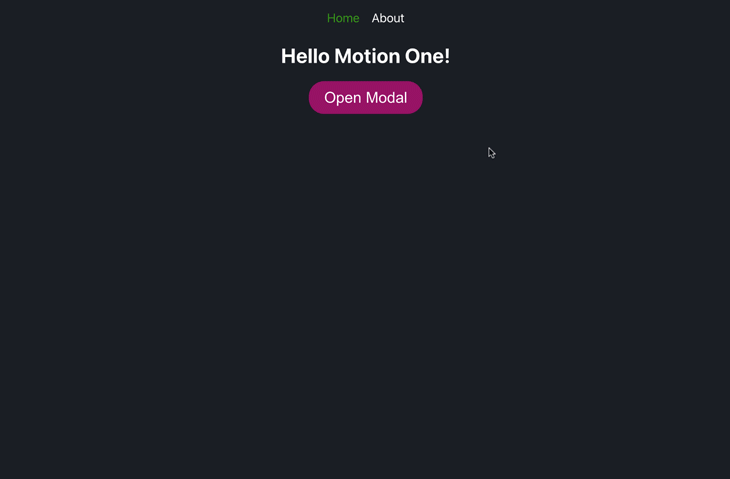
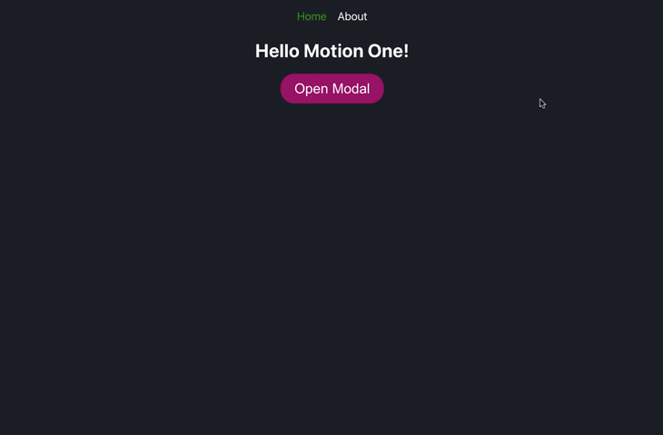
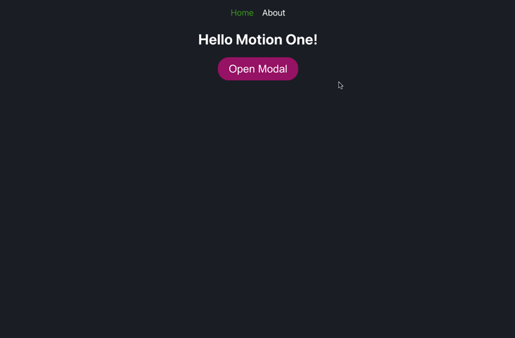
This will start the app on port 3000 or the next available port, which will be displayed on the terminal. You can view the app on your browser by navigating to http://localhost:3000. You should see a page that looks like this:
Our app is a simple modal that we can open and close by clicking the Open Modal and Close Modal buttons, respectively.
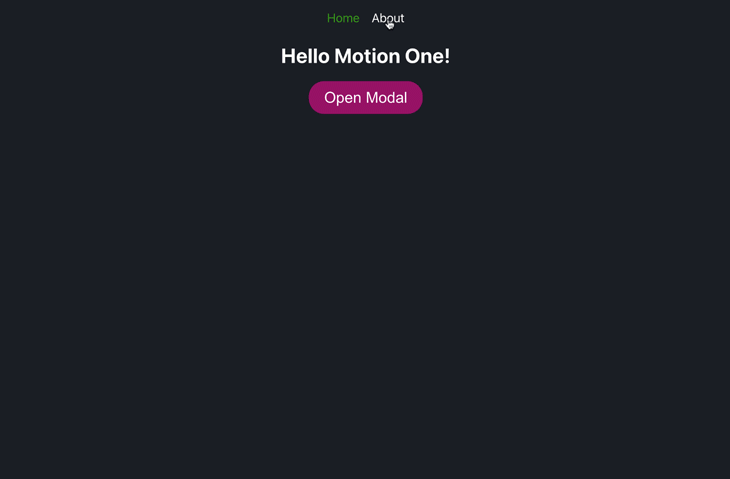
We’ll be animating this modal with Motion One so that it pops in and out of the screen. We also have an About page that we can navigate to by clicking About on the navbar. We’ll also animate the page transition to the About page as well.
In our codebase, we have an src directory that contains the code for our app. The src directory contains the following files:
About.jsx: Contains the code for the About pageApp.jsx: In this file, we have the code for our app’s layout, including our router, navbar, and Home pageApp.module.css: Contains the styles for our Home page, modal, and About pageHome.jsx: Contains the code for our Home page, which includes our modal and the buttons to open and close itindex.css: Contains the global styles for our appindex.jsx: This is the entry point for our app. It contains the code for rendering our app to the DOMNow that we have our app set up, let’s install Motion One. On the terminal, run the following command:
pnpm install @motionone/solid
This will install Motion One and add it to the package.json file as a dependency. With Motion One installed, we can start by animating our modal.
To animate our modal, we’ll use the <Motion /> component from Motion One. The <Motion /> component is used to create an HTML or SVG element that is animatable. It also provides props for customizing the animation, including the initial state of the element, the animate state, the transition options, and the exit animation.
Let’s start by importing the <Motion /> component into our src/Home.jsx file. Add the following import statement to the top of the file, just after the createSignal import statement:
import { Motion } from '@motionone/solid'
With the <Motion /> component imported, we can now use it to animate our modal. Since the default element that the <Motion /> component creates is a <div /> element, we can replace the current <div /> element that wraps our modal with the <Motion /> component inside the return JSX code:
<Motion class={styles.Modal}>
  <div>
    <h1>Hello World!</h1>
  </div>
</Motion>
Alternatively, we can specify the element we want to create by writing it as a property of the Motion component:
<Motion.div> {/* ... */} </Motion.div>
In the same way, we can create any animatable element by writing it as a property of the <Motion /> component. For example, to create an <h1 /> element, we can use Motion.h1, and to create a <button /> element, we can use Motion.button.
Our src/Home.jsx file should now look like this:
import { Motion } from '@motionone/solid'
import { createSignal } from 'solid-js'
import styles from './App.module.css'
const Home = () => {
  const [modalIsOpen, setModalIsOpen] = createSignal(false)
  const toggleModal = () => {
    setModalIsOpen(!modalIsOpen())
  }
  return (
    <div class={styles.Home}>
      <h1>Hello Motion One!</h1>
      <button class={styles.openButton} onClick={() => toggleModal()}>
        {modalIsOpen() ? 'Close Modal' : 'Open Modal'}
      </button>
      {modalIsOpen() && (
        <Motion.div class={styles.Modal}>
          <div>
            <h1>Hello World!</h1>
          </div>
        </Motion.div>
      )}
    </div>
  )
}
export default Home
Now that we have a Motion element, we can animate it using its animation props. Let’s explore them one after the other.
initial propThe initial prop defines the initial state of the element and expects an object with CSS properties and values, which will be applied to the element when it renders. If nothing is passed to this prop, the element will take on the styles it has in the DOM.
Let’s add an initial prop to our <Motion /> component:
<Motion.div
  class={styles.Modal}
  initial={{
    background: 'green',
    transform: 'rotate(15deg)',
  }}
>
  {/* ... */}
</Motion.div>
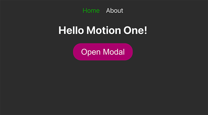
With this, our modal will have a green background and will be rotated 15 degrees when it renders:
animate propThe animate prop defines the animation state of the element. This prop defines the CSS properties and values we want to animate. Let’s add an animate prop to our <Motion /> component:
<Motion.div
  class={styles.Modal}
  initial={{
    background: 'green',
    transform: 'rotate(15deg)',
  }}
  animate={{
    background: '#ac0073',
    transform: 'rotate(0deg)',
  }}
>
  {/* ... */}
</Motion.div>
This will animate the modal from its initial state to the animate state when it renders. Clicking Open Modal will render the modal with a green background and rotated 15 degrees, and then animate it to a purple background and no rotation:
animate with initialWe can also use the animate prop without the initial prop. When we do this, the element will animate from its default DOM state to the animate state.
Let’s remove the initial prop from our <Motion /> component and, instead, use the animate prop to rotate the modal 360 degrees when it renders and change the background color to blue:
<Motion.div
  class={styles.Modal}
  animate={{
    background: 'blue',
    transform: 'rotate(360deg)',
  }}
>
  {/* ... */}
</Motion.div>
animate propWith the animate prop, we can also specify the starting state of the animation by passing the style property value as an array. This is called a keyframe animation.
The first item in the array will be the starting state of the animation, and the following items will be in order of states to animate to.
Let’s use the animate prop to animate the modal from a yellow background to a purple background:
<Motion.div
  class={styles.Modal}
  animate={{
    background: ['yellow', 'purple'],
  }}
>
  {/* ... */}
</Motion.div>
We can also animate the position of the modal using the x and y properties of the animate object. Let’s make the modal slide up from the bottom of the screen when it renders. We’ll use the y property to animate the modal from 500px below the default DOM position to its default position:
<Motion.div
  class={styles.Modal}
  animate={{
    y: [500, 0],
  }}
>
  {/* ... */}
</Motion.div>
We can use similar logic to slide the modal in from the top, left, or right of the screen. We want our modal to have a popup animation, so that it grows from a very small size to its default size. We can do this by animating the scale property of animate object from 0 to 1. We’ll also animate the opacity property from 0 to 1 so that the modal fades in as it grows:
<Motion.div
  class={styles.Modal}
  animate={{
    scale: [0, 1],
    opacity: [0, 1],
  }}
>
  {/* ... */}
</Motion.div>
Next, let’s set the duration of the animation. We’ll do this with the transition prop of the <Motion /> component.
transition propThe transition prop defines the duration and easing of the animation. Like the previous props, it also expects an object as its value. These properties are:
duration: Defines how long the animation runs in secondsease: Defines the easing function to use for the animation Motion One provides a number of easing functions that can be used, including:
ease-inease-outease-in-outThe best way to see how these easing functions work is to try them out. We’ll be using ease-in-out for our modal animation, which will make the modal animation start slow, speed up in the middle, and then slow down again at the end.
Let’s add the transition prop to our <Motion /> component:
<Motion.div
  class={styles.Modal}
  animate={{
    scale: [0, 1],
    opacity: [0, 1],
  }}
  transition={{
    duration: 0.5,
    ease: 'ease-in-out',
  }}
>
  {/* ... */}
</Motion.div>
The modal now animates over a duration of 0.5 seconds and uses an ease-in-out transition.
We’ve seen how to animate elements when they are rendered. We can also animate elements when they are removed from the DOM. This is called an exit animation. Exit animations give our app a more polished feel.
To add an exit animation to our Motion component, we have to first render it with the Solid <Show /> component. This will enable the Solid framework to notify Motion One when the element is about to be unmounted, thus triggering the exit animation.
The <Show /> component is a conditional rendering component in Solid that is similar to the ternary operator, which we’ve been using to render our modal when the modalIsOpen state is true. With the <Show /> component, we can use a when prop to define when the element should be rendered.
The when prop expects a boolean value. When the value is true, the element will be rendered. When the value is false, the element will be removed from the DOM. Let’s import the <Show /> component from solid-js and replace the ternary operator with it:
import { Show } from 'solid-js'
/* ... */
<Show when={modalIsOpen()}>
  <Motion.div
    class={styles.Modal}
    animate={{
      scale: [0, 1],
      opacity: [0, 1],
    }}
    transition={{
      duration: 0.5,
      ease: 'ease-in-out',
    }}
  >
    {/* ... */}
  </Motion.div>
</Show>
With the <Show /> component, our modal will still render depending on the value of modalIsOpen(). However, Motion One cannot yet detect when the modal is about to be unmounted. To do this, we need to wrap the <Show /> component with the <Presence /> component from @motionone/solid. Let’s import the <Presence /> component:
import { Presence } from '@motionone/solid'
Then, let’s wrap the <Show /> component with the <Presence /> component:
<Presence>
  <Show when={modalIsOpen()}>
    <Motion.div
      class={styles.Modal}
      animate={{
        scale: [0, 1],
        opacity: [0, 1],
      }}
      transition={{
        duration: 0.5,
        ease: 'ease-in-out',
      }}
    >
      {/* ... */}
    </Motion.div>
  </Show>
</Presence>
The <Presence /> component will detect when the modal is about to be unmounted and will trigger the exit animation, if available.
To add an exit animation to our modal, we can use the exit prop of the <Motion /> component. The exit prop is similar to the animate prop; it defines the CSS properties and values to animate to when the element is unmounted.
Let’s add an exit prop to our <Motion /> component:
<Motion.div
  class={styles.Modal}
  animate={{ scale: [0, 1], opacity: [0, 1] }}
  transition={{ duration: 0.5, ease: 'ease-in-out' }}
  exit={{ scale: 0, opacity: 0 }}
>
  {/* ... */}
</Motion.div>
With this, our modal will animate to a scale of 0 and an opacity of 0 when it is unmounted. This will give the effect of the modal shrinking and fading out:
If we want the exit animation to have a different duration or easing than the enter animation, we can pass a transition object to the exit object:
<Motion.div
  class={styles.Modal}
  animate={{ scale: [0, 1], opacity: [0, 1] }}
  transition={{ duration: 0.5, ease: 'ease-in-out' }}
  exit={{
    scale: 0,
    opacity: 0,
    transition: {
      duration: 2,
      ease: 'ease-in',
    },
  }}
>
  {/* ... */}
</Motion.div>
With this, our modal will animate out with a duration of 2 seconds and an ease-in transition.
In addition to individual component animations, Motion One can also handle page transitions in a smooth and efficient manner. We have two pages in our application: the Home page and the About page. Let’s add a page transition effect when navigating between these pages.
We’ll start by wrapping our Home component with the <Motion /> component instead of the current <div /> tag. This will allow us to animate our page when it is being rendered. Then we’ll use the animate prop and its opacity object to give it a fade-in animation:
const Home = () => {
  /* ... */
  return (
    <Motion.div
      class={styles.Home}
      animate={{
        opacity: [0, 1],
      }}
    >
      {/* ... */}
    </Motion.div>
  )
}
Let’s do the same for our About component. We’ll first import the <Motion /> component from @motionone/solid, then we’ll wrap our About component with the <Motion /> component:
import { Motion } from '@motionone/solid'
import styles from './App.module.css'
const About = () => {
  return (
    <Motion animate={{ opacity: [0, 1] }}>
      <h1 class={styles.About}>About us!</h1>
    </Motion>
  )
}
export default About
Now, when we navigate between the Home and About pages, we’ll see a fade-in animation:
In this tutorial, we’ve successfully journeyed through the fundamentals of Motion One and how to animate Solid components with the Motion One library. We learned about animating CSS properties, adding enter and exit animations, and handling page transitions. The Presence and Motion components from Motion One provide a simple and intuitive way to add animations to our Solid application.
The combination of Solid and Motion One offers endless possibilities, from constructing more complex animations and transitions to animating SVGs. Check out the Motion One documentation for SolidJS to learn more about the library and its features.
With animations, always remember to keep your users in mind. While they can significantly enhance the user experience, animations can be distracting if overused. Strive for a balance that makes your application engaging without overwhelming users.
You can find the repo for our demo app on my GitHub. I also have a Solid and SolidStart crash course on my YouTube channel, which I’d love for you to check out. And if you want to keep in touch, consider following me on LinkedIn or Twitter. Keep building!
There’s no doubt that frontends are getting more complex. As you add new JavaScript libraries and other dependencies to your app, you’ll need more visibility to ensure your users don’t run into unknown issues.
LogRocket is a frontend application monitoring solution that lets you replay JavaScript errors as if they happened in your own browser so you can react to bugs more effectively.
LogRocket works perfectly with any app, regardless of framework, and has plugins to log additional context from Redux, Vuex, and @ngrx/store. Instead of guessing why problems happen, you can aggregate and report on what state your application was in when an issue occurred. LogRocket also monitors your app’s performance, reporting metrics like client CPU load, client memory usage, and more.
Build confidently — start monitoring for free.

Learn how to use Fallow to analyze AI-generated code, detect dead code, duplicate logic, and complexity issues, and integrate automated code quality checks into your AI-assisted development workflow.

Learn how to protect full-stack projects from NPM supply chain attacks with a practical security checklist.

Explore 15 essential MCP servers for web developers to enhance AI workflows with tools, data, and automation.

Learn how contrast-color() automatically picks accessible text colors using native CSS, without JavaScript.
Hey there, want to help make our blog better?
Join LogRocket’s Content Advisory Board. You’ll help inform the type of content we create and get access to exclusive meetups, social accreditation, and swag.
Sign up now

 Learn more →
