When I first built a dark mode toggle in React, I was convinced I was doing something wrong. Surely it couldn’t require this much code just to switch some colors.

That’s the thing about React: it’s designed to build complex web applications, which also makes it very easy to overengineer simple features.
A theme switcher in vanilla JavaScript might take four or five lines to detect a click and toggle a class on the body. In React, you can quickly end up with useState to hold the theme, a Context provider to pass it through the app, re-renders on every toggle, and a hydration flicker to deal with on load.
The goal of this article is to spot those places where React adds complexity to a feature the browser can already handle, then replace that extra JavaScript with a matching HTML or CSS feature.
Here are the six patterns we’ll look at:
| Pattern | Built-in alternative |
|---|---|
| Dark mode | :has() + a checkbox |
| Accordion | <details> / <summary> |
| Modal | Popover API / <dialog> |
| Carousel | scroll-snap + ::scroll-button() + ::scroll-marker |
| Custom select | appearance: base-select |
| Animate on scroll | animation-timeline: view() |
This article is based on my React Summit 2026 talk of the same name.
Let’s start with the toggle that triggered this whole thing.
If we write out the actual code for a dark mode toggle in React, it can look like this:
const ThemeContext = createContext<ThemeCtx | null>(null);

function ReactThemeProvider({ children }) {
  const [theme, setTheme] = useState<Theme>('light');

  useEffect(() => {
    const saved = localStorage.getItem('theme');
    if (saved) setTheme(saved as Theme);
  }, []);

  useEffect(() => {
    localStorage.setItem('theme', theme);
  }, [theme]);

  const toggle = useCallback(
    () => setTheme((t) => (t === 'light' ? 'dark' : 'light')),
    []
  );

  const value = useMemo(() => ({ theme, toggle }), [theme, toggle]);

  return (
    <ThemeContext.Provider value={value}>
      {children}
    </ThemeContext.Provider>
  );
}
This works, but it is doing much more than the job actually requires. A theme switcher needs to update the page’s styling. Most components do not need to know which theme is selected; they only need the correct styles to apply.
We can move that responsibility into HTML and CSS:
// HTML
<label className="switch">
  <input type="checkbox" id="theme-switcher" />
  <span>Toggle dark mode</span>
</label>
:root {
  --bg: #fff;
  --text: #000;
  color-scheme: light;
}

:root:has(#theme-switcher:checked) {
  --bg: #000;
  --text: #fff;
  color-scheme: dark;
}
The :has() selector lets us style a parent based on the state of one of its descendants, which wasn’t possible in CSS for a long time. Here, we use it to change root-level theme variables when the checkbox is selected.
color-scheme handles another part of the theme for us. It tells the browser which color scheme the page is using, so native UI such as form controls and scrollbars can adapt automatically when the user switches themes.
You can view the working dark mode demo on CodePen.
And that’s all she wrote. This example gets at the central idea of the article: let the browser do the work it already knows how to do.
That doesn’t mean we can remove JavaScript entirely. CSS can handle the visual state, but it can’t remember a user’s choice across visits on its own. If we want to persist the selected theme or fall back to the user’s system preference, JavaScript still has a useful job:
// JS
const savedTheme = localStorage.getItem('theme');
const initialTheme =
  savedTheme ??
  (matchMedia('(prefers-color-scheme: dark)').matches ? 'dark' : 'light');

// HTML
<label className="switch">
  <input
    type="checkbox"
    id="theme-switcher"
    defaultChecked={initialTheme === 'dark'}
    onChange={(e) =>
      localStorage.setItem('theme', e.target.checked ? 'dark' : 'light')
    }
  />
  <span>Toggle dark mode</span>
</label>
Here, we first check for a stored theme in localStorage. If there isn’t one, we use the prefers-color-scheme media query to check the user’s system setting and choose an initial value from there.
The same principle applies to the other patterns we’ll look at: let HTML and CSS handle as much interaction and presentation as they can, then use JavaScript for the parts they cannot handle.
Building an accordion can easily turn into an entire component’s worth of state and event handlers:
function AccordionItem() {
  const [open, setOpen] = useState(false);

  return (
    <div>
      <button
        aria-expanded={open}
        onClick={() => setOpen(!open)}
      >
        What is an accordion?
      </button>

      {open && (
        <div>This is an accordion</div>
      )}
    </div>
  );
}
Or it can be two HTML elements:
function AccordionItem() {
  return (
    <details>
      <summary>Is an accordion a type of animal?</summary>
      No, that's an armadillo.
    </details>
  );
}
<details> and <summary> handle the open-and-close behavior themselves. Content inside <summary> becomes the accordion header, while the rest of the content inside <details> is revealed when the element opens.
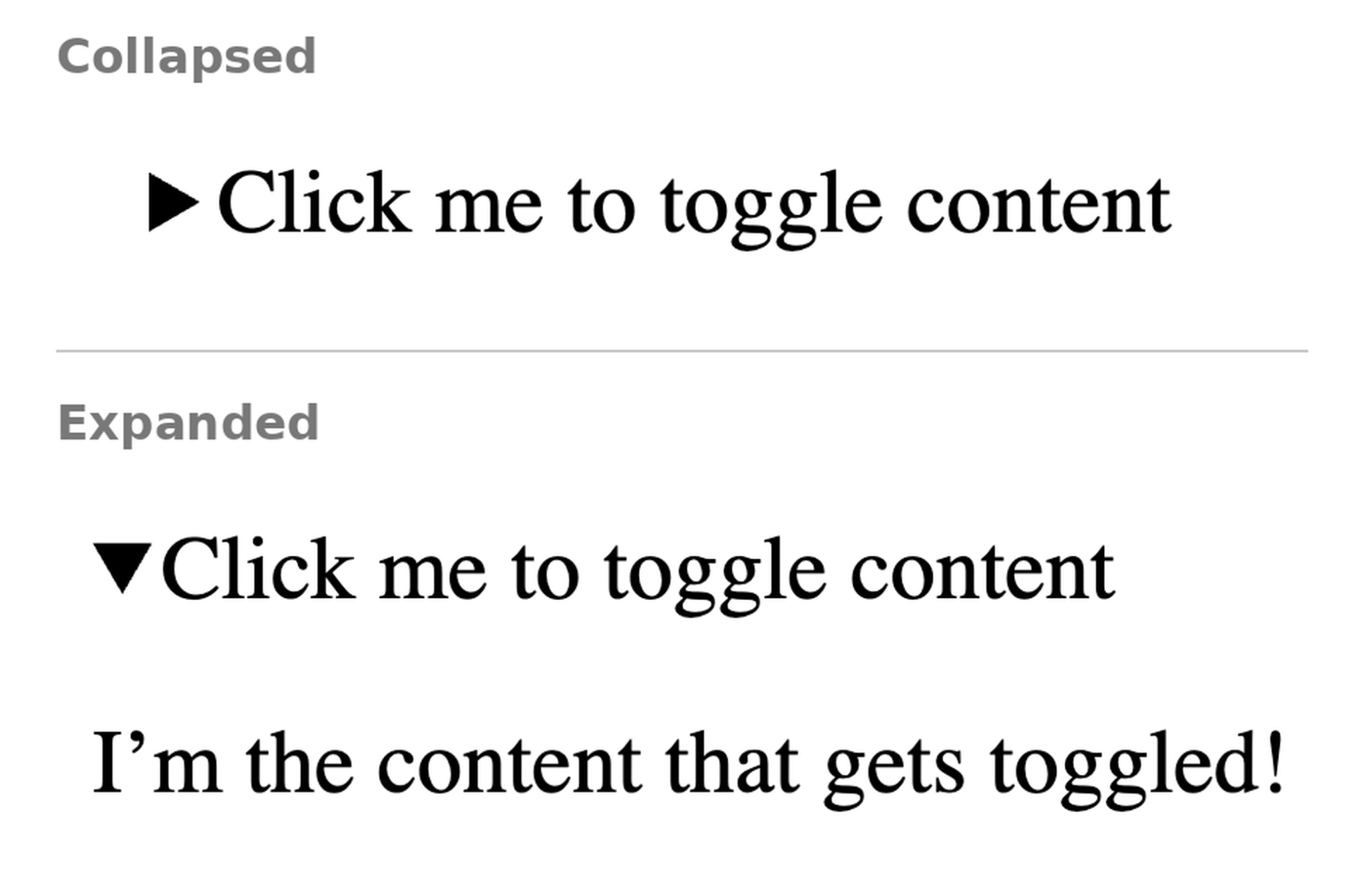
<details> element and open it automaticallyNote: In React, setting open on a <details> element alongside an onToggle handler causes the toggle event to fire when the component mounts. If that initial event would trigger application logic, you can guard against it with a “has mounted” ref.
Modals are more complicated than they look. Putting content on top of the page is the easy part. You also need to think about the backdrop, focus management, returning focus to the trigger, keyboard interaction, and whether the page behind the modal can scroll.
That’s why developers often reach for a library. The browser now gives us two native options for a lot of these use cases.
<dialog> element for true modalsIf you want a modal that blocks interaction with the rest of the page, reach for <dialog>:
function ConfirmDialog() {
  const ref = useRef<HTMLDialogElement>(null);

  return (
    <>
      <button onClick={() => ref.current?.showModal()}>Open</button>

      <dialog ref={ref}>
        <h4>Hi, I'm a modal!</h4>
        <p>Okay, bye.</p>
        <form method="dialog">
          <button>Close</button>
        </form>
      </dialog>
    </>
  );
}
The browser gives you several behaviors automatically:
showModal() opens the dialog in the top layer with a ::backdrop, makes the rest of the page inert, and keeps keyboard focus inside the modal<form method="dialog"> closes the dialog when submitted, so a basic confirm/cancel flow doesn’t need another close handlerIf you want an overlay that doesn’t block the rest of the page, such as a menu or other lightweight popup, the Popover API is a better fit:
<button popoverTarget="native-popover">Open popover</button>

<div id="native-popover" popover="auto">
  <h4>Hi, I'm a popup!</h4>
  <p>Okay, bye.</p>
  <button
    popoverTarget="native-popover"
    popoverTargetAction="hide"
  >
    Close
  </button>
</div>
Two attributes define and control the popover:
popover opts the element into popover behavior. An auto popover supports light dismiss, so clicking outside closes it; a manual popover stays open until you explicitly close itpopoverTarget points a control at the popover’s id. You can combine it with popoverTargetAction to explicitly show or hide the popover; without an action, the control toggles itBoth <dialog> and popovers are placed in the top layer, which solves a class of stacking problems that are awkward to handle with increasingly large z-index values.
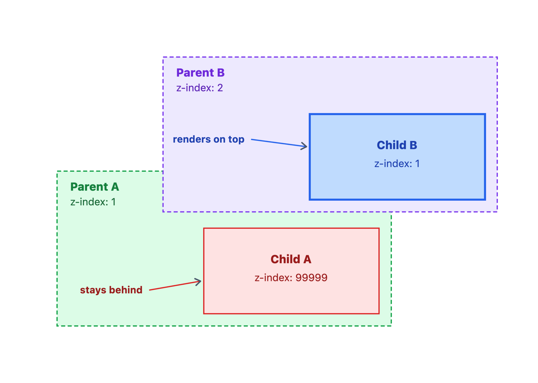
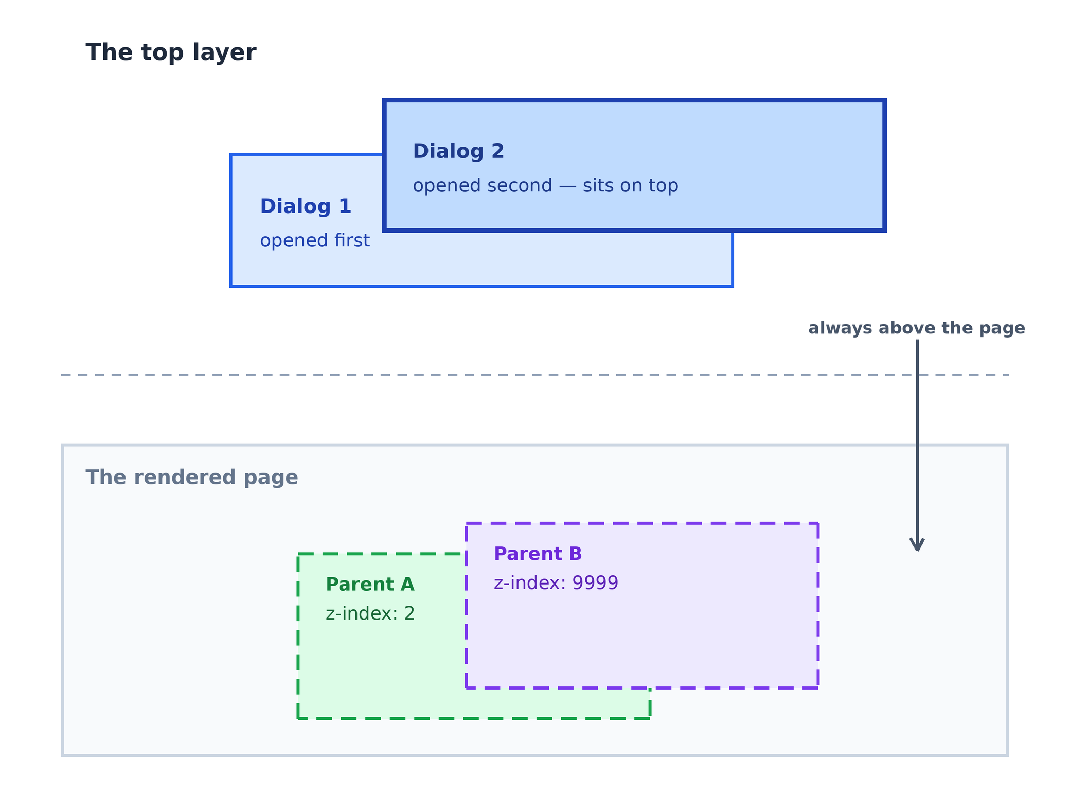
In either case, you’re replacing a chunk of custom overlay logic with behavior the browser already understands. Both APIs also start from better accessibility primitives than the div-based modal patterns AI tools still tend to generate, which I wrote about in AI has an accessibility problem.
I’ve covered two of these patterns in more depth in my article CSS in 2026, so let’s move more quickly through three other places where newer CSS can replace JavaScript-heavy React implementations.
Several newer CSS features can handle the mechanics of a carousel. If you’ve compared React component libraries for complex UI patterns, you know how much JavaScript typically goes into building one of these from scratch:
scroll-snap-type snaps the container to each slide as the user scrollsscroll-marker-group tells the browser where to place generated markers::scroll-button() generates previous and next controls wired to the scroll position::scroll-marker generates one marker per slide, while :target-current styles the active one.carousel { display: flex; overflow-x: auto; scroll-snap-type: x mandatory; scroll-marker-group: after; } .carousel::scroll-button(left) { content: ‘‹’; } .carousel::scroll-button(right) { content: ‘›’; } .slide::scroll-marker { content: ”; } .slide::scroll-marker:target-current { background: var(–accent); }
Note: These pseudo-elements aren’t Baseline yet. Use @supports to progressively enhance a plain horizontally scrolling container when the browser supports them.
Native <select> elements are becoming much more customizable. The important pieces are:
appearance: base-select opts the <select> into the customizable select model::picker(select) targets the dropdown panel generated by the browser<selectedcontent> mirrors the selected option’s content into the buttonselect,
select::picker(select) {
appearance: base-select;
}
With base-select, you can style a native select much more freely and include richer content, such as images, inside its options while keeping the underlying select behavior. This is a good example of where modern CSS techniques can dramatically reduce the amount of JavaScript you need to ship.
Instead of adding another scroll event listener or IntersectionObserver, scroll-driven animations can let CSS reveal elements as they enter the viewport:
animation-timeline: view() ties an animation’s progress to the element’s position in the viewportanimation-range defines the portion of that scroll progress where the animation runsIn the following example, the animation starts when the card enters the viewport and finishes once it reaches 30 percent coverage:
@supports (animation-timeline: view()) {
  .card {
    animation: rise linear both;
    animation-timeline: view();
    animation-range: entry 0% cover 30%;
  }
}

@keyframes rise {
  from {
    opacity: 0;
    transform: translateY(24px);
  }
}
The point isn’t “no JavaScript.” It’s “not that much JavaScript.”
We’ve looked at six cases where HTML and CSS can take on work that would otherwise become custom JavaScript, state, event handlers, or another dependency. As the web platform keeps adding capabilities, that list is only getting longer.
This matters even more in the age of AI-assisted development. A model can generate a React abstraction very quickly, but generated code still has a maintenance cost. If you’ve ever shipped AI-generated React code and later had to debug or refactor it, you know how that cost compounds. If the browser already provides the behavior, starting there usually gives you less code to own and fewer things to keep in sync.
React is excellent at building complex interfaces. We just don’t need an entire state-management path to switch between two colors.
When you’re deciding how to build a UI feature, start with the least complex browser primitive that satisfies the requirement. Add JavaScript when the interaction actually needs it. And if you do reach for React, understanding how React Fiber manages rendering can help you make smarter decisions about where state and effects actually belong.
Install LogRocket via npm or script tag. LogRocket.init() must be called client-side, not
server-side
$ npm i --save logrocket

// Code:

import LogRocket from 'logrocket';
LogRocket.init('app/id');
// Add to your HTML:

<script src="https://cdn.lr-ingest.com/LogRocket.min.js"></script>
<script>window.LogRocket && window.LogRocket.init('app/id');</script>

A real-app benchmark of cnfast’s drop-in cn() replacement: isolated speed tests look great, but does any of it survive contact with an actual React render?

Compare the top AI development tools and models of August 2026. View updated rankings, feature breakdowns, and find the best fit for you.

Learn to build multi-turn AI agents with Genkit’s Agents API — with persistent Firestore sessions, detached long-running turns, and human approval gates.

Learn how to build and deploy production-ready AI streaming applications in Nuxt using the Vercel AI SDK, Nuxt UI chat components, and Cloudflare Workers AI at the edge.
Would you be interested in joining LogRocket's developer community?
Join LogRocket’s Content Advisory Board. You’ll help inform the type of content we create and get access to exclusive meetups, social accreditation, and swag.
Sign up now

 Learn more →