Many successful digital tools often evolve from one core functionality into multiple, interconnected modules. Companies expand their offerings to serve more user needs, increase their value proposition, and strengthen competitiveness. Many platforms also accelerate growth by acquiring complementary products and integrating them into a broader portfolio.

This shift from standalone applications to multi-product ecosystems introduces one of the most persistent UX challenges in enterprise software, which is helping users move seamlessly between tools without getting lost.
Even small navigation inconsistencies can break continuity in a system. When a user lands in a space that looks different, behaves differently, or labels familiar concepts in unfamiliar ways, their momentum stops and disrupts their workflow as it takes them longer to adapt to the new space. Good navigation design ensures that the architecture of the system remains invisible, letting users focus solely on their goals. In this article, we’ll talk about why navigation tends to break down in multi-product environments and how to design cross-product navigation that helps users stay oriented, confident, and in control no matter where they go.
In a single product, navigation patterns, terminology, and visual hierarchy are relatively straightforward to standardize. However, once there are multiple products, each with its own feature sets, teams, development history, and even design systems, that consistency becomes difficult to maintain.
As a product grows, navigation naturally becomes more complex. Teams add new menus and sections to support additional tools, while existing areas become deeper and more layered to handle advanced features. But when these changes happen independently without a shared system, the navigation starts to feel disjointed. Each product or module develops its own structure, language, and rules. Users are then forced to relearn how things work every time they move into a different part of the platform. If someone needs to switch tools frequently to complete their task, this constant reorientation can become a major source of friction.
Multi-product ecosystems typically form around multiple roadmap owners. Before joining forces, teams will optimize for their own local experience, but not necessarily for the platform as a whole. Over time, this can lead to many differences, including naming conventions, placements for common actions, and even interaction models for similar workflows.
Companies often acquire smaller, complementary products that add value to their portfolio. The challenge with integrating acquisitions is that new products come with legacy UI systems, different design languages, and unrelated foundational assumptions. If left untouched, this can create a sort of Frankenstein of user experiences, which can be frustrating and confusing to interact with.
Adobe Creative Cloud is a good example of this issue. Older apps like Photoshop and Illustrator were built decades ago, so they still use legacy interface patterns. Newer tools, such as Adobe Express, are designed with modern web experiences in mind. Adobe is working to make everything feel more unified through efforts like standardizing top-level menus and shared libraries, but users can still notice big differences from one product to another. Even experienced users sometimes feel disoriented when switching between apps.
Some common frustrations that users encounter with broken navigation include repeatedly accessing the incorrect page or product, bouncing between products trying to locate content, and eventually giving up when switching becomes too complex or risky. If users have to question whether they are in the right place or whether an action will result in unexpected consequences, their trust in the system drops significantly.
Before jumping into UI changes to fix navigation issues, product teams need to step back and understand the ecosystem as users actually experience it. Cross-product navigation problems are rarely caused by a missing menu or link. They usually come from an unclear or fragmented mental model of how the system fits together. Think of the product ecosystem as a web of connected tools. When the connections between tools are weak, misaligned, or hidden, users feel the friction every time they move across them.
A strong ecosystem model makes those connections explicit. It should clearly define the role of each product, how tools depend on one another, where workflows typically start and end, and how access and permissions differ across products. This shared understanding gives teams a foundation to design navigation that supports real user behavior rather than patching isolated problems.
HubSpot is a good example of this approach in practice. Its ecosystem is intentionally built around a central CRM, with Marketing, Sales, Service, and CMS Hubs supporting adjacent workflows. Because navigation mirrors how work naturally flows between these areas, users can continue tasks across product boundaries without having to stop and reorient themselves.
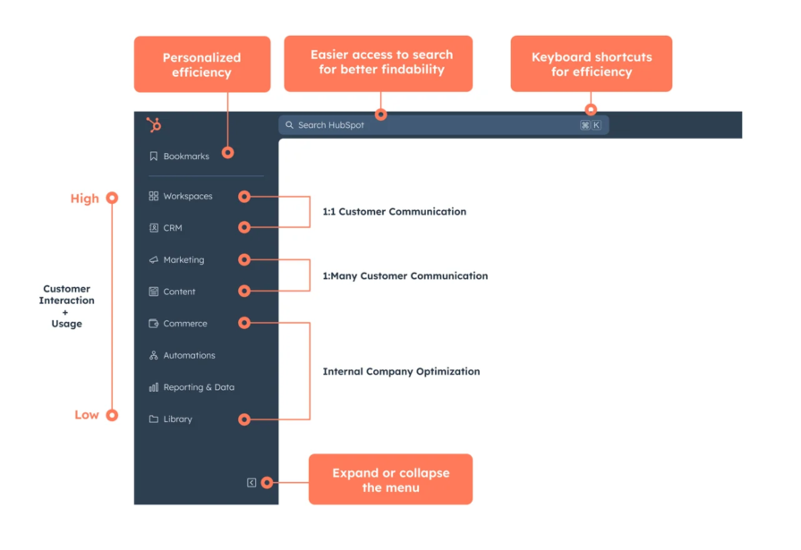
HubSpot’s information architecture prioritizes high-frequency usage and direct customer communication. (Source: HubSpot)
Users rarely think in terms of product boundaries. They think in terms of outcomes, like closing a deal, resolving a support issue, or publishing a piece of content. The product is just a means to achieving a goal. If navigation is designed around screens or individual tools rather than these goals, users are forced to stitch the experience together themselves.
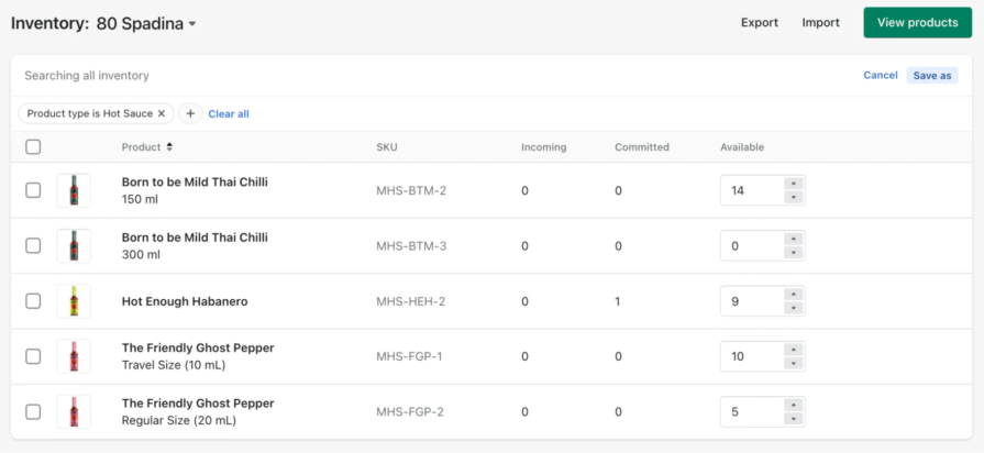
Mapping cross-tool journeys helps teams identify where navigation must support continuity. These journeys often span multiple environments, but from the user’s perspective, they are a single task. For example, in Shopify, updating product inventory can naturally lead to updating storefront content. The platform supports this flow without requiring users to stop and consciously transition between tools. The system moves with the user, rather than making the user manage the transition.
By focusing on journeys instead of pages, teams can design navigation that anticipates where users want to go next and reduces the friction of getting there.
In multi-product systems, a significant portion of cognitive load stems from simple uncertainty. When users can’t quickly tell where they are or what other tools might help them move forward, their momentum breaks. They might pause, second-guess themselves, or avoid exploring altogether.
Good cross-product navigation removes that uncertainty. It makes the user’s current context obvious and clearly signals what meaningful paths are available next. Instead of asking users to piece the system together on their own, the product does that work for them. Designers should ensure that the ecosystem is clear to users early on, so that they always understand where they are and where they can go. This makes moving across tools feel more fluid rather than risky.
Not all navigation is trying to do the same job, but a lot of products treat it that way. In multi-product systems, confusion often comes from mixing global navigation and app-level navigation together. They solve very different problems, but when they look or behave the same, users become uncertain whether they’re switching tools or just moving deeper into the same one.
To put it simply, global navigation helps users understand the entire system, while app-level navigation helps them get work done. Global navigation doesn’t exist to help users complete tasks. It’s there to give them orientation across the product suite, the organization, and their environments. This is where users switch between major tools, change workspaces, or manage account-level settings. Because it represents the highest level of scope, it needs to feel stable and familiar everywhere.
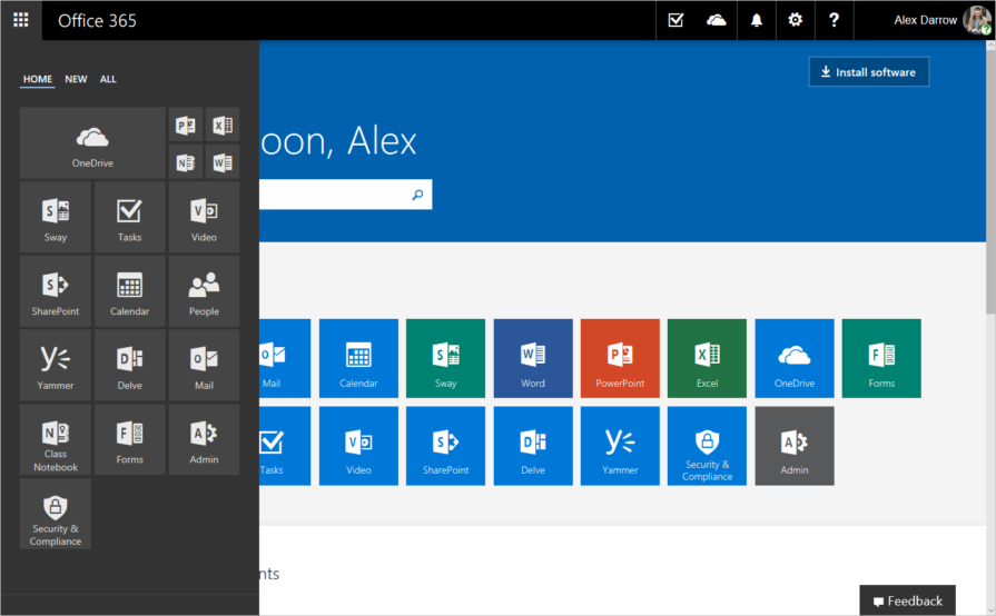
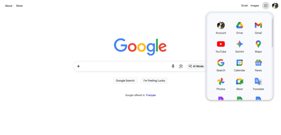
Microsoft 365’s app launcher sits above every Microsoft product and works the same way, no matter where you are. Jumping from Outlook to Excel doesn’t feel like leaving one app and opening another. It feels like moving within the same system. That consistency matters more than people realize.
Once users are inside a tool, they’re no longer thinking about the platform. They’re focused on the task in front of them, which should be supported by app-level navigation. It helps users move through features, understand where they are in a workflow, and discover what’s possible next without constantly reminding them that other tools exist.
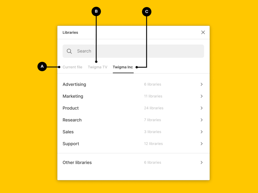
Products like Miro and Figma draw this line clearly. System-level things like teams and permissions live in one place. Actual work, like boards, files, and frames, lives somewhere else. You always know whether you’re configuring the system or creating something inside it, and that separation reduces hesitation.
Once a platform grows, product switchers become unavoidable. They act as a safety net that lets users know they can get to where they need to go without backing out or starting over.
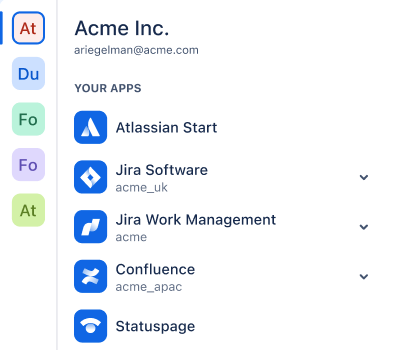
Switchers make sense when users regularly move between tools as part of the same workflow, especially when those tools represent different mental models. That’s why platforms like Atlassian and Google Workspace rely on them so heavily. Switching tools is the default behavior, not an edge case there.
Context also matters when switching tools. If a user is looking at a specific account or object, the system should preserve that context when possible. If multiple organizations exist, display those on a different level, separate from the platform level. This creates a cleaner interface and only shows apps that are relevant to your organization.
At the end of the day, a good switcher should help the user understand where they are currently located and get them to where they want to go. When that works reliably, users trust the system more and explore it more freely.
When products grow in silos, navigation often becomes one-way. Users can enter a workflow easily, but struggle to move forward or find their way back. Sometimes modules feel like separate apps stitched together. Sometimes switching tools means starting over from a home screen. Either way, momentum gets lost.
Strong platforms keep the next step visible. When editing a product in Shopify, it naturally leads to other areas that you can configure. The system guides users forward instead of making them manage transitions manually.
In complex tools, it’s natural for users to fall deeper into specific workflows, but they should always be aware of where they are located in the platform. Progressive disclosure works when users can go deeper, back out, and still understand how their current actions fit into the bigger flow.
Finally, don’t forget that users will inevitably make mistakes or accidentally click the wrong thing. They’ll follow paths that don’t lead where they expected. But it’s important to consider how easily they can recover. Showing clear breadcrumbs, reliable back behavior, and obvious exit paths makes those moments feel recoverable instead of stressful.
In multi-product systems, users should always know which workspace they’re in, which product is active, and what data they’re affecting. When that information isn’t visible, users hesitate because they’re not sure what the consequences of their actions will be.
Subtle visual cues help a lot here. Headers that clearly identify the current module, search that’s scoped to the active environment, role indicators, and small layout shifts when crossing boundaries all reduce “Where am I?” moments. Figma’s structure makes hierarchy obvious at every level, which is why moving between teams, projects, and files rarely feels confusing.
Transitions should feel different enough to signal change, but not so different that users feel like they’ve left the system entirely. Too much contrast creates friction. Too little hides important boundaries.
When users learn a pattern once and see it repeated everywhere, they move faster, make fewer mistakes, and feel more comfortable exploring. Over time, that predictability compounds.
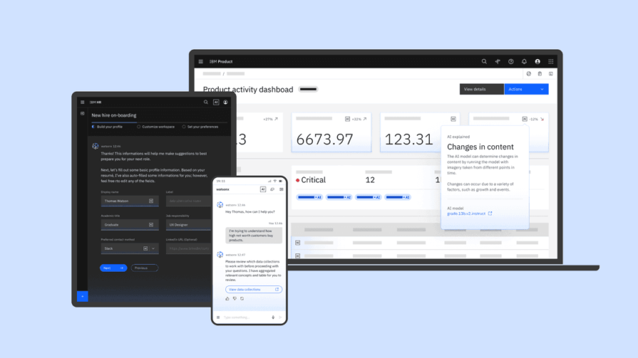
At scale, consistency doesn’t happen by accident. It requires shared information architecture, navigation patterns, and governance. Organizations like IBM and Microsoft invest in cross-product alignment to keep their ecosystems from slowly drifting apart. As your platform evolves, it becomes more critical to use a design system that enforces consistent visual language, patterns, and expectations.
That doesn’t mean everything has to look the same. Some divergence is healthy, especially when tools serve different mental models. The goal is to provide a coherent experience, allowing your platform to evolve without becoming a navigation nightmare.
Navigation problems usually show up when transitioning from one place to another, not in isolated views. They appear when users switch tools, go deep into a product, or land somewhere unexpected. That’s why testing navigation screen by screen often misses the real issues. You need to test full workflows that span multiple modules.
Pay attention to how quickly users reorient after switching, how confident they feel choosing where to go next, and how easily they recover when they get lost. Analytics can help here by revealing where users abandon journeys mid-flow.
New users and experienced users surface different problems. New users struggle with discoverability. Power users feel friction when efficiency breaks down. Both perspectives matter, especially in enterprise products.
One of the strongest signals is abandonment. When users consistently drop out before finishing a task, it’s often a navigation issue, not a feature problem. Measuring completion across the entire suite, rather than per product, gives a much clearer picture of what’s really happening.
Cross-product navigation isn’t about menus or layout. It’s about whether users can move through a growing system without stopping to think. It breaks when global and app-level navigation blur together. Global navigation should orient users across the platform, while app-level navigation should support deep, focused work. A clear hierarchy helps users understand scope, reduces hesitation, and builds trust.
Good navigation also protects journeys. Users think in tasks, not products, so context needs to carry across tools without forcing restarts or guesswork. Consistency isn’t about making everything look the same, but rather offering predictability at scale.
If you’re working on a multi-product platform, don’t treat navigation as a surface-level problem. Take a step back and look at the system as a whole. Spend time with users and follow how they actually move across tools to get real work done. The more intentionally you design the connections between products, the less users have to think about navigation at all. When it works well, it disappears, and users just keep moving, confidently and without friction.

LogRocket's Galileo AI watches sessions and understands user feedback for you, automating the most time-intensive parts of your job and giving you more time to focus on great design.
See how design choices, interactions, and issues affect your users — get a demo of LogRocket today.

AI has accelerated design execution, but speed can come at the expense of intentionality. Learn how UX teams can preserve product thinking and judgment.

UX testing is not limited to layouts, copy, and visual design. Full-stack and server-side experiments help teams evaluate how backend logic, APIs, algorithms, and product flows affect the overall user experience.

In A/B, A/B/n, or multivariate testing scenarios, using p-value with traditional null-hypothesis-based statistical analysis is so common, and most designers […]

Traditional A/B testing splits traffic evenly, but multi-armed bandits dynamically send more users to the better-performing version. Here’s how the method works, where it helps, and when UX teams should use it over classic A/B testing.

 Learn more →
