A design hypothesis is a cornerstone of the UX and UI design process. It guides the entire process, defines research needs, and heavily influences the final outcome.

Doing any design work without a well-defined hypothesis is like riding a car without headlights. Although still possible, it forces you to go slower and dramatically increases the chances of unpleasant pitfalls.
There are three main reasons why no discovery or design process should start without a well-defined and framed hypothesis. A good design hypothesis helps us:
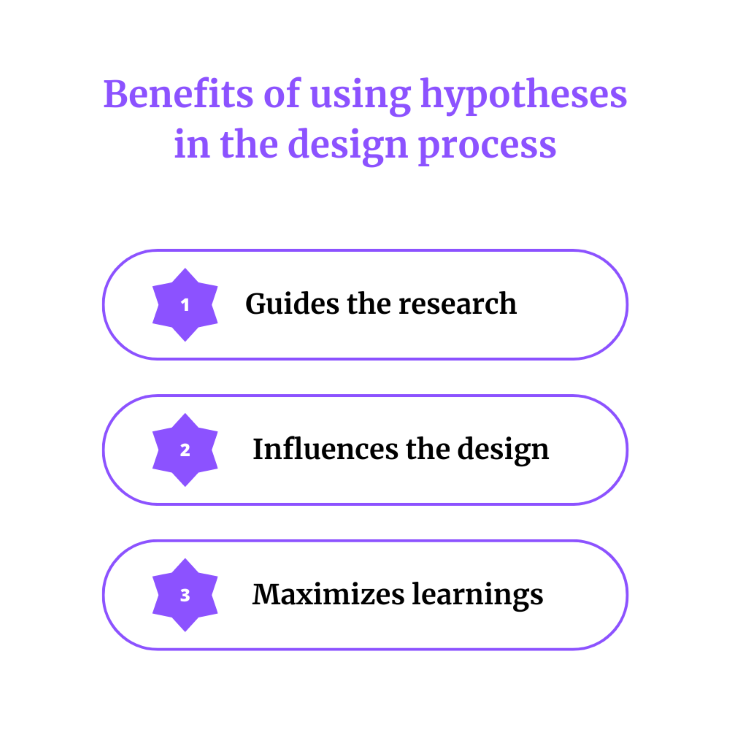
A good hypothesis not only states what we want to achieve but also the final objective and our current beliefs. It allows designers to assess how much actual evidence there is to support the hypothesis and focus their research and discovery efforts on areas they are least confident about.
Research for the sake of research brings waste. Research for the sake of validating specific hypotheses brings learnings.
Design hypothesis gives much-needed context. It helps you:
The more detailed and robust the design hypothesis, the more context you have to help you make the best design decisions.
If you design new features blindly, it’s hard to truly learn from the launch. Some metrics might go up. Others might go down, so what?
With a well-defined design hypothesis, you can not only validate whether the design itself works but also better understand why and how to improve it in the future. This helps you iterate on your learnings.
I am not a fan of templatizing how a solid design hypothesis should look. There are various ways to approach it, and you should choose whatever works for you best. However, there are three essential elements you should include to ensure you get all the benefits mentioned earlier of using design hypotheses, that is:
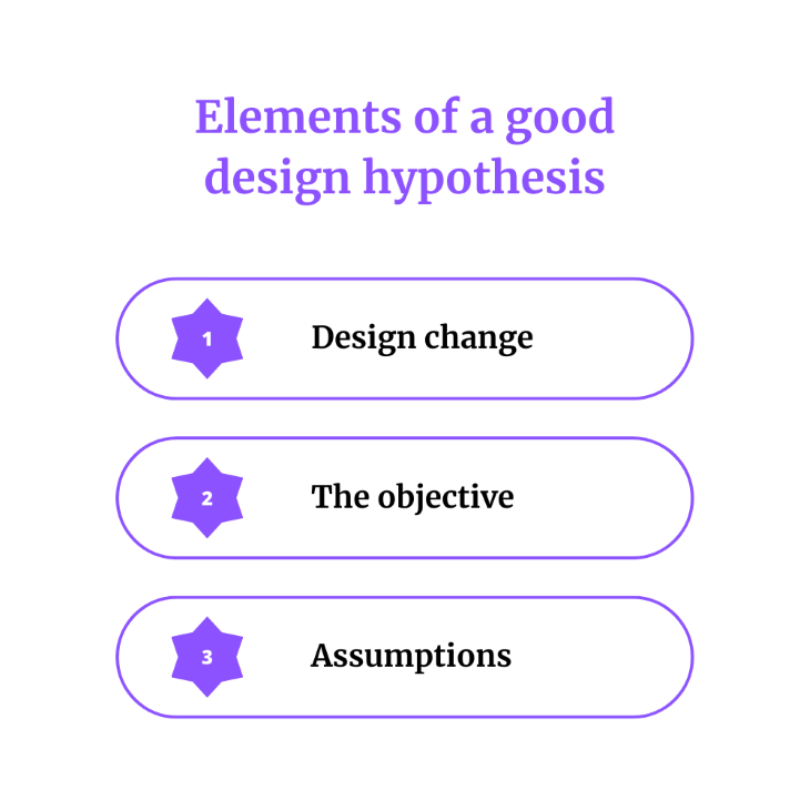
The fundamental part is the definition of what you are trying to do. If you are working on shortening the onboarding process, you might simply put “[…] we’d like to shorten the onboarding process […].”
The goal here is to give context to a wider audience and be able to quickly reference that the design hypothesis is concerning. Don’t fret too much about this part; simply boil the problem down to its essentials. What is frustrating your users?
In other words, the objective is the “why” behind the change. What exactly are you trying to achieve with the planned design change? The objective serves a few purposes.
First, it’s a great sanity check. You’d be surprised how many designers proposed various ideas, changes, and improvements without a clear goal. Changing design just for the sake of changing the design is a no-no.
It also helps you step back and see if the change you are considering is the best approach. For instance, if you are considering shortening the onboarding to increase the percentage of users completing it, are there any other design changes you can think of to achieve the same goal? Maybe instead of shortening the onboarding, there’s a bigger opportunity in simply adjusting the copy? Defining clear objectives invites conversations about whether you focus on the right things.
Additionally, a clearly defined objective gives you a measure of success to evaluate the effectiveness of your solution. If you believed you could boost the completion rate by 40 percent, but achieved only a 10 percent lift, then either the hypothesis was flawed (good learning point for the future), or there’s still room for improvements.
Last but not least, a clear objective is essential for the next step: mapping underlying assumptions.
Now that you know what you plan to do and which goal you are trying to achieve, it’s time for the most critical question.
Why do you believe the proposed design change will achieve the desired objective? Whether it’s because you heard some interesting insights during user interviews or spotted patterns in users’ behavioral data, note it down.
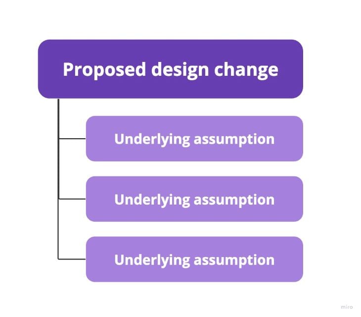
Even if you don’t have any strong justification and base your hypothesis on pure guesses (we all do that sometimes!), clearly name these beliefs. Listing out all your assumption will help you:
You’ll see exactly how in the examples of good design hypotheses below.
Let’s put it all into practice and see what a good design hypothesis might look like.
I’ll use two examples:
You should still formulate a design hypothesis if you are working on minor changes, such as changing the copy on buttons. But there’s also no point in spending hours formulating a perfect hypothesis for a fifteen-minute test. In these cases, I’d just use a simple one-sentence hypothesis.
Yet, suppose you are working on an extensive and critical initiative, such as redesigning the whole conversion funnel. In that case, you might want to put more effort into a more robust and detailed design hypothesis to guide your entire process.
A simple example of a design hypothesis could be:
Moving the sign-up button to the top of the page will increase our conversion to registration by 10 percent, as most users don’t look at the bottom of the page.
Although it’s pretty straightforward, it still can help you in a few ways.
First of all, it helps prioritize experiments. If there is another small experiment in the backlog, but with the hypothesis that it’ll improve conversion to registration by 15 percent, it might influence the order of things you work on.
Impact assessments (where the 10 percent or 15 percent comes from) are another quite advanced topic, so I won’t cover it in detail, but in most cases, you can ask your product manager and/or data analyst for help.
It also allows you to validate the hypothesis without even experimenting. If you guessed that people don’t look at the bottom of the page, you can check your analytics tools to see what the scroll rate is or check heatmaps.
Lastly, if your hypothesis fails (that is, the conversion rate doesn’t improve), you get valuable insights that can help you reassess other hypotheses based on the “most users don’t look at the bottom of the page” assumption.
Now let’s take a look at a slightly more robust assumption. An example could be:
Shortening the number of screens during onboarding by half will boost our free trial to subscription conversion by 20 percent because:
The most significant difference is our effort to map all relevant assumptions.
Listing out assumptions can help you test them out in isolation before committing to the initiative.
For example, if you believe most users don’t complete the onboarding flow, you can check self-serve tools or ask your PM for help to validate if that’s true. If the data shows only 10 percent of users finish the onboarding, the hypothesis is stronger and more likely to be successful. If, on the other hand, most users do complete the whole onboarding, the idea suddenly becomes less promising.
The second advantage is the number of learnings you can get from the post-release analysis.
Say the change led to a 10 percent increase in conversion. Instead of blindly guessing why it didn’t meet expectations, you can see how each assumption turned out.
It might turn out that some users actually perceive the product as more complex (rather than less complex, as you assumed), as they have difficulty figuring out some functionalities that were skipped in the onboarding. Thus, they are less willing to convert.
Not only can it help you propose a second iteration of the experiment, that learning will help you greatly when working on other initiatives based on a similar assumption.
Ensuring everything you work on is based on a solid design hypothesis can greatly help you and your career.
It’ll guide your research and discovery in the right direction, enable better iterative design, maximize learning, and help you make better design decisions.
Some designers might think, “Hypotheses are the job of a product manager, not a designer.”
While that’s partly true, I believe designers should be proactive in working with hypotheses.
If there are none set, do it yourself for the sake of your own success. If all your designs succeed, or worse, flunk, no one will care who set or didn’t set the hypotheses behind these decisions. You’ll be judged, too.
If there’s a hypothesis set upfront, try to understand it, refine it, and challenge it if needed.
Most senior and desired product designers are not just pixel-pushers that do what they are being told to do, but they also play an active role in shaping the direction of the product as a whole. Becoming fluent in working with hypotheses is a significant step toward true seniority.
Header image source: IconScout
LogRocket lets you replay users' product experiences to visualize struggle, see issues affecting adoption, and combine qualitative and quantitative data so you can create amazing digital experiences.
See how design choices, interactions, and issues affect your users — get a demo of LogRocket today.

Designing for enterprise isn’t just about looks — it’s about making complex workflows easy. Here’s how to do it right.

When familiar patterns start to feel stale, these seven ways will help you revive your design inspiration and to create standout user experiences.
Here’s the lowdown. Scaling icons properly keeps them crisp and clear on any screen size. I talk more on this in the blog.

Brands like Amazon and Walmart have a product page design that sells itself. In this blog, I analyze how they do it and what you can learn from them.