The world of digital design is full of various UX dark patterns. Although these might seem beneficial at first, in the long run, they can pose serious harm to the business in the long run. Let’s dig deeper into the topic so you can push back if someone ever recommends that you design a dark pattern.

Dark patterns, also called deceptive patterns, occur when we design a product in a way that tricks users into doing things they would normally not do. If, at some point, you accidentally signed up for a newsletter you never wanted to or clicked an advertisement you didn’t intend to, you probably fell into one of UX design’s dark patterns.
So, why would anyone intentionally trick users? One word: results. We don’t design new solutions just for the sake of building new features. They usually aim to achieve a specific outcome:
By tricking users into unintentionally taking particular actions or hiding some information from them, we can often get a solid boost in the metrics we care about.
If dark patterns help us drive outcomes, then what’s the issue?
Apart from purely ethical reasons, the main issue with dark patterns is their short-termism. Although dark patterns might give you a nice boost to your metrics, they won’t stick for the long run.
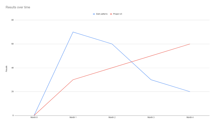
Users will realize they were tricked or simply get annoyed by a deceptive design. As a result, it’ll decrease the chance of them wanting to transact with you again and significantly increase user churn if there are alternative solutions that don’t use dark patterns. In the long run, all dark patterns do is harm to both users and the business.
Let’s take a look at the most common dark patterns and what are alternative, more ethical solutions. Pay close attention to any similarities between dark patterns described in this article and patterns used in your product. The truth is, you might be using dark patterns without even knowing it.
Disguised advertisements are one of the most annoying dark patterns. The trick here is to create and position an advertisement so that users think clicking on it is what they need to fulfill their job to be done.
One of the most common ways to do so is to distinguish an advertisement as a desired call-to-action (CTA), like this:
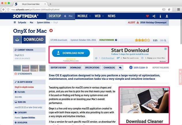
It’s common for various software download sites. Websites like that tend to have a “download” call to action displayed in numerous places, with most of them being hardly distinguishable advertisements. Although you might score some ad displays with new users, they’ll learn to distinguish and avoid them over time, resulting in even lower CTR than if you advertise something meaningful and usable for them.
Instead, consider introducing native advertisements. Native ads:
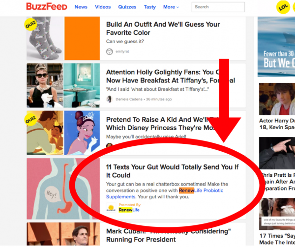
For example, although advertisements on BuzzFeed don’t resemble ads and thus don’t impact user experience, they are relevant to the searched content, so even if a user accidentally clicks on that, they’ll still achieve the desired outcome of reading the content they search for. Win-win!
Confirm-sharing occurs when you use manipulative copy to make users feel bad if they don’t do the action you wish for. Examples include:
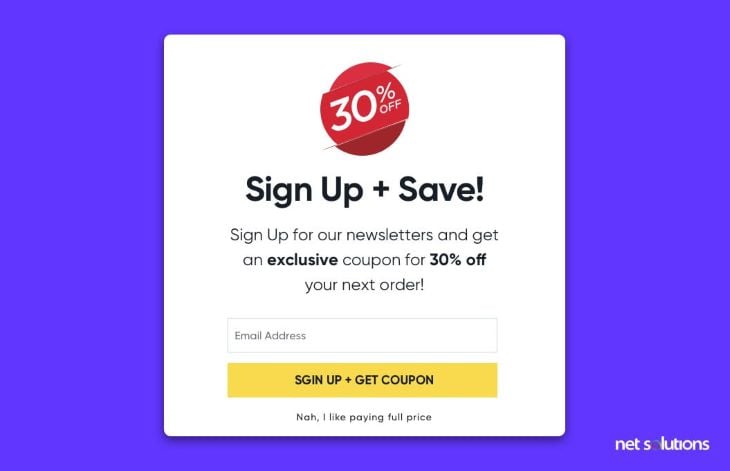
Not only does it rarely work, but it can even decrease your conversion rates. As an anecdote, I was once genuinely interested in the product. Still, the confirm-sharing copywriting made me so disgusted that I didn’t want to give my money to the company responsible for that.
Instead of shaming users for choosing the “wrong” option, focus on nailing your value proposition and your copy on your preferred options. Users should feel great that they signed up for something, not wrong because they didn’t.
I’ve never heard of a company that boosted its CTR by 50 percent by experimenting with the negative copy. But there are plenty of success stories of optimizing CTA and value communication.
There are certain UI patterns that walk users through their journey; these patterns are expected and established. If you break these patterns, we call it a misdirection.
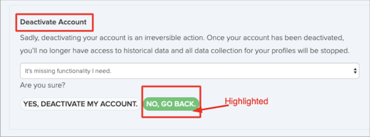
It’s widespread for CTAs. For example, when deleting an account, a “happy path” from the user’s perspective is to finish the account deletion process. And if you use a green color in your CTAs for moving forward and break this convention in that particular case (that is, use a green color to abort the deletion process), you misdirect users.
Even if you manage to trick your users, the best thing you will achieve is to delay the action by a couple of seconds while irritating your users. If you really don’t want users to complete a specific action, consider giving them alternative options (for example, pausing versus canceling a subscription) or a real incentive (bonus points or a discount if they stay longer). These have higher chances of success than simply knocking your users a few steps back with a deceptive UI.
When the user does an action expecting outcome A but instead gets outcome B, we talk about bait and switch. One of the most infamous examples of this dark pattern is Windows 10 upgrade window:
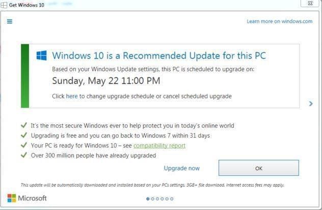
Typically, you would expect that clicking OK would initiate an upgrade while clicking X would lead to rejecting or delaying it, but that wasn’t the case here. Users that tried to dismiss the window accidentally initiated the upgrade process.
It led to serious media backlash and user anger. Some people had urgent work to do, which was severely delayed by the unwanted upgrade.
Microsoft’s aggressive update policies are one of the reasons why companies prefer to use MacOS in business environments — unexpected, lengthy interruptions like that can severely harm people’s workflows.
If you need to push users to upgrade, at least give them some options. For example, communicating that the upgrade will automatically occur within 24 hours gives users time to prepare and organize their work around that. It would help Microsoft achieve the same result without annoying users so much.
It’s common to default options, such as newsletter sign-ups, with the hope that users won’t notice that and unintentionally sign up for an extra service.
However, all it does is boost vanity metrics. For example, you might get more newsletter subscribers if you keep opt-in as a default option, but do you think users will read (or even open) these newsletters if they weren’t intentional about that when signing up? On the contrary, it’s one of the fastest ways to get your emails blocked and moved into spam.
To boost your results, increase the number of intentional opt-ins, not accidental opt-ins. It’s better to have 2,000 newsletter subscribers with a 60 percent open rate than 10,000 subscribers with a 10 percent open rate.
Focus on your value communication (why a user should opt in for a particular service?), and right incentives (e.g., a discount for newsletter subscribers) rather than deception. Ultimately, all unintentional opt-ins do is increase your cost of service.
A typical ecommerce dark pattern is to sneak unwanted items into customers’ baskets to improve sales and transaction value:
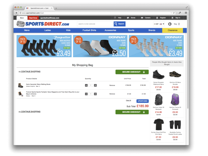
It’s exceptionally harmful on many levels. First, if users notice it, they’ll remove the item from the basket anyway, but their willingness to transact with you again will decrease regardless. But that’s actually the best-case scenario.
If they notice they purchased something accidentally post-factum, there’s a high chance they’ll want to return the item and request a refund anyway. If you include customer support costs and the return logistics, making that extra sale might be more expensive than not making the sale at all.
And the most dangerous outcome: in many cases, actions like that are simply illegal, and you might pay thousands in fines for doing so. Instead, consider these options:
I understand why people use dark patterns. I really do. The promise of quick results is just so tempting.
However, although dark patterns might give you a temporary boost, they’ll slow you down in the long run. It’ll incentivize you to try even more dark patterns to catch up. Let the cycle repeat a few times, and you’ll build a product that’ll scare even the most loyal customers.
But UX designers rarely implement dark patterns just because they want to. Sometimes stakeholders push for that. That’s a tough spot. If that’s the case, the best you can do is to sit on 1-1 with such a stakeholder:
And if you really must implement a dark pattern (e.g., the CEO literally told you to), do your best to make it as ethical and user-friendly as possible while looking for a healthier company to work for.
LogRocket lets you replay users' product experiences to visualize struggle, see issues affecting adoption, and combine qualitative and quantitative data so you can create amazing digital experiences.
See how design choices, interactions, and issues affect your users — get a demo of LogRocket today.

Designing for enterprise isn’t just about looks — it’s about making complex workflows easy. Here’s how to do it right.

When familiar patterns start to feel stale, these seven ways will help you revive your design inspiration and to create standout user experiences.
Here’s the lowdown. Scaling icons properly keeps them crisp and clear on any screen size. I talk more on this in the blog.

Brands like Amazon and Walmart have a product page design that sells itself. In this blog, I analyze how they do it and what you can learn from them.