Editor’s note: This article was updated by Chinwike Maduabuchi on 26 November 2024 to provide actionable insights and best practices for designing tabbed navigation with UX in mind. Changes include recommendations around when and when not to use tabs, an expanded list of best practices for effective tabs UX, updated examples of use cases and modern trends, answers to common questions, and more.

Tabbed navigation is a widely used design pattern for organizing UI content. This type of navigation menu provides users with a set of clearly labelled tabs, each representing a unique category of content or functionality. Among its many advantages are:
However, designing tabbed navigation requires careful consideration of usability, including the number of tabs, their labels, and the content they organize.
In this article, we’ll explore the advantages and disadvantages of using tabs for UX, as well as when and where to use the design pattern. Then we’ll talk about some best practices for designing effective tabbed navigation.
There are several situations where tabbed navigation can be an effective way to organize content within an application or website. However, tabs don’t provide the best UX for every situation, so it’s important to consider your content as well as your user’s needs.
Let’s go over some of the advantages and disadvantages to consider when it comes to tabs and UX. At the end, I’ll summarize my recommendations regarding when and when not to use tabbed navigation in your UI design.
Tabbed navigation excels in scenarios where users benefit from a simplified and organized navigation structure. In the next few sections, we’ll discuss situations where tabs are particularly effective.
When you have a limited number of top-level categories, tabbed navigation can provide a clear and simple way for users to navigate between them. Similarly, if users need to frequently switch between categories, tabs can make this process much more efficient, simple, and intuitive:

Tabs allows users to quickly and easily access different areas of an application without the need to navigate through multiple screens or menus.
Screen real estate is a valuable commodity in UX, especially in mobile applications or websites where space is limited. Tabs help conserve screen real estate while still providing users with access to all the content they need:
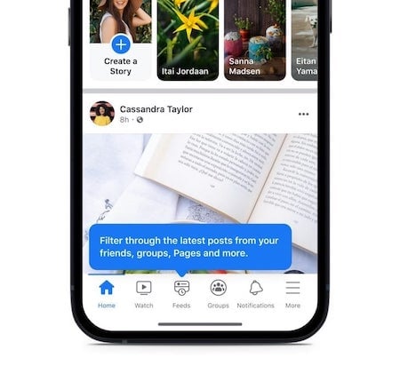
This can be particularly useful on small mobile screens or when there are related categories of content without the space to support it. Additionally, if multiple categories of content don’t need to be shown at the same time, then tabbed navigation can be an effective way to save space and limit what is shown at a given time.
Keep in mind that if the user will be comparing the content across tabs, then having to switch back and forth between tabs can be frustrating.
When you have hierarchical content, users need a way to navigate through multiple levels of menus quickly and easily. Grouping related content or functionality within tabs can help users understand the relationships between different elements and make it easier for them to find what they’re looking for.
Tabbed navigation helps create a sense of hierarchy and organization within an application or website. You can use it to provide quick access to frequently used features or content within a specific section of the application or website.
In some applications or websites, the main navigation may be located in a side menu or navigation bar, while tabbed navigation serves as secondary navigation on the page. Tabs can then be used for efficient sub-navigation within a page when the primary navigation lives in a side menu:
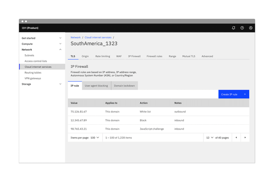
Using side navigation or a navigation bar for the main navigation gives users an overview of the entire application or website. Then, you can add tabs to enable quick access to content or functionality that users need frequently.
Placing frequently used features or content within tabs enables users to access them quickly and easily without the need to navigate through multiple screens or menus. This can improve the overall efficiency of the UI and be more convenient for users.
While tabs have their strengths, there are scenarios where they may not be the best choice. Consider avoiding tabbed navigation in the following cases:
Tabbed navigation works best when there are only a limited number of top-level categories to navigate between. If there are too many categories to display within tabs, it can become difficult to manage and the user interface can become cluttered and confusing.
For example, Airbnb lists dozens of options in its tabbed navigation, which essentially filters places by type:

It’s impossible to view all the labels at once due to limited screen space. This can make it hard for users to jump between tabs, as they might forget which tab they were on previously or have to scroll through the menu to find the tab they’re looking for.
Another drawback of using tabbed navigation is that there is often limited space available for labels. This can make it difficult to provide clear and descriptive labels for each tab, which can lead to confusion for users.
It’s important to keep labels short and clear, but this can be challenging when dealing with more complex or technical content. Long labels can lead to text wrapping within a tab label or even truncation, which can hinder understanding of the label’s meaning:
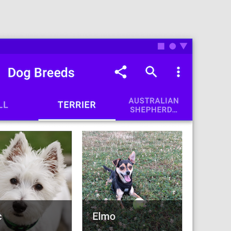
Although (as we covered above) tabs can help organize hierarchical content, there’s a limit to its effectiveness for complex content. Tabbed navigation is best suited to relatively simple content structures with a limited number of levels.
If the content or functionality is more complex and hierarchical, tabbed navigation may not be the best choice. Nesting tabs within tabs, in particular, can quickly become difficult to manage and navigate.
One additional disadvantage of tabbed navigation is that it can sometimes lead to hidden content. When content or functionality is placed within tabs, it may not be immediately visible to users. This can be especially problematic if the hidden content is critical to the user’s goals.
Here’s a summary of the recommendations I made above:
You can use this to quickly consider your needs at a high level and determine whether tabbed navigation is a good choice for UX or not in your specific situation.
Once you decide to use tabbed navigation, you have another question to ask yourself: where will you use tabs for the best possible UX? Tabbed navigation can be used in a variety of contexts, and it’s important to consider where it will be most effective for your users.
When designing a website, you may choose to use tabbed navigation within data-heavy sections of the website that have a lot of content that needs to be organized and presented clearly:

For mobile apps, tabbed navigation is often used to provide users with quick and easy access to the most important features and content. In this context, tabs allow users to quickly switch between different sections of the app without having to navigate through a series of menus.
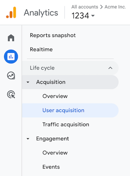
Similarly, in software applications, tabbed navigation can be used to organize content within the application and make it easier for users to find what they need. This is particularly useful in complex software applications where there are many different modules and features that users need to access:
A central concern of user interface design is to develop applications that are usable. By this, we mean applications that are generally easy to learn, effective to use, and provide an enjoyable user experience. There are several best practices to keep in mind when designing tabbed navigation.

role="tablist" for the container and role="tab" for each tab. Support keyboard navigation as well so users can move between tabs using the arrow keys
Responsive tab design is essential for delivering a seamless user experience across devices, particularly in mobile-first development. As tabs are a critical UI component for navigation and content organization, designing them responsively ensures they adapt to varying screen sizes and orientations while maintaining usability.
Some ways you can approach responsive tab design include:
Since mobile-first design assumes the smallest screen size as the starting point, tabs should be optimized for touch interactions:

Tabs should adapt their layout to accommodate various screen sizes while maintaining usability. On smaller screens, horizontal scrolling tabs (as seen earlier) are an effective solution. Users can swipe or tap arrows to access additional tabs, ensuring the navigation remains functional and visually clean.
For larger screens, tabs can take advantage of the increased space by maintaining a fixed horizontal layout. In some cases, using tooltips or expandable subtabs for secondary options can further aid navigation without overwhelming the interface.
Responsive tabs should provide clear visual cues to maintain user orientation:
Providing visual feedback for tabs enhances UX on any screen size.
Users expect efficient, enjoyable application UX, and the bar for user satisfaction continues to rise. Tabs UX, for example, is expected to go beyond simple content segmentation to address the complex demands of modern web applications.
Tabs now support features such as dynamic content loading, collapsible and customizable layouts, and gesture-friendly designs, enhancing their interactivity and user focus. This isn’t just for mobile apps, either; tabs also play a critical role in seamless navigation and state management for PWAs and SPAs.
Let’s explore some adjustments we can make to keep pace with modern design trends.
Modern tabs can fetch and display dynamic content without full page reloads. For example, in dashboards or admin panels, tabs dynamically load analytics or user data via API calls, reducing load times and enhancing the user experience.
Design tips:
Multi-level tabs are particularly valuable in dashboards, enterprise applications, or content-heavy platforms where users need to drill down into nested information. Here’s an example of an internet service provider’s app:

As you can see, you can switch between tabs to choose who you are buying a data plan for (self or others). Within each tab, you can also switch between tabs to choose the type of data plan (weekly or monthly).
Design tips:
The example above may be confusing for users because the nested Daily and Weekly tabs look visually similar to the parent Buy For Self and Buy For Others tabs. However, you can clearly see the active tab in each level thanks to the yellow underline, and placing the parent tab above the child tab helps distinguish them.
With the rise of mobile-first design, tabs have evolved to include swipe gestures and simplified layouts for smaller screens. For example, Reddit uses swipeable tabs for switching between feed options, offering a seamless experience:

Design tips:
Modern progressive web apps (PWAs) and single-page applications (SPAs) leverage tabs for seamless navigation between views without requiring a full reload.
Tabs in SPAs, such as in React or Angular frameworks, often integrate with routing systems to maintain URL states. For example, in a PWA ecommerce app, tabs can help users navigate between “Products,” “Cart,” and “Profile,” preserving state across sessions.
Design tips:
Tabs are UI components that allow users to switch between different content sections or views without leaving the current page, improving navigation and reducing clutter.
Tabs enhance user experience by organizing content into digestible sections, reducing cognitive overload, and improving navigation efficiency.
Use tabs when content can be logically grouped into categories and users need quick access to each section. Avoid tabs for large datasets, deeply nested content, or when switching between tabs disrupts user workflows.
Toggles are binary switches used to activate or deactivate settings. Tabs, on the other hand, organize and display multiple content sections, allowing users to select one at a time.
Tabs display one content section at a time, typically arranged horizontally or vertically. Accordions reveal and hide content vertically, often used for expanding and collapsing longer lists of items or FAQs.
The ideal number of tabs is typically 5–7, as more can overwhelm users and complicate navigation. Use dropdowns or secondary navigation if you have more categories.
Tabbed navigation remains a cornerstone of effective UI design, offering an intuitive and space-efficient way to organize content. Its ability to simplify navigation, save screen real estate, and provide quick access to key features makes it an essential tool for many applications.
However, the success of tabs in terms of UX depends on careful implementation, including clear labelling, thoughtful categorization, and accessibility considerations. While tabbed navigation excels in many ways, its limitations — such as restricted space and challenges with complex hierarchies — highlight the importance of context in design decisions.
Balance the advantages of tabs for UX with potential drawbacks and follow best practices to create interfaces that enhance usability and ensure seamless navigation for users.
LogRocket's Galileo AI watches sessions and understands user feedback for you, automating the most time-intensive parts of your job and giving you more time to focus on great design.
See how design choices, interactions, and issues affect your users — get a demo of LogRocket today.
A three-week mobile banking project taught me that the “proper” UX process is not always realistic. Sometimes, the better approach is to work with what you know, identify what you still need to learn, and make the strongest decision possible under real constraints.
A/B testing compares two versions of a design to see which performs better with real users. Here’s how UX teams can use it to test hypotheses, measure outcomes, and make smarter product decisions.
This case study shows how one ad experience redesign increased total ad exposure while lowering perceived friction, proving that timing and context can matter more than raw interruption.

As products evolve into ecosystems, navigation becomes a system-level challenge. This article explores how to align structure, context, and user journeys to create seamless movement across tools without confusion.