If you’d like to learn how to measure ease of use in UX, then you’re in the right place. In this article, we’ll be exploring key usability metrics and the tools and methods you can use to measure them. We’ll also be letting you know how you can use and apply the data you’ve collected once testing is over.

We’ll be covering:
Measuring the ease of use in UX is typically done using usability metrics. These are key measurements of effectiveness, task success, duration, and user satisfaction. Together, these key measurements provide a full picture for a UX team regarding how intuitive or easy-to-use a product, website, system, or feature is for users.
Ease of use is calculated using tools and methods such as usability testing, heuristics evaluations, surveys, and questionnaires. A UX team can garner valuable quantitative and qualitative usability and user experience data from measuring their designs against these metrics. This data might include how effective a product is and how easy it is for users to understand and interact with.
The key metrics for measuring ease of use (also known as usability metrics) are task success rate, time on task, error rate, and user satisfaction. If you want to know how effective your design is with users, you’ll most likely want to collect data on all of these metrics.
Let’s take a look in more detail at what we mean by each one.

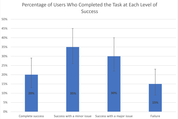
For many UX designers, the primary usability metric is the task success rate (sometimes known as the task completion rate). What this metric measures is simply whether or not a user is able to complete the task they have been given.
This ease of use metric is the one that UX teams will usually start with because all of the other metrics hinge on the design functioning as it should and users being able to reach their goals while interacting with it.
Measuring the success rate of a design is relatively straightforward. According to UX leaders the Nielsen Norman Group, this measurement is simply “the percentage of users who were able to complete a task in a study.” If five out of ten were able to complete the task, then you have a 50 percent success rate.
While the success rate is certainly a useful jumping off point for further investigations into a design’s usability, it’s not going to be providing the UX teams with any answers as to why or how users successfully or unsuccessfully completed their assigned task.
However, the success rate will give a very clear indication of how much work there is left to do on a design; e.g, if most users can’t complete the task, then there’s clearly something wrong.
Being able to complete a task quickly is another important usability metric to track. No UX team wants to see their users struggling for long periods of time to successfully reach their goals because this is clearly a sign of bad usability.
In order to calculate the task time, you’ll need to work out the average time users spend trying to complete an assigned task or activity. You can do this by adding together the time it took each user to complete the task and divide it by the number of users.
Although it can be hard to ascertain objectively what a “good” or “bad” result is for this metric, you and your team can calculate an ideal task time by observing an experienced user complete the task and using that time as your benchmark.
Time on task is a good metric for comparing older versions of a design against newer versions to see how effective the improvements have been to a design’s overall usability. And remember, for the user, every second that’s saved is a bonus!
In user experience, all errors are not equal. There are, in fact, two types of errors: slips and mistakes. Slips occur when a user has a specific target or goal in mind but instead of performing that action accidentally performs a different one. A typo when filling out an address label is a good example of a slip.
A mistake, however, is when the user’s mental model of a design doesn’t fit the actual design they’re interacting with. When a mistake happens, the fault typically lies with the design itself; it is failing to meet the expectations of the user and isn’t communicating its functions clearly enough.
In UX, the error rate is the number of times a user makes a mistake while trying to complete a task or reach a goal. You can measure it in two ways:
To get the total error rate, you first need to count the total amount of errors. Whether through simple user observation or by using another kind of usability testing, you’ll actively note the number of times a user makes any mistake. Once you have this number, you need to divide it by the number of times the activity was attempted by the user. If the user makes the same mistake over and over, each time it happens is counted as a separate attempt.
To calculate the error occurrence rate, you’ll first need to know how many possible errors users might make when completing a task. This number can be identified by having a member of the UX team attempt to complete the task first, pinpointing any potential pitfalls or opportunities for error as they go.
Once you’ve identified this error occurrence rate, you’ll need to divide the total number of actual errors by the total number of possible errors (or error opportunities).
Remember, making mistakes is a normal part of being human, and it’s extremely rare for a user to complete any activity without making some errors. In fact, the average number of errors that occur per activity is 0–7.
What you can learn from a high user error rate is that the design itself needs work. The user error rate provides valuable insights into your users’ pain points and how you can reduce frustration and improve their overall experience with your site.

In order to test a user’s level of satisfaction with an activity, you’ll need to ask them. This should happen irrespective of whether they were successful in completing their assigned task or not. Typically, you’d hand a user satisfaction questionnaire to users directly after they have attempted to complete a task, and the questionnaire should contain five or so questions asking them specifically about the difficulty of the task from their perspective.
This user satisfaction metric is usually called Post Task Satisfaction and provides users the space to talk about their general impression of the activity they were asked to do. This questionnaire produces qualitative answers: data that is nonnumerical that provides insights into users’ attitudes, goals, and motivations.
After the Post Task Satisfaction questionnaire, you’ll be ready to hit your users with a Task Level Satisfaction survey to assess their general impression of the design and its usability.
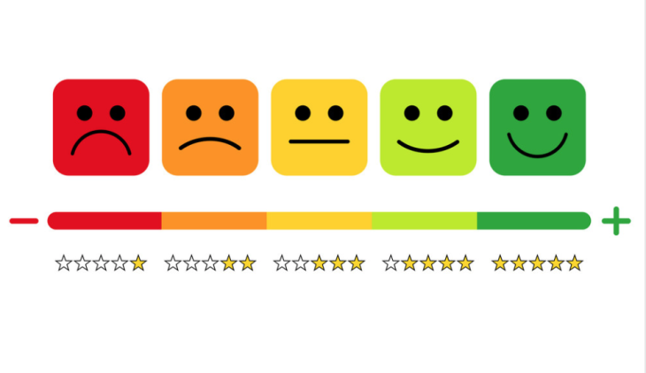
Questions on this survey should be designed with a Likert scale or similar system for answering the questions. This enables the UX team to gain quantitative answers, numerical data that can be measured and compared easily.
Overall, the Task Level Satisfaction questionnaire should help give you and your team a general impression of how users feel when faced with the system or design in question.
As we have seen, figuring out the ease of use of a product, website, or design requires user data and insights that the UX team can use to calculate each metric.
So how do you gather the data needed to inform your calculations? There actually isn’t one single way for measuring ease of use; there are multiple methods and tools adopted by UX teams to assist with this. We’re going to take a look at some of the most popular processes used, such as usability testing and questionnaires. Let’s dive in!
Usability testing, also referred to as simply “testing” or “user testing,” is a process that involves UX designers observing users while they operate and interact with a website, feature, product, or system.
Typically, you ask users to perform specific actions or complete tasks in a range of different scenarios. The data collected by the UX team during these sessions can be both qualitative and quantitative and is used to improve the UX of the system the users are interacting with.
In terms of measuring ease of use in UX, usability testing is an ideal way to gather the data needed by the team to calculate each rate.

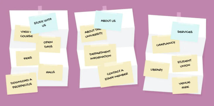
A UX design team will use card sorting to assist in how they categorize data and website content within a design, with the goal being that all the information on the site is ordered in a way that is inherently logical to users.
The UX designer will write different labels onto cards such as “blog posts,” “press releases,” and “news” and ask the user to put these cards into groups that make sense to them. In this case, those groups might be “resources,” “media,” and “homepage.”
Card sorting is a great methodology for gaining a deeper understanding into how users expect to encounter information within a design as well as how and where they look to find what they need.
Although card sorting does not involve users working within the actual design, it can still be a valuable way to gather data for usability metrics, particularly qualitative data around error rates. For example, if users are frequently categorizing data in a different way to how the UX team has categorized it, this would explain a high error rate during testing.

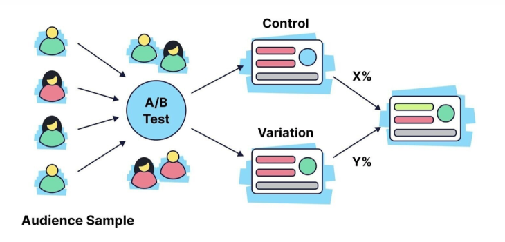
A/B testing is when two versions of an element, design, or feature are tested with users to see which performs better or is more popular. When used in usability studies to measure a design’s ease of use, A/B testing can be an effective way of measuring how users interact with one design over another. The results demonstrate to the UX team which design:
Not only will the results of these tests demonstrate the usability of one element with multiple users (similar to regular observational testing), the UX team will also be able to see how that element compares to a differently-designed version of the same element.
This might mean, for example, that although Element A saw every single user complete the assigned task and reach their goal with 100 percent success, Element B saw every single user complete the assigned task and reach their goal considerably faster. In another example, while Element C may have caused users to make the fewest number of errors when compared to Element D, Element D produced higher rates of user satisfaction.
UX teams use a heuristic evaluation as a fast problem-solving or decision-making method. When testing a product, it helps UX designers review the usability of a design, website, or single feature and ensure that it is aligned with pre-existing usability principles.
“Heuristics” is simply a term used to address these principles, but in UX design, the word is also used to refer to a lo-fi and practical approach to problem solving. The idea is that rather than aiming for perfection, the list of criteria or principles provides a gauge by which teams can assess their designs and achieve a specific objective.
The Nielsen Norman Group defines a heuristic evaluation as “a usability engineering method for finding the usability problems in a user interface design so that they can be attended to as part of an iterative design process. Heuristic evaluation involves having a small set of evaluators examine the interface and judge its compliance with recognized usability principles (the ‘heuristics’).”
A heuristic evaluation differs from other forms of testing in that it is performed not by users but by an individual who is already an expert with the system. This individual performs a walkthrough of the system being evaluated, simultaneously comparing its usability to the established criteria or heuristics.
A heuristic evaluation, or product walkthrough, is a great time for the team to measure ease of use in UX because during this assessment, they can measure the task success rate, time on task, error rate, and user satisfaction rate of the person conducting the evaluation.
Indeed, a heuristic evaluation is an opportunity to test all these metrics in one setting and gain benchmarks by which they can later test regular users. It’s important to note that in order to gather enough data to calculate averages, the evaluation would need to be conducted by a group of different people separately, rather than just by one expert individual.
Surveys and questionnaires are handy tools for understanding user behavior better. They provide insights into exactly how users experience your product or website, and through them, you can learn what to prioritize when it comes to making changes to the UX.
In UX, a survey seeks to gather both quantitative and qualitative data about each individual’s experience and interactions with a website. This data can then support UX metrics collected through the other methods we’ve discussed here, such as A/B testing.
In terms of gathering data for key ease of use metrics, surveys and questionnaires are perfect for finding out more about how satisfied users are with their experience while completing a task (the user satisfaction metric).
Questions can be open or closed, leading to quantitative data that can be measured, tracked and compared; and qualitative data, which can provide important insights into each individual’s experience with the product and can also support quantitative findings.
As noted when we discussed key metrics for ease of use, a UX team should try to use some sort of scale, such as a Likert scale, when asking users closed questions about their experience. For the open questions, we should give space for users to air their views.
A closed question on a survey or questionnaire might look like this:
“On a scale of 1 to 10, how much did you enjoy interacting with the new feature?”
1 = not at all, 10 = a lot
An open question on the same questionnaire might look like this:
“Please explain how you felt when you first saw the image on the homepage.”
Now that you’ve gathered all that quantitative and qualitative data on each of the usability metrics through observational testing, card sorting, A/B testing, heuristic evaluations, and surveys and questionnaires, it’s time to unpick the data and apply what you’ve learned to your design.
Remember that data-driven designing is an ongoing process, and that one application of new information doesn’t mean you shouldn’t continue to check your metrics regularly. Users’ preferences change all the time, as do trends in design, which means UX designers are continually having to move with the times and tweak and adjust as they go.
The data you collect will only be as good as the questions you posited to your users in the first place. Be sure to have a clear hypothesis before you begin your testing and ask open and closed questions, which will help you establish if your hypothesis is true or not.
Once testing is over, you’ll want to log the results of each test in a central place, such as a spreadsheet. With your data organized and accessible, you can start looking for patterns and trends that indicate problems in the design or specific user challenges.
Don’t forget to record positive outcomes, too! These can indicate processes you can look to strengthen or repeat elsewhere.
You might want to consider tagging your data with correct labels. This will save you time later when you’re trying to find specific pieces of information and make it easier to pinpoint patterns and trends.
Although patterns in data can be indicative of issues with the design, it’s important to support your assumptions from the quantitative data with more detail and context from qualitative data that you’ve gathered from, for example, surveys or user interviews.
Data visualization is when you choose to represent your data in a graphic form. Graphs, charts, timelines, and maps can help you identify trends more easily and make data more engaging to other stakeholders. If you need to get your team on board with some design changes, putting your findings into a visual form can be a much more persuasive tool than sharing a spreadsheet of numbers. Having an eye-catching chart or graph for each of the key ease of use metrics can also make for a great presentation when you’re demonstrating how a change in design has improved the user experience.
How you apply what you’ve learned from measuring your key metrics will vary from company to company and will often involve more testing and investigation.
For example, if only 50 percent of users are completing a task, you’ll need to do further research into why that is. You could do this with observational testing or you might want to conduct user interviews to gather qualitative data and insights.
Once you’ve established the root cause of the problem, you’ll be in a good position to make changes to the design to improve the user experience.
In this article, we’ve taken a look at the different ease of use metrics in UX and the methodologies you can adopt to measure them. While numeric data is great for measuring, comparing, and tracking, remember to support your testing for quantitative data with qualitative results from users obtained via interviews or questionnaires in order to provide relevant context.
Header image source: IconScout
LogRocket lets you replay users' product experiences to visualize struggle, see issues affecting adoption, and combine qualitative and quantitative data so you can create amazing digital experiences.
See how design choices, interactions, and issues affect your users — get a demo of LogRocket today.

You don’t need a PhD, a big budget, or months of planning to do solid UX research. Let’s break down the biggest myths stopping teams from learning what users really need.

Thinking of switching from graphic design to UX? The transition isn’t as daunting as you might think. Here’s what you need to know about their differences, similarities, and career paths.

Users shouldn’t have to guess what to do next. Here’s how you can close the two UX gulfs — the gulf of execution and evaluation — for better designs.

Error messages don’t have to be frustrating! In this blog, I discuss writing clear, user-friendly messages that keep people on track. Tips, examples, and best practices in here.