A few weeks ago, I was juggling multiple projects at once, switching between files and responding to messages, when I accidentally hit “Send” halfway through drafting an email. My heart dropped initially, but then a wave of relief hit as an “Undo” button appeared. Whether it’s sending a half-written email or deleting an important file that you’ve spent weeks working on, mistakes like these are universal. It’s one of the most relatable experiences on the internet.

The truth is, mistakes happen not because users are careless, but because attention is limited and systems are complex. A good product doesn’t just prevent errors, but it makes recovery simple, predictable, and safe. Designing with recovery in mind is a mindset that involves planning for failure instead of fearing it. It’s about designing for the worst-case scenario and asking, “What happens if the user gets this wrong?”
In this article, we’ll explore how to design for reversible actions, such as the ability to undo, restore, or recover from mistakes. We’ll also introduce a decision framework to help you determine when reversible actions make sense, which type to use, and when they might be unnecessary or even harmful.
Reversibility is one of the strongest trust signals in UX. When users can reverse an action, they feel safe. That sense of safety changes how they interact with your product. It boosts confidence, keeps them in flow, and reduces hesitation when performing actions. When people know they can recover from mistakes, they explore more, click faster, and stay focused on their goals instead of being worried about clicking the wrong thing.
Aside from users, reversible actions also benefit your internal support team by reducing their workload. Mistakes that can be easily reversed don’t become support tickets. Giving users the autonomy to correct their own mistakes not only makes them feel in control of the system but also avoids overloading your support team with bug tickets and customer complaints. By reducing friction on both sides, it builds trust, efficiency, and long-term loyalty in the process.
There are different ways to reverse an action, and they’re not all created equal. Each pattern serves a purpose and comes with its own tradeoffs. Choosing the right one depends on the level of risk, frequency of use, and the complexity of the system behind it. Here are the four major types of reversible actions that are frequently found in product design.
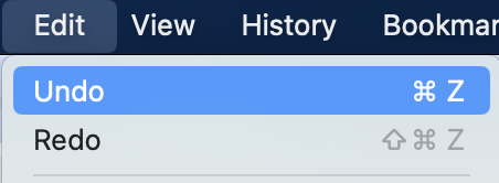
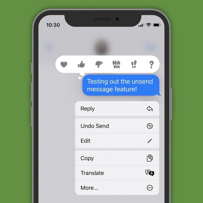
This is the simplest and fastest form of recovery. Undo reverses a recent action within the same session. It’s best for frequent, lightweight interactions where mistakes are easy to make, like moving an element in Figma or accidentally hitting “Send” in Gmail. Undo keeps users in flow by providing instant correction without breaking their rhythm. It’s low-cost to implement for small, contained actions, but less effective for complex workflows or multi-user environments.
Depending on the environment, undo can be a fixed button, such as in a toolbar, or appear contextually after an action has completed, such as after sending an email in Gmail. The standard undo keyboard shortcut is Ctrl+Z on Windows and Cmd+Z on macOS:
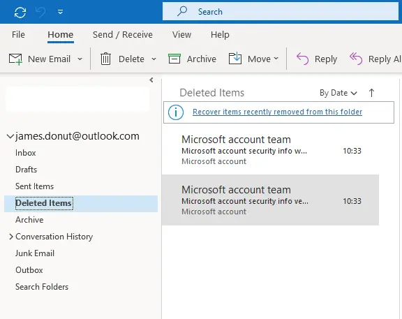
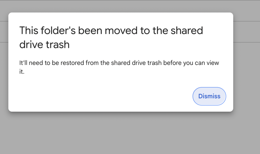
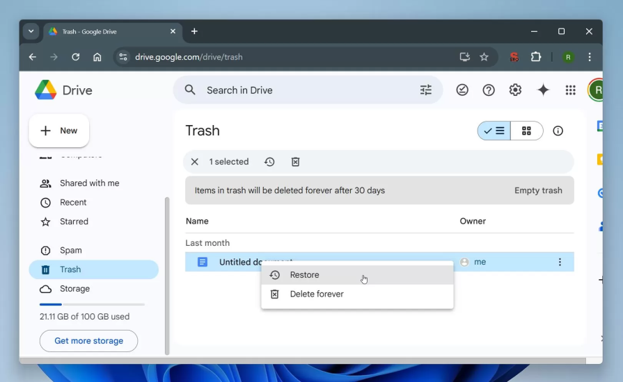
A soft delete temporarily hides or archives content before it’s permanently removed. Think of the Google Drive Trash or Outlook’s “Deleted” messages. This pattern creates the illusion of deleting something by removing items from the main interface, such as an inbox or file list, while still keeping them recoverable for a limited period, typically 30 days.
Soft deletion gives users a safety net for moderate-risk actions they might regret later, allowing them to restore content within that time window in case they change their mind, while still understanding that deletion will eventually become permanent:
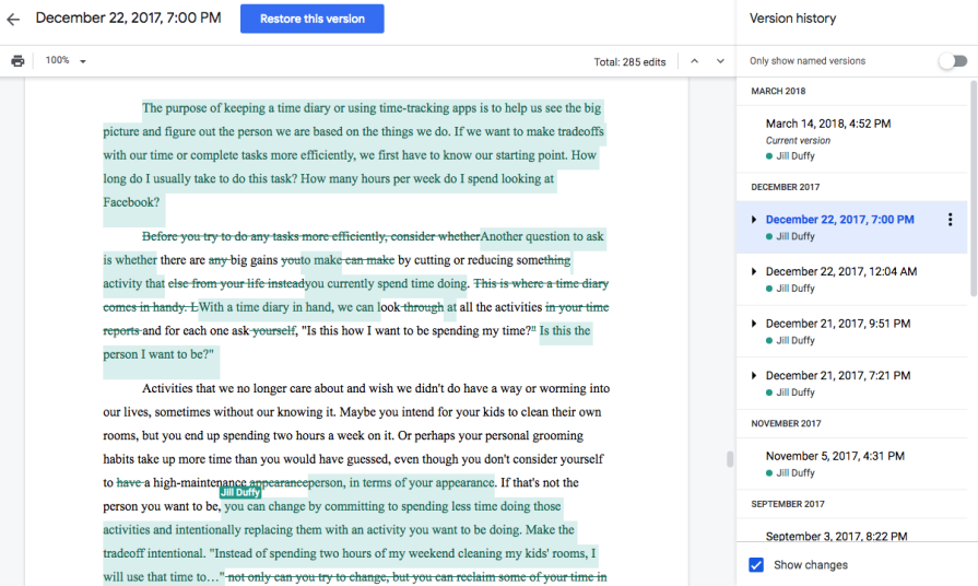
A version history stores past iterations of a file, document, or project so users can view or restore earlier states. This pattern exists in tools like Google Docs, Notion, and Figma, where collaboration and ongoing edits are constant. It’s invaluable for creative or shared work, giving users a clear timeline of changes and the ability to recover from accidental edits or overwrites.
The main tradeoff is complexity, as maintaining multiple versions of a file or project requires extra storage and careful interface design. Without clear labeling or visual cues, version lists can become confusing or overwhelming. If it’s done well, though, version history builds confidence as users can experiment freely, knowing they can always roll back to a previous point in time.
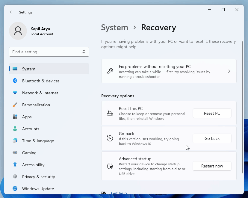
A rollback feature is typically found in tools like Git, content management systems, or database management software, where a single mistake can break something critical. Usually, system administrators are given the capability to conduct a rollback, which reverts an entire product, environment, or dataset to a previous stable state. It’s a last-resort safety net for high-impact actions that can’t be easily undone through regular interactions.
Rollback mechanisms are powerful but come with heavy technical and performance costs. They require the system to capture snapshots or checkpoints, which can consume storage and increase complexity.
Unlike an undo or version history, rollbacks are less about quick user correction and more about system-level recovery, which returns everything to a known good state after a failure. When designed thoughtfully, they can prevent catastrophic errors and give teams the confidence to experiment, knowing that recovery is possible even when things go wrong:
So, when should you make an action reversible? And how do you know which type of reversible action is suitable for your scenario? Not every mistake needs an undo button, and not every workflow can support a full rollback. The goal is to match the level of reversibility to the impact, frequency, and complexity of the action.
Here’s a decision framework to help you evaluate when to make an action reversible and which recovery pattern fits best.
First, start by considering the impact and consequences of the action. Deleting a chat message is fairly low impact, while closing a financial position in a stock portfolio has larger consequences.
Some questions you can ask are:
If the outcome is minor, such as repositioning a UI element in Figma, an undo is enough. However, if it risks losing hours of work, you’ll likely need version history or a rollback. For example, deleting something at a larger scale, such as an entire dataset that powers reports, may require full rollback support.
The more frequent the action, the lighter and faster its recovery should be. Undo works best for actions users perform repeatedly, like formatting text, moving layers, or sending messages, where interruptions would break the flow.
For less common but riskier actions, like deleting accounts or changing permissions, a best practice is to use confirmation dialogs in addition to a soft delete. This way, users are given a chance to consider the consequences of the action and proceed with safety and clarity. With a soft delete, they’ll still be able to reverse their action if they change their mind down the road.
The next step is to think about the cost of recovery. Ask yourself what it would take to complete the fix manually. If the user can easily recreate or re-upload something, recovery features may not be worth the overhead. But if recreating it requires hours of work or technical help, recovery should be built in.
This is where version history and rollbacks start to diverge. Version history protects user content by storing document versions, design file changes, or collaborative edits that change over time. For example, a photo editor might make edits to a photograph, but then decide to revert to the original version. In this case, a version history is beneficial as the previous states of the image are stored and recoverable. It’s also beneficial in case multiple users are collaborating on the same file.
On the other hand, a rollback protects system integrity. It’s used for when a product itself breaks, not just the data within it. A rollback reverts the environment to a previous state, not just a file or record. For example, in Git, a rollback resets the repository to a previous commit, which potentially impacts everything downstream.
More recovery options don’t always mean better UX. Having too many recovery layers can confuse users and end up harming the experience rather than helping it. Each recovery method should have a distinct purpose and clear boundaries.
It’s important that users clearly understand what’s reversible and how to do it. When performing an action, they should be in control by knowing what happened, whether it’s reversible, and for how long. It’s helpful to keep recovery options visible, but not overwhelming. For example, an undo toast message should be apparent but transient, while version history belongs in a menu for deliberate, but less frequent access.
Reversibility works only when users trust it. Unclear instructions and confusing UX lead to losing users’ trust in a product. Make recovery options visible, consistent, and time-bound.
For example, make it clear that soft-deleted items are recoverable for 30 days, or a rollback is available for a deployment within 24 hours. Hiding reversible actions doesn’t build confidence, but transparency can go a long way in giving users a sense of control and increasing trust in your product.
When deciding on which reversible action to use, refer to the decision process and framework to match the recovery pattern to the impact and frequency of the action.
For low-impact, frequent actions, use undo or a confirmation step. These patterns keep users in flow and help them quickly correct small mistakes, like Gmail’s “Undo Send.” They prioritize speed, ease, and minimal friction.
For moderate-impact, occasional actions, use a soft delete or trash pattern. This gives users a safety net for actions they might regret later, such as deleting an email or file. Some examples of soft delete include Google Drive’s Trash or Outlook’s Deleted Items. The focus here is on reassurance and recoverability.
For high-impact actions that are complex or collaborative, use version history. This is ideal for evolving content that changes over time, like Figma files or Google Docs documents. It allows users to revisit and restore past versions, supporting iteration and shared ownership.
For critical, system-level actions, use rollback mechanisms. These patterns revert entire environments or datasets after failure, such as Git reverts or CMS restore points. They focus on system stability and large-scale recovery rather than individual user mistakes.
By thinking through these layers, you can design recovery experiences that feel intuitive to users and maintainable for your team. This builds safety, confidence, and trust into every interaction.
Reversibility can be a lifesaver, but it isn’t always the right design choice. In some cases, allowing users to undo actions can introduce confusion, conflict, or even risk. Knowing when not to make an action reversible is just as important as knowing when to.
Some actions are meant to feel final, like publishing a post, submitting a payment, or signing a document. These actions all carry intentional weight. Making these reversible could undermine user confidence or remove accountability. Finalizing an action communicates commitment, which is essential when it comes to actions that have social, financial, or legal consequences.
In collaborative environments, reversibility can interfere with other users’ work. If one user undoes a change in a live editing tool like Notion or Miro, it might inadvertently erase another person’s contribution. That’s why these tools often rely on version history instead of global undo, since it protects collaboration without introducing conflict. Even Git commits, while technically can be reverted, are designed to feel permanent. That perceived finality reinforces accountability and discipline in collaborative coding.
Also, giving too much flexibility can make users uncertain about the system’s true state. If everything can be undone, users may question whether their changes really saved or if others can alter them afterward. In some workflows, like submitting tax forms or approving transactions, clarity and commitment matter more than recoverability.
On a more technical note, storing long undo stacks or version histories consumes storage and system resources. In data-heavy environments, this can slow down performance or increase infrastructure costs. Designers and engineers need to weigh the user benefit against the technical tradeoffs of maintaining deep history or rollback states. Sometimes the right UX choice is to make an action feel serious, but with clear warnings and confirmation.
Good recovery design helps users feel safe without breaking their flow. The key is to make recovery options visible, communicate clearly, and keep the experience simple. Here are a few best practices to keep in mind when designing recoverable interfaces.
Clear, upfront messaging strengthens trust and usability. Subtle toast messages like “Your file was moved to Trash. Undo.” instantly reassure users that mistakes aren’t permanent. Instead of panicking after deleting a file, users feel confident knowing there’s an easy fix:
Visual cues can influence how users perceive an action. Use calm colors, soft icons, and gentle motion to signal that an operation is reversible. These subtle details reduce anxiety and help users interpret what’s safe to change:
For temporary undos, show clear time windows to communicate some sense of urgency. Be transparent about recovery timelines, like saying “Undo available for 30 seconds.” or “Items are deleted after 30 days.” Using calm, factual language keeps users focused on the action rather than the mistake. The goal is to make recovery feel like part of the experience, turning an error into a moment of trust and control:
Everybody makes mistakes once in a while. It’s inevitable. That’s why good UX should assume that users are human, not perfect. Great design turns those moments into opportunities for trust, not frustration. Reversible actions provide users with a safety net. It gives them the confidence to explore, experiment, and engage more deeply with your product without fear of failure.
As you design or review new features, adopt this mindset into your process. Always design for edge cases by thinking about the worst that could happen after completing an action and how easy it is to recover. This thinking can reveal gaps in user safety and guide you toward smarter, more resilient experiences. Ultimately, a well-designed product helps users succeed, but also helps them recover when they don’t.

LogRocket's Galileo AI watches sessions and understands user feedback for you, automating the most time-intensive parts of your job and giving you more time to focus on great design.
See how design choices, interactions, and issues affect your users — get a demo of LogRocket today.

Adaptive interfaces personalize experiences using behavioral signals and machine learning. But when personalization becomes autonomous, systems can reinforce patterns, limit discovery, and shape user behavior in ways designers didn’t intend.

Security requirements shouldn’t come at the cost of usability. This guide outlines 10 practical heuristics to design 2FA flows that protect users while minimizing friction, confusion, and recovery failures.
2FA failures shouldn’t mean permanent lockout. This guide breaks down recovery methods, failure handling, progressive disclosure, and UX strategies to balance security with accessibility.

Two-factor authentication should be secure, but it shouldn’t frustrate users. This guide explores standard 2FA user flow patterns for SMS, TOTP, and biometrics, along with edge cases, recovery strategies, and UX best practices.


