How did I, a UX designer who’s supposed to be pushing pixels, end up talking numbers and metrics? And how did I find myself influencing stakeholders to make decisions that turned a redemption (withdrawal) feature’s success rate from 60 percent to 95 percent?
If you haven’t explored product or UX analytics as a designer yet, I hope this story pushes you to see just how powerful it can be. In my case, it meant saving a critical money withdrawal feature from frustrating drop-offs and proving that good UX directly protects revenue, trust, and user confidence.
In this article, I’ll show you exactly how it happened, what worked, what didn’t, and the lessons I learned about balancing user needs and business goals, plus how I now measure the real impact of every design decision I make.
It started like any other Monday. Every week, I track the funnel performance of key money-moving features — the flows that keep people happy and the business earning. I look at each step, compare last week’s numbers with this week’s, and flag anything that looks off.
That’s when I noticed it. The redemption flow, the part where users withdraw their money, was doing poorly. We had thousands of users starting a withdrawal, but only about 60 percent finishing it. 40 percent were dropping at the last step.
In the world of money, that’s not a small hiccup, that’s trust on the line. I double-checked our funnel. The numbers were clear: people weren’t getting past the OTP verification step.
No OTP, no withdrawal. That single friction point was costing us completed transactions, user trust, and time for the customer support team chasing angry calls.
At that point, I knew this wasn’t just a glitch, it was a UX problem worth fighting for.
So what was causing the drop off? Missing OTPs. Users would hit “withdraw,” get to the point where they should receive a one-time password, and… nothing. No OTP, no money, no success. Most just gave up or called customer support to complain.
If I had stopped at the funnel numbers alone, we might have blamed bad design — maybe the flow was confusing, maybe the copy wasn’t clear enough. But the data told a sharper story.
Our funnel broke down each stage: User clicks on redemption/ withdrawal → Inputs details → OTP is sent → OTP is entered → Success message displayed.
The drop off was right at “OTP is sent.” Most users didn’t move past that stage.
To confirm, I pulled in our customer experience team. I then asked them to call a few users who had dropped off. Same story, every time: “I didn’t get my OTP.”
That’s when I knew the design wasn’t broken, the system was. My weekly report format kept this visible for everyone:
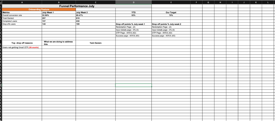
I track key funnel points side-by-side: starting count, success count, percentage drop, and crucially, what we’re doing to address the issues identified. I even added a task owner column because I learned quickly that when you write someone’s name next to a problem, and their boss sees it in a Monday meeting, things move faster.
Those weekly updates turned this OTP issue from an invisible leak into a clear, measurable problem and set the stage for getting it fixed.
So we knew the OTPs were the problem, now what?
My first move was the obvious one: I flagged it to the head of engineering. He dug into it and came back with an answer we wanted to hear: the SMS vendor was at fault. They promised it was fixed. I watched the funnel for another week… 58 percent, 59 percent, 60 percent.. no real improvement.
I pushed again. This time, engineering switched the vendor entirely. I reported that change in our Monday meeting, and told everyone we would track it for two more weeks. Again, the same pattern: OTPs were still missing, drop-offs still stuck.
By now, we had burned almost a month on “fixes” that changed nothing for real users. And here’s where the real lesson hit me: sometimes fixing a UX problem isn’t about redesigning the screen, it’s about pushing the right people to act.
I needed to escalate but carefully. I didn’t want it to look like I was skipping line managers or pointing fingers. My chance came in an impromptu review meeting where the head of the unit asked for product performance updates. I laid it out clearly: here’s the problem, here’s every fix we have tried, here’s the same stubborn drop-off.
Right there, the head of the unit made the big call: scrap OTP and switch to a PIN. Of course, that opened a new can of worms: security worries, user trust, and a fresh flow to design and validate.
But at that moment, we finally had a real business decision that gave us something we could redesign for and a new chance to get that success rate moving.
At first, I was skeptical about this solution. We’re talking about people’s money here, why should we switch to a PIN for something so sensitive? You can’t really blame me. We were coming from a flow where users had to get a one-time password sent to their email, open it, copy it, paste it, then get their money. That felt like the “safest” option to me.
So I did what any UX designer should do: I didn’t assume. I ran quick user checks, a few short calls and surveys with real customers who had struggled with the old flow. One line stuck with me: “As long as my money is safe, I don’t mind using a PIN.”
That gave me the angle: the PIN idea could work, but only if we layered in extra protection. So I sat down with compliance and IT. We talked through potential loopholes, fraud risks, edge cases. Together, we landed on adding secret questions as an extra check. Simple, familiar, secure enough to calm worried users.
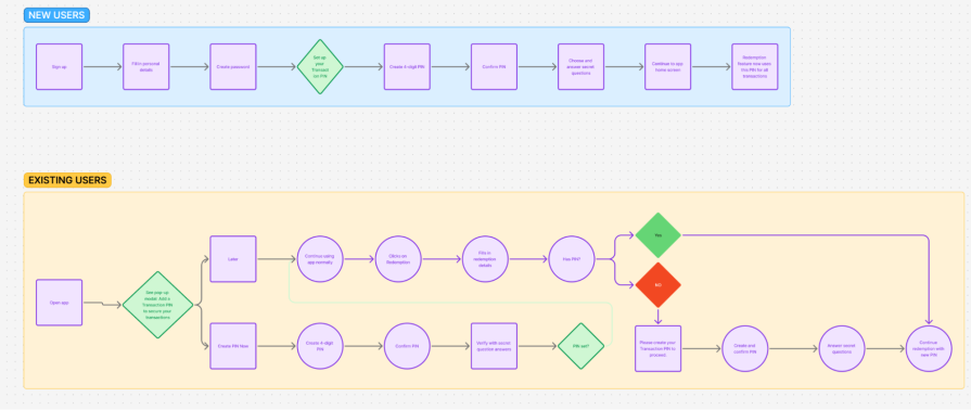
Once I had the green light, I mapped out the new flow in FigJam, making sure it handled both new and existing users smoothly, with no surprises:
New users
Existing users
Once everyone agreed the flow covered all angles, I designed the actual screens, wrote a clear copy for every step, and handed it over to engineering to build. And just like that, our OTP headache turned into a safer, smoother experience for everyone.

The best part of this fix? We didn’t have to guess if it worked, we could see it, week by week.
Because we already had clean funnels and dashboards set up, I could pinpoint exactly where users were dropping off before: stuck at OTP verification. Once the new PIN flow went live, I kept tracking those same steps every Monday.
The numbers told a clear story: redemption success climbed from hovering around 60 percent to a steady 95 percent. No sudden spike that dropped off later, it held. That single change meant thousands more people could actually get their money out, frustration-free.
The data didn’t just help me measure the win, it made it undeniable. Instead of vague “we think it’s better,” I had hard proof to show stakeholders exactly how a UX tweak directly protected revenue and boosted trust. We used session replay tools to spot real user struggles, replay dropped attempts, and match tiny behavioral details to the big funnel numbers.
It wasn’t just the numbers on the dashboard either. The CX team saw redemption-related calls drop sharply, freeing them up to handle real user needs instead of fielding endless OTP complaints. And for me, it cemented one big lesson: good UX analytics doesn’t just prove your design works, it proves our work as UX designers matter.
Seeing the redemption success rate jump from 60 percent to 95 percent wasn’t just about the dashboard. It meant real people could get their money when they needed it, no failed OTPs, no frantic calls to support, no trust lost. For the business, it meant more completed transactions, more loyalty, and less wasted time for the CX team.
But getting there wasn’t a straight line. Balancing user needs with business goals is never as clean as a flowchart. Users wanted withdrawals to feel fast and simple, but they also wanted to know their money was safe.
Compliance wanted zero loopholes. Engineering wanted a fix that wouldn’t break other systems. Finding that sweet spot meant trade-offs, extra checks, and not everyone loving every part of it. And that’s real UX work, designing the thing and negotiating the edges.
The biggest lesson for me? Good design is only half the job. The other half is proving it works. Practicing product analytics made my design credible not just with nice screens, but measurable impact the business could see and trust.
Since then, I never ship without clear funnels, clean tracking, and a way to prove what’s working and what’s not. It has changed how I handle feedback, how I present to stakeholders, and how I collaborate with engineering, compliance, CX and support.
That’s what this project left me with: a reminder that UX doesn’t end at the design file, it lives in data, conversations, and the confidence to push for what users need, backed by proof that it delivers.
Looking back, this project flipped my idea of UX on its head. I didn’t just redesign a broken flow, I learned to fight for what users actually need, prove it with data, and bring the right people along for the ride.
It forced me out of my comfort zone, talking to engineers, compliance, IT, and customer support every week, not just when a screen needed changing. It made me see that good UX is just as much about what happens behind the scenes as what shows up in the interface.
Now, every feature I touch gets the same treatment: track the numbers, listen to real users,
design the fix, and show the impact, clearly, consistently, week by week.
If you are a UX designer who thinks analytics is someone else’s job, I hope my story changes your mind. Pair your design instinct with solid data, and you won’t just hope your work makes a difference, you’ll know it does.

LogRocket's Galileo AI watches sessions and understands user feedback for you, automating the most time-intensive parts of your job and giving you more time to focus on great design.
See how design choices, interactions, and issues affect your users — get a demo of LogRocket today.
Learn how context-aware mode prioritization and seamless transitions improve multimodal UX and reduce mode confusion.

Research is becoming more democratized, product cycles are accelerating, and AI is transforming synthesis and ResearchOps. Here are the three trends shaping UX research in 2026.
Voice support is not the same as multimodal UX. Here’s how to design systems with true mode continuity and context-aware interactions.

AI tools can generate beautiful UI concepts in minutes, but most teams struggle to integrate those outputs into real design systems. This guide explores why AI drifts toward generic patterns and how to build governed workflows that keep speed without sacrificing brand consistency.


