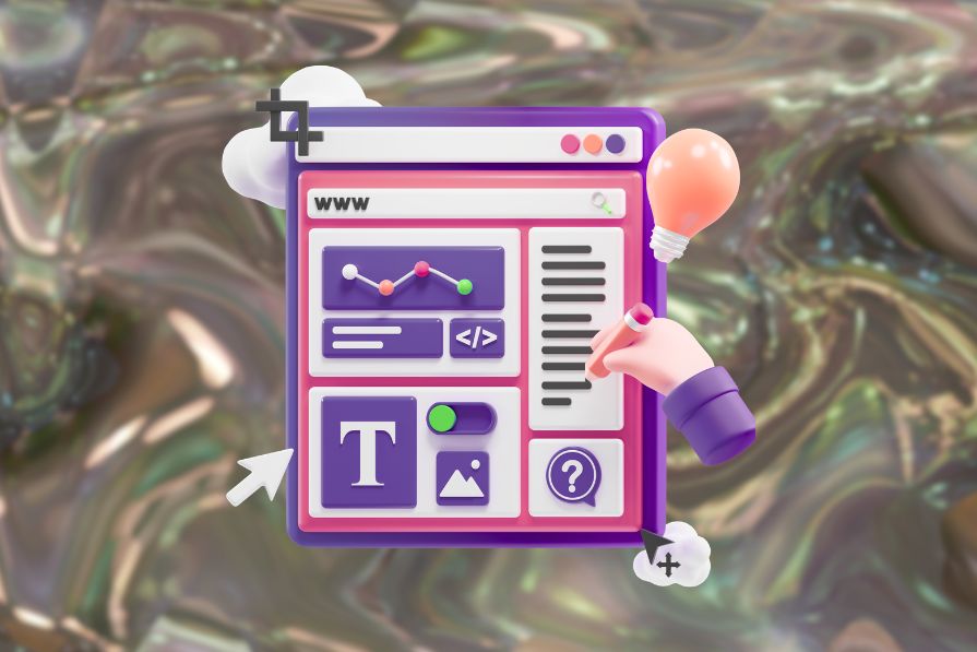
Finding information, an application, or a product through traditional menu navigation has never been fast. Users often face difficulty. They want to understand how information is organized before accessing it. Here’s a simple example. If a user is on a sports website looking for running shoes from a specific brand, where do they start? Do they filter by shoe type or brand? The structure isn’t always clear, and that slows people down.
It’s the same on a mobile device or a desktop computer. When searching for an app, you often need to swipe through multiple screens and scan numerous icons until you find what you need. It’s not always fast and efficient.
Navigation menus have been the default for years. They provide a simple, structured way to organize large amounts of information. Whether it’s a first-time user exploring the app or a returning user, the menu structure helps them find information more easily.
But they’re not always the most effective solution. People expect faster, smarter ways to find what they’re looking for, whether it’s a product, a piece of information, or an app.
In this article, I’ll explore several alternatives to the traditional navigation menus and also how the future of search might look. These ideas offer real, practical ways to help users get to what they need more quickly and easily. Whether you’re designing for the web, desktop, or mobile, these patterns can help you create better experiences. Let’s start.
Menus often have too many options, especially on large marketplaces or e-commerce websites. Users must stop, read, and think before clicking. What should be a quick decision turns into confusion. As an example, we can look at the Amazon menu. Even though this large e-commerce website is structured and organized, users often have to go back and forth in the menu to find the exact category of the item they want:
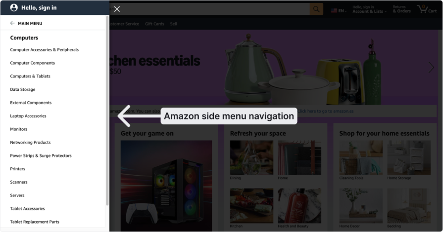
They need to read each category, think, make a choice, click, and if they do not land in the right category, they must repeat the process. With so many options, users often spend a long time navigating before they find the correct category.
Let’s say you’re on a cooking website and want to buy a new plate set. If the categories are just “Bowls” or “Dinner plates,” it’s difficult to know where to click. Do you browse by item type, by use case, or by brand? When the structure doesn’t reflect how people think, they get stuck.
Sometimes, the menu goes too deep. The user’s thing might be down four levels. And if they choose the wrong option at the start, they still have to click through everything before realizing they’re in the wrong place. That’s frustrating. Especially when they have to return and try again. It shouldn’t be this hard to find something simple.
Microcopy can be a label or a short piece of text, like the words on a button that tell the user what will happen after they click it. Even though it looks small, it can have a big impact on the user and where they decide to click.
Users might call something one thing, but the designers who built the interface might call it something else.
For example, think about a video platform like Netflix or HBO. If a user watches a series and wants to watch it again, they usually look for a label like “Watch Again,” “Last Viewed,” or “History.” When they click on it, they expect to find the shows they watched before.
But sometimes UX writers might try to sound more “sophisticated,” and they use labels like “Activity,” “Archives,” or “My List.” This makes the user stop and think about where to click before they can find their viewing history. It creates confusion and does not help the user find what they are looking for easily.
Another point is that the terminology needs to be consistent in the app. So, if in one place you write “History” to describe the viewing history, it is better to use “History” everywhere else in the app that leads the user to the same page. This lowers the user’s cognitive load and makes navigation easier.
Some products have more than one menu. For example, on a video conference call, you might have one menu for managing your account settings and another for changing specific settings during the call.
For example, you might change the microphone while you are on a call and choose your laptop’s mic. This can be confusing because you might think the change applies to all future calls. However, it only changes the microphone for the current call. To make it the default for all calls, you need to go to the main settings menu and change it there.
This point needs to be clear to the user. Some apps solve this by showing a short message like:
“This change will only apply to this call. To set a default for all calls, go to the main settings menu.”
When the search bar doesn’t work well, things are harder. A user might search for a product, but if the search only looks for exact keywords or is sensitive to upper and lower case, it won’t show any results even if the product is right there in the store.
When the user is deep in a category, they sometimes forget where they are. That’s why breadcrumbs help. But not every website includes them. Without showing the user where they are or the full picture, it’s easy to feel lost in the navigation process.
This might look like a technical detail, but it’s not. It’s pure UX. If the menu doesn’t work well with keyboard navigation, it creates real barriers, especially for people who rely on the keyboard instead of a mouse. It may seem like a small thing, but it has a big impact.
First, people with accessibility needs notice issues quickly, especially when keyboard navigation is not working as expected. Some common problems include:
These issues create confusion and make the app hard to follow and frustrating to use. That’s why applying the WCAG guidelines and best practices is essential. It helps ensure that users can navigate the app smoothly and easily using only the keyboard.
Second, keyboard shortcuts also help power users work faster. If you add shortcuts to the app you design, it improves the user experience. For example, you can create a shortcut to open a menu or even a specific one to skip the menu and go straight to a feature. On Mac, for instance, you can start screen recording by pressing Shift+Cmd+5. Instead of opening the QuickTime app menu, this shortcut lets you do it instantly.
One of the easiest ways to help users find information is by adding a global search option. This can be part of your website or built into your app. Users can type in what they are looking for, and the search bar will show the results.
You probably already know this, but you can take it a step further and make the search even more useful:
In the past, search was based on exact keywords. Now, with AI, users can search naturally. For example, instead of typing something like “baking tray,” they can write, “I want to make a birthday cake for my daughter, help me find the best tray.”
AI can understand what the user means, even if they do not know the exact name of the item.
If you want to do a quick test, try writing this prompt in ChatGPT or Gemini:
“I want to make a birthday cake for my daughter. Help me find the right tray. The birthday party will be at home with 10 people, and the tray must be big enough to make portions for all 10. You must read reviews and check product information before recommending it to me. You must also show proof that the tray is large enough to make portions for 10 people. You must show me a link to buy the products.”
Then you will see how ChatGPT starts to search based on both internet data and its own knowledge to give you the best results. You can also add other details to your prompt, like the price or whether you want a round or rectangular tray.
You can make the results more personal based on the user’s preferences. For example, if you design an app to search for restaurants and you know the user’s tastes from past searches, the places they viewed, and the reviews they wrote, you can show results that are more likely to match what they are looking for.
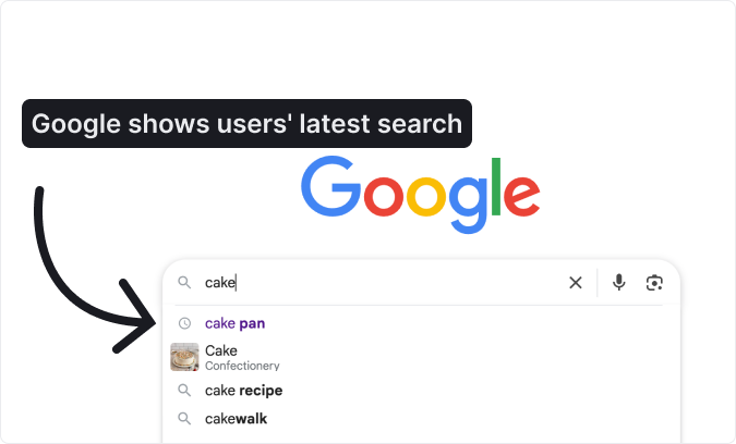
Another option is to show a list of past searches. Just like on YouTube or Google, users don’t need to type again. Some of their previous searches appear when they click on the search bar:
Designers can make search faster by adding a keyboard shortcut. For example, pressing a key combination can instantly open the search bar, similar to Spotlight on macOS, where CMD+SPACE brings up search for apps, files, and more. This saves time by skipping extra steps like opening the Launchpad and swiping around. iPhones use a similar approach, letting users swipe down to reveal search immediately.
Instead of making users search or dig through menus for apps they use every day, give them the option to auto-launch those apps when the computer starts. This way, their go-to tools are ready the moment they log in:
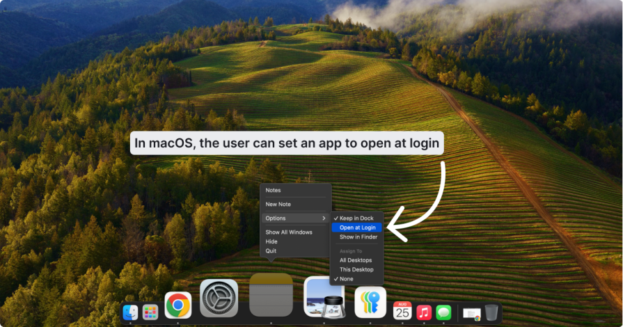
It may seem like a small detail, but for people who rely on specific software daily, it saves time and mental energy. With their main tools already open, they can focus immediately instead of spending effort on setup.
You can also design systems that recognize which apps users open most often. From there, the product can suggest auto-launch or even enable it by default, while still allowing users to turn it off. The goal is simple: reduce effort, save time, and cut down on repetitive clicks.
The idea is simple: why search if software already knows what you are looking for?
With machine learning and advanced algorithms, apps like Netflix and Spotify predict user preferences without asking. Netflix studies viewing history. Spotify tracks listening habits. Combined with many other signals, these patterns allow them to anticipate what you want next:
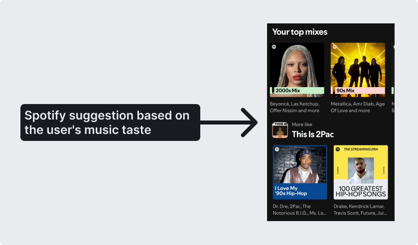
These systems even adapt to habits. They can tell what type of music you prefer in the morning versus the evening, or which shows you usually watch at certain times. When you open the app, it already suggests what you are most likely to enjoy. The result feels effortless, almost like someone who knows you well, anticipating your needs.
Companies such as Netflix, Spotify, and TikTok use these techniques to shape the user experience. Netflix recommends shows and films that match your taste. Spotify offers personalized playlists. TikTok fills your feed with videos that keep you engaged.
But there are risks. Personalization can trap users in a bubble, limiting exploration of new music, products, or ideas. It can also foster blind trust. If a platform recommends something, people may assume it is the best choice without questioning its quality or relevance.
Pricing strategies add another layer of concern. Algorithms are not always designed to serve user needs alone. They also aim to maximize company profits. If the system detects that you are willing to pay more, it may show higher-priced options or target you at times of day when you are more likely to purchase.
Algorithmic personalization clearly improves convenience, but designers must also weigh its hidden risks.
For many years, Google was the place to search and find links to information. Before Google, we relied on portals: long lists of links where users had to scroll to find what they needed. If you grew up in the 90s, you probably remember. A typical portal had a “News” section with a stack of links below it.
Google changed everything. Suddenly, we could just type what we wanted, and it would find the best sources. But that was years ago, and search has shifted again. Today, a simple list of links feels outdated.
AI is driving this change. After the rise of tools like ChatGPT and Claude, users no longer want links alone. They expect real answers to their questions. Google sees this, which is why many searches now show an AI Overview at the top of the results page.
This shift has huge implications for design and SEO. It is no longer just about ranking at the top of the results list. The priority is to appear in the AI Overview. That means structuring and presenting content so AI can easily understand and reuse it. This new approach even has a name: AEO, or Answer Engine Optimization. Take recipes as an example:
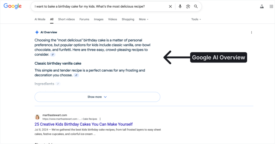
If you search for “birthday cake recipe,” Google still shows links, but now it also displays a clear summary or even a full recipe at the top. Users can also write natural, detailed questions like “I want to bake a birthday cake for my kids. What’s the most delicious recipe?” Google then serves up a direct answer that feels personalized.
This is more than just an SEO tweak. It marks a fundamental change in how we use search, the internet, and even computers. Users will not want to sift through inaccurate results. They will expect precise, immediate answers.
Chatbots make it easier for users to find what they need on websites and apps. They are quickly becoming a go-to tool for guiding users to the right information or product. Take shopping for an above-ground pool. Instead of clicking through menus or typing in the search bar, a user can simply chat with the bot. A basic request, like asking for a specific brand or model, can be handled instantly. Decathlon, for example, already uses an AI chatbot to assist customers as they shop:
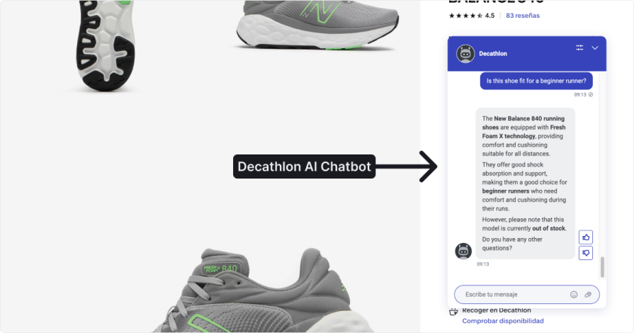
The real potential, though, shows when users are not sure what to buy. In that case, the chatbot can act like a sales assistant. A shopper might say they want an above-ground pool, and the bot can follow up with the right questions, such as how often they plan to use it, how many people will use it, and what type of surface they have at home, before suggesting the best options.
This feels more natural than clicking through menus or using a search bar. It creates a guided, conversational experience that mirrors real-world interactions. Chatbots can even evolve beyond text, adding avatars or video to make the exchange more immersive.
In other words, instead of navigating menus, you simply ask the software to do something—and it does it. For example, if you want to view the last invoice for a product you’ve used, you don’t need to search through the interface. You just ask, and the system understands your request and emails the invoice to you. This makes finding information feel more natural, like talking to a person. You explain what you need, and the AI interprets it, then completes the task.
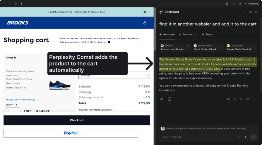
The same principle applies to e-commerce. If I want a pan for a birthday cake, I could ask the site to find it, add it to the cart, and eventually even handle payment.
The Perplexity Comet Browser already takes steps in this direction. It completes tasks like a person would, while visually showing how the interface updates as it searches. For instance, I can ask it to find a cake pan and see the result once it’s done. I can then ask it to add the item to the cart, and in the near future, payment might follow:
But here’s the design tension — how much freedom should we give the system, and how much control should we keep for the user?
In the invoice example, automation is low risk. The system retrieves a simple document with no major decisions involved. But if the AI chooses a product, selects a seller, and pays for it, the stakes are higher. The system might pick poorly, over-order, or purchase something overpriced. Current AI models still hallucinate, which makes mistakes more likely, especially when money is involved.
As designers, we need to decide where automation should stop and where human confirmation is essential. Today, that often means limiting AI to simple, low-risk automation and letting users make the final call on complex or high-stakes actions. Over time, as systems improve, that balance might shift.
Not long ago, searching for information was hard. As a kid, I flipped through physical encyclopedias, letter by letter. Then the internet arrived. At first, it meant clicking through endless menus on portal websites. But when Google appeared, everything changed. Type a query, and the answer is right there. Now we’re entering a new era. Navigation menus may no longer be central. Instead, we’ll simply ask, and computers will deliver exactly what we need.
In this article, we explored what that shift means for UX design. We started by looking at common navigation issues such as information overload, unclear labels, and high cognitive effort. Then we explored alternatives: search bars with shortcuts, apps that auto-launch when the system starts, and personalization tools that reduce user effort.
We also examined how AI is reshaping navigation. Think Netflix and Spotify-style recommendations that anticipate user intent, Google’s evolving results page with AI overviews, and chatbots that handle conversations instead of menus. The next frontier goes even further: software completing tasks for us, from retrieving invoices to purchasing products.
For designers, the takeaway is clear. Technology will keep changing, but our job remains the same. Understand users, reduce friction, and apply the right tools to create seamless, enjoyable experiences.

LogRocket's Galileo AI watches sessions and understands user feedback for you, automating the most time-intensive parts of your job and giving you more time to focus on great design.
See how design choices, interactions, and issues affect your users — get a demo of LogRocket today.
Multimodal UX goes beyond designing for screens. Learn how context-aware systems, progressive modality, failover modes, and accessibility-first design create better digital product experiences.

Learn how context-aware mode prioritization and seamless transitions improve multimodal UX and reduce mode confusion.

Research is becoming more democratized, product cycles are accelerating, and AI is transforming synthesis and ResearchOps. Here are the three trends shaping UX research in 2026.

Voice support is not the same as multimodal UX. Here’s how to design systems with true mode continuity and context-aware interactions.


