Cognitive overload is a UX designer’s nightmare. But at what point does the load become too much for users? That’s where Miller’s law comes in — it tells us that humans can only hold about 7 (plus or minus 2) items in their working memory.

Great user experience is rooted in psychology, and Miller’s law is one key principle. It was introduced in 1956 by George A. Miller, a pioneer of cognitive psychology. Miller found that when people are presented with a list of items, they can remember an average of seven things at a time.
But why should this “magical number seven” matter to you as a designer? How can you use this principle to enhance user experience? This article will answer these questions and explore real-life examples, like how Netflix and Dropbox simplify their interfaces using Miller’s law.
If you’re ready to see how less can mean more, let’s get started.
Miller’s law is a psychological principle that suggests that a person can only hold 7±2 items in their working memory at a time.
In his paper titled The Magical Number Seven, Plus or Minus Two, George A. Miller introduced two key concepts regarding cognitive limitations:
But here’s what I found most interesting about his findings. Miller noted that what counts as a unit of information can vary depending on the individual’s knowledge and context.
For example, to someone familiar with the word “bicycle,” it’s a single unit of information. However, to a non-English speaker who might see it as a collection of letters, it counts as several information units. Why? Because we tend to “chunk” information into the largest meaningful unit we recognize.
Stick with me on this concept of chunking for a moment, as it’s a proven way to minimize the cognitive load on users.
As we’ve discussed, an individual can make accurate judgments until they reach a certain threshold of information. To push this threshold, we use chunking.
Chunking basically involves grouping large amounts of information into smaller, manageable units to reduce cognitive load. With effective grouping, several units of information can become one, allowing us to fit more into our short-term memory without crossing the threshold.
Take how we recall phone numbers, for instance.
A nine-digit phone number like 053250455 is easier to remember if you split it into chunks of threes (O53) 250-455. These chunks of information are much more likely to stick to your memory than the original nine digits.
Let’s look at an example:
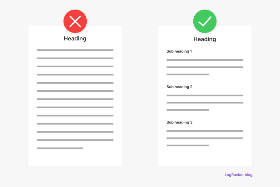
At a glance, you can deduce core information from the content on the right because of how it’s chunked. However, the one on the left forces you to muddle through a sea of content, which your brain will most likely perceive as multiple, overwhelming chunks of information.
Bottom line? Don’t be the designer on the left. Chunk information into manageable units. After all, the fewer units of information a user has to process, the less mental effort they’ll need to exert, allowing them to complete tasks more easily.
Having looked at chunking, a key application of Miller’s law in UX design, let’s explore some other ways you can apply this principle in UX design.
Progressive disclosure involves presenting only the most important information first and gradually revealing more details as needed. So, instead of showing all the content and overwhelming users, you present only what is essential at that point in their journey.
Here’s an example of progressive disclosure:
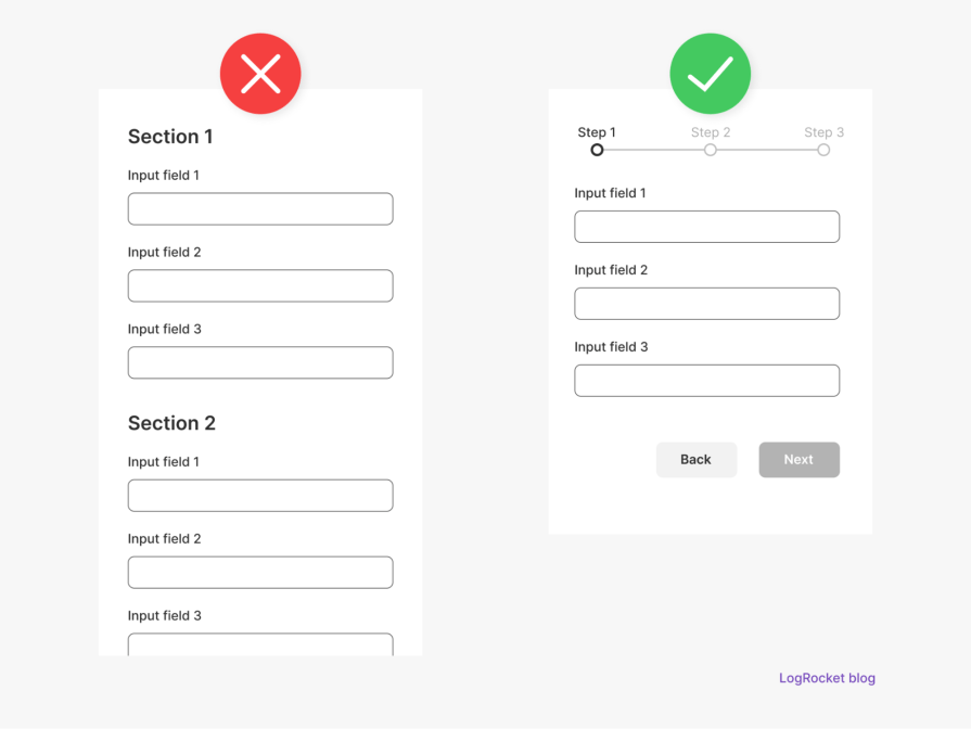
Merely looking at the form on the left, you know you’re in for a long session of entering details. The form on the right, however, conceals the actual length of the process by breaking it down into manageable steps. Bottom line? Only show what’s necessary at any given time to avoid overwhelming users.
Content prioritization means presenting information based on their order of importance. So, instead of displaying everything at once, you show the most important content first and save the less critical ones for later.
Here’s what it looks like:
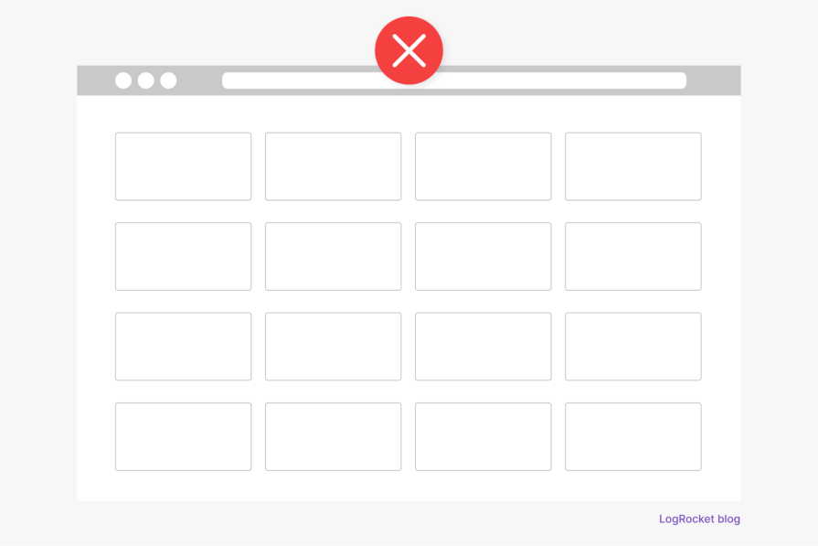
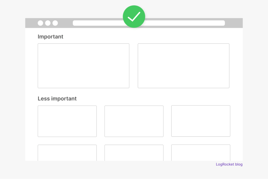
The first example could easily overwhelm users, as they’ll need significant mental effort to process the numerous options. The second example, on the other hand, minimizes the number of options, which also minimizes the cognitive load on the user.
Bottom line? Content prioritization is your friend.
This involves reducing the number of navigation items to make it easier for users to find what they need.
So, instead of displaying an endless list of links or menu items, you can group related items into broader categories. Say you have 12 navigation links, for example. Rather than placing them individually on the top navigation bar, you can group them into four main categories: “Home,” “Shop,” “About,” and “Contact.” That way, the user isn’t bombarded with too many options at once.
This means keeping form input fields and menu options to a minimum. So, instead of asking for all the user’s information upfront during signup, only request what’s necessary and leave the rest for later. Similarly, avoid offering too many menu options at once — use dropdown to reveal additional choices as needed.
That said, you shouldn’t get too caught up in limiting information. In my experience, there are times when minimizing input fields in a form can do more harm than good.
For instance, if a user’s phone number is necessary for account verification or communication, omitting it from the signup form to reduce input fields can create friction later. Once a user is already signed up, asking for such details might feel like an extra (and unimportant) step, making it less likely for them to want to provide it.
So, yes, less is more when designing forms, but try to find the right balance.
So far, I’ve shared five applications of Miller’s law in UX design. Whichever one you decide to use will depend on the context and amount of information being presented.
But of all these techniques, I’ve found progressive disclosure to be the most effective for driving user engagement.
Why?
Here’s the thing. No matter how much you try to limit the information you put in front of users, some cognitive load is inevitable. Users must exert some mental effort to navigate any interface. As a designer, part of your job is to predict the limit of cognitive load a user can comfortably handle at any given time and respect that limit. Progressive disclosure is a great way to do this.
Take Duolingo’s signup process, for example:

Even though the process is a bit lengthy, you barely notice it because it’s split into interactive steps that keep you engaged.
But Miller’s law goes way beyond minimizing cognitive load — it directly influences how users perceive and interact with your product.
Once a user visits a site or opens up an app, every content card, carousel, or block of text, they encounter is a possible information unit. The more units they’re exposed to, the greater the cognitive load. As the information keeps piling up, users can reach their mental threshold, leading to confusion and frustration. At that point, they’ll probably just give up and leave.
Miller’s law suggests that to keep users engaged, we need to stay within their cognitive limits. This is even more crucial now as the digital world is becoming a battlefield where users’ attention is the ultimate prize.
But of what use would my explanations be if I don’t show you some practical examples of what we’ve discussed? So, here you go:
Etsy, the online marketplace, clearly showcases Miller’s law by organizing content into digestible chunks. Each section on the homepage is presented with a limited number of items — mainly within the 7±2 range.

If you decide to delve deeper into any of the categories, you’ll notice that their products are presented in rows of no more than six items. This approach helps keep users’ cognitive load to a minimum.
Netflix, the video streaming giant, sure knows a thing or two about minimizing cognitive load by applying Miller’s law.

For starters, the homepage content is chunked into distinct categories to make scanning easy. Furthermore, each content category is limited to a maximum of six visible items at a time, which is well within the 7±2 range.
Even more interesting, this pattern of sixes shows up in the navbar, too, which has six main navigation links. Now, that’s how you use Miller’s law to avoid cognitive overload.
Dropbox is another platform that applies Miller’s law effectively. A quick look at the homepage and you’ll notice clever use of chunking:
Even the navbar keeps things within the 7±2 limit. With information being kept to a minimum like this, there’s no risk of cognitive overload.
Okay, we’ve looked at some platforms that use Miller’s law effectively. Let’s switch gears by analyzing one that doesn’t necessarily follow this principle.
E-commerce giant, Amazon, seems to prioritize functionality over limiting cognitive load. Upon visiting the website, you’re hit with countless product categories, recommendations, carousels, deals, and banners — each offering a different choice for the user. You’ll even find sub-categories within categories.

While this abundance of information makes it faster for users to view products, read reviews, and make a purchase, it also makes it hard for them to focus on one task or decision at a time.
Miller’s law is arguably more important now than ever for UX design. Think about it: users are bombarded by information from all corners of the digital world nowadays. What this means is that they’re constantly at risk of cognitive overload. The last thing you want to do is to add unnecessary cognitive load to their already overburdened digital experience.
That’s why you need to seriously consider the principles covered in this article. By simplifying your interface, chunking related information, and keeping cognitive load to a minimum, you can create products that users want to interact with.
If you’re new to UX design and want to start applying Miller’s law right away, here’s a quick checklist to get you started:
Having said all of this, it’s important to recognize that individual cognitive limits can vary. While the 7±2 range suggested by Miller’s law works as a general rule of thumb, individuals differ. Factors like prior knowledge, experience, and context can influence how much information a person can process and retain.
LogRocket's Galileo AI watches sessions and understands user feedback for you, automating the most time-intensive parts of your job and giving you more time to focus on great design.
See how design choices, interactions, and issues affect your users — get a demo of LogRocket today.

As products evolve into ecosystems, navigation becomes a system-level challenge. This article explores how to align structure, context, and user journeys to create seamless movement across tools without confusion.

Figma’s AI features have exploded in 2026 — from text generation and image editing to full UI drafts and code handoff. But speed isn’t the same as quality. This guide breaks down every major feature, what it’s good at, and where human judgment still does the heavy lifting.

Zero UI works well for screenless, voice-first experiences, but most digital products still require visual interaction. Here’s why multimodal UX offers a more scalable foundation for the future of design.

Multimodal UX goes beyond designing for screens. Learn how context-aware systems, progressive modality, failover modes, and accessibility-first design create better digital product experiences.