Poorly designed support flows frustrate users, but smart, intentional redesigns can turn a help center into an intuitive, self-service space that feels like a natural extension of the product. This improves the customer experience while reducing live support needs and helping internal teams spot common problems and solutions.
Help centers are no longer afterthoughts; they’re now core to digital product experiences and key drivers of user satisfaction, retention, and brand trust. Users expect support to be seamless, consistent, and personalized across every channel. If you visit any major company’s support page, you’ll notice familiar patterns that make them visually pleasing and easy to use. But these polished experiences took time and iteration to get right.
Let’s go through five real-world case studies that show how digital products transformed messy, outdated support systems over the years. We’ll see how these redesigns establish best practices for today’s sleek, modern support pages that serve both users and the business. At the end, I’ll summarize these insights and map them to action items you can take and an audit checklist to follow while designing your own help center UX.
Dropbox’s support UX used to be inconsistent and confusing. Help flows didn’t match the product style, forms were overly complex, and users were unaware of what support was available to them (e.g., whether live chat existed on their plan).
Dropbox tackled the problem by running a heuristic evaluation and auditing best-in-class SaaS support flows, leading to several key improvements:
These changes resulted in cleaner, more intuitive support navigation, faster issue categorization, and a tone and flow that felt fully aligned with the core Dropbox UI.
The MVP prototype quickly proved the value of the redesign, with users engaging meaningfully with the new support cards. The interface didn’t just look better; users could easily find and act on the help they needed without friction, reducing the need for live support while still delivering an experience that matched user expectations for a modern, digital-first help center:
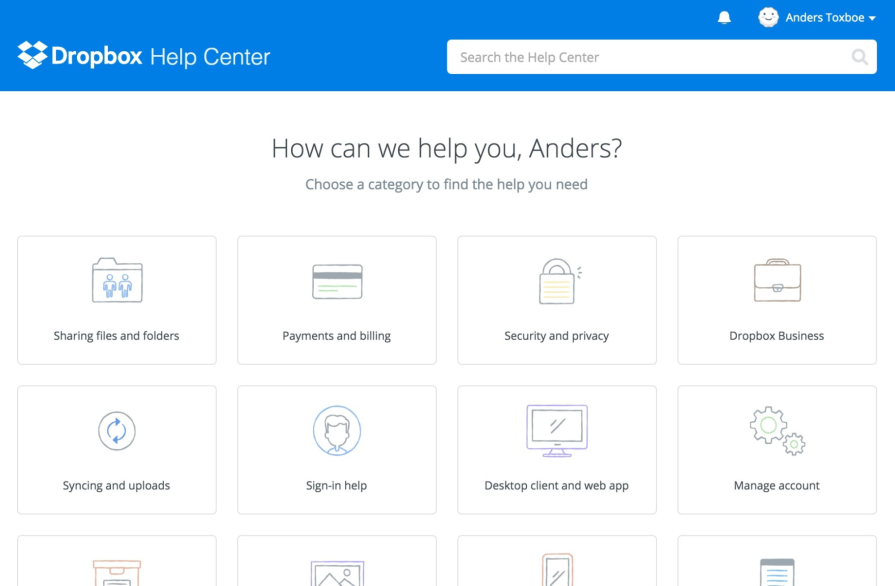
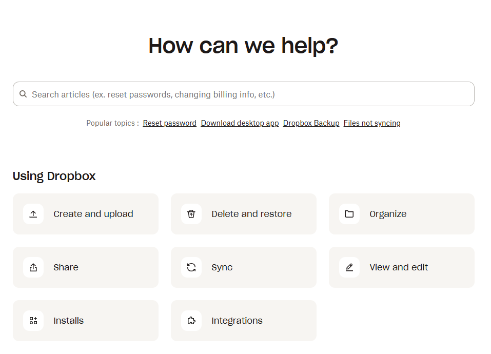
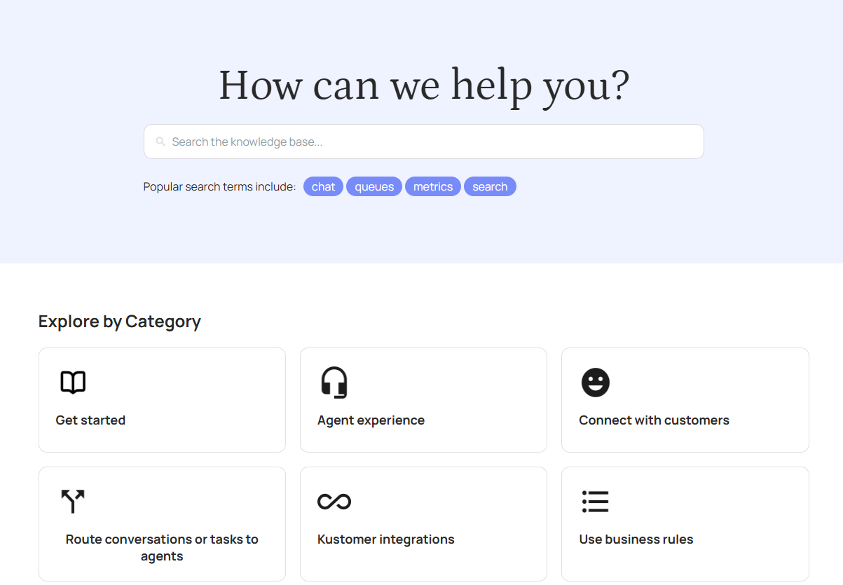
After this major UI rehaul, Dropbox has maintained the major elements of this polished, modern design through subsequent minor adjustments. Here’s how today’s Dropbox help center looks, with the search bar now under the welcoming “How can we help?” statement and more minimalist icons to reduce visual clutter:
Litmus, an email marketing platform, had its support resources spread across separate tools: Intercom for messaging and WordPress for the help center. Despite a solid product, support workflows were fragmented.
Litmus tackled its fragmented support experience by bringing all customer communication channels under one roof:
The overhaul transformed Litmus’s help center into a smooth, cohesive experience where users could get answers quickly without the constant back-and-forth between platforms. By making self-service tools more visible and effortless to use, the new system encouraged customers to resolve issues on their own while still having easy access to human help when needed.
The impact was clear: customers who interacted with support in their first three months were 26 percent more likely to stick around, showing that a streamlined support journey can directly boost retention and overall customer loyalty.
Back before Reply.Ai was acquired by Kustomer, their web-based help center was inefficient and frustrating, burdening users and customer service teams with redundant searches and low self-service efficacy. Their UX team approached the help center design overhaul with a research-first mindset:
Multiple validation rounds showed a clear lift in user satisfaction, as the redesigned help center aligned more closely with real user needs. The result was an elegant, functional tool that reduced frustration, eased the support burden, and turned the help center into a genuinely helpful resource rather than a point of friction.
Reply.Ai carried these best practices through the larger rebranding effort after the acquisition by Kustomer. Here’s how their help center looks today:
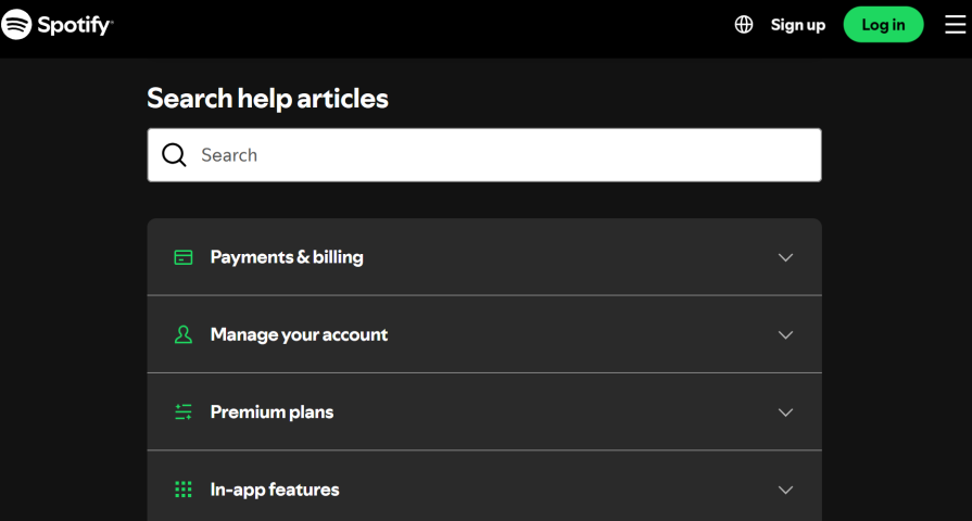
Spotify’s old help center was designed so that users could contact Spotify via multiple channels (chat, email, Twitter). Though this may initially seem helpful, allowing users to choose how to interact with a support agent, the reality was that the support experience became fragmented and frustrating for users and support agents alike.
To counter this, Spotify:
With a unified support system, Spotify could more effectively analyze qualitative data, identify pain points in customer complaints, and find the right way to solve them. This UX improvement took their help center to the next level and enabled agents to provide faster, more context-aware support, fostering stronger emotional connections through personalized human responses.
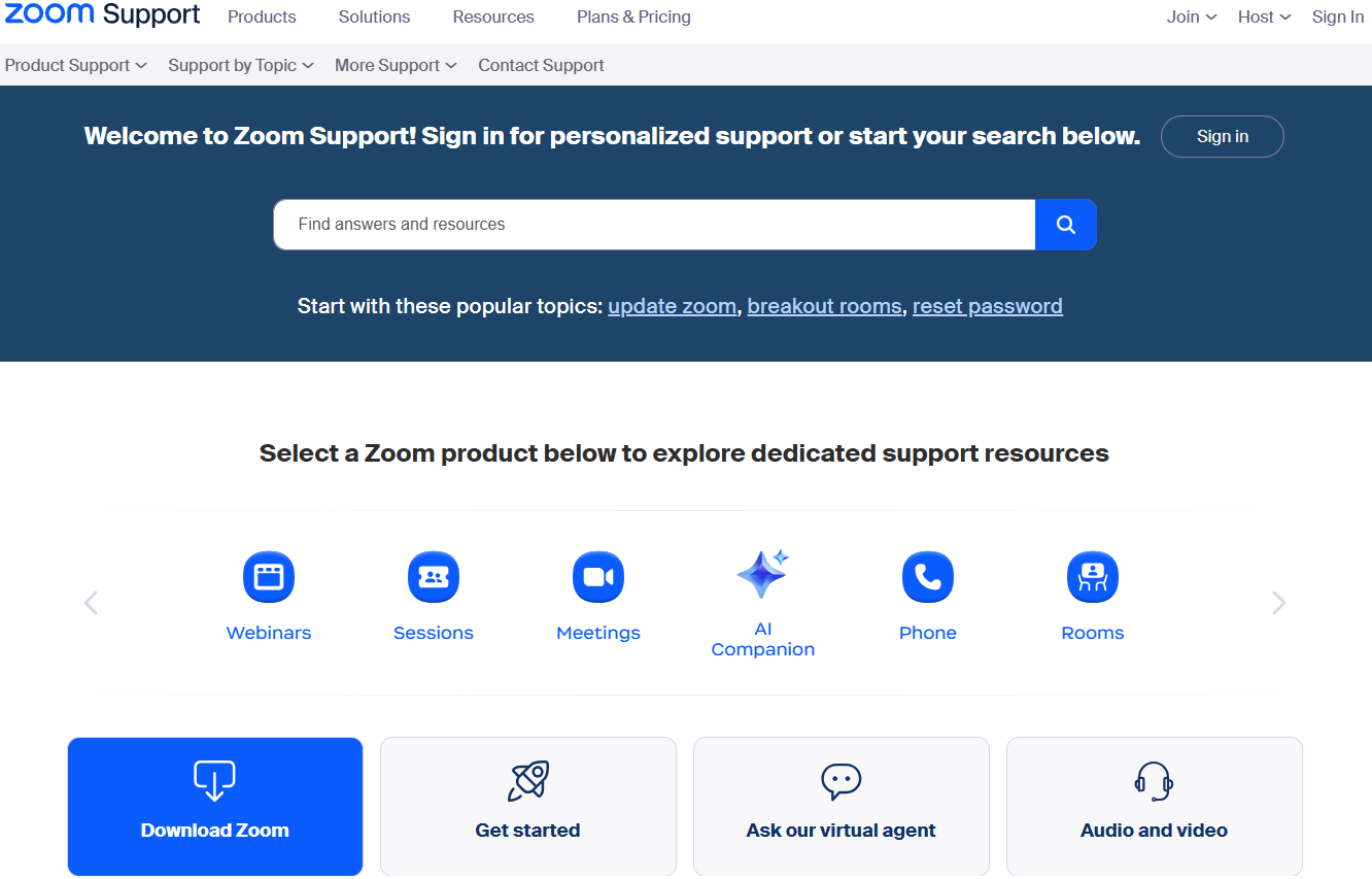
Zoom’s user base grew rapidly worldwide, which meant its support center had to handle a massive increase in questions across web, mobile, and even voice. At first, Zoom relied heavily on human support through live chat and tickets, but this approach created bottlenecks for both users and agents. Simple questions clogged the system, while customers with complex or urgent issues were left waiting.
To counter this, Zoom:
With this modernized help center, Zoom enabled users to resolve the majority of issues on their own with the AI agent, while also giving their human agents more time to focus on high-value cases. Zoom reports that its AI assistant and self-service-oriented help center resolve up to 97 percent of inquiries via self-service, boosting CSAT by 28 percent.
The four case studies we discussed above reveal clear patterns in what makes modern help centers effective. To sum it up, let’s map these patterns and insights to some best practices and action items you can take:
| Pattern/insight | Best practices/action items |
|---|---|
| 1. Information architecture & navigation — Clear categorization reduces friction |
|
| 2. Search & findability — Self-service works only if the search feature is effective |
|
| 3. Content quality & tone — Human-centered content lowers escalations |
|
| 4. Escalation & live support rules — Reserve live support for complex/urgent cases |
|
| 5. Omnichannel & integration — Unified systems reduce user frustration |
|
| 6. Measurement & iteration — Success comes from testing + data |
|
| 7. AI-powered self-service (if possible) — Augment human support with intelligent assistance |
|
Pair the map above with the following audit checklist to ensure that your help center UX aligns with these patterns and best practices:
1. Information architecture & navigation
Can users identify their issue in ≤2 clicks?
Are categories labeled in plain language?
Is navigation consistent with product UI?
2. Search & findability
Do top results answer without scrolling?
Are search analytics tracked?
Does search support auto-suggest?
(If applicable) Does search leverage semantic/AI-powered matching for intent-based results?
3. Content quality & tone
Are help center articles scannable?
Do they include images/videos that walk users through each step?
Is the tone friendly/reassuring?
(If applicable) Are articles optimized for both human reading and AI retrieval (structured headings, metadata, FAQ-style)?
4. Escalation & live support rules
Are escalation rules clear?
Is context carried forward?
Is live support visibly available when needed?
(If applicable) Are AI-to-human handoff rules defined so that escalation happens smoothly without users repeating themselves?
5. Omnichannel & integration
Do agents see full customer history?
Is one knowledge base powering all channels?
Can users switch channels without losing context?
(If applicable) Is the AI assistant/virtual agent integrated across all channels (not just web)?
6. Measurement & iteration
Are self-service vs. escalation rates measured?
Is there a process for content gap analysis?
Are quarterly usability reviews in place?
(If applicable) Are AI performance metrics tracked (Self-Service Resolution %, escalation accuracy, CSAT impact)?
Together, these resources can serve as a help center UX audit framework. Teams can score themselves in each area to spot quick wins and prioritize redesign efforts.
While the patterns and best practices above offer strong starting points, there are important exceptions to keep in mind:
At one point in my career, I learned about the Dropbox case study and decided to use some key lessons from it to increase profit in one of my projects. Building on the lessons from Dropbox’s redesign, I led an initiative to optimize live chat triggers on our platform:
Over time, these adjustments reduced live support load by roughly 50 percent, improved SEO by minimizing intrusive pop-ups, and even increased overall revenue, as interactions were both more targeted and higher in quality.
This hands-on experience reinforced the principle that careful UX design and thoughtful automation can simultaneously enhance the user experience, reduce friction, and deliver measurable business impact.
The evolution of help center UX is no longer about building a “support page” — it’s about creating an experience that feels as intentional, polished, and user-centric as the product itself. Well-executed redesigns can do far more than solve user problems; they can strengthen brand trust, drive retention, reduce operational costs, and even increase revenue.
As we can see from these case studies, the brands that treat help centers as a living, evolving part of their UX strategy will not only resolve more issues but will turn every support interaction into an opportunity.

LogRocket's Galileo AI watches sessions and understands user feedback for you, automating the most time-intensive parts of your job and giving you more time to focus on great design.
See how design choices, interactions, and issues affect your users — get a demo of LogRocket today.

Research is becoming more democratized, product cycles are accelerating, and AI is transforming synthesis and ResearchOps. Here are the three trends shaping UX research in 2026.

AI tools can generate beautiful UI concepts in minutes, but most teams struggle to integrate those outputs into real design systems. This guide explores why AI drifts toward generic patterns and how to build governed workflows that keep speed without sacrificing brand consistency.

Adaptive interfaces personalize experiences using behavioral signals and machine learning. But when personalization becomes autonomous, systems can reinforce patterns, limit discovery, and shape user behavior in ways designers didn’t intend.

Security requirements shouldn’t come at the cost of usability. This guide outlines 10 practical heuristics to design 2FA flows that protect users while minimizing friction, confusion, and recovery failures.


