Editor’s note: This blog was rewritten on 28 February 2025 by Allie Paschal to provide three real-world examples of great login screens, expand on best practices, and cover FAQs.
Oftentimes, login screens feel like an afterthought in UX design — they’re typically not a key part of the user experience and fill more of a functional requirement. However, the login process is a critical touchpoint in your user’s journey as it serves as the place where they enter the product.
Although you might not notice login screens with good design (since you experience no friction), I bet you remember the ones with a poor design. If a user doesn’t feel like their account is well-secured or can’t remember their password, they might get frustrated and abandon the login process altogether. And if less and less users are logging in the website or app, you may not have the website or app much longer.
Users create their first impression with a product through the login process. This first interaction should guide the user to access their account or create a new one. It should also visually reflect the brand’s identity and be simple and intuitive, but also give helpful instructions when needed.
There’s so much more to designing for login screens than you might initially think. But whether you’re designing a new login screen from scratch or refining your current design, these examples and tips will help optimize your designs for an engaging and positive login process.
To understand what makes a good login screen, pay attention to what these successful products do.
Adobe Creative Cloud holds the collection of Adobe apps, including Photoshop, Illustrator, and InDesign. It has both a website and desktop app login:
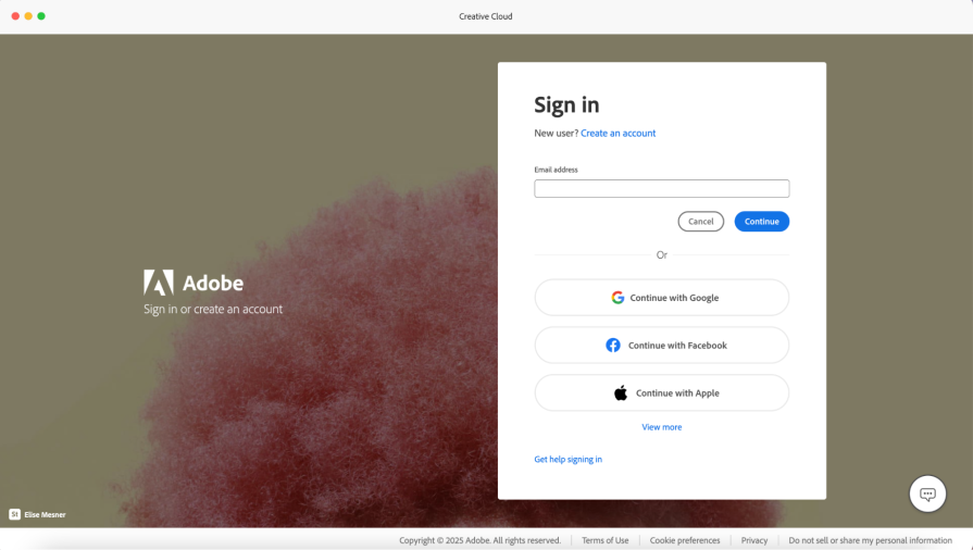
Adobe Creative Cloud’s login page is minimal, yet includes Adobe’s brand identity of creativity and innovation. The sign-in form has a total of eight buttons and one text field, grouped in a way for a user to quickly understand they have multiple login options to choose from.
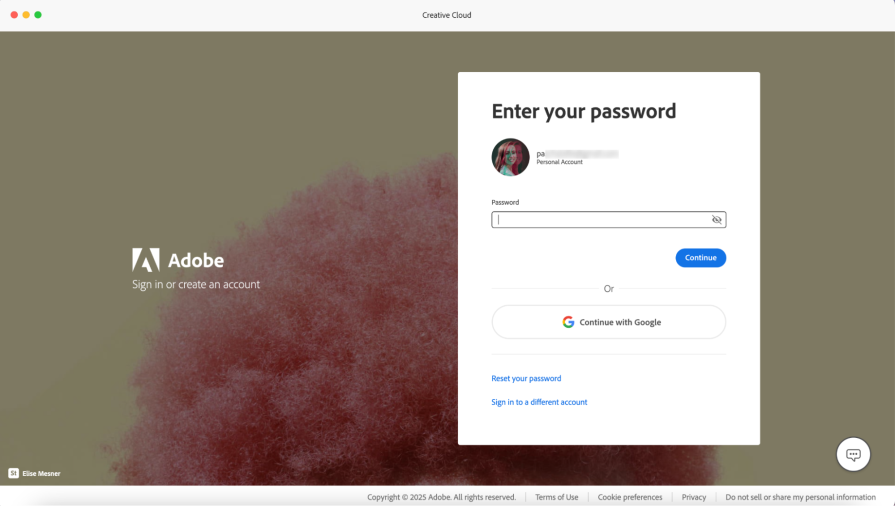
If I enter my email in the text field, then select “Continue,” I’m taken to the next screen to enter my password or to continue with Google. Here, Adobe still gives you multiple options to proceed with logging in — whether it be through the standard password, social media, or getting help:
What does Adobe’s login screen do well?
SoFi is a personal financial company that offers services like investments, personal loans, and savings accounts. Since it’s a banking service with people’s hard-earned money on the line, the login process must be easy to use, but also have added layers of security. Similar to Adobe, SoFi has login processes for both the desktop website and native mobile application:
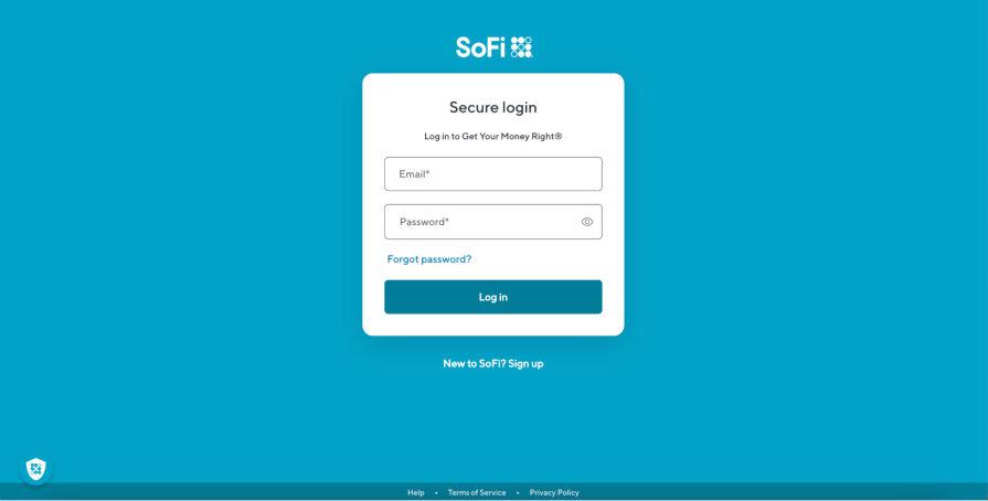
SoFi’s login screen is a simple, straightforward, and accommodates multiple types of users, such as existing users, first-time users, or users who forgot their password. The login form is on an all-white card with two text fields and three buttons. Other than the SoFi logo and the website’s footer, the login form is the only other element on the screen.
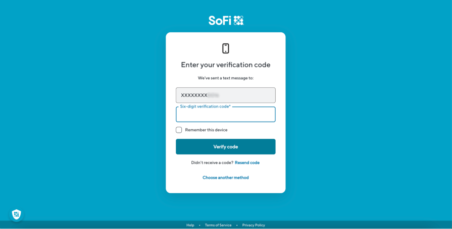
When you select the “Log in” button after inputting your login credentials with your email and password, you’re presented with a two-factor authentication screen where you must input a code your mobile phone received via SMS. This gives you a sense of security that your accounts are safe, but you can also select the “Remember this device” checkbox on the two-factor page if you don’t want to authenticate each time you access your account on a certain device.
What does SoFi’s login screen do well?
Spotify is a music streaming service that provides access to millions of songs, artists, and podcasts. Spotify’s user interface and branding has received a lot of praise, but have you observed if their login screens follow suit?
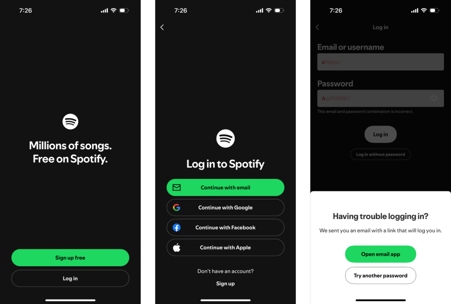
Since these login screens are for a mobile device, Spotify takes a step-by-step approach compared to Adobe and SoFi. The first screen only has two buttons that display “Sign up free” or “Log in.” After pressing “Log in,” you’re given four methods to log in as well as the choice to “Sign up.” After pressing “Continue with email,” you’re taken to a new page to enter your email and password.
If you fail to login with the correct password, Spotify proactively displays a bottom sheet letting you know they sent help to your email.
What do Spotify’s login screens do well?
Now that you’ve explored examples of effective login designs, keep the following UX principles in mind to build a good login screen:
This section walks you through the most frequently asked questions about login screens.
Even though the examples of login screens looked different, they have multiple similarities that make each of them effective.
These include:
Creating a “good” login screen from scratch is challenging – Figma offers login page templates for desktop and mobile screens to give you a jump-start.
Providing an easy way to log in with strong security is a delicate balance — the goal is to minimize the user’s effort while making the authentication robust so people can’t access an account that’s not theirs.
Methods to balance login friction and security include:
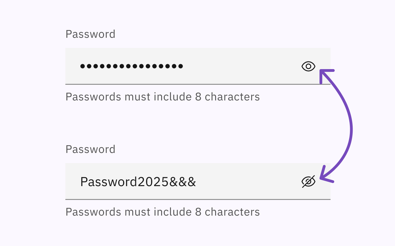
Yes, include a toggle to show and hide the password because it allows users to confirm their password before submission and improves accessibility for users who rely on screen readers (screen readers may ignore masked characters).
Best practices for including a password toggle include:
Preventing errors and providing beneficial feedback when errors occur are critical aspects to consider when designing a login screen. Error prevention proactively reduces common barriers to entry like wrong user ID or password.
Best practices to consider for error handling and prevention include:
Accessibility is becoming a greater need for digital products. If a user can’t login due to poor accessibility, they’re excluded from the entire product.
Some considerations from including accessibility for login screens include:
To learn more about making your login process compliant with the Web Content Accessibility Guidelines (WCAG), check out this video from GOV.UK on accessible authentication.
I get it – login screens feel like a mundane requirement the UX designs must include. The login process isn’t one of the key user flows you worked tirelessly on, and some users don’t really notice it. But it’s a more significant touchpoint than it seems; it’s the first step of the user’s journey and where they create their first impression of a product.
Creating a successful login screen is challenging. It involves balancing the company’s brand with simplicity, as well as usability with security. Not only that, you must account for the different types of users who may be accessing the login, such as new and existing users.
As a designer, you can generate this balance and user accommodation by using UX principles such as consistency, clarity, and accessibility. With these principles, you’ll design login screens that match your users’ mental model, improve usability, and include many user groups – all so the users can access and begin using your product.

LogRocket's Galileo AI watches sessions and understands user feedback for you, automating the most time-intensive parts of your job and giving you more time to focus on great design.
See how design choices, interactions, and issues affect your users — get a demo of LogRocket today.
Skeuomorphism helped define early digital interfaces by mimicking real-world objects to make technology more intuitive. Learn how it compares with flat design and neumorphism, why it declined, and where it still has a place in modern UX.
AI has made polished, confident content easy to generate, but that does not make it trustworthy. This article explains how UX teams can design stronger quality signals using source transparency, validation, confidence communication, and reputation.
Inclusive design is evolving beyond accessibility alone. This guide explains how UX designers can create more inclusive products through usability, accessibility, neurodiverse UX, adaptive personalization, multimodal design, and culturally aware product experiences.
I was working with an intern on a UX research project, and before we even started, we both had private […]

 Learn more →
