Editor’s note: This blog was updated 21 February 2025 by Chidera Nwankwagu to explain common critiques, offer additional examples, and cover alternatives to carousels.

When it comes to UX design, carousels have become ubiquitous. Carousels allow you to display many pieces of content in a single, organized section. They also have the added benefit that you can develop them relatively easily.
You tend to see carousels used to highlight specific content, such as products, promotions, and images in slides that you can interact with.
However, research by Baymard Institute shows that the use of carousels has decreased year-after-year between top U.S. and European ecommerce sites. There’s also literally a website called “Should I Use A Carousel” that discourages using them.
And do you know the reasons behind that?
This article discusses the main reasons why the design community is discouraging the use of carousels and whether you can still use them safely.
Carousels may seem like an elegant way to showcase content, but in practice, they often do more harm than good. Research and usability testing have repeatedly shown that carousels fail to engage users, create accessibility issues, and even slow down websites.
Carousels also fall short for the following reasons:
Studies have shown that most visitors don’t really interact with carousels, and only the first slide receives much attention. Also, people tend to skim rather than read, so expecting users to wait for content to cycle through is unrealistic. If an important message is hidden in the carousel, it’s the same as the message not existing.
Users have developed banner blindness or the tendency to ignore anything that looks like an ad or large promotional banner. Since many carousels look like advertisements, people often scroll right past them without even noticing the content. This makes carousels ineffective as a major medium to pass very important messages.
Carousels that autoplay take control away from the user, creating a frustrating experience. Imagine walking a dog without a leash — it may be friendly, but without a way to guide it, you lose control. In this analogy, the leash represents navigation controls, and autoplay is the unpredictable movement of the dog.
When carousels move on their own without user input, they can be distracting, especially when users are trying to read or navigate a page. Websites shouldn’t function like automated slideshows; users should have full control over how they consume content.
Carousels often feature large images that load via JavaScript after the initial page load. This practice delays the loading of these images, causing a slower LCP. Moreover, many carousels aren’t optimized for accessibility, making it difficult for users with disabilities to engage with the content. Slow load times combined with poor usability create a frustrating experience that increases bounce rates.
Despite these flaws, carousels still have their place in UX when used correctly.
Carousels work best when users are actively looking for something rather than when you’re trying to push information onto them. For example, in an ecommerce store, users browse for products, so they’re more likely to interact with a product carousel, swiping through options to find what they like.
Similarly, on platforms like Netflix, users know there’s a top 10 list, and since only a few items fit on the screen at once, they expect to scroll to see the rest. In these cases, carousels enhance user experience by allowing easy exploration.
However, when you’re the ones trying to communicate a message — like announcing a new feature or explaining an important concept — carousels aren’t the best fit. As mentioned earlier, most users only engage with the first slide of a carousel, ignoring the rest. This means that if key information is placed on later slides, many users will never see it.
So what am I trying to say here? Important content should never be hidden behind a carousel, and if a carousel is necessary, the most critical details should be repeated elsewhere on the page to ensure visibility.
Carousels should be used strategically. When used in the wrong context, such as for delivering important messages or CTAs, they can result in poor engagement and missed information. Since most users won’t interact with slides beyond the first one, relying on carousels for key content can hurt usability.
By using carousels where they make sense and ensuring that essential information is always accessible, you can create a better user experience that aligns with how people naturally browse content.
So, when should you use carousels in your design, how do you implement them effectively, and when is it better to avoid them? To understand all of this and make an informed decision, it’s important to first understand their UX composition and be aware of specific components that require attention.
Effective carousels need these components:
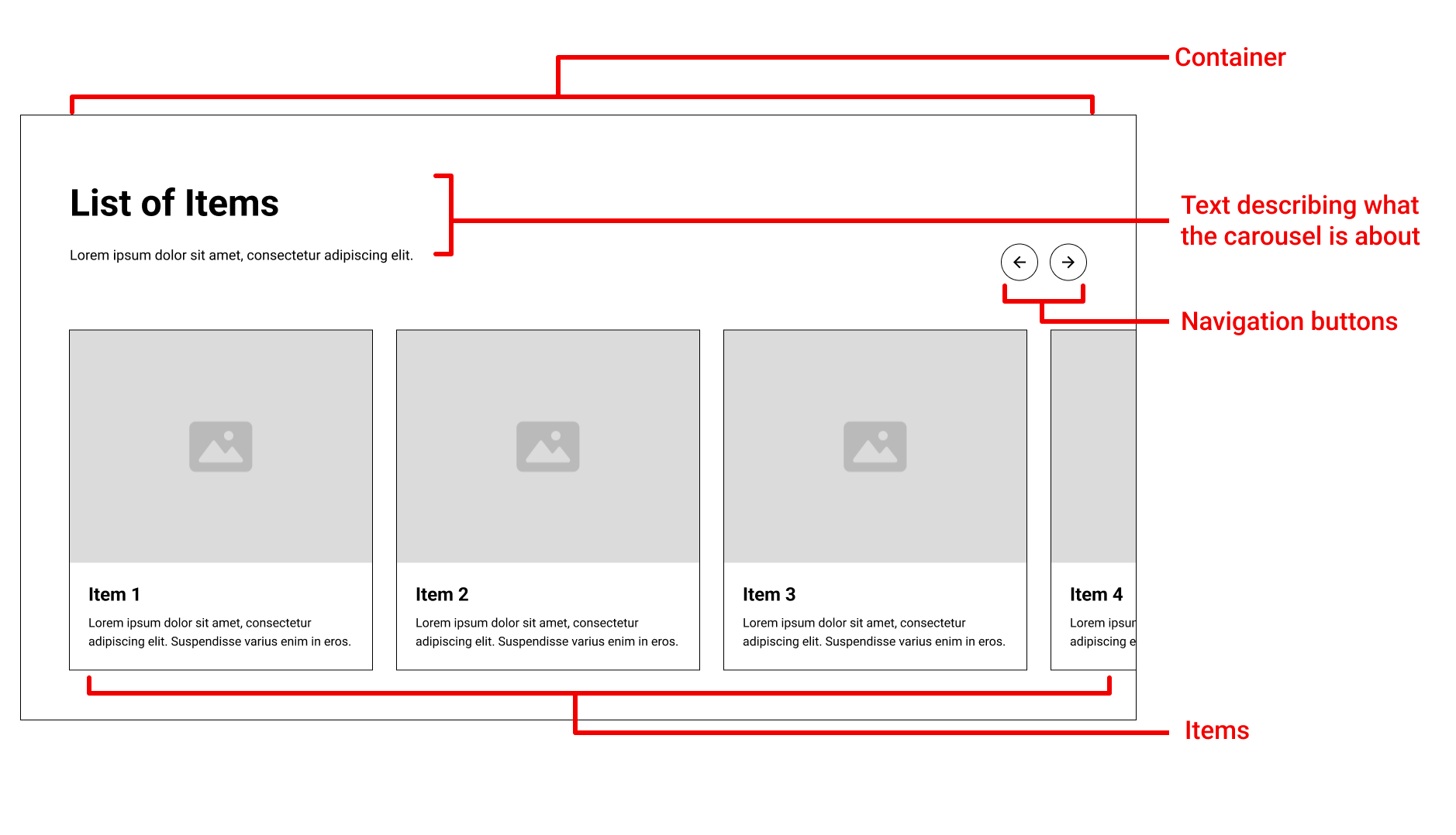
These components can make a carousel easier to navigate, but depending on the context, may be overwhelming to your user:
Mercedes Benz makes use of the components present in both sections below:
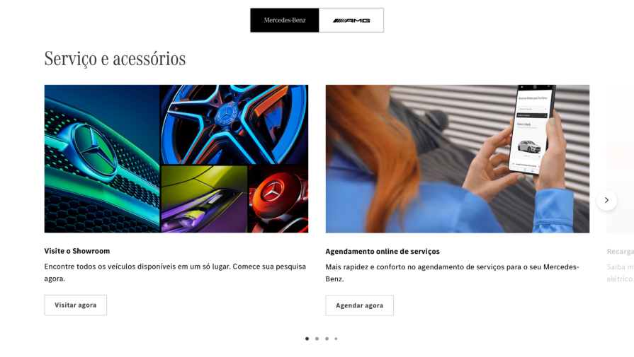
It uses a static carousel, which allows users to rotate it at their own pace. Additionally, it uses a container, items, text, calls to action, dots to indicate how many items it has, and navigation buttons.
Carousels often get a bad reputation for distracting users, but when designed with user experience in mind, they can enhance content discovery. Platforms like Airbnb and Netflix show that strategic use — clear purpose, intuitive navigation, and user control — makes all the difference.
Airbnb is well-known for its outstanding user experience, and as you can see, it uses dozens of carousels in the same section of its website.
To be honest, I don’t see a better way for a website such as Airbnb, which has dozens of users with different intentions, to be able to captivate everyone on its first page:
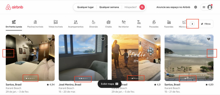
The fact is that in this case, the carousels make more information accessible to users in a very minimalist way. It uses carousels in an effective way by having:
Airbnb’s success with carousels comes from strategic placement and relevance. The design ensures users can browse options seamlessly without distractions or unnecessary movement.
Netflix’s carousels prioritize user control and clarity. Instead of automatic rotation, it uses intuitive navigation with arrows that appear as needed, guiding users without overwhelming them:

First of all, don’t judge my music taste! As you can see below, Spotify also uses carousels in a way similar to Netflix:

One thoughtful addition Spotify makes is the “Show all” button in the top-right corner. Instead of forcing users to scroll left or right, this option lets them view the entire list in a single viewport, providing a more seamless browsing experience.
Note: Airbnb, Netflix and Spotify’s design of carousel aren’t the standard for every website or web-app. You are free to break rules, as long as you have knowledge about them and can tell exactly why and based on which user’s behavior you are breaking them.
Amazon is well known in ecommerce for turning hard-to-convert users into buyers, but why does it use the carousels if they’re considered conversion killers?
Do you really believe that Amazon designers don’t know this and are just being silly?

Amazon doesn’t just make use of carousels, it uses your biggest enemy: the auto-rotation feature. How could that be right?
Only research focused on specific website users would be able to tell you. Even though there are best practices, when it comes to UX, it’s important to remember that every decision should be validated through user research.
But I have a few guesses. In this case, we could think about the hypothesis that Amazon users are accustomed to finding site promotions on the top of the website in a carousel. So, maybe Amazon prefers to be conservative so the users can still identify its product, but again, it’s just a possibility.
Many factors should be analyzed while designing a product. You cannot assume general UX design rules will automatically apply to you. First you need to know your users, their context, and your business expectations.
Carousels still sometimes have a place in modern UXs. If you decide a carousel fits your use case, make sure it’s easy for users to access and interact with the content. To help with this, try the following:
If you still find yourself hesitant about carousels, the good news is that there are a number of different approaches you can take instead. Common alternatives include:
Multiple items can be presented in the same viewport using a structured format called a grid, which makes it easy to scan and compare options. This makes them a great option for ecommerce product listings, image galleries, and portfolio pages allowing users to browse multiple items at once.
Although, if not well-designed, grids can become visually cluttered, making it harder to focus on individual elements.
Pros:
Cons:
A hero section makes use of a large, well known banner with a call-to-action to immediately grab attention and create a strong visual identity. This makes it very effective for landing pages, branding campaigns, and service-based websites for creating a strong first impression.
However, they’re not ideal for content-heavy pages where multiple key messages need to be conveyed at once because hero sections center on a single primary message.
Pros:
Cons:
Cards are self-contained content blocks that merge text and images into a singular format. They are used in dashboards, news websites, and streaming platforms passing information in an organized way. Cards are used for dynamic content because they are flexible, but too much can make the layout feel boring and visually unexciting.
Pros:
Cons:
Videos replace static images with engaging motion content, making them very effective for product showcases, marketing campaigns, and educational content. They capture attention quickly and help explain complex concepts visually.
Although, videos require more bandwidth and can slow down the loading times of pages, which may unfavorably impact user experience.
Pros:
Cons:
Accordions allow content sections to expand and collapse, keeping clean pages and minimizing the need for too much scrolling. This makes them very much useful for FAQs, documentation, and mobile interfaces where there is limited space. However, users may overlook important information because accordions keep content hidden until clicked.
Pros:
Cons:
Your user will always be the best person to tell whether carousels will be an effective choice or not on your website.
But now, you know that carousels should be carefully analyzed because while they can be a great solution to your product like Airbnb, they can also scare users away.
The truth is that for most websites, carousels aren’t really needed. But if you decide to have them, be aware of the best practices, and don’t forget to run tests to understand whether your users are interacting with the carousels and whether they’re really being effective.

LogRocket's Galileo AI watches sessions and understands user feedback for you, automating the most time-intensive parts of your job and giving you more time to focus on great design.
See how design choices, interactions, and issues affect your users — get a demo of LogRocket today.

Learn what makes a great login screen through real-world examples and UX best practices for creating secure, accessible, and low-friction authentication flows.
Skeuomorphism helped define early digital interfaces by mimicking real-world objects to make technology more intuitive. Learn how it compares with flat design and neumorphism, why it declined, and where it still has a place in modern UX.

Memos don’t have to be complicated. Just keep them clear, concise, and focused on actionable items. More on that in this blog.

AI has made polished, confident content easy to generate, but that does not make it trustworthy. This article explains how UX teams can design stronger quality signals using source transparency, validation, confidence communication, and reputation.

 Learn more →
