If being a designer has taught me anything over the past ten years, it’s that design is never truly finished. We don’t live in a world where a product or feature is launched “perfectly” to users, never to be revised again. It just isn’t possible because design is an inherently iterative process. But it hasn’t always been seen that way.
With the rise of the Agile methodology, the IT industry has become more understanding of design being part of that methodology. The premise is simple — cross-disciplinary teams work together making incremental improvements on a cyclical basis, over the course of a series of sprints and towards a common goal. Users now expect as much. The vast majority of people listening to music via Spotify, or watching their favorite shows on Netflix, understand apps on their phones or smart TVs will continuously update. This customer demand, coupled with a more agile way of working, has resulted in design being front and center.
However, before Agile gained popularity in project management circles, the Waterfall methodology ruled the roost. There’s nothing wrong with the Waterfall methodology per se, but from my experience, I find it significantly limits the potential of design as an iteration, and can also lead to much slower updates pushed to end users. It’s not the wrong way of getting work done, but it completely contrasts with Agile.
Designing websites and apps as part of the waterfall methodology inevitably meant I had to complete my work, then hand the designs over to the engineering team. This was jokingly referred to as “throwing the designs over the wall,” a term that highlights how poor cross-team collaboration could be.
As a designer, I was at the top of the “waterfall,” with each subsequent section of the waterfall below me. If any part of the waterfall weren’t complete, it would push back the entire project. Simply put, the next stage would not be able to progress unless the prior stage was finished.
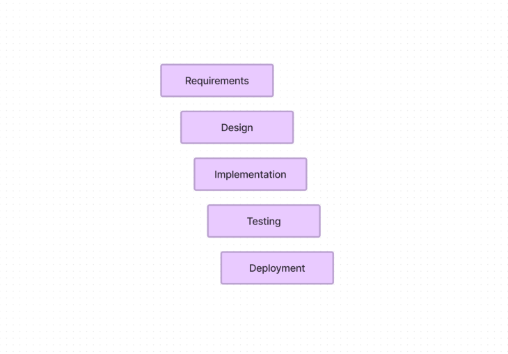
Comparatively speaking, this is a rigid and at times unforgiving way of working, completely at odds with the concept of iterative design. If at any point the team received feedback from users that required design alterations, well, it was often “too bad.” Those alterations would have to wait until the next project update, which was either months away or possibly not defined at all.
Thankfully, over the succeeding years, many teams have moved on to a more agile viewpoint, the benefits of which we’ll get into. But first, a definition of what iterative design is.
Iterative design is a process in which the design of a product or system is improved gradually through repeated cycles of design and testing. Iterative design differs from noniterative design when a product or system is designed in a single cycle and then released to the public. This design methodology allows for ongoing improvements and adjustments to the design based on user feedback and testing, over multiple cycles.
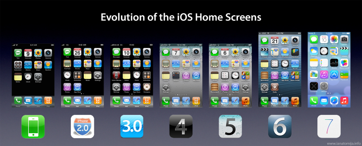
Probably the best-known example of iterative design comes from Cupertino, California. Whilst some bemoan Apple’s approach to iPhone updates, there’s no denying that their dedication to an iterative approach has helped win over millions of customers. Every year, Apple releases a new version of the iPhone with upgrades and improvements made from feedback from previous models.
But let’s focus on iOS. It might be difficult to believe, but the first version of iOS was released way back on June 29, 2007. Now some sixteen years later, the latest iPhones run iOS 16. Regardless of what the process is called within Apple, it’s likely that their design methodology aligns with an iterative design mindset. Sixteen years of continuous iterative design based on user feedback, as well as shifting business demands, has users benefitting from continuous updates.
Apple is well known for its design process, which involves a continuous cycle of user research, prototyping, testing, and iterating. User research helps Apple understand the needs and desires of its users, uncovering their behaviors, idiosyncrasies, and preferences. Broadly speaking, these methods of research can be divided into three categories: qualitative research, quantitative research, and psychographic research.
Qualitative research involves gathering data from individual users through interviews, focus groups, and surveys. Quantitative research involves collecting data from a large number of users. From a data perspective, a user’s iPhone is a goldmine that Apple uses (with permission) to monitor user behavior. This helps Apple measure user responses to certain features and identify patterns in user behavior. Psychographic research on the other hand involves gathering data about users’ psychological characteristics such as their values, beliefs, and attitudes.
This research then feeds into the design process itself, in the form of sketch workshops, prototyping, and higher-fidelity designs that are continuously evaluated internally, as well as with user research participants. This is part of the research and analysis phase, which we’ll explain in more detail later.
Perhaps a slightly controversial entry, as many see the Autopilot system as an impossible goal. But Autopilot will only survive if iterative design is especially adhered to. The world around us is too complex for any other design process to work within this context.
Tesla’s Autopilot system uses iterative design to improve user experience and, importantly, make the system more reliable. By releasing updates to the Autopilot system, new features and improvements are introduced based on user feedback and analytical data. Just as Apple has access to data from a number of iPhones, so too does Tesla from a number of its own vehicles. Preferences and behaviors are recorded, then sent back to Tesla HQ for analysis and consideration as part of the research and analysis phase.

When Autopilot first launched, the system depended on just one forward-facing camera. This was a great first step for the system, but was limited because of both hardware and software reasons. These limitations were then, as part of an iterative design process, fed back to Tesla. Inevitably this led to further iterations, namely hardware 2.0, 2.5, and 3.0 as well as a whole host of software updates, which significantly increased the level and complexity of technology offered within the car.
Given that Tesla is in a unique position of controlling both the hardware and software within their vehicles, just like Apple controls its hardware and software, it makes sense that one of the key features of owning a Tesla is knowing it’s part of an iterative design process.
Uber is a champion of design, especially in the usage of the sprint methodology. Without going into too much detail, the sprint methodology is effectively the iterative design process condensed into just five days. During the working week, diverse teams ideate, build, launch, and learn. This is a tightly monitored cyclical process that then feeds into an even larger iterative design process, involving wider teams within the company. Whether or not folks agree that the sprint methodology is beneficial — it represents the cutting edge of iterative design thinking.

Uber’s apps, for both their cab and food delivery service, embody this approach. Uber is constantly evolving new features and improvements based on user feedback. The company uses an iterative design process to improve the user experience and make their service more accurate and reliable.
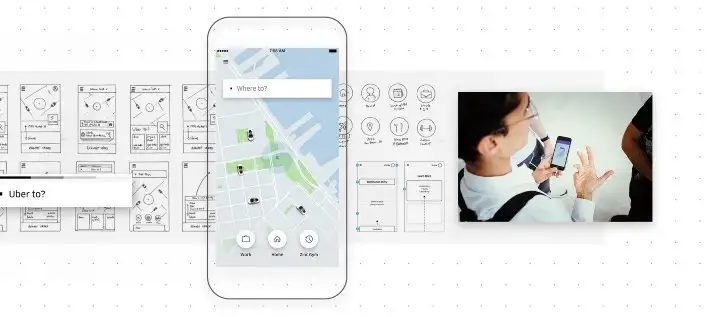
A key area of attention was the product selection focus, which the design team at Uber realized wasn’t as scalable as they first thought. More options presented within the product selection focus led to a real strain on the end user’s cognitive load, so they knew something that particular feature had to be redesigned in a more scalable way.
Didier Hilhorst went on to explain, from the Uber Design blog, that “this feature went through the most design cycles and iterations” and that “ongoing user research and iterative prototyping played a crucial role in our process.”
This crucial research and design phase went through multiple iterations, particularly with internal stakeholders and user research participants. Once Hilhorst and his team felt confident that the right solution had been chosen, it was then passed on to the engineering team for development.
Iterative design is very much a sum of its parts. Where iterative design won’t work is whenever a part of the process falls behind or is neglected altogether. This does happen, and often unexpectedly as teams are pulled in various directions during the process of shipping new features. Teams that work together, and collaborate to the best of their abilities (regardless of the different professions that make up that team), are most likely to succeed with iterative design.
From my own experience, here’s why iterative design doesn’t produce the expected results:
The concept of iterative design itself isn’t necessarily a problem or why results aren’t being produced; rather, it is likely because the process doesn’t provide sufficient feedback from users. Without user feedback, the iterative process cannot be used to make improvements or adjustments to the design. The process isn’t truly iterative unless meaningful user feedback is incorporated into the process. This highlights just how important talking to users is.
Additionally, without user input, it can be near impossible to identify any issues with the design or user experience. This can lead to a product or system that is not optimized for user needs and preferences, which can lead to the team not seeing success with their iterative process.
We know what iterative design is, and why even the largest organizations in the world use this methodology, but how do you use it and make it a success? Let’s take a look at the five steps to implementing iterative design.
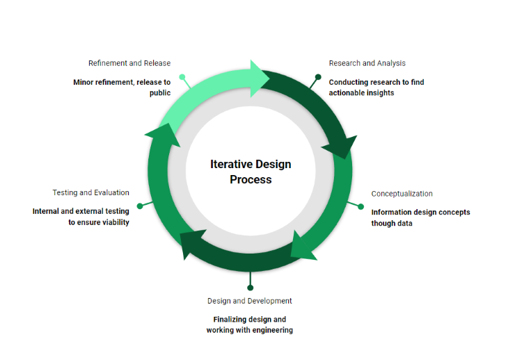
Talking to users is critical in establishing which problems need to be solved. The first step in any successful iterative design process is to conduct research and analysis. The design team generally arranges this, and more specifically, UX designers or researchers within the team. It’s imperative to conduct user research that acts as the cornerstone for all decisions going forward. This includes gathering data about user needs, preferences, and behaviors. Perhaps this data already exists in some format, so the design team should build upon that. By using primary or secondary research, this data can be used to identify potential problems and opportunities for improvement in the existing design.
Presenting to the team and articulating the meaning behind the data is also crucial. So much insight can be lost depending on how this information is conveyed back to the team, so it’s important to present back findings in an engaging way that quickly establishes the reason for the research and why it impacts the business.
Types of research that can lead to actionable insights:
| Behavioral | Attitudinal |
| Remote usability testing | Interviews |
| Remote moderated testing | Desirability studies |
| Clickstream/analytics | Surveys |
| A/B Testing | Customer feedback |
N.B., I’ve noted this as the first step, but your team should really have a research and analysis mind at all times, regardless of where in the design process you are. There are always opportunities for learning, feedback, and iteration based on that feedback.
Research and analysis is also beneficial for teams that may be faced with several ideas, and are unsure which idea should get the (potentially limited) dedicated time and money. Developing a simple prototype for each idea can be massively inexpensive when compared to the equivalent development costs. It’s also much easier to disregard an idea at this stage is less has been invested into it.
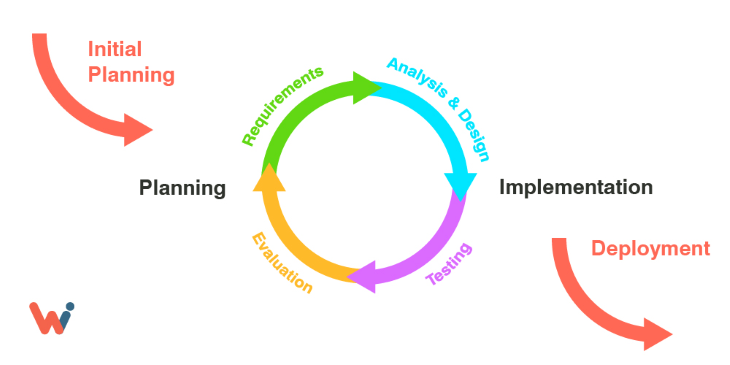
In the second step of the iterative design process, conceptualization, teams are encouraged to use the data gathered in the previous step to create a plan and concepts to illustrate potential solutions.
Consider any research that’s taken place in the form of usability testing, clickstream analysis, or customer feedback. How does this inform design decisions going forward? It’s important to remember that this step can also involve brainstorming ideas and creating quick and dirty prototypes before moving on to higher fidelity concepts designed in Figma.
Mockups you produce are particularly useful for internal discussion, but they’re also an opportunity to present user testing participants with work in progress for a more granular, incremental, approach to usability testing. Effectively, micro-iterations within overarching iterations. Being able to take this granular approach requires working within a team that’s “UX-mature” — that is to say, UX is very much at the heart of what the company does.
When I worked at an online retailer, we regularly created mockups to present to users during testing sessions. By incrementally improving upon these designs, not only did we feel we were improving our offering, but we felt we were instilling further confidence in stakeholders in the process itself. They were able to see, firsthand, the benefits of an iterative approach and actively became proponents of it. By carefully crafting our questions to ensure no biases existed and allowing participants enough time to assess what was in front of them, we could determine quickly if changes resulted in a negligible improvement, a measurable improvement, or a detractor.
Iterative design worked particularly well if we wanted to test multiple hypotheses in this instance. We simply wouldn’t have been able to approach projects in this manner had we been working with a more rigid design methodology.
Being able to rapidly iterate through multiple scenarios, we were ensuring a more proactive approach to design — rather than shipping based on assumptions and making changes much further down the line. We effectively became a well-oiled team that made rapid micro-iterations within the overall process, ensuring we were searching out the best possible outcome for users.
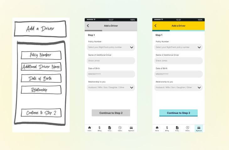
The third step of an iterative design process is design and development. Firstly, this includes settling on an actual design that solves problems outlined during research and analysis. There may have been many to choose from, but by this point, a team should have settled on a singular design (or series of designs) that best fit the initial problem statement.
Based on the data from the previous two stages, the design team (and wider teams) will give them the confidence needed. The engineering team will begin building the design, but this doesn’t necessarily mean the engineering team will go off with no communication needed between design/development. I find it’s the opposite at this point, actually.
Communication is critical to the success of an iterative design process, so the engineering and design teams talking to one another is important. It’s still possible to conduct testing with users at this point, but ultimately depends on time, budget, and general confidence factors. A successful iterative design process should ideally mean that any issues discovered have been documented, shared with the team, and resolved beforehand during earlier stages. This ensures the team can focus on building out the solution.
N.B., the best designers I’ve worked with are those that take the time to build rapport with the engineering team. There’s no need for animosity. The perception that designers are always butting heads with developers is a myth, and a good iterative design process can go a long way in creating a more harmonious workplace. A mutual understanding from both professions results in better collaboration.
Alternatively, any other points of interest at this stage (outside of blockers) could roll over to the next iterative design phase.
The fourth step of the iterative design process is testing and evaluation. This involves testing the latest work from the engineering team internally to gather feedback from a quality assurance perspective, and to identify any final potential issues or areas for improvement that could be included in another sprint. Communication should be ongoing between the design and engineering teams, but it’s likely the focus will now start to shift to another upcoming iteration.
There still may be last-minute ongoing questions that require someone from the design team to support the engineering team, perhaps in the form of joining daily scrum meetings or a dedicated meeting for both teams to get together. This ensures that all bases are covered and that the process continues as smoothly as possible before going live after refinement and release.
The fifth and final step in the iterative design process is refinement and release. At this point, any changes made will be minor, if there are any at all. Adjustments to the design/build based on user feedback at this point are unlikely, and testing and then releasing the design to the public will be a top priority. It’s at this point the process goes full circle. With the latest release out in the user’s hands, the continuation of feedback will persist and feed directly back into the overall design process, and specifically, into the research and analysis phase.
Design never stops, and it’s unlikely that feedback with either. Feedback from the latest release can be gathered in various ways:
This is it. We’re now at the end of the cycle, but the design process never stops. We know by using the process above that we’ll iterate again, and again, surfacing new problems to be solved because of market factors, business reasons, or due to user research.
Iterative design allows for more flexibility, empathy for users, and scope to allow teams to rapidly iterate out ideas that range from the simple to the complex. Established as a mainstay to guide teams in building great products, it’s unlikely that iterative design will change any time soon.
Header image source: IconScout
LogRocket's Galileo AI watches sessions and understands user feedback for you, automating the most time-intensive parts of your job and giving you more time to focus on great design.
See how design choices, interactions, and issues affect your users — get a demo of LogRocket today.

As products evolve into ecosystems, navigation becomes a system-level challenge. This article explores how to align structure, context, and user journeys to create seamless movement across tools without confusion.
Figma’s AI features have exploded in 2026 — from text generation and image editing to full UI drafts and code handoff. But speed isn’t the same as quality. This guide breaks down every major feature, what it’s good at, and where human judgment still does the heavy lifting.

Zero UI works well for screenless, voice-first experiences, but most digital products still require visual interaction. Here’s why multimodal UX offers a more scalable foundation for the future of design.

Multimodal UX goes beyond designing for screens. Learn how context-aware systems, progressive modality, failover modes, and accessibility-first design create better digital product experiences.