Discoverability refers to the ease with which users can find and access the information they need within a digital product. It is an important aspect of creating websites or digital products that are easy to use and can greatly impact user satisfaction and retention.
When users are able to find what they are looking for quickly and easily, they are more likely to engage with the product and continue using it in the future. Moreover, helping users discover new content can also encourage them to explore your product or website and increase the time that they spend using it.
In this article, we’ll discuss best practices for optimizing for discoverability, as well as strategies for conducting user testing to identify areas of improvement. We’ll also explore examples of websites that excel in discoverability, providing insights into how designers can create effective digital products.
Creating discoverable content can be a challenging task. With the overwhelming amount of information available online, it can be difficult to ensure that the right information is presented in the right way, at the right time, and to the right audience.
Users have a limited attention span and a low tolerance for frustration when navigating digital products. In fact, the average human attention span is only 8.25 seconds, which is less than that of a goldfish!
If users can’t find what they need quickly and easily, they are likely to leave the product and go elsewhere. That’s why discoverability plays such a big role in creating an overall positive user experience.
Let’s not forget that users come from different backgrounds and have different levels of knowledge, experience, and expectations when it comes to digital products. Designers need to account for accessibility and inclusive design to ensure that all users can easily find the information they need.
Navigation and search functionality are two areas that can lead to more discoverable content if done right. Let’s talk about how designers can improve the experiences with both in order to improve discoverability.
To make content discoverable, optimizing the product’s navigation can ensure that users are able to easily find what they are looking for. Navigation menus should be organized logically, with related items grouped together. This helps users quickly locate content or functionality that they are interested in. Use categories or subcategories to group items together and make it easier for users to find what they are looking for, but don’t overwhelm the user with too many subcategories.
The navigation menu should be easily accessible and include clear labels. A good rule of thumb is to keep navigation labels short and simple, so users can quickly scan and locate the desired content.
Another important factor in making content discoverable is search functionality. Users should be able to quickly and easily search for relevant content within the product.
The search bar should be prominently displayed and easy to use. Autocomplete suggestions can help users discover popular things to search for. Many search pages display trending or recent searches by other users to encourage discoverability. Additionally, filtering and sorting capabilities can greatly enhance the search experience and make it more efficient.
Yelp’s website is a prime example of having effective search functionality. The search bar is clearly noticeable at the top of the page, which uses placeholder text to prompt the user with search suggestions. Once a user starts typing, the search function provides autocomplete suggestions to their input, including names of dishes and restaurants, which teaches the user about the different things they can search for.

The search results page includes comprehensive filter and sort capabilities, as well as a map view to help users identify a restaurant’s location. This is useful information that can help users ultimately make a decision, which makes Yelp’s search results page effective at giving the user multiple ways of discovering content.

When users can easily discover relevant content and features, they are more likely to have a positive experience and spend more time using the product. This can lead to improved performance metrics such as user engagement and retention.
Here are ways to optimize your product’s content for discoverability.
One way to optimize content for discoverability is through the use of descriptive headings. Headings should be short, concise, and accurately reflect the content of the page. Users should be able to quickly scan the headings or subheadings to identify the content they’re looking for. This will also help screen reader users understand the subject of the content.
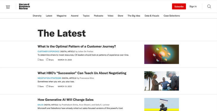
Harvard Business Review makes use of headings and subheadings to distinguish page and article titles.
The main headings are short and concise, accurately representing the information on the page. The subheadings used for article titles are descriptive and explain what the article is about. This makes it easy for the user to scan the page and discover content that is relevant to them.
Metadata is also an important factor in optimizing content for discoverability. Metadata provides additional information about the content, such as the author, date published, and keywords.
Tags provide additional context and help categorize content, making it easier for users to find related content. When selecting tags, designers should choose descriptive terms that accurately reflect the content of the page.
This information helps search engines index the content, making it easier for users to find through search queries. By using relevant metadata, products can rank higher in search results and attract more organic traffic.
Medium’s website uses tags and keywords to categorize stories written about different topics. Users can use these tags to search and filter through content for each topic, as well as easily discover stories in related topics.

Designers can also optimize content for discoverability by incorporating internal linking. Internal links help users navigate between related content, providing a more seamless user experience. Additionally, internal linking can improve the overall search engine optimization (SEO) of the product, making it more visible to users.
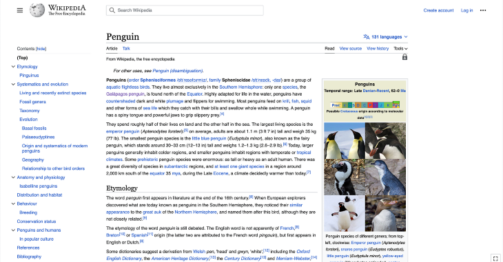
An excellent example of a website that leverages internal linking is Wikipedia. Each article contains numerous links to other pages within its website, which helps with discovering information and ranking in web search results.
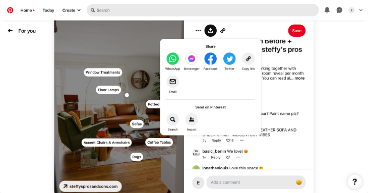
Finally, designers should ensure that the content is easily shareable. Sharing buttons should be prominently displayed on the page, allowing users to easily share the content on social media platforms. This can help increase the visibility of the content and drive engagement.
Pinterest has a share feature on each post, allowing users to send content through email and various social media platforms. This can help drive more traffic to Pinterest’s website as external users discover their content. It also includes an internal sharing feature, which sends content to other Pinterest users, leading to better discoverability for existing users.
In order to learn about areas where your product’s discoverability can be improved, usability tests can help to uncover issues with navigation, search functionality, and content organization. User feedback can then be used to refine and improve these aspects of the product.
There are several user testing strategies that can be used to identify areas of improvement for discoverability.
One strategy is task-based testing, where users are given specific tasks to complete within the product. Task-based testing is useful for identifying specific areas where users are struggling to discover content within a product.
By observing users as they complete tasks, designers can identify areas where users are struggling to find content and make informed decisions on how to improve the discoverability of the product.
To conduct task-based testing, follow these steps:
A/B testing is a user testing strategy that involves testing two different versions of a digital product against each other to identify which version performs better in terms of discoverability. This testing strategy is useful for identifying which design elements are most effective in improving discoverability.
To conduct A/B testing, follow these steps:
After conducting user testing, designers can analyze the insights gathered and make informed decisions on how to improve the product. This may involve making changes to navigation design, search functionality, or content optimization strategies.
Designers should focus on the areas where users are struggling the most and prioritize changes that will make the most significant impact on improving discoverability.
Now that we’ve talked about how to optimize for discoverability and some usability testing strategies, let’s look at some examples of websites that excel in discoverability.
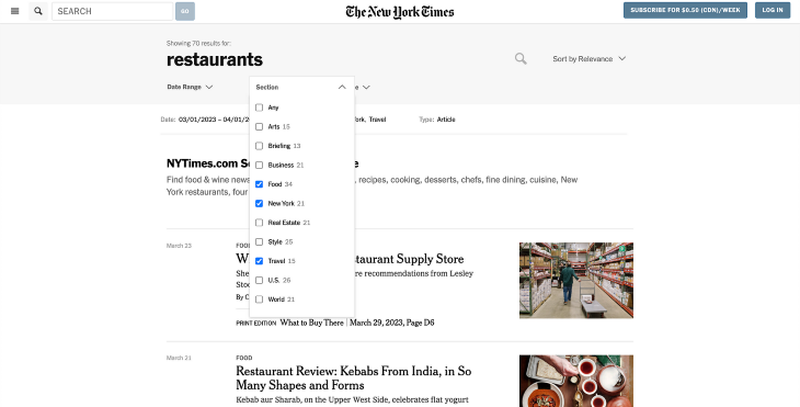
One example of a website that has effectively implemented discoverability is The New York Times. The main navigation menu is prominent across the top of the page, offering easy access to the most popular news topics. The secondary side menu includes clearly labeled links to topics and subtopics for all areas of the site.

The search bar is prominently displayed at the top left side of the page header, making it easy for users to find it. The results page allows filtering by date range, section, and content type to help users refine their search results. Users can also sort the results by relevance or time while the sorting options.
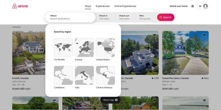
Another good example of a website with effective discoverability is Airbnb. The site’s navigation menu is immediately noticeable due to its use of clear labels and iconography across the top of the page. This makes it easy for users to explore and filter down different accommodation options by simply selecting an option from the menu.

The search bar is also prominently displayed at the top, and when clicked, it offers users with additional filtering options to narrow down their search. They can filter by Stays, Experiences, or Online Experiences, and search by region or date range.
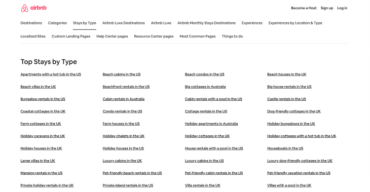
Additionally, Airbnb uses descriptive tags and metadata to help users find relevant listings. The website’s footer includes a link to a sitemap, which breaks down its content by different categories, such as Destinations, Categories, or Stays by Type. Each section provides a list of links to help the user browse using specific descriptive tags, such as “Beach cabin” or “Amazing pools”. This gives the user the flexibility to discover content based on the tags that are most relevant to them.
In conclusion, creating discoverable content is essential to the success of any website or digital product. Designers must take into account several factors such as navigation design, search functionality, and content optimization to create a discoverable product.
By implementing these best practices, designers can help users easily find relevant content and functionality within the product, leading to a better user experience and increased engagement.
The process of creating discoverable content is an ongoing one, and you should continuously evaluate and improve your products to meet the changing needs of users. Ultimately, discoverability is not just about making a product easy to use, but about creating an experience that allows users to fully explore different content so that they can get the most value out of it.
Header image source: IconScout
LogRocket's Galileo AI watches sessions and understands user feedback for you, automating the most time-intensive parts of your job and giving you more time to focus on great design.
See how design choices, interactions, and issues affect your users — get a demo of LogRocket today.

As products evolve into ecosystems, navigation becomes a system-level challenge. This article explores how to align structure, context, and user journeys to create seamless movement across tools without confusion.

Figma’s AI features have exploded in 2026 — from text generation and image editing to full UI drafts and code handoff. But speed isn’t the same as quality. This guide breaks down every major feature, what it’s good at, and where human judgment still does the heavy lifting.

Zero UI works well for screenless, voice-first experiences, but most digital products still require visual interaction. Here’s why multimodal UX offers a more scalable foundation for the future of design.

Multimodal UX goes beyond designing for screens. Learn how context-aware systems, progressive modality, failover modes, and accessibility-first design create better digital product experiences.