Consider how elements are organized and arranged on a screen: a header at the top, perhaps with a logo in the top left corner, and a navigation menu or profile button in the top right. Below that, it might have a secondary navigation on the side and the main content grouped next to it. Altogether, this describes the visual composition of the website.

One factor that can greatly impact visual composition is aspect ratios, and these ratios can define how all these visual elements are arrayed. In this article, we’ll talk about considerations and best practices for designing with different aspect ratios, as well as different tools you can use to test out your own designs and optimize them for different aspect ratios.
Aspect ratios define the proportional relationship between the measurements of an element’s width and its height. They are written in the form of a ratio such as x:y, where x is the width and y is the height. They can directly influence how elements are displayed and organized on a screen, and thus, can affect the visual composition dramatically.
Let’s dig into the details of aspect ratios and some commonly used ones in UX design. An aspect ratio determines how an element is displayed on a screen. You can figure out an element’s aspect ratio by reducing its dimensions to its lowest form, just like a fraction.
For example, to determine the aspect ratio of a laptop screen with a resolution of 1920×1080, simplifying both numbers gives us an aspect ratio of 16:9.
Now, here are some commonly used aspect ratios and what they are most used for.
This aspect ratio can be found in many applications including videos, television, laptops, and computer monitors. With its wide horizontal space, it offers ample room for content presentation.

While not as common nowadays, this aspect ratio can still be observed in older television screens and computer monitors. It provides a taller format resembling a square, making it suitable for traditional presentations like PowerPoint slides.

Notably popular on social media platforms such as Instagram, this aspect ratio forms a perfect square. Its balanced format is well-suited for displaying images, profile pictures, and icons in a visually appealing manner.

In contrast to widescreen, this aspect ratio is commonly used for vertical video content, particularly on social media platforms like TikTok where videos are viewed on mobile devices in portrait orientation.

Going beyond widescreen, this aspect ratio offers an exceptionally wide format. It is often used in movies and immersive gaming experiences, providing an expansive horizontal screen space for a captivating visual experience.

Serving as the standard aspect ratio for traditional photography, especially with 35mm film, this format strikes a balance between width and height, allowing photographers to compose their shots effectively.

When choosing the right aspect ratio, designers need to consider both content and context. The aspect ratios of each visual element can have a significant impact on how the content is arranged and organized within a design. If chosen incorrectly, it can negatively affect the overall composition’s balance.
Considering the context, designers should factor in the screens on which the design will be displayed. Devices come in various sizes and dimensions, ranging from small smartwatches to large digital billboards. Choosing the correct aspect ratios for the design ensures that all visual elements are properly displayed for the end users.
Think about watching an old movie where the image appears stretched or distorted to fit a modern TV display. Using incorrect aspect ratios negatively affects the experience of consuming content.

The same goes for websites and digital applications. Using incorrect aspect ratios can negatively impact the website’s aesthetics and also affect users’ perception of its usability, known as the Aesthetic-Usability Effect. That’s why designers should ensure that images and videos are displayed with optimal aspect ratios to enhance the quality and user experience.
More often than not, your designs will be shown on various devices of different sizes and orientations, such as a smartphone or a laptop. So, it’s important to consider how your layouts and visuals will scale and adjust accordingly. Now let’s talk about some best practices to follow when adapting content to different aspect ratios.
Responsive design techniques can ensure your content adjusts to various screen sizes while still displaying correctly. Using grid systems can help maintain visual harmony and balance within different aspect ratios.
The twelve-column grid system is widely accepted as the industry standard in design, although the number of columns you choose largely depends on what your design needs.
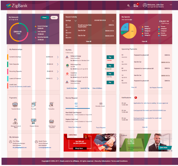
Grid systems create flexibility by dividing layouts into multiple columns. This makes it easy to arrange and align elements in a design, allowing endless possibilities for organizing your content. They enable designers to create responsive designs that adjust to various devices, regardless of screen size or aspect ratio.
When adapting your design to different screen sizes, adjust the number of columns in your grid system to suit each specific screen size and orientation. This way, your design can be rearranged to fit each aspect ratio properly instead of trying to replicate the exact same design.
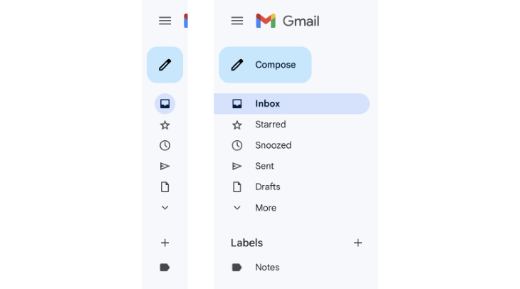
Screen space becomes limited as your design scales down to smaller screen sizes, such as on mobile devices. In these cases, using progressive disclosure can help you save space while maintaining access to essential information for the user.
Progressive disclosure ensures that the design is focused on the most important information and hides any secondary content that otherwise can be revealed through interaction when it becomes relevant to the user.
A popular example of progressive disclosure is the use of a hamburger menu. While a website or desktop application might have its navigation menu laid out across the header or in a side panel, its mobile version commonly uses a hamburger menu icon to hide the navigation. This keeps the screen uncluttered and allows users to access navigation when they need to.
When elements require different aspect ratios to fit responsive layouts, ensure that they are resized while maintaining the correct proportions so that the element doesn’t become distorted or stretched. A distorted image can ruin the aesthetic and overall experience while using a website or application.

If the element must be cropped in order to fit into a specific aspect ratio, be careful not to cut out any important features like the focal point so that the visual integrity of the element is preserved.

A common technique used to adapt images or videos to different aspect ratios is letterboxing and pillarboxing. Letterboxing is used when adapting widescreen content to a standard-width aspect ratio by adding black bars above and below the content.
Similarly, pillarboxing is used when adapting standard-width content to a widescreen aspect ratio by adding black bars to both sides of the screen. These bars prevent the content from distorting or stretching in order to fit the screen and maintain the original aspect ratio.


Let’s take a closer look at The New York Times. The newspaper publication showcases the effective use of aspect ratios with its website and mobile app. For a while, The New York Times had invested in creating a dynamic and appealing mobile experience, but its website had some catching up to do.
The New York Times design team conducted extensive user research, including user interviews and usability testing, in order to gain feedback on how to improve the experience of their product.
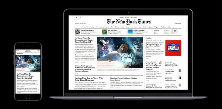
The desktop version of the website features several different sections of content, including a navigation menu across the top, recommended articles below that, and top news stories taking up the bulk of the screen.
Its main feature image has a 3:2 aspect ratio, which is commonly used by standard 35mm film photography. The site also uses smaller thumbnail images that have a 1:1 aspect ratio, which contributes to a visually balanced composition.
The New York Times presents its visual hierarchy well, incorporating different font sizes and image sizes to draw the users’ attention. The layout of the website follows a column grid system, making it easy to adopt a responsive design on mobile devices.
Its mobile app showcases one story at a time instead of displaying multiple articles cluttering up the screen. It uses progressive disclosure to hide features, such as navigation, mainly due to screen space limitations. The main feature image on mobile maintains the same 3:2 aspect ratio to present a consistent experience with its website.
After releasing a design, it’s important to gather feedback to understand how your users feel about the overall experience. Whether it’s through methods like surveys, in-depth user interviews, or A/B testing, conducting user research can help you identify the areas in your design that need improvement.
Focus on testing your designs on different aspect ratios to identify any issues with responsive design or inconsistencies. After gathering user insights, make the necessary adjustments so that your designs use aspect ratios correctly.
Here are some tools and resources to check out for testing and optimizing aspect ratios:
BrowserStack makes testing and optimizing aspect ratios easy by offering cross-browser testing on mobile and desktop. They offer a range of devices, including Android, iOS, as well as multiple versions of desktop browsers on Windows and macOS.
LambdaTest is another tool that provides cross-browser testing of websites and web applications across different browsers, operating systems, and devices, such as smartphones, tablets, and desktops. It also has responsive design testing to optimize designs for different aspect ratios.
Responsive Design Checker allows you to test out any website by entering an aspect ratio. The tool will display the website in the aspect ratio, which can help designers and developers identify any issues with the content and user experience.
In conclusion, we’ve explored the importance of aspect ratios in UX and how they can significantly impact the visual composition of a design. We discussed several common aspect ratios in UX design and considerations when choosing the right one.
Keep in mind best practices when designing and adapting content to different aspect ratios, such as using grid systems, progressive disclosure, and content scaling techniques. Don’t forget to leverage cross-browser testing and responsive design tools to test and iterate on your designs. This will ensure that the user experience maintains visual harmony and balance across all different screen sizes and aspect ratios.
LogRocket's Galileo AI watches sessions and understands user feedback for you, automating the most time-intensive parts of your job and giving you more time to focus on great design.
See how design choices, interactions, and issues affect your users — get a demo of LogRocket today.

As products evolve into ecosystems, navigation becomes a system-level challenge. This article explores how to align structure, context, and user journeys to create seamless movement across tools without confusion.

Figma’s AI features have exploded in 2026 — from text generation and image editing to full UI drafts and code handoff. But speed isn’t the same as quality. This guide breaks down every major feature, what it’s good at, and where human judgment still does the heavy lifting.

Zero UI works well for screenless, voice-first experiences, but most digital products still require visual interaction. Here’s why multimodal UX offers a more scalable foundation for the future of design.

Multimodal UX goes beyond designing for screens. Learn how context-aware systems, progressive modality, failover modes, and accessibility-first design create better digital product experiences.