
AI features are becoming a standard part of digital products. While there’s no shortage of advice on designing AI experiences, there’s far less guidance on where those features belong in a UI. Whether it’s a chatbot, writing assistant, or image generator, placement shapes how users perceive and adopt AI. The question isn’t just where AI should sit. It’s how prominently it should show up.
AI needs to be visible, but not imposing. You can’t just slap it onto any surface and call it a day; its placement must be intentional. This post will focus on products where AI is a feature, not the product, just there to assist, not to gatekeep or replace core tasks.
Let’s be honest, AI fatigue is real. People are tired of being sold on AI. Your features need to feel more like suggestions. Nobody wants another rectangle asking if you’d like help. At this point, AI should feel expected, not like a promotion, and your placement should reflect that.
Consider the screenshot below. It shows a list of domains from a hosting company’s website. There’s a “Spin AI site” button next to every domain in the list:
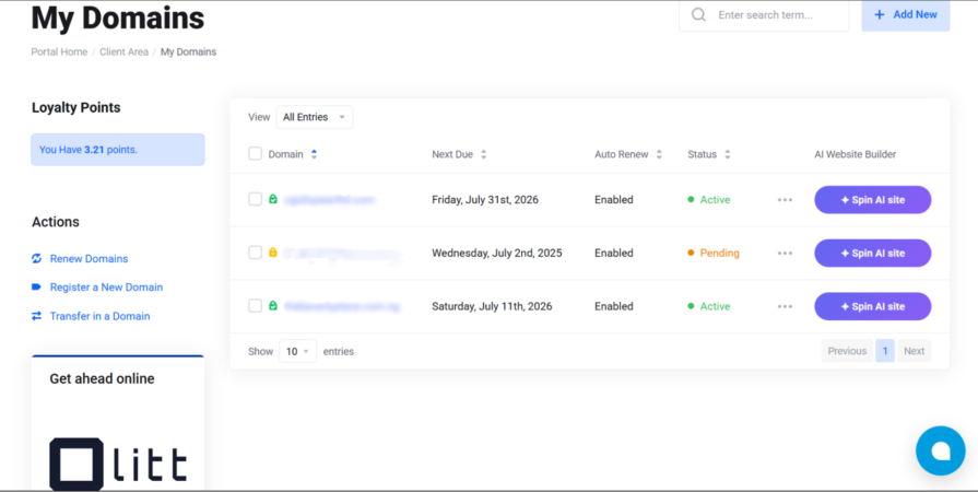
The core problem with this placement pattern is redundancy. One “Spin AI site” button would be a feature. However, the same button repeated next to every single domain listed in a column is noise. It starts feeling like a sales pitch. Users aren’t being helped; they’re being reminded, over and over, that AI exists.
A better placement would have been a single entry point, at the top of the domain list as a global action, or contextually when managing a domain. That way, it’s more of a genuine suggestion rather than a persistent advertisement.
Key Takeaways
Placement patterns for AI features depend on a combination of product type, UX convention, and industry-standard practices. Here are the most common ones, and what each pattern communicates to the user, even before they’ve interacted with the feature:
Widgets are small interactive UI components that provide specific, additional functionality or information. They provide quick access to extra features without your users having to leave the page.
Floating widgets are not fixed to a specific position and may or may not remain in view when scrolling. Widgets are commonly used for customer support, live chat, FAQs, tooltips, knowledge base, and more.
Your widget placement directly affects whether it’s noticed, and users expect help or chat functions in the bottom right corner. It’s the industry-standard practice, most likely because we mostly consume content from left to right. Most languages in the world read left to right. Widgets have to be visible with low intrusiveness, so letting them sit in the bottom-right corner, waiting to be seen after users have scanned through some content on the page, is good UX practice.
Grammarly is a good real-world example of this placement pattern done well. It appears as a small widget anchored to the bottom-right of text fields. It’s consistent, unobtrusive, and recognizable. UX designers can also borrow from its idle-to-active state transition. It’s a small “G” icon when there’s nothing to flag; it switches to a colored circle with a number when suggestions are waiting, and a dot when it’s idle or waiting for you to finish typing. Grammarly uses subtle but effective signals without ever interrupting users until they interact with the widget.
Toolbars and action bars contain buttons, menus, and controls that allow users to perform and execute common tasks. They are convenient and make it easy to find what you need without navigating through multiple windows or pages.
Placing AI features in a toolbar, or action bar, puts them on equal footing with your product’s tools. Your users will pick it up when they need it, like any other tool in the panel.
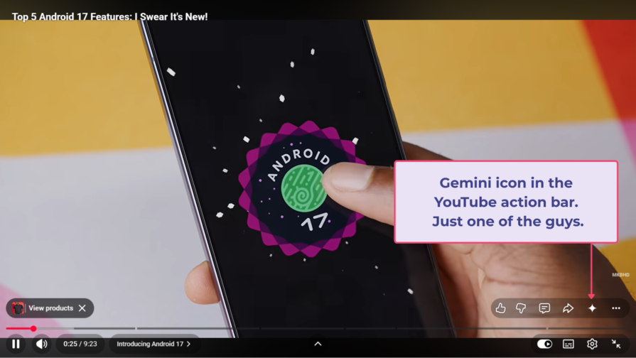
Toolbars are typically persistent and static, sitting on the top or bottom of the UI, regardless of what you’re doing. They are mostly customizable and can be used to organize frequently used features. Placing features in a toolbar signals that it’s likely to affect the entire file or document.
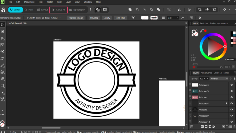
This placement pattern works well in creative and professional tools where users have or develop workflows that they don’t want disrupted. A good example is Canva AI in Affinity’s Studio Manager:
Action bars are contextual, tied to what activity the user is currently doing. For example, the Canva action bar that appears when elements are selected:
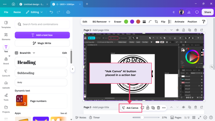
Placing AI in a toolbar says it’s always available and relevant, while placing it in an action bar says it’s relevant for what you’re doing right now.
Sidebars are panels running along the left or right side of a UI. They provide additional context or secondary tools and can be static or collapsible.
Sidebars have more space or real estate to support prolonged AI interactions than widgets and toolbars. Even these can be made to expand into side panels, providing more functionality.
Placing AI features on the right side panel frames it as a secondary helper, like the bottom-right help widget placement. On the other hand, placing them on the left frames the AI features as active collaborators.
Opera AI on the right, Firefox AI chatbots on the left, GitHub Copilot in VS Code; sidebars keep AI accessible without taking users away from the primary space. Users engage with them on their own terms.
Your decision on placement depends on how prominent you want your AI features to feel in your product. Collapsible sidebars, for example, are easy to forget, especially for users who aren’t already looking for AI features.
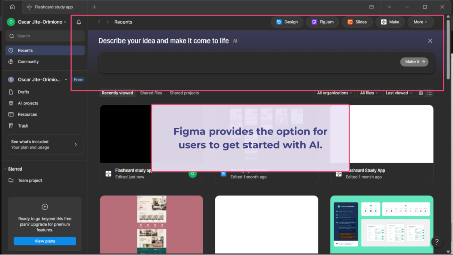
This is where AI features stop feeling like an add-on. Figma AI is a good (and bad) example.
First, it invites you in on the homepage:
Then it opens up a dedicated hub, and it feels like you’re in a different product:
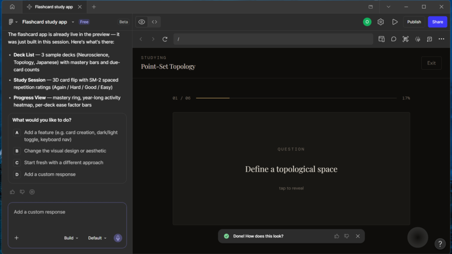
Am I in Claude, ChatGPT or Gemini?
But the route back to the main canvas is blocked by a paywall:
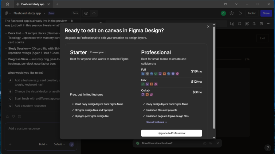
Having a dedicated AI hub in Figma is useful as a starting point for generating first drafts or exploring ideas before moving to the main workspace. AI lowers the entry barrier to starting a task, but the real work should happen on the canvas. However, in Figma’s case, this is only available to users on the professional plan.
When a product gives AI its own full-screen interface, it’s no longer just another feature sitting in a workflow. It’s a new destination that’s only justified in specific contexts. When the dedicated hub becomes the whole experience, with no clear way to hand control back to your users, it doesn’t work because at that point you’re building a different product.
Inline AI generates the least resistance, which can make it a very effective UI placement option. The principle at work here is task proximity, keeping AI as close as possible to what it’s acting on. If users have to navigate away from their primary activity to look for AI, they’re likely to skip it entirely.
Inline placement preserves your users’ sense of control. It’s great for small actions and selections, without interrupting your workflow.
As we’ve established, good UI placement comes down to your product type and what users have come to expect.
Every AI placement decision is essentially a negotiation between discoverability and interruption, two opposing needs. You want your AI features to be visible, that is, discoverable enough that users know it exists in your product, but not intrusive enough that it interrupts their workflow.
Push too much towards discoverability, and it becomes a salesperson always asking for attention.
Pull too far in the opposite direction, and there’s the danger that your AI features disappear entirely and users never find and use them.
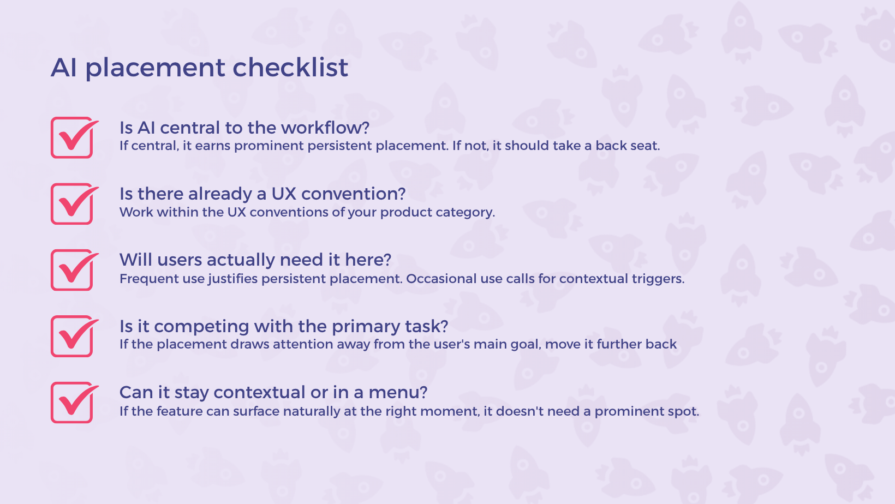
So, your goal should be to match discoverability to the value of the feature. And asking the right questions should give you a clear picture to make placement decisions:
If users open your product because they’re looking for AI, it deserves a dedicated page or primary interface. However, if it’s only there to assist an existing workflow, it should take a back seat in a sidebar, as a toolbar button, or inline trigger.
A writing tool with inline suggestions feels natural. A creative tool with AI in the toolbar feels the same way. Tools like Grammarly, Notion, Canva, etc, have established that pattern. Work within the UX conventions of your product category so you don’t fight user expectations.
A feature that will be used occasionally is better hidden away to appear contextually so it doesn’t clutter the UI. AI features should earn permanent visible placement when you expect users to reach for them every time.
Consider the scope AI operates on in your product. Does it act on a selection or the entire product or document? Selection-level AI features belong inline or in an action bar. Document-level or product-wide features can be placed in a toolbar, sidebar, or have a dedicated page.
Before committing to any visible UI placement, ask whether the AI feature would work just fine tucked away into a menu or triggered by a shortcut. If your answer is yes, then you should probably do that. Not every AI feature needs a permanent/persistent presence in your UI.
| Question | If yes | If no |
| Is AI central to the workflow? | Dedicated page. | Toolbar, sidebar, inline, action bar, or widget. |
| Does your product type have an established AI placement pattern? | Follow existing UX conventions. | Ask a different question. |
| Will users use AI frequently in your product? | Sidebar, toolbar, or persistent widget. | Inline trigger or action bar based on context. |
| Does it operate on the whole product or specific selecton? | Sidebar, action bar, or dedicated page. | Inline trigger or floating widget. |
| Would it work fine in a menu? | Put it in a menu. | Ask a different question. |
Let’s say you’re designing a project management tool, something like Notion, Trello, or Asana, and you’re adding an AI feature that drafts suggestions based on a task title a user types.
First question: Is AI central to the workflow? No, because users are there to manage and track their tasks by themselves. AI is not a core function, so that rules out any prominent or persistent placement option.
Next question: What are users expecting based on the product type? Project management tools are task-focused and can become information-dense. Users expect to move quickly between items and are generally not in a mode to chat with a bot. So, inline placement fits better here.
Third question: How often would users need the AI? Not every task needs an AI-generated description, so its use is occasional. This reinforces the idea of a user-triggered inline placement or a non-intrusive widget.
Fourth question: How would the AI operate? Here, the AI operates within the description text field, pointing directly at inline placement.
Fifth question: Can it stay in a menu? Possibly, but this feature is meant to appear when a user clicks into a text field; a clear trigger point. It’s not intrusive, and a menu would add an unnecessary step.
Final recommendation: An inline prompt inside the description text field when it’s empty; something like “Draft with AI.” It appears only when it’s useful and disappears when the user starts typing. It never asks for attention when it’s not needed.
WhatsApp gives Meta AI a fixed, prominent button. Windows laptops now ship with a physical dedicated Copilot key, replacing the right Ctrl key users have relied on for decades. A meaningful functional key swapped out for an AI shortcut. I upgraded to a new Samsung phone, and the side button I’d reasonably expect to handle power controls opens Gemini by default. It can be jarring when an experience you’ve built muscle memory around suddenly does something else.
We didn’t need a physical key to start using the features on our daily products; those became part of our routine because they were useful, not mandatory. Asking your users “what do you want to do?” via a chatbox is, in some ways, regressive. We already know how to perform habitual tasks through direct manipulation: clicking, dragging, typing in the right field. Adding a conversational AI layer on top of that can feel unnecessary and annoying.
Having a dedicated, prominent AI button says this matters — more than whatever was there before. As everything becomes “agentic,” strive to be different with your product’s design. Don’t force users into a chatbot; place AI exactly where it’s useful — and invisible everywhere else.
AI placement in your UI should reflect genuine, frequent need.
Users aren’t opposed to AI; they just don’t want to be constantly reminded that it exists. Placement is one of the ways you can control how AI is received. You can make a genuinely useful feature feel natural by placing it in the right place. Where would users actually want to find your AI features?
LogRocket's Galileo AI watches sessions and understands user feedback for you, automating the most time-intensive parts of your job and giving you more time to focus on great design.
See how design choices, interactions, and issues affect your users — get a demo of LogRocket today.

Your UX copy documentation isn’t just for human writers anymore. Here’s how to build a copy ecosystem that AI tools and agents can understand too.

Colors in UI aren’t just decoration. They’re the key to emotional impact, readability, and accessibility. This blog breaks down how to pick colors that don’t just look good — they work for your users.

For when you’re stuck in a UX design rut next, bring in lateral thinking. Lateral thinking will take your designs in fresh directions, solving tricky problems with unexpected creativity.

Giving designers AI tools is the easy part. I share how our team used office hours, small experiments, hackathons, and shared failures to build better AI habits together.


 Learn more →