Want to learn how to get the most out of Figma, the powerful and collaborative design tool that designers use to stay aligned? If so, then you’re in the right place.

In this article, we’ll be outlining the seven best Figma courses for boosting your career, whether you’re a complete beginner to the software or you’re an experienced designer looking to learn how to utilize its more advanced features.
Here is a list of the courses and training programs we’ll be covering:
Are you ready to find out more? Then keep reading for our list of top Figma courses.

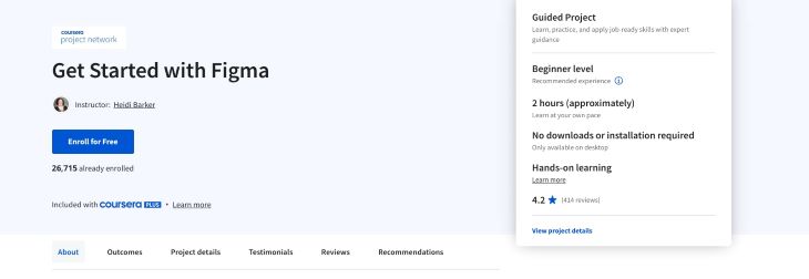
During Coursera’s two-hour, beginner-level “Get Started with Figma” course, course attendees are guided through the main features of Figma by design industry professionals, completing tasks as they go. Students learn how to add pages to a frame, create plans for team collaboration, share designs between colleagues, and get to know the different access levels a user can grant other users in the tool.
The skills students hone during the session are particularly wide-ranging considering its relatively short time span, and include UI design (user interface design), web design, design patterns, and design thinking. With a shareable certificate upon course completion, training from design industry experts, and assignments provided which are directly related to real-world tasks, students have the opportunity to build both their confidence and tangible skills during this short but in-depth Figma training session.
Pros
Cons
Duration:
Price:

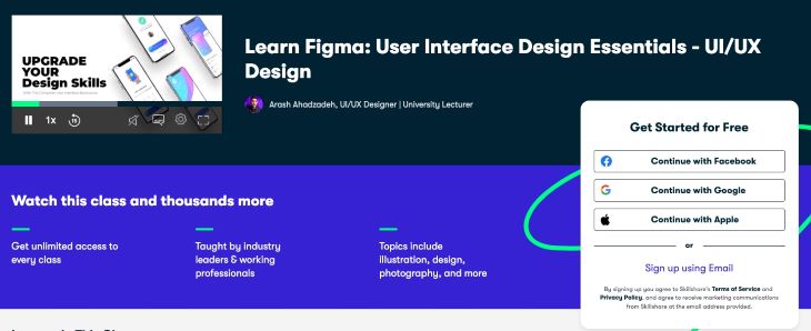
Designed with complete beginners in mind, Skillshare’s “Learn Figma: User Interface Design Essentials – UI/UX Design” begins by walking students through the central functions of the tool, such as design basics, UI elements, and typography. Once the groundwork is laid, students move onto a real world project; wireframing, designing, and prototyping a mobile application and landing page for a finance app.
In addition to learning how best to use Figma, students are also encouraged to explore other tools during the course — for example, Adobe Photoshop, Vectary, Dribbble, and Behance.
Skillshare also introduces InVision Studio to course participants as they learn about microinteractions; small moments in a user’s journey which make the experience more enjoyable. Finally, course instructors discuss the theory behind layout, iconography, typography, color contrast, composition, and spacing, which students can then apply to their own designs and projects in Figma.
By the end of this ten-hour course, students can expect to have expert-level knowledge and skills in both Figma and a range of other UX and UI tools and processes.
Pros:
Cons:
Duration:
Price:

Want to learn the ins and outs of Figma? Well, why not go straight to the source itself?
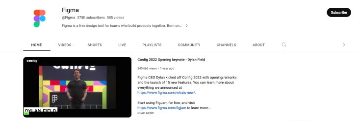
Figma has created its own YouTube channel of inspirational and instructional video content that’s completely free of charge. Its content caters to budding and more experienced designers and provides short tutorials as well as longer-style lessons covering a range of subjects related to both Figma and design in general.
The content of Figma’s YouTube channel is categorized by playlist, with subjects including “Figma for Beginners” and “Build Your First Plugin.” However, alongside the playlists are also individual lessons covering one-off topics, such as gradients, creating styles, color picker, and constraints. (Don’t forget to check out the Tips section for quick videos showcasing lesser known shortcuts and handy tricks.)
The main advantage to using Figma’s own video tutorials is that they’re straightforward and easy to follow, irrespective of the experience you bring to the table. Also, as creators of the product, they have the best hints and tips to help you achieve your goal.
For those starting out, we’d suggest taking the courses in the following order:
Pros:
Cons:
Duration:
Price:

Being a thriving online learning marketplace, Udemy boasts hundreds of Figma courses. However, knowing which one to choose can take some research. “Learn Figma” by Caleb Kingston is a particularly popular choice with students and one we’ve added to our list due to its accessibility and simplicity of approach that makes it easy for aspiring designers to follow.
During the course, Kingston covers all the basic elements of Figma, in addition to elaborating on design processes and special features of the tool.
Well known for his work as both a UX professional and founder of App Design Tips, Kingston provides students with 3.5 hours of compelling video content during the course, teaching students how to use Figma to build a “beautiful and engaging mobile app.”
The skills which students learn include how to design websites, mobile apps, and desktop apps; how to manage real-time team collaboration; and where to find the tools they need within the app.
The last stage of the course puts these skills into practice with students working on designing and prototyping a fully interactive app. In addition to his video content, Kingston offers Figma enthusiasts further resources and articles, covering topics such as UI design and mobile app design.
The course encourages a learning-by-doing philosophy that is perfect for both total beginners and those with backgrounds in graphic or web design who are hoping to upskill or move into UI or UX careers.
Finally, all students receive a certificate that they can share with employers, potential employers and clients upon completion of the course.
Pros:
Cons:
Duration:
Price:

Created by digital product designer and founding designer at Maven Michael “Ridd” Riddering, Figma Academy — now part of Dive — is a comprehensive masterclass course on everything Figma.
Although parts of the course are accessible to beginners, most of the content is clearly aimed at those with more experience in the field, with the goal being to learn how to use Figma to its maximum potential, rather than simply learning the basics. Students are taught advanced techniques in design, strategies to use in responsive design, development team collaboration skills, how to leverage component properties, efficiency in design, and creating a design language.
In addition to teaching students how to utilize Figma for best results, students are also taught tangible design skills, mental models, and techniques that will enhance their portfolios and assist those looking to move up to the next level in their careers. Additionally, course modules are paired with matching Figma resources to provide a rounded and comprehensive learning experience.
Pros:
Cons:
Duration:
Price:

A video course for total newbies to Figma, “Learning Figma” by former Udacity course designer, Georgia Davis, covers everything you need to know when you’re first getting acquainted with the design tool. Students learn how to interact with the basic features of the software, the essentials of brainstorming and wireframing, how to use advanced features such as components and autolayout, and finally, the skills needed to create prototypes and animations.
The videos cover all the essential features of Figma, from getting started to planning and wireframing. Handoffs to engineers are also covered, as are some of the more advanced layout tools available within the software. Unlike other courses, this one really keeps the teaching within the remit of what the tool can and can’t do and doesn’t branch out into UI or UX design theory in general, which users who want to learn more about design may find limiting.
Pros:
Cons:
Duration:
Price:

Not strictly a course, Figmaster is a workbook plugin which has been made specifically to assist designers seeking to make the most out of the software. Describing itself as “The world’s first design systems workbook for Figma” and utilizing a learning-by-doing approach, the plugin is the perfect addition to the Figma app for designers who want to upgrade their skills, learn how to create design systems and components from scratch, and get to grips with more advanced design subjects such as typography and grid layouts.
The workbook is split into separate modules which address different elements of working with Figma, with the ultimate goal being to create and manage your own unique design system. Module topics include: style guide, components, and documentation, with students encouraged to put their acquired knowledge into practice as they go.
Pros:
Cons:
Duration:
Price:
We hope our rundown of the best Figma courses has helped guide you towards the course that best suits your needs, level of experience, and career aspirations.
When looking for a course or training program, be clear what your goals are from the outset. For example, do you want to simply learn the basics, get to grips with a specific feature, or get to a more advanced level generally with the tool? Once you’ve established your primary objective or objectives, you’ll need to consider your budget, the amount of time you can commit to learning, and how flexible you’re willing to be in terms of how and when you learn.
Do you prefer video content over workbooks, or do you enjoy learning in an interactive setting? Would you like to have resources which support your learning at hand, and will you expect to have lifelong access to these resources? How important is mentorship or a student community to you?
Being clear with yourself about your expectations, constraints, and preferences ahead of time will help you narrow down the best course of action for you and give you a greater chance of success when you do start your chosen course.
Header image source: IconScout
LogRocket lets you replay users' product experiences to visualize struggle, see issues affecting adoption, and combine qualitative and quantitative data so you can create amazing digital experiences.
See how design choices, interactions, and issues affect your users — get a demo of LogRocket today.

Dive into the world of mobile UX design and explore the best practices, common challenges, and examples of apps that are doing it right.

Clickable text seems simple, right? Until a button blends into the background or a ghost link disappears on hover. Let’s fix those clickability fails.

Neon lights, chunky buttons, and pixel-perfect nostalgia — retro-futurism in UX is more than a vibe. It’s a strategy. And here’s how to use it.

No designer works in a vacuum. If you want your ideas to land, you need facilitation skills. Let’s talk about what that really means.