Hey there! Welcome to the exciting world of UI design! We’ll be exploring the 60-30-10 rule, which plays a significant role in achieving a balanced color palette.

In this article, we’ll delve into the details of this rule and how you can apply it in your designs, considering color psychology as well, to make things more relatable.
I’ll also share some real-life examples that use the 60-30-10 rule in action. Get ready for an insightful journey into the world of color in UI design!
In the passionate world of UI design, the 60-30-10 rule is a guiding light, a principle that brings order to the chaos of color:
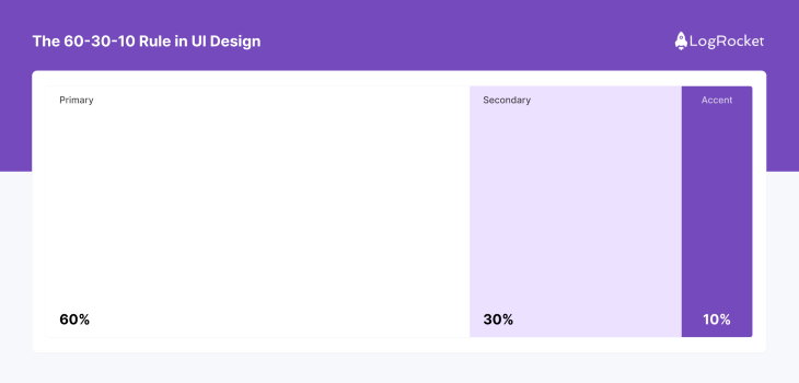
This rule, simple yet profound, divides color usage into three distinct categories:
It is a calculated approach to create a sense of harmony and visual comfort in the design, but the 60-30-10 rule is more than just a formula for aesthetic appeal. It serves a functional purpose, guiding the user’s eye through the interface, highlighting important elements, and creating a visual hierarchy. This intuitive navigation is what makes an interface not just usable, but enjoyable.
The impact of this rule extends beyond the individual user. It influences the overall user experience, affecting user engagement, satisfaction, and ultimately, the success of the design.
In the competitive area of UI design, mastering the 60-30-10 rule is not just an option, it’s a necessity. It’s the key to creating designs that are not only visually pleasing but also user friendly and effective.
Color psychology plays a pivotal role in UI design, wielding the power to evoke emotions, shape perceptions, and guide behaviors:

Each color carries its own psychological value, influencing how users interact with an interface. For instance, red often signifies urgency or importance, while blue exudes trust and stability.
Understanding these emotional and psychological associations is crucial in UI design. Designers leverage color psychology to create desired user responses.
A well-chosen color palette can guide users’ attention, prompt actions, and even influence their overall experience.
Thus, color psychology is not just a design consideration — it’s a strategic tool for designing effective and engaging user interfaces.
Applying the 60-30-10 rule in UI design is a strategic process that ensures balanced and visually appealing interfaces. Here’s a step-by-step guide:
This color sets the overall tone of your design. It should be a neutral or low-saturated color that doesn’t overpower the rest of the design. This color typically covers large areas like the background.
This color should complement the dominant color. It’s used in smaller areas, like sidebars or secondary sections, to create contrast and interest.
This color should be the most vibrant, and used sparingly for call-to-action buttons or key elements you want to highlight.
Remember, the 60-30-10 rule is a guideline, not a hard rule. Feel free to adjust the percentages slightly to suit your design.

The key is to maintain a balanced color hierarchy that guides the user’s eye through the interface.
Many UI design styles can benefit greatly from the 60-30-10 rule when it’s adapted appropriately. Here we are going to talk about adapting this rule for some of the most popular UI design styles.
Neobrutalism design style is characterized by raw, rough aesthetics, and is often accompanied by bold typographies and harsh contrasting color combinations.
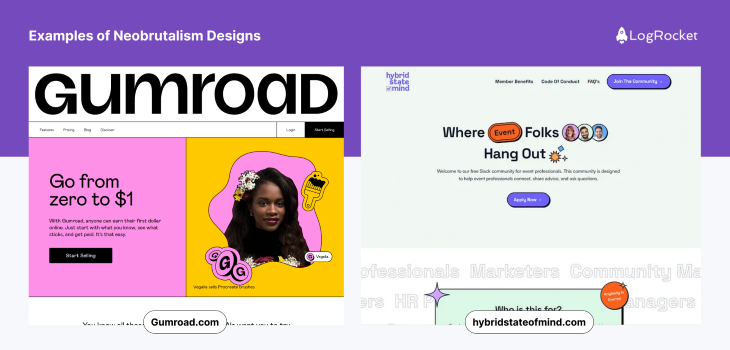
In this style, it’s common to see cards, buttons, and other components outlined with heavy black borders which act as the accent color (10 percent).
The main backdrop of the design is the dominant color (60 percent) and the components have the secondary color (30 percent) that is always in high contrast with the dominant color, which provides the design with a sense of rawness.
Neumorphism is known for its soft, realistic, and minimalistic appearance and it can be enhanced with the application of the 60-30-10 rule:
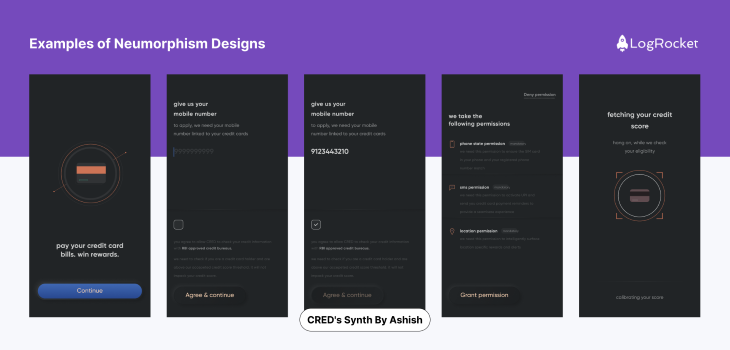
The dominant color (60 percent) in neumorphism forms the background and sets the mood for the design. Typically, it’s a soft and neutral hue. Then the secondary color (30 percent) complements the dominant color providing a subtle contrast that enhances the depth and realism of the design. This is mainly applied to elements like cards, panels, or other significant UI components.
Lastly, the accent color (10 percent) plays a small yet crucial role in drawing the attention of the user towards the small interactive elements or key actions such as buttons or icons; it is used in various ways like subtle shadows and highlights.
It’s a layout structure that divides a webpage or screen into columns to organize its contents.
In the context of a column grid system, the main content typically occupies the central and the largest portion of the layout. The primary content such as important text, images, and critical information, is displayed here:
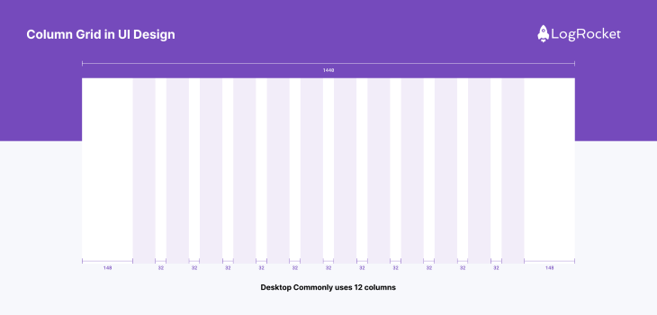
The secondary content area which includes sidebars, provides supplementary information, navigation menus, links, or options for users. This can occupy up to 30 percent of the available horizontal space in your column grid. The remaining 10 percent is allocated to whitespace or padding.
This acts as a buffer between the main and secondary content areas, providing visual separation and a clean look while also improving readability and user experience.
The 60-30-10 rule commonly used in design can be effectively applied within a hierarchical grid system. This system is a structured layout that arranges content elements in a hierarchical manner emphasizing their importance and relationships:

In a hierarchical grid system, the primary content area where the most crucial information is displayed is allocated approximately 60 percent of the available space. It typically contains the core message, primary imagery, or central piece of information.
The secondary content area complements the primary content by providing support information or additional context. It’s dedicated around 30 percent of the space, this may include sidebars, related articles, or secondary images.
The tertiary content area makes up roughly 10 percent of the layout and contains some supporting information or elements that enhance the overall experience of the user. It includes elements like navigation menus, related links, or buttons.
Maintaining color harmony while accommodating different brand identities and design languages requires a thoughtful and flexible approach. The 60-30-10 rule can serve as a great guideline for achieving visual balance and consistency across brand identities and design styles. Here’s a quick rundown of how to apply this rule effectively:
Start by deciding on a universal color palette that forms the foundation of your design system. This palette should ideally consist of neutral and versatile colors that can harmonize with different brand identities and design aesthetics.
The 60 percent portion of your design can integrate these universal colors as their primary background or base.
The 30 percent portion of your design should be used to incorporate secondary colors that align with the particular brand identity you’re working with.
These secondary colors should be chosen to contrast and complement the universal palette while adding a unique touch that represents the brand. It’s also important to consider the emotional and psychological associations of these colors to ensure they resonate with the brand’s values and message.
The final 10 percent is dedicated to brand-specific accents or highlights. This small portion includes unique brand colors or quirky design elements that are distinctive to each identity
Documenting your design decisions and creating detailed design guidelines or a style guide that outlines how the 60-30-10 rule should be applied across all the assets is a very important part of making your design process streamlined and consistent.
This guide should include details on color usage, typography, and layout to ensure consistency in future designs for the brand.
The 60-30-10 rule is not just a theoretical concept; it’s a practical tool widely used in successful UI designs. Let’s explore some real-world examples:
Google’s Material Design is a prime example of the 60-30-10 rule. The dominant color is white (60 percent), used in the background. The secondary color is light gray (30 percent), used in elements like the search bar. The accent color is a bright blue (10 percent), used for buttons and links.

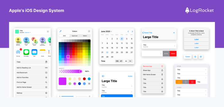
Apple’s iOS interface also follows the 60-30-10 rule. The dominant color is white (60 percent), the secondary color is light gray (30 percent), and the accent colors are vibrant hues like blue and green (10 percent).
Spotify’s interface showcases a darker theme. The dominant color is black (60 percent), the secondary color is a darker shade of gray (30 percent), and the accent color is vibrant green (10 percent).

In each of these examples, the 60-30-10 rule helps create a visually balanced and intuitive interface.
The dominant color provides a clean canvas, the secondary color adds depth, and the accent color draws attention to key elements. This strategic use of color enhances usability and user experience.
In conclusion, the 60-30-10 rule is a strategic tool in UI design, ensuring balanced color schemes. It aids in creating a visual hierarchy, enhancing user experience.
Color psychology plays a key role in influencing user emotions and behaviors. Real-world examples illustrate its effective application.
Designers are encouraged to use this rule as a foundation while experimenting to suit unique design needs. The goal is to create visually pleasing, user-friendly interfaces. Thank you for reading.
LogRocket's Galileo AI watches sessions and understands user feedback for you, automating the most time-intensive parts of your job and giving you more time to focus on great design.
See how design choices, interactions, and issues affect your users — get a demo of LogRocket today.

As products evolve into ecosystems, navigation becomes a system-level challenge. This article explores how to align structure, context, and user journeys to create seamless movement across tools without confusion.

Figma’s AI features have exploded in 2026 — from text generation and image editing to full UI drafts and code handoff. But speed isn’t the same as quality. This guide breaks down every major feature, what it’s good at, and where human judgment still does the heavy lifting.

Zero UI works well for screenless, voice-first experiences, but most digital products still require visual interaction. Here’s why multimodal UX offers a more scalable foundation for the future of design.

Multimodal UX goes beyond designing for screens. Learn how context-aware systems, progressive modality, failover modes, and accessibility-first design create better digital product experiences.