Editor’s note: This article was last updated on 27 April 2022 to reflect changes to class-based components used in the tutorial.

A gradient is a design technique that blends more than one color together in a smooth transition. For example, think of the Instagram logo. Gradients can come in handy when you want to create multi-color backgrounds or custom buttons, adding visual interest to your UI and guiding user attention.
In this article, we’ll explore horizontal, vertical, and diagonal linear gradients, learning how to add them to our React Native apps. To follow along, you‘ll need a basic understanding of React Native. You’ll also need React Native set up on your development machine. Let’s get started!
locationsIn this tutorial, we’ll use react-native-linear-gradient, a library for adding gradients into our application. First, let’s set up a new React Native project:
npx react-native init LinearGradientExample

cd LinearGradientExample
yarn start
Then, we’ll run our app to display the React Native welcome screen on a device or simulator. With our React Native app running, we can add react-native-linear-gradient. The setup for react-native-linear-gradient varies depending on which React Native version you’re on. In this tutorial, I’m using v0.6+. If you’re working on an older version of React Native, check out the setup:
yarn add react-native-linear-gradient
To finish up the setup for iOS specifically, install pods:
npx pod-install
We’ll begin by importing the LinearGradient component from the library:
import LinearGradient from 'react-native-linear-gradient'
The LinearGradient component takes in a few props that determine how the gradient will be displayed, including colors, where it starts, and where it ends. Before we can start using the props to build complex gradients, we should break down and review each one.
colorscolors, which is required, is how we pass the colors we want to display. Colors can be passed in different formats, like name, rgba, hex, etc. You should order the colors in the order you want to display them. For example, with colors={["purple","white"]}, the gradient will move from purple to white.
startstart indicates where the gradient will start by passing coordinates to the x and y-axis. The coordinates are passed as a fraction of the whole view with values ranging from 0 – 1. The default is { x: 0.5, y: 0 }, starting from the top center.
endend is similar to start, but it indicates where the gradient finishes. It takes in coordinates just like start, which, as mentioned earlier, is a fraction of the whole view. The default is { x: 0.5, y: 1 }, ending at the bottom center.
locationslocations are an array of numbers that define where each color will stop in the gradient. These values are also passed as a fraction of the entire gradient from 0 – 1 and have to map the corresponding colors passed in length and position.
For example, let’s say we have colors = {["red","yellow","green"}]. Then, we’ll have locations ={[0, 0.5, 0.6]} with first color red covering 0 – 0.5, the second color yellow going from 0.5 – 0.6, and finally, green from 0.6 – 1.
Now that we understand the fundamentals, let’s build a few different types of gradients.
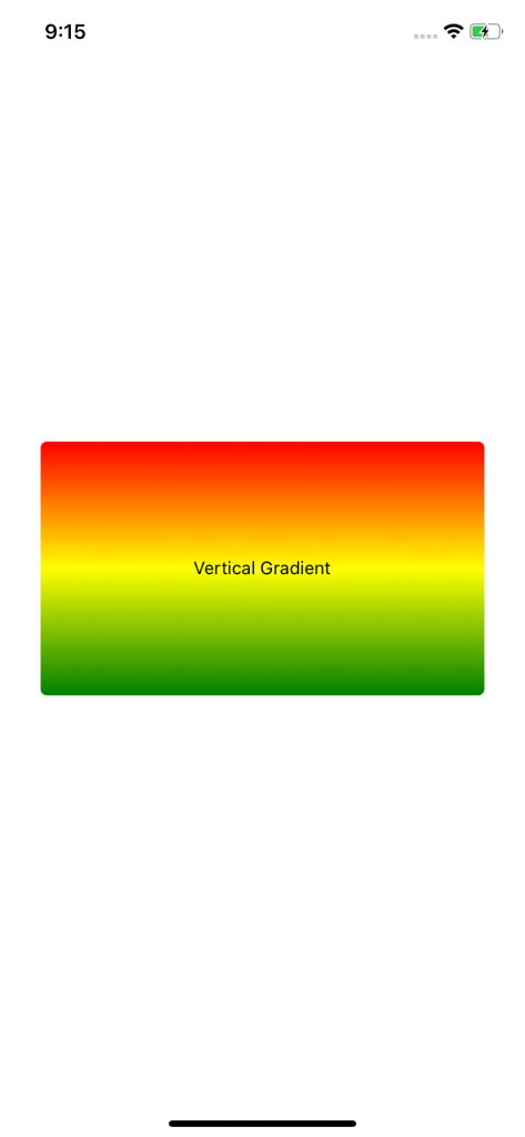
As mentioned earlier, you can create gradients with different orientations. Let’s try a vertical gradient first, which is the default for react-native-linear-gradient. The gradient starts from the top center, going all the way down to bottom center. Let’s try it out!
First, clear everything in App.js so you can start from the ground up. Add the following code:
import React from 'react'
import { StyleSheet, View, Text } from 'react-native'
import LinearGradient from 'react-native-linear-gradient'. // import LinearGradient

function App() {
    return (
      <View style={styles.container}>
        <LinearGradient
          colors={['red', 'yellow', 'green' ]}
          style={styles.linearGradient}
        >
          <Text>Vertical Gradient</Text>
        </LinearGradient>
      </View>
    )
}

const styles = StyleSheet.create({
  container: {
    flex: 1,
    alignItems: 'center',
    justifyContent: 'center',
  },
  linearGradient: {
    alignItems: 'center',
    justifyContent: 'center',
    borderRadius: 5,
    height: 200,
    width: 350,
  },
})
export default App
Starting from the imports at the top, we import React from React, a few components from React Native, then add the import for LinearGradient.
Next, we add a View with styling to position everything at the center where we’ll add our gradient. In the LinearGradient component, we pass colors, which is the required prop, as mentioned earlier. We are adding three colors; our gradient will move from red to yellow and finally green. By default, the gradient will move from the top center to the bottom center.
Reload the app, and you should see the gradient:
Nice, our gradient is showing up as expected. To better understand the props we talked about earlier, let’s play around a little bit with the gradient we currently have.
As mentioned, the default properties for start are start={{ x: 0.5, y: 0 }}, which means the gradient will start from the top center. But what exactly do we mean by top center?
Imagine the entire width of the gradient, i.e., the x-axis is calibrated from 0 – 1. The center should be 0.5, as shown below. Altering that value should shift the top point that our gradient starts from, creating a diagonal gradient. Let’s update our current LinearGradient to add values for start, as shown below:
...
      <LinearGradient
        colors={['red', 'yellow', 'green' ]}
        style={styles.linearGradient}
        start={{ x: 0.7, y: 0 }}
      >
        <Text>Diagonal Gradient</Text>
      </LinearGradient>
...
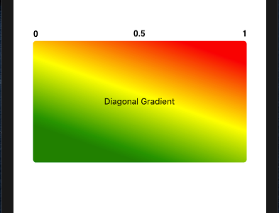
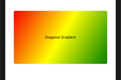
As you can see in the screenshot above, the gradient becomes diagonal, starting somewhere between 0.5 and 1 moving downwards. If you have the value as either 0 or 1, the diagonal gradient will start at the respective corners, right or left.
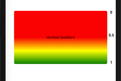
Adjusting the y-axis value will determine where the gradient will start. The space before the gradient will be covered by the first color. Updating the props to start={{ x: 0.5, y: 0.5}} will make the gradient start at the center of our view with the top half covered by red:
Now that we understand how to update our starting point on both the x and y-axis, let’s combine that with the end property to create horizontal gradients.
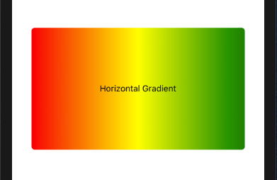
As discussed earlier, end determines where our gradient will end. For a horizontal gradient, ideally, we’d want it to start at the left center and end at the right center. Let’s try that out:
...
      <LinearGradient
        colors={['red', 'yellow', 'green' ]}
        style={styles.linearGradient}
        start={{ x: 0, y: 0.5 }}
        end={{ x: 1, y: 0.5 }}
      >
        <Text>Horizontal Gradient</Text>
      </LinearGradient>
...
As you can see, the y-axis is maintained from start to end, whereas the x-axis moves from 0 – 1, creating the following gradient:
We can further adjust this to create a diagonal gradient close to the horizontal alignment. Updating start={{ x: 0, y: 0 }} and end={{ x: 1, y: 1 }} should create a gradient like this:
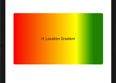
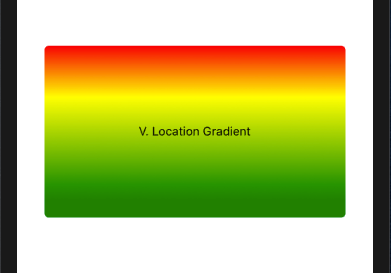
locationsWith most of the other props put into use, we only have the locations prop pending that we haven’t utilized yet. As a quick recap, locations determines where a color will stop in the gradient and map up to the corresponding color values.
Locations is used mostly when you want one or more colors to cover more space in the gradient view in comparison to the others. The color with the larger range will cover more space:
...
      <LinearGradient
        colors={['red', 'yellow', 'green' ]}
        style={styles.linearGradient}
        start={{ x: 0, y: 0.5 }}
        end={{ x: 1, y: 0.5 }}
        locations={[0, 0.7, 0.9]}
      >
        <Text>H. Location Gradient</Text>
      </LinearGradient>
      <LinearGradient
        colors={['red', 'yellow', 'green' ]}
        style={styles.linearGradient}
        locations={[0, 0.3, 0.9]}
      >
        <Text>V. Location Gradient</Text>
      </LinearGradient>
...
Let’s see that in action:
Feel free to play around with the colors, change them, add more, and adjust the values for start, end, and locations and see how they behave.
In this section, we’ll review a few use cases for LinearGradients covered above:
For these examples, let’s start fresh! Create a new file called Home.js and update index.js to point to it as the root file:
// index.js
...
// import App from './App'  // comment this out
import App from './Home'  // add this
...
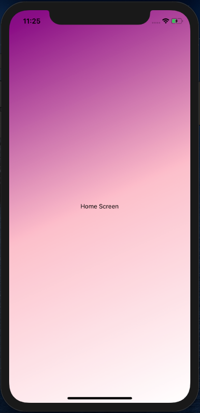
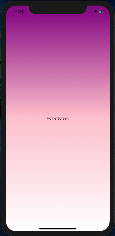
Now, our app should render the Home screen, so we can make the updates there. Then, let’s jump to the new Home.js file and create a few things, for one, the full-screen, multi-color background:
// Home.js
import React from 'react'
import { StyleSheet, Text } from 'react-native'
import LinearGradient from 'react-native-linear-gradient'
function Home() {
    return (
      <LinearGradient
        colors={['purple', 'white']}
        style={styles.container}
        start={{ x: 0, y: 0 }}
        end={{ x: 1, y: 1 }}
      >
        <Text>Home Screen</Text>
      </LinearGradient>
    )
}
const styles = StyleSheet.create({
  container: {
    flex: 1,
    alignItems: 'center',
    justifyContent: 'center',
  },
})
export default Home
You can choose whether or not to have the start and end props to create a vertical or diagonal background:
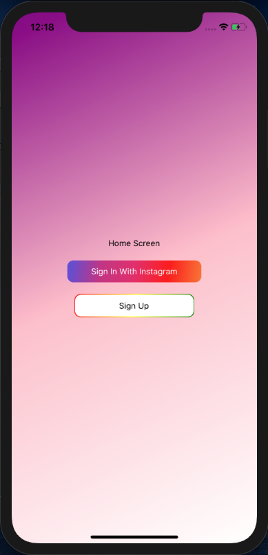
Finally, for our two buttons, let’s jump back to Home.js just below the home screen text and add the two buttons. I’ve used horizontal backgrounds for both. The first one, gradient background, tries to mimic the Instagram color scheme, whereas the other one created a border gradient effect:
// Home.js

...
      <Text>Home Screen</Text>
      <TouchableOpacity onPress={() => {}}>
        <LinearGradient
          start={{ x: 0, y: 0 }}
          end={{x: 1, y: 1 }}
          colors={['#5851DB', '#C13584', '#E1306C', '#FD1D1D', '#F77737']}
          style={styles.instagramButton}
          >
          <Text style={{ color: 'white' }}>
            Sign In With Instagram
          </Text>
        </LinearGradient>
      </TouchableOpacity>
      <LinearGradient
        start={{ x: 0, y: 0 }}
        end={{x: 1, y: 1 }}
        colors={[ 'red', 'yellow', 'green' ]}
        style={{
          alignItems: 'center',
          justifyContent: 'center',
          borderRadius: 10,
        }}
      >
        <TouchableOpacity
          onPress={() => {}}
          style={styles.signUpButton}
        >
          <Text>Sign Up</Text>
        </TouchableOpacity>
      </LinearGradient>

...

// styles
  instagramButton: {
    paddingHorizontal: 40,
    paddingVertical: 10,
    borderRadius: 10,
    margin: 20
  },
  signUpButton: {
    margin: 1,
    width: 200,
    borderRadius: 10,
    paddingVertical: 10,
    alignItems: 'center',
    justifyContent: 'center',
    backgroundColor: 'white',
  },
The code above should give us a final output, as seen below:
As always, practice makes perfect, so play around with the different props until you have a hang of it. As a word of caution, when it comes to colors, try not to overdo them. Having too many colors on your screen can adversely affect the user interface and experience. I hope you enjoyed this article. Happy coding!

LogRocket's Galileo AI watches sessions for you and and surfaces the technical and usability issues holding back your React Native apps.
LogRocket also helps you increase conversion rates and product usage by showing you exactly how users are interacting with your app. LogRocket's product analytics features surface the reasons why users don't complete a particular flow or don't adopt a new feature.
Start proactively monitoring your React Native apps — try LogRocket for free.

Learn how to protect full-stack projects from NPM supply chain attacks with a practical security checklist.

Explore 15 essential MCP servers for web developers to enhance AI workflows with tools, data, and automation.

Learn how contrast-color() automatically picks accessible text colors using native CSS, without JavaScript.

Learn how to build a harness-style AI workflow using Claude Code with specialized Dev, QE, and Ops subagents, gated handoffs, MCP telemetry, and LEARNING.md.
Hey there, want to help make our blog better?
Join LogRocket’s Content Advisory Board. You’ll help inform the type of content we create and get access to exclusive meetups, social accreditation, and swag.
Sign up now

 Learn more →
