To err is human. We all make mistakes,and when it comes to digital design, users likely face error conditions when they interact with your product. But how the system handles those conditions have a tremendous impact on the experience that users will have.

In this article, we will review practical tips that will help you design error states for websites.
Every error, regardless of the root cause, becomes a point of friction for your visitors. It blocks them from moving forward towards their goal. The visitor has to stop and invest time and effort into solving a problem they face. Experienced designers know that preventing errors is always better than curing them. That’s why the best error message is the one that never shows up.
Analyze how users interact with your website and identify where they might face errors. It’s recommended to start with high-level analysis — analyze user flows to identify areas where users might face troubles.
Typically, errors appear when users do incompatible operations (such as provide invalid data input) or due to technical problems (various network problems). For example, it’s usually hard to correctly fill out a long form without errors on the first attempt. You should take these cases into account to minimize the chance of errors.
It’s also essential to collect information about real user behavior (how users interact with your product). Use both in-person observation and analytics for that:
Clarity is a top priority in digital design. Instructions that you provide to your users should help them understand what they need to do in each given moment of time. Instructions are especially important during the first-time experience because when users only learn how to use a product they might face a lot of problems.
When writing instructions, you should always avoid jargon. Get rid of technical terms, and express everything in the user’s vocabulary. And always test your instructions with your users. Conduct a series of usability tests with your target audience to ensure that users understand what they need to do in each given situation.
Jakob Nielsen calls Undo/Redo operations “emergency exits.” This feature lets users leave an unwanted state without any impact to their data and gives users a freedom of exploration. Users are more willing to explore when they know that they are safe. Always support the keyboard shortcuts Ctrl + Z and Ctrl + Y for common operations.
Here are some techniques that can help you avoid error conditions.
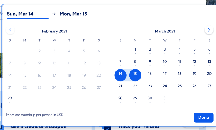
It’s possible to prevent users from making errors in the first place by utilizing constraints. Do not allow users to type or select something that is not valid. For example, when you design a flight booking form, you shouldn’t allow users to select dates from the past because it doesn’t make much sense.
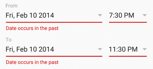
Use a date picker that allows users to only choose today’s date or dates in the future. This constraint will make users pick a date range that fits.
Good defaults minimize interaction cost (user effort required to provide data). For example, instead of making the user provide information about her/his address, it’s possible to pre-select some fields based on a user’s geolocation data.

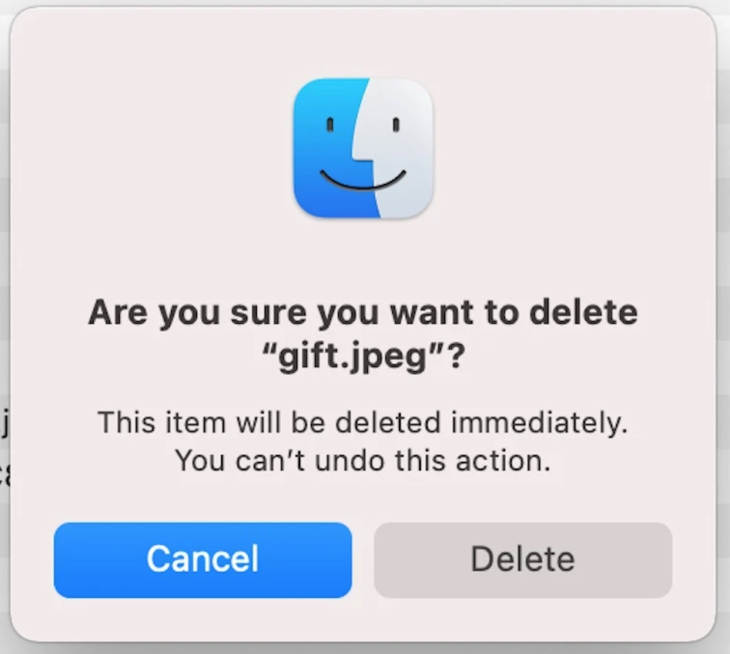
It’s always a good idea for any irreversible operations to show a confirmation dialog such as “Are you sure you want to do it?” This extra friction will make the user stop and think about what they’re doing. It also prevents users from triggering some action by accident.
Side note: You might argue that design should always support Undo operations. It’s true, but sometimes it’s impossible to introduce the Undo feature due to business logic limitations or the nature of operation.

When errors do arise, well-designed error handling prevents users from feeling ignorant. Here are some techniques that you can use when things go wrong:
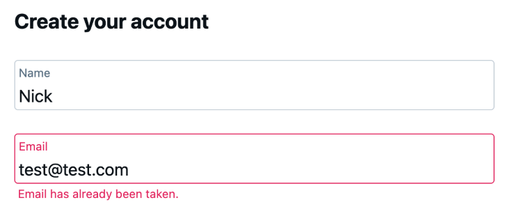
How do you make it easy for the user to recover from form errors? The answer is to write proper error messages.
Do not write:
Make your error message easy-to-understand and helpful:
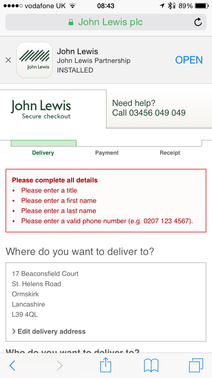
Imagine you go through filling out a long form, and when you click Submit, you see a long list of error messages at the top of the form. Not cool, right?
User input should be validated right after the user provides it. A technique called inline validation will help you with that. The user doesn’t need to click/tap the Submit button to see what’s wrong.
In his article “Inline validation in forms — designing the experience,” Mihael Konjević compares benefits and downsides of various inline validation strategies and proposes a validation strategy which he calls “reward early, punish late.”
Apps that follow this approach inform the users about incorrect input in the context of operation (right after the user stops typing and moves to the next input section).
Proximity is another important element of data validation. Place the error message next to the field to help users comprehend the status.
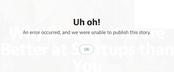
Well-crafted error handling can turn a moment of failure into a moment of delight. Humor is the spice of life and it’s easy to humanize error states by pairing nice visuals with a funny copy.
At the same time, you need to remember that humor is contextual. A joke that can be funny in one context can be terrible in another. Imagine a situation when you work hard on a very important document for a few hours and finally decide to save it. When you click the Save button, the system “rewards” you with an error message “Uh-oh, we were unable to save it. Sorry!” Such a message is entirely inappropriate.
The best error message is the one that never shows up. Yet, when we design for error-prone conditions, our goal is to prevent users from having stress and make interaction with a product as enjoyable as possible.
Install LogRocket via npm or script tag. LogRocket.init() must be called client-side, not
server-side
$ npm i --save logrocket

// Code:

import LogRocket from 'logrocket';
LogRocket.init('app/id');
// Add to your HTML:

<script src="https://cdn.lr-ingest.com/LogRocket.min.js"></script>
<script>window.LogRocket && window.LogRocket.init('app/id');</script>
Hey there, want to help make our blog better?
Join LogRocket’s Content Advisory Board. You’ll help inform the type of content we create and get access to exclusive meetups, social accreditation, and swag.
Sign up now
Discover how to use Gemini CLI, Google’s new open-source AI agent that brings Gemini directly to your terminal.

This article explores several proven patterns for writing safer, cleaner, and more readable code in React and TypeScript.
A breakdown of the wrapper and container CSS classes, how they’re used in real-world code, and when it makes sense to use one over the other.

This guide walks you through creating a web UI for an AI agent that browses, clicks, and extracts info from websites powered by Stagehand and Gemini.