There’s no question that components are a powerful abstraction for authoring frontend user interfaces (and, it turns out, text-based UIs, application routers, and many other types of interfaces).

But there are many different approaches to authoring components. In this post, we’ll talk about the compound component pattern and when it may be an appropriate choice for component authors.
The Replay is a weekly newsletter for dev and engineering leaders.
Delivered once a week, it's your curated guide to the most important conversations around frontend dev, emerging AI tools, and the state of modern software.
Compound components are groups of individual components that come together to create a cohesive and complex behavior. They work together, sharing state behind the scenes, to offer an intuitive and expressive syntax for the programmer who is using the components. One of the most familiar examples of compound components comes from vanilla HTML:
<select>
  <option value="apples">Apples</option>
  <option value="oranges">Oranges</option>
  <option value="pears">Pears</option>
</select>
In this example, the <select> and <option> elements come together to form a complex input control that is familiar for many users. The <select> maintains its own internal state for which <option> is currently selected by the user and provides advanced behaviors like keyboard input to change the selected <option>.
First, make sure a compound component is the appropriate API design. Like any programming paradigm, compound components come with their fair share of tradeoffs. Generally, any pattern where there is an implicit shared state — or behavior that is “magical” or not easily discoverable — can cause headaches down the road if not designed with utmost care.
Some questions to ask yourself before designing a compound component are:
Carefully consider various APIs for your new component and consult with colleagues on which API they would prefer to consume.
Here are some examples of common UI paradigms that lend well to the compound component pattern:
To implement our example compound components in React, we will be leveraging a number of React APIs, so a foundational knowledge of each will be helpful:
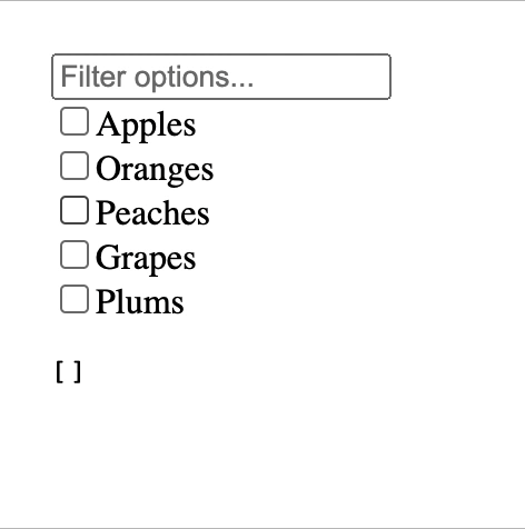
We will build a rough draft of a compound component that allows the user to select multiple options from a list, using a text field to filter the list if desired.
App componentTo create our compound component, we will implement two sub-components:
EnhancedMultiSelect: this will be the outer wrapping component and will have the following roles:
EnhancedMultiSelectOption: this component will express the individual selectable options and will have the following roles:
Finally, we will also implement an App component that uses our compound component, to develop and test its API.
EnhancedMultiSelect
First, we’ll create a context that will be used to share state between the parent and child components.
export const EnhancedMultiSelectContext = createContext();
Next, we’ll implement the signature for our component, which will take three props:
children: the children in the render tree, which will include the selectable options and any other markup required by the UI. We don’t care how deeply nested the options appear or if there are other components in the tree, allowing flexibility in usage for the engineer who is using our componentvalue: a Set of strings representing the selected optionsonChange: a function that we will call with a new Set whenever the selection changesexport default function EnhancedMultiSelect({ children, value, onChange }) {}
Now we’ll implement the body of our component. First, we’ll use a useState hook to keep track of the query the user has typed into the filter text input.
const [filter, setFilter] = useState('');
We’ll next return the components that React will render for us. We’ll first set up a provider for the context we set up earlier and use it to provide a few values that will be used by the options later on:
isSelected function that takes a string key and returns whether or not the given key appears in the selectionsetSelected function that takes a key and adds or removes the key from the selection as indicatedWe’ll also render our filter text input and the components children inside the context provider. Here is the full source code for EnhancedMultiSelect:
import { createContext, useState } from 'react';

export const EnhancedMultiSelectContext = createContext();

export default function EnhancedMultiSelect({ children, value, onChange }) {
  const [filter, setFilter] = useState('');
  return (
    <EnhancedMultiSelectContext.Provider
      value={{
        isSelected: key => value.has(key),
        setSelected: (key, selected) => {
          const newValue = new Set([...value]);
          if (selected) {
            newValue.add(key);
          } else {
            newValue.delete(key);
          }
          onChange(newValue);
        },
        filter,
      }}
    >
      <input
        type="text"
        placeholder="Filter options..."
        value={filter}
        onChange={evt => setFilter(evt.target.value)}
      />
      {children}
    </EnhancedMultiSelectContext.Provider>
  );
}
EnhancedMultiSelectOption
Now we’ll implement the other half of our compound component, which will take two props:
children: for displaying whatever the user of our component would like to render inside the selectable optionvalue: a string for representing this option; if this option is selected, this value will be included in the Set exposed by the parent EnhancedMultiSelect componentexport default function EnhancedMultiSelectOption({ children, value }) {}
The first thing we’ll do in the body of our component is consume the context provided by the parent EnhancedMultiSelect component, using destructuring assignment to pull the context apart for easier usage.
const { isSelected, setSelected, filter } = useContext(
  EnhancedMultiSelectContext,
);
Now that we have the user’s filter query from the context, if it doesn’t match the option’s value, we’ll return null to render nothing:
if (!value.includes(filter)) {
  return null;
}
Finally, we’ll render the checkbox and plug its checked state into our compound component’s selection state, as well as any children the consumer of our component would like to render. Here is the full source code for EnhancedMultiSelectOption:
import { useContext } from 'react';
import { EnhancedMultiSelectContext } from './EnhancedMultiSelect';

export default function EnhancedMultiSelectOption({ children, value }) {
  const { isSelected, setSelected, filter } = useContext(
    EnhancedMultiSelectContext,
  );
  if (!value.includes(filter)) {
    return null;
  }
  return (
    <label style={{ display: 'block' }}>
      <input
        type="checkbox"
        checked={isSelected(value)}
        onChange={evt => setSelected(value, evt.target.checked)}
      />
      {children}
    </label>
  );
}
App
To see how it all works together, we’ll consume our compound component and render it in an entry point App component:
import { useState } from 'react';
import EnhancedMultiSelect from './EnhancedMultiSelect';
import EnhancedMultiSelectOption from './EnhancedMultiSelectOption';

export default function App() {
  const [selection, setSelection] = useState(new Set());
  return (
    <section>
      <EnhancedMultiSelect value={selection} onChange={v => setSelection(v)}>
        <EnhancedMultiSelectOption value="apples">
          Apples
        </EnhancedMultiSelectOption>
        <EnhancedMultiSelectOption value="oranges">
          Oranges
        </EnhancedMultiSelectOption>
        <EnhancedMultiSelectOption value="peaches">
          Peaches
        </EnhancedMultiSelectOption>
        <EnhancedMultiSelectOption value="grapes">
          Grapes
        </EnhancedMultiSelectOption>
        <EnhancedMultiSelectOption value="plums">
          Plums
        </EnhancedMultiSelectOption>
      </EnhancedMultiSelect>
      <pre>
        <code>{JSON.stringify([...selection], null, 2)}</code>
      </pre>
    </section>
  );
}
Let’s build the same simple compound component using the Angular framework.
enhanced-multi-select.component.ts
For the outer component, we’ll set up a simple template that contains a text input with a two-way binding to the filter property. Like in the React example, we’ll create an input for the selection state and an output when the selection state changes. Here’s the full source code:
import { Component, Input, Output, EventEmitter } from '@angular/core';

@Component({
  selector: 'app-enhanced-multi-select',
  template: `
    <input type="text" [(ngModel)]="filter" />
    <ng-content></ng-content>
  `,
})
export class EnhancedMultiSelectComponent {
  @Input()
  value!: Set<string>;

  @Output()
  valueChange = new EventEmitter<Set<string>>();

  filter = '';
}
enhanced-multi-select-option.component.ts
For the option items, we’ll render a label that wraps the checkbox and the content of the component, just like in the React example. We’ll utilize Angular’s dependency injection system to get a reference to the parent EnhancedMultiSelectComponent instance passed via the constructor.
With that reference, we can evaluate and manipulate the state directly and check to see if the option should be visible according to the value of the user-provided filter string. Here is the source code:
import { Component, Input } from '@angular/core';
import { EnhancedMultiSelectComponent } from './enhanced-multi-select.component';

@Component({
  selector: 'app-enhanced-multi-select-option',
  template: `
    <label *ngIf="visible()" style="display: block">
      <input
        type="checkbox"
        [ngModel]="selected()"
        (ngModelChange)="setSelected($event)"
      />
      <ng-content></ng-content>
    </label>
  `,
})
export class EnhancedMultiSelectOptionComponent {
  constructor(private readonly select: EnhancedMultiSelectComponent) {}

  visible() {
    return this.value.includes(this.select.filter);
  }

  selected() {
    return this.select.value.has(this.value);
  }

  setSelected(selected: boolean) {
    if (selected) {
      this.select.value.add(this.value);
    } else {
      this.select.value.delete(this.value);
    }
  }

  @Input()
  value!: string;
}
app.component.ts
Finally, we’ll utilize our compound component and display the formatted JSON selection data for demonstration purposes:
import { Component } from '@angular/core';

@Component({
  selector: 'app-root',
  template: `
    <app-enhanced-multi-select [(value)]="selection">
      <app-enhanced-multi-select-option value="apples">
        Apples
      </app-enhanced-multi-select-option>
      <app-enhanced-multi-select-option value="oranges">
        Oranges
      </app-enhanced-multi-select-option>
      <app-enhanced-multi-select-option value="peaches">
        Peaches
      </app-enhanced-multi-select-option>
      <app-enhanced-multi-select-option value="grapes">
        Grapes
      </app-enhanced-multi-select-option>
      <app-enhanced-multi-select-option value="plums">
        Plums
      </app-enhanced-multi-select-option>
    </app-enhanced-multi-select>
    <pre><code>{{ selectionArray() | json }}</code></pre>
  `,
})
export class AppComponent {
  selection = new Set<string>();

  selectionArray() {
    return [...this.selection];
  }
}
In this post we’ve implemented a filterable multi-select compound component in React, using the Context API, and in Angular, using dependency injection.
Compound components are one option for creating a simple API to compose behavior that is too complex for a single component. There are plenty of alternative patterns, such as “render props” in React, and each pattern’s trade-offs should be carefully considered for a particular use case.
The full source code for running the above examples in a development environment can be found on GitHub.
Install LogRocket via npm or script tag. LogRocket.init() must be called client-side, not
server-side
$ npm i --save logrocket

// Code:

import LogRocket from 'logrocket';
LogRocket.init('app/id');
// Add to your HTML:

<script src="https://cdn.lr-ingest.com/LogRocket.min.js"></script>
<script>window.LogRocket && window.LogRocket.init('app/id');</script>

I had four weeks to build a complete app from scratch using AI tools like OpenCode and Claude Opus: here’s how it went.

Learn how to build a reusable Vue 3 table engine that powers tables, cards, and lists with shared sorting and pagination logic.

Compare the best React chart libraries for 2026, including Recharts, Nivo, visx, Apache ECharts, MUI X Charts, and more.

Claude Code vs. OpenCode in a real Next.js refactor: benchmark results, mistakes, prompts, and when to use each CLI agent.
Would you be interested in joining LogRocket's developer community?
Join LogRocket’s Content Advisory Board. You’ll help inform the type of content we create and get access to exclusive meetups, social accreditation, and swag.
Sign up now

 Learn more →
