React v19.3 made <ViewTransition> stable on 9 September 2026. It lets React coordinate animations through the browser’s View Transition API, giving developers another option for animating changes between UI states.

I wanted to see how much of my animation code it could replace, so I built the same app twice: once with Motion and once with <ViewTransition> and CSS. Each version covers a modal, a sortable grid, directional navigation, and a shared-element transition.
The native build shipped 39,005 fewer bytes of gzipped JavaScript and 437 more bytes of CSS. It also required more animation code, most of it in the stylesheet. Performance was harder to compare, and the measurements below need more context before I can recommend either implementation on speed alone.
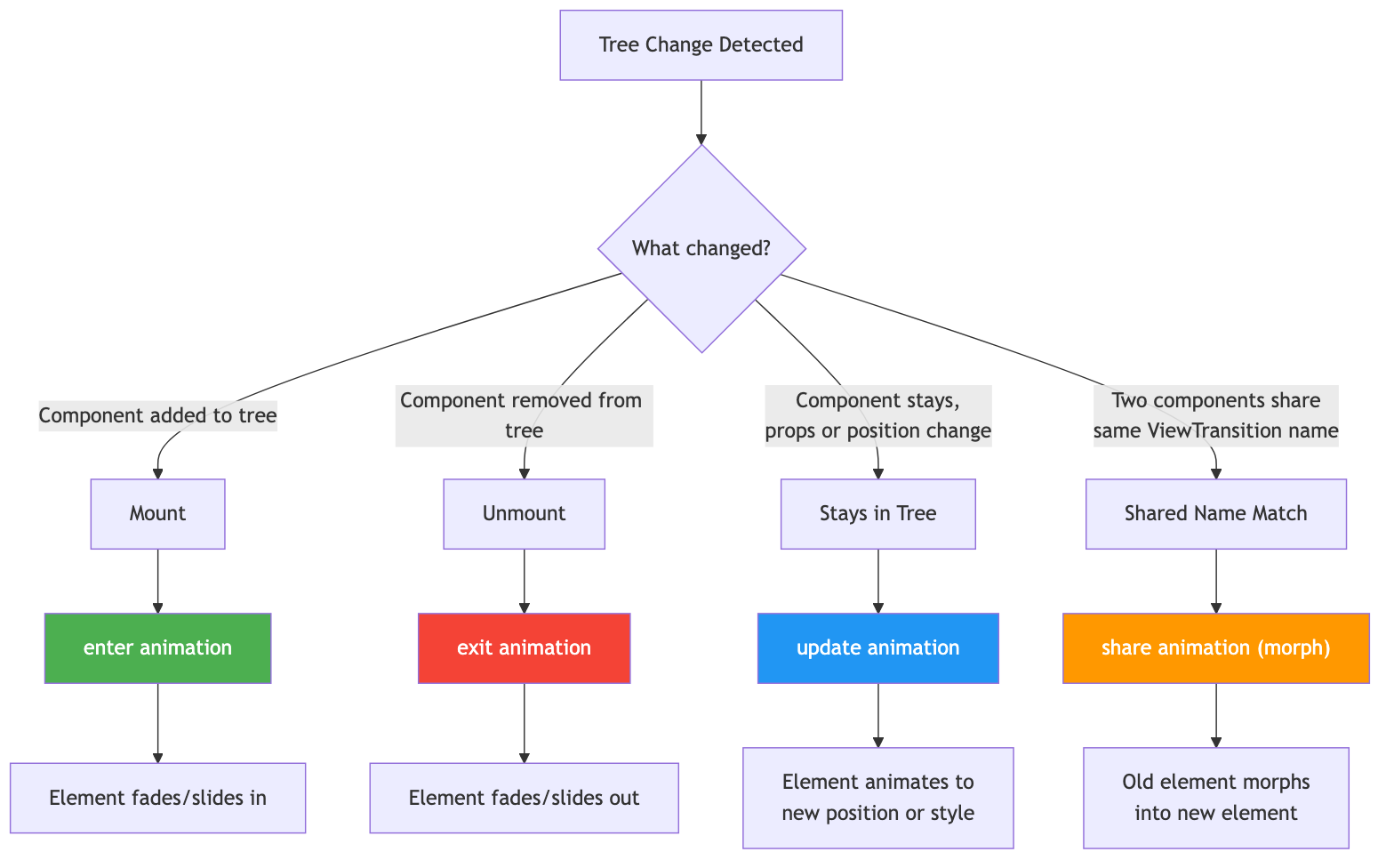
With <ViewTransition>, React coordinates the DOM update and the browser’s animation between states. You can use it for elements entering or leaving the UI, changes in layout, and shared elements moving between views.
That can remove an animation dependency from an app whose needs fit those patterns. You still need to implement the transition styles and check their behavior in the browsers you support.
Both apps use the same shared UI files. A check script compares those files byte for byte, while the animation code lives separately. The dependency lists differ by the addition of Motion.
| Dependency | Version tested |
|---|---|
| React and React DOM | v19.3.0 |
| Motion | v12.12.1 |
| Vite | v6.3.5 |
| React Router | v7.6.1 |
These are the versions used for this comparison. The results apply to these builds and their particular implementations.
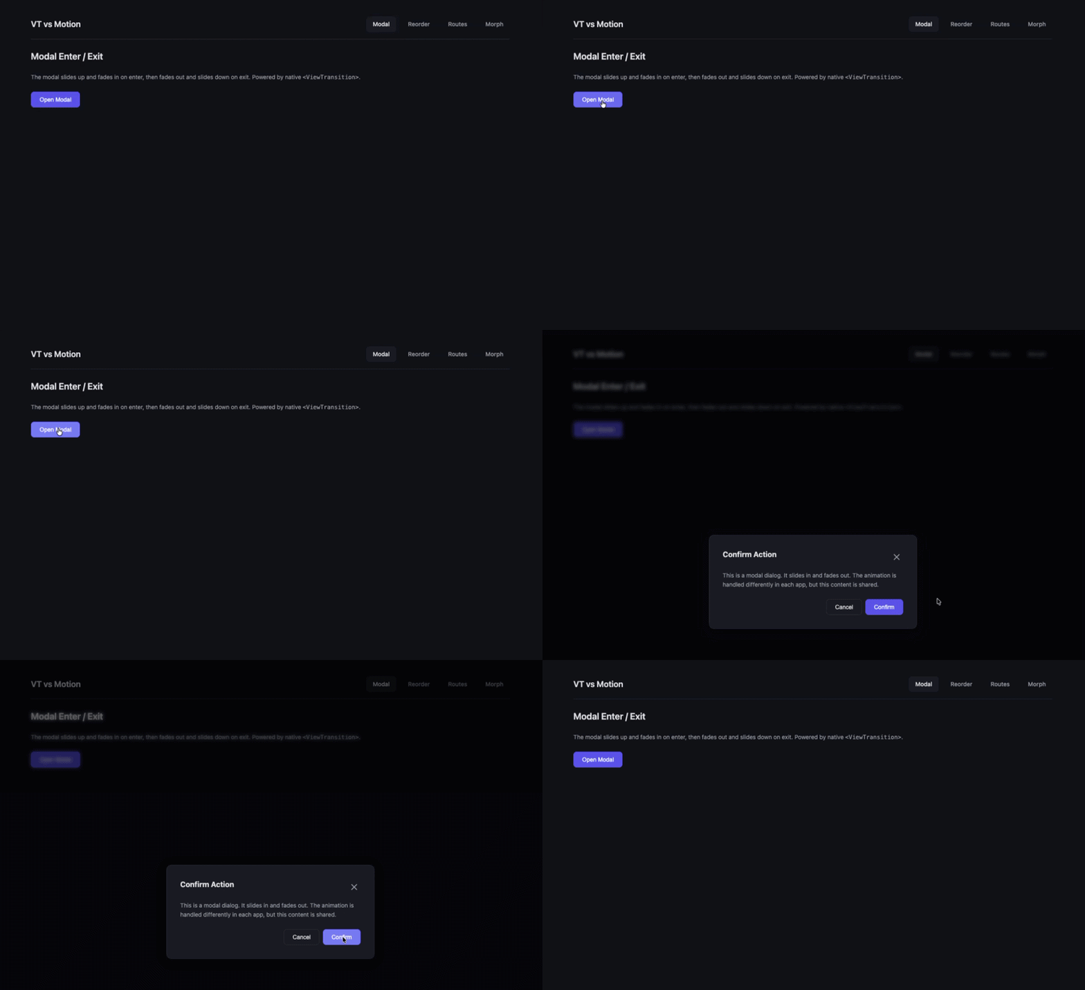
The modal slides up and fades in when opened, then slides down and fades out when closed.
In the native version, the isOpen condition controls whether <ViewTransition> is mounted. This placement triggers the enter and exit styles. The state update runs inside startTransition:
function openModal() {
  startTransition(() => setIsOpen(true));
}

{isOpen && (
  <ViewTransition enter="modal-enter" exit="modal-exit">
    <div className="modal-overlay" onClick={closeModal}>
      <ModalContent onClose={closeModal} />
    </div>
  </ViewTransition>
)}
::view-transition-new(.modal-enter) { animation: modal-slide-in 600ms cubic-bezier(0.16, 1, 0.3, 1); }
::view-transition-old(.modal-exit)  { animation: modal-slide-out 500ms cubic-bezier(0.4, 0, 1, 1); }
The CSS excerpt references keyframes defined elsewhere in the demo. The close handler also needs to schedule its state update as a transition.
Motion keeps the animation settings in JSX:
<AnimatePresence>
  {isOpen && (
    <motion.div className="modal-overlay" onClick={closeModal}
      initial={{ opacity: 0 }} animate={{ opacity: 1 }} exit={{ opacity: 0 }}>
      <motion.div initial={{ opacity: 0, y: 50 }} animate={{ opacity: 1, y: 0 }}
        exit={{ opacity: 0, y: 50 }} onClick={e => e.stopPropagation()}>
        <ModalContent onClose={closeModal} />
      </motion.div>
    </motion.div>
  )}
</AnimatePresence>
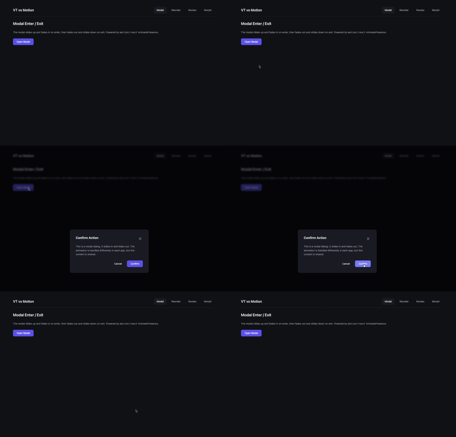
Both implementations produced the slide-up effect I wanted. My Motion version took 15 lines and worked on the first attempt. The native version took 82 lines, including 66 lines of CSS, and needed two fixes: wrapping the state update in startTransition and moving the conditional outside <ViewTransition>.
These excerpts focus on animation. A production modal also needs focus management, keyboard dismissal, and appropriate dialog semantics.
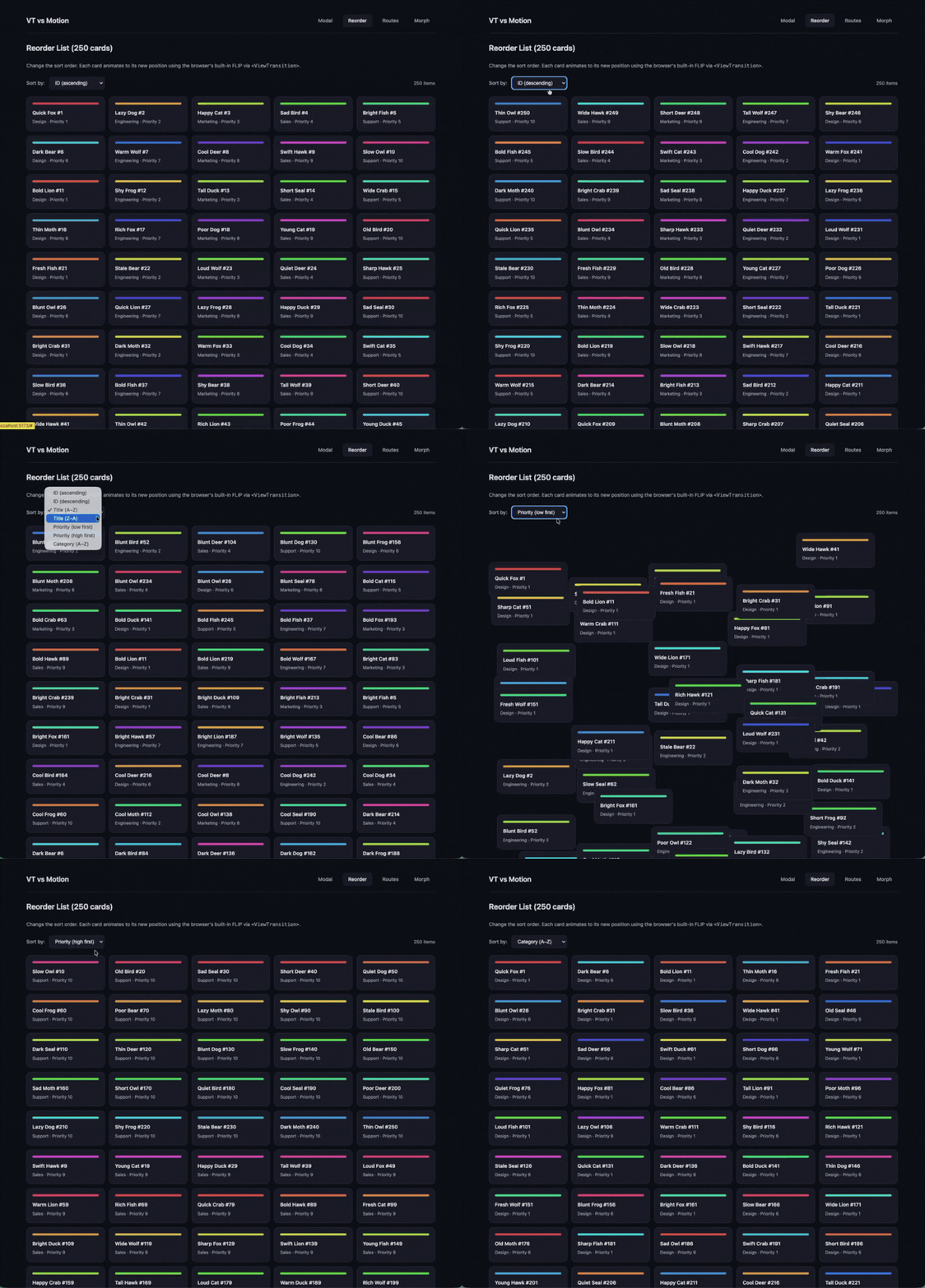
The next test changes the sort order of a 250-card grid and animates the cards into their new positions. I used AI assistance while building this example.
Each card in the native implementation has a <ViewTransition> boundary. Changing the sort key inside startTransition allows the browser to animate between the old and new arrangements:
function handleSortChange(newKey) {
  startTransition(() => setSortKey(newKey));
}

{sorted.map((card) => (
  <ViewTransition key={card.id} name={`card-${card.id}`} default="card-reorder">
    <CardItem card={card} />
  </ViewTransition>
))}
This implementation assigns explicit names to the cards. React recommends reserving name for shared-element transitions; automatically generated names are sufficient for ordinary reordering.
Motion enables layout animation with the layout prop:
<LayoutGroup>
  <div className="card-grid">
    {sorted.map((card) => (
      <motion.div key={card.id} layout transition={{ duration: 0.3, ease: 'easeInOut' }}>
        <CardItem card={card} />
      </motion.div>
    ))}
  </div>
</LayoutGroup>
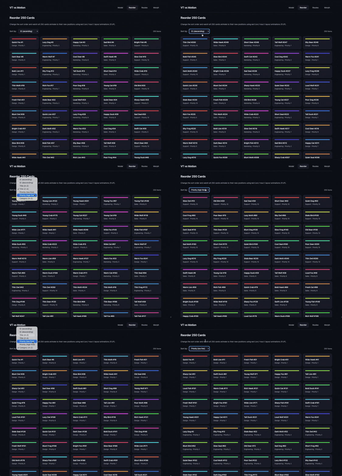
The complete native implementation took 27 lines, compared with five in my Motion implementation. Motion’s API kept this example concise.
The rendering mechanisms differ. View transitions animate snapshots of the UI, while Motion’s layout animations use transforms to animate elements. The cost of each approach depends on the content and the work required to capture, measure, and animate it.
I used Playwright to change the grid from ascending ID order to alphabetical title order, then measured intervals between requestAnimationFrame callbacks. The headless Chromium run produced these results:
| Metric | Native (<ViewTransition>) |
Motion |
|---|---|---|
| Reported frame count | 20 | 49 |
| Intervals over 17ms | 13 | 1 |
| Longest interval | 166.6ms | 66.6ms |
| Average interval | 41.2ms | 17.7ms |
Motion had shorter callback intervals in this run. However, requestAnimationFrame measures callback timing on the main thread, which gives us only part of the information needed to assess animation smoothness.
Headless mode also needs to be documented precisely. Without the Chromium version, launch flags, and GPU status, I cannot attribute the difference to disabled compositing or assume that the environment affects only one implementation.
I also recorded the following measurements in headed Chrome:
| Metric | Native (<ViewTransition>) |
Motion |
|---|---|---|
| Reported main-thread scripting time | Approximately 123ms | Numeric value not supplied |
| Reported LCP | 0.22s | 0.37s |
The recorded LCP was about 41 percent lower for the native build. LCP describes loading performance, so that result needs to be evaluated separately from the card animation. The scripting comparison also needs a corresponding Motion value and the same capture window for both builds.
The traces need to show where each implementation spends time before I can make a broader performance claim. A browser-managed transition still involves rendering work, and a smaller JavaScript bundle alone does not establish smoother animation.
For navigation, I wanted the detail view to slide in from the right when opened and the gallery to return from the left when going back.
addTransitionType lets the handler label a transition. The enter and exit props map that label to an animation class. Here, a changing key remounts the boundary when switching views:
function handleSelectItem(item) {
  startTransition(() => {
    addTransitionType('forward');
    setSelectedItem(item);
  });
}

<ViewTransition
  key={selectedItem ? `detail-${selectedItem.id}` : 'gallery'}
  enter={{ forward: 'slide-forward', back: 'slide-back', default: 'slide-forward' }}
  exit={{ forward: 'slide-forward', back: 'slide-back', default: 'slide-forward' }}>
  {selectedItem ? <DetailView /> : <GalleryGrid />}
</ViewTransition>
I found this mapping easy to follow because the forward and back styles were declared together. My Motion implementation passed direction through a ref and the custom prop on AnimatePresence and its children.
The native version took 84 lines, compared with 23 for Motion. I preferred its directional logic, despite the additional CSS.
The excerpt shows a state-driven switch between views. A router integration also needs to handle URL changes and browser history consistently. If you are working with React’s internal rendering architecture, understanding how transitions interact with the reconciler can help you debug unexpected animation behavior.
Clicking a thumbnail opens a detail view, with the image moving and scaling into the header.
In the native version, the two image boundaries share a name. When one leaves and the other enters during the same transition, the browser connects them. The share prop selects the animation class:
<ViewTransition name={`morph-image-${item.id}`} share="morph-image">
  <img src={item.thumb} alt={item.title} />
</ViewTransition>
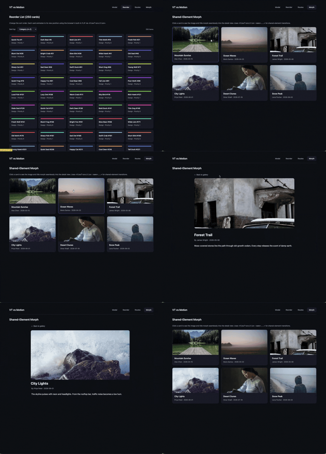
Motion connects the images through a matching layoutId:
<motion.img layoutId={`image-${item.id}`} src={item.thumb} alt={item.title} />
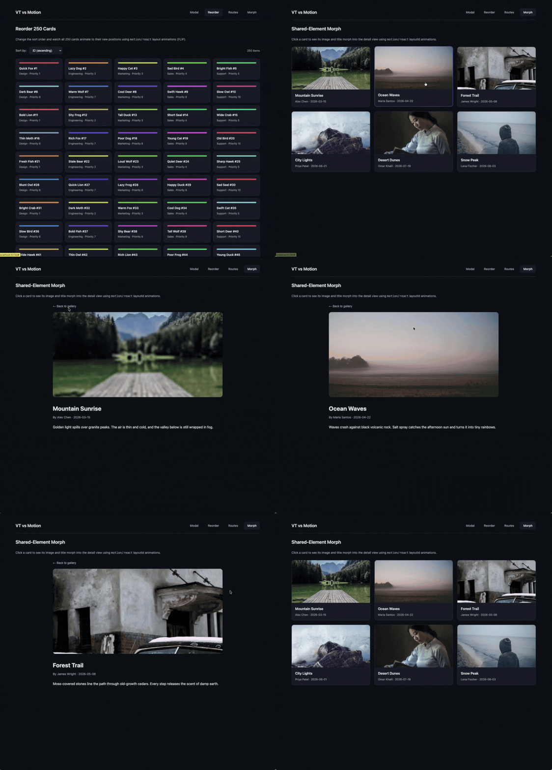
Both versions produced the effect I wanted. Motion required less setup for this example. With React, the matching named boundaries must participate in the same transition, so their mounting behavior matters.
The native build contained 39,005 fewer bytes of gzipped JavaScript. Its CSS was 437 bytes larger, giving a combined reduction of 38,568 bytes, or about 38.6kB, across the measured assets.
| Gzipped asset size | Native | Motion | Difference |
|---|---|---|---|
| JavaScript | 72,789 bytes | 111,794 bytes | Native is 39,005 bytes smaller |
| CSS | 1,733 bytes | 1,296 bytes | Native is 437 bytes larger |
| Combined | 74,522 bytes | 113,090 bytes | Native is 38,568 bytes smaller |
That saving applies to this build and its imports. The amount another app saves will depend on which Motion features it uses and how it bundles them. Tools that help you find unused and ghost dependencies can make that audit easier before committing to a migration.
The implementation line counts tell a different part of the story:
| Pattern | Native total (CSS + JSX) | Motion JSX |
|---|---|---|
| Modal | 82 (66 + 16) | 15 |
| Reorder | 27 (18 + 9) | 5 |
| Navigation | 84 (63 + 21) | 23 |
| Shared element | 60 (32 + 28) | 32 |
| Total | 253 (179 + 74) | 75 |
Across these implementations, JSX counts were almost identical: 74 lines for native and 75 for Motion. The native build also needed 179 lines of animation CSS. That is additional code to write and maintain, even if a team prefers keeping animation styles in a stylesheet.
My first modal used a plain state update and appeared immediately. Scheduling the update with startTransition enabled the animation in this example:
setIsOpen(true);                          // instant cut
startTransition(() => setIsOpen(true));   // animates
I initially kept <ViewTransition> mounted and changed only its children:
<ViewTransition enter="modal-enter" exit="modal-exit">
  {/* The boundary stays mounted, so its enter and exit styles do not run. */}
  {isOpen && <div className="modal-overlay">...</div>}
</ViewTransition>
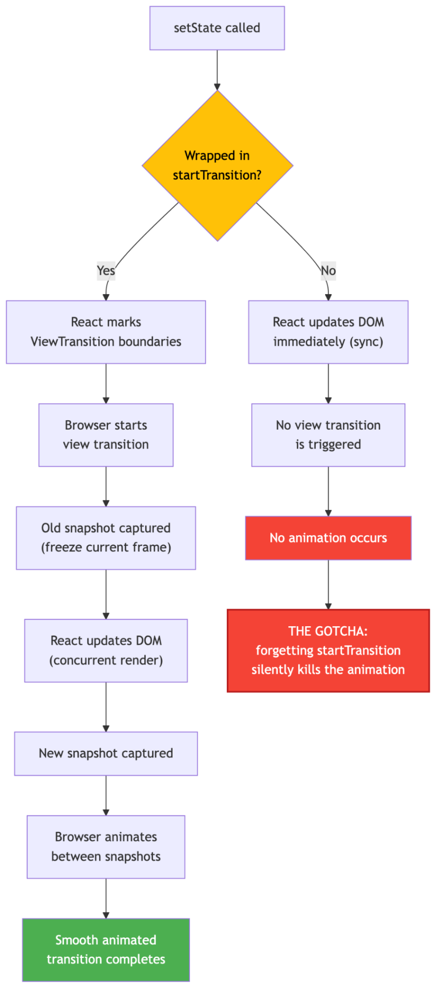
Because the boundary remained mounted, this arrangement did not trigger its enter and exit animations. Moving the conditional outside the boundary fixed the modal. Changing a boundary’s key can also trigger that lifecycle, as in the navigation example.
A mounted boundary can still participate in an update animation. The distinction matters when diagnosing an animation that runs with an unexpected style. If you have previously used React Compiler’s memoization, be aware that its optimizations can also affect when components re-render during transitions.
The browser provides a default cross-fade. This demo’s slides and other custom effects use keyframes with ::view-transition-old and ::view-transition-new selectors. Include that stylesheet work when estimating a migration.
React does not automatically disable view transitions for users who prefer reduced motion. Add styles for prefers-reduced-motion and test the result. Motion’s accessibility controls also need to be configured for the intended experience.
| Pattern | What I would consider |
|---|---|
| Modal | The native version can remove the dependency when simple enter and exit effects cover the app’s needs; allow time for CSS and dialog testing |
| Card reorder | Motion’s layout prop kept the implementation shorter; I would resolve the benchmark gaps before choosing on performance |
| Directional navigation | I preferred React’s transition-type mapping, with browser history behavior still needing explicit testing |
| Shared element | Both approaches achieved the effect; Motion’s layoutId required less setup in this demo |
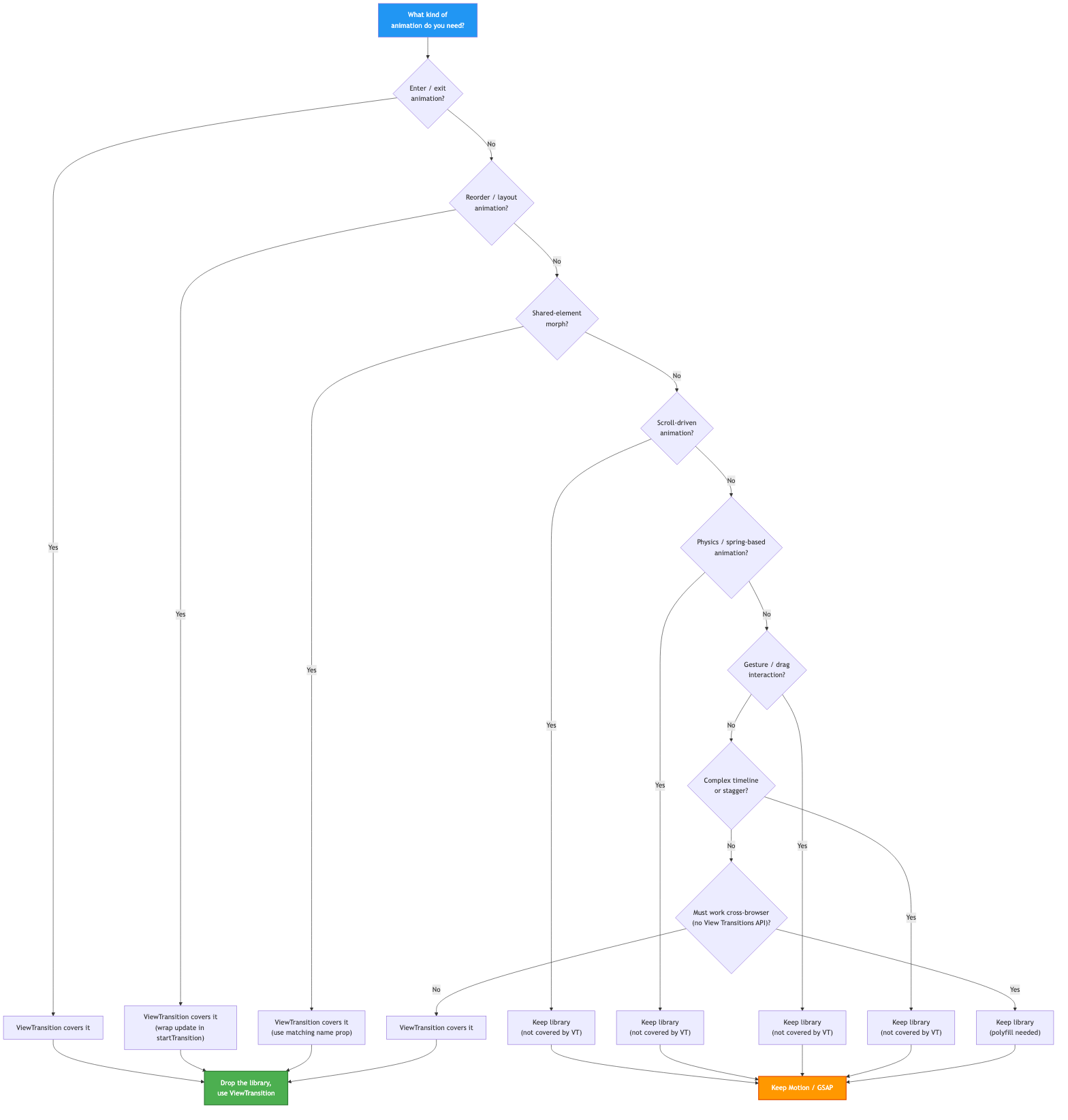
The bundle saving is the clearest result from these builds. Choosing an implementation also depends on how much animation code a team is prepared to maintain and how the transitions behave during repeated interaction.
An app with broader animation requirements may still benefit from a library:
<ViewTransition>Some of these effects also have browser-native implementations. The choice depends on the required behavior and browser support, rather than on <ViewTransition> alone.
Check support for the specific View Transition features used in the app, including transition classes and types. Users should still be able to complete the interaction when the animation is unavailable. If you are also evaluating CSS staggered animations as a lighter alternative for sequential effects, those techniques can complement a native transition strategy without adding a JavaScript dependency.
I could reproduce all four effects with <ViewTransition> and CSS. The native build reduced the combined gzipped JavaScript and CSS by about 38.6kB, at the cost of more CSS to maintain.
For an app that uses Motion only for these transitions, I would test a migration on one representative interaction first. I would keep Motion where its layout or gesture APIs already save substantial implementation work, and use comparable browser traces before making performance part of that decision.

Learn how to run Cline locally with Ollama to build a secure, private AI coding agent that keeps your proprietary code off cloud servers.

Compare TanStack Charts, Recharts, and Chart.js by building the same React dashboard three times. See how each library’s mental model affects your code.

Is the Rust React Compiler’s 10x speed claim real? We put Babel, Vite (Oxc), and Bun to the test on a real app to find out where the speed actually matters.

Compare the top AI development tools and models of September 2026. View updated rankings, feature breakdowns, and find the best fit for you.
Hey there, want to help make our blog better?
Join LogRocket’s Content Advisory Board. You’ll help inform the type of content we create and get access to exclusive meetups, social accreditation, and swag.
Sign up now


 Learn more →