If you have shopped online recently, especially on mobile apps, you have probably noticed something subtle happening in the background. You click on one item, pause for a moment, or add something to your cart, and soon your entire feed begins to change. The products you see start to look similar. The recommendations repeat the same style, the same colors, and the same patterns. At first, this feels helpful because the product appears to understand your taste. Over time, however, the experience often becomes narrow and predictable. This is the promise and the problem of adaptive UX.

Personalization systems are designed to reduce effort and help users discover relevant options faster. In theory, they should make exploration easier. In practice, many products gradually reduce variety as they optimize for short-term engagement. The interface learns from early signals and then reinforces them repeatedly, creating a feedback loop where users see more of what they already clicked instead of being exposed to new possibilities.
Research in recommender systems has described this pattern as a shift toward homogeneity. When algorithms continuously learn from their own recommendations, user behavior becomes more similar over time, even when overall utility does not improve. This is why many recommendation systems now emphasize concepts like diversity, novelty, and serendipity, because relevance alone is not enough to maintain long-term satisfaction.
The tension here is not purely a design problem. Adaptive logic usually sits at the intersection of multiple teams. Growth teams optimize engagement and retention. Machine learning teams focus on prediction accuracy. Product teams prioritize measurable business outcomes. UX teams focus on usability, trust, and user agency. Each group is solving a different problem, which means the system often evolves toward what is easiest to measure rather than what feels healthiest for the user experience.
This creates a predictable conflict. An algorithm can be successful from a metrics perspective while quietly reducing user freedom. Engagement may increase because users keep clicking familiar options, yet exploration decreases because the system stops offering meaningful variety. In some cases, controls such as “show me something different” or reset options are intentionally deprioritized because they introduce uncertainty into performance metrics. The goal is rarely to restrict users. The goal is to protect numbers that look good on dashboards.
The result is a subtle shift in power. The interface stops supporting exploration and starts shaping behavior. Users are treated as stable profiles instead of changing individuals, even though real people shop differently depending on mood, context, or stage of life.
Behavioral research in recommender systems shows that users value novelty and unexpected discoveries because repeated similarity eventually reduces satisfaction. Systems that intentionally balance relevance with diversity and surprise tend to improve long-term engagement because they prevent recommendation fatigue.
This is why adaptive UX should not be viewed as a purely technical feature. It is a product decision that reflects how a company defines success. Who owns the adaptive logic? Which metrics are prioritized? Whether users are allowed to reset, explore, or redefine themselves over time. These choices determine whether personalization feels empowering or limiting.
Before we define what adaptive interfaces are, we need to ask a more important question. When does adaptation help users, and when does it start narrowing their world without them realizing it?
Adaptive User Interface, AUI, is a digital interface that automatically changes its layout, content, and functionality in real time to match a user’s unique needs, behavior, or environmental context. While traditional responsive design simply resizes content to fit different screens, an adaptive interface goes further by using intelligence to tailor the actual experience for each person.
To be fair, adaptive interfaces can be powerful.
They reduce friction.
They surface relevant content faster.
They can make large platforms feel personal.
When done well, they save users time and help them focus. That’s why companies invest heavily in behavior tracking, analytics, and machine learning models that detect patterns and automate decisions.
The intention is good.
The problem is what happens when adaptation replaces choice.
Adaptive interfaces don’t change randomly. Behind the scenes, there’s usually a predictable decision pipeline happening every time you interact with a product.
At a high level, it looks like this:
Signals → Models → Ranking → UI
Everything starts with signals, small pieces of behavioral data the system collects, such as:
These signals are not intentions. They are simply observations. But they become the raw material for personalization.
Machine learning models analyze those signals and try to answer questions like:
The model doesn’t understand context or mood. It only learns correlations based on past behavior. This is important because the model is not making human judgments. It’s making probability predictions.
Once predictions exist, a ranking system decides what gets shown first. This layer is often where business priorities enter:
Two users may have similar interests, but what they see can differ depending on what the ranking system is optimized for.
And this is also where bias can creep in. Bias can be introduced at multiple levels:
Finally, the interface adapts.
Content moves. Recommendations change. Layouts shift.
What feels like a “smart” interface is actually the final output of many invisible decisions made upstream. And here’s something many users don’t realize:
The UI often updates in real time, while models update more slowly.
A model might be retrained daily or weekly, but the interface can adapt instantly based on small interactions. This means the experience may change faster than the system truly understands the user. That gap is where many adaptive experiences start to feel jumpy, narrow, or overly confident.
The biggest risk is misalignment between what the system thinks you want and what you actually want right now.
Adaptive systems are great at recognizing patterns. They are terrible at understanding context, emotion, and change.
Just because I watched a horror movie last night or for the past 6 months doesn’t mean I want one today.
Just because I bought oversized shirts last month doesn’t mean that’s my identity forever.
Yet many adaptive interfaces treat behavior as a fixed truth, not a temporary signal.
Here’s where adaptive interfaces quietly cross a line.
If an interface only shows me what it thinks I like, and I only interact with what it shows me, the system starts collecting data that “confirms” its own assumptions.
I click on one type of item.
The interface shows me more of it.
I click again, because that’s what’s available.
The system records this as a strong preference and high engagement.
On dashboards, this looks like success. But what’s actually happening is a recursive loop:
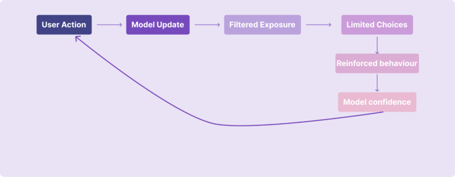
The interface isn’t learning who I am.
It’s reinforcing the decisions it already made about me.
Because alternatives are quietly removed from view, my behavior becomes narrower over time. And because my behavior becomes narrower, the system feels justified in narrowing the experience even further. This is how personalization becomes a self-fulfilling prophecy.
From a data perspective, everything looks healthy:
But this isn’t always genuine interest.
Sometimes users click because:
Adaptive systems often can’t tell the difference.
This is where teams accidentally get into trouble.
Most adaptive systems are measured using engagement metrics. Click-through rates go up. Time spent increases. Recommendation interaction looks strong. On paper, the system appears successful.
But engagement is not always the same as preference:
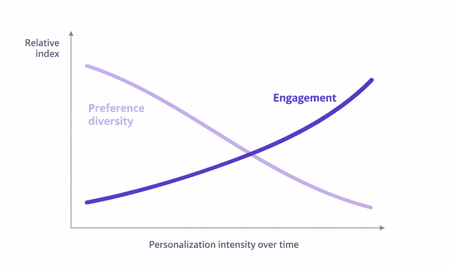
Sometimes users click because the system keeps showing similar options. Sometimes they click because they are curious, or because there is nothing else visible. The model reads this as confirmation, but the user might simply be adapting to what is available.
This is how teams unintentionally optimize for narrowing behavior.
The algorithm learns from interaction. The interaction becomes more repetitive because choices become narrower. And the resulting metrics reinforce the belief that personalization is working.
Over time, the product becomes very good at predicting what users have already done, not what they might want next.
Some metrics look healthy but can hide long-term problems:
These signals often measure compliance, not true preference.
Strong adaptive UX balances relevance with discovery. Instead of measuring only engagement, teams should also ask:
Some teams call this exploration diversity or novelty exposure tracking, measuring how often users encounter something new rather than just something familiar.
Because real personalization should not only say: “I know what you like.”
It should also say: “I can help you discover what you might like next.”
Users often don’t know why they are seeing what they see. Are recommendations driven by privacy-sensitive data? Is there a way to opt out?
Without transparency, users feel surveilled, not supported. Adaptive design isn’t just a technical choice; it has ethical implications:
Good UX respects user agency. Too many adaptive systems decide for the user without giving them real control over how adaptation occurs. Users need:
Not just personalization, but personal control.
One way to think about adaptive UX is as a spectrum rather than a single approach:
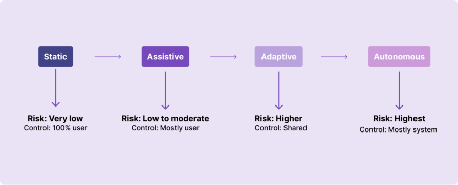
Not every product moves straight from static interfaces to full autonomy. Most experiences sit somewhere in between, and the more decision-making the system takes over, the higher the risk to user control and trust.
Adaptive interfaces make sense when:
They don’t make sense when:
Sometimes, a simpler, user-controlled interface is the more respectful choice.
If your product uses adaptive behavior, consider these:
In adaptive systems, control should be obvious and easy to access. It should never feel hidden or complicated.
Users need simple ways to change or interrupt personalization when it stops working for them. This could include things like a clear reset button, an option to pause recommendations, or a way to explore outside what the algorithm suggests.
If you’re wondering what that actually looks like in a real product, Instagram offers a useful example:
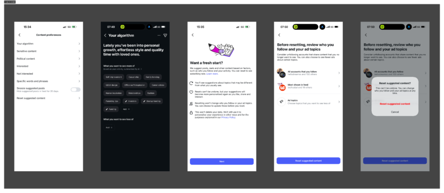
Inside its Content preferences settings, there is a section labeled “Your algorithm.” Instead of treating the ranking system as invisible, Instagram summarizes what it believes you are interested in, based on your activity. It shows categories like self-improvement, fashion, parenting tips, UI/UX design, and more. The system is not just adapting silently. It is reflecting back its understanding of you.
From there, users can choose to edit interests, indicate what they want to see less of, or go a step further and select “Reset suggested content.” When you choose to reset, Instagram explains clearly what will happen:
This is important. It acknowledges that preferences evolve. It creates an interruption point in the adaptive loop. And it makes the system visible instead of purely automatic.
That is what meaningful control looks like in an adaptive interface. It does not remove personalization entirely. It makes personalization interruptible.
Teams also need to decide when personalization should reset automatically and when users should control it themselves. Manual reset works when users clearly feel the system is wrong. However, in some cases, personalization should naturally expire over time because people change their interests, moods, and goals. If a system never forgets past behavior, it can trap users in old preferences that no longer reflect who they are.
Another important question is whether users should see how confident the system is about its recommendations. When the system is unsure, the experience should feel more open and exploratory instead of overly certain.
Good adaptive design gives users control without forcing them to fight the system.
Personalization feels helpful when users understand why something is being shown to them. It feels uncomfortable when the logic is invisible.
Products should explain recommendations in simple language. For example, users should be able to see messages like “Recommended because you watched…” or “Shown because you recently searched for…”. This does not mean exposing complex algorithms. It simply means helping users understand the connection between their actions and what they see next.
Teams should also think about whether users should know which data signals are being used, such as watch history, clicks, saved items, or search behavior. When people understand what the system is using, they feel more in control and less watched.
Transparency builds trust, and trust makes personalization feel supportive instead of manipulative.
Adaptive behavior should improve the experience, not replace the basic structure users rely on. Some parts of a product must remain stable no matter how much personalization is happening in the background.
The first foundation that should stay consistent is navigation. Users should always know where they are and how to move around the product. If navigation keeps shifting based on behavior, people lose confidence and feel disoriented.
The second foundation is core actions. Important actions like buying, saving, submitting, or confirming something should behave the same way every time. These actions build muscle memory, and changing them dynamically can increase mistakes and frustration.
The third foundation is information hierarchy and clarity. While recommendations can change, the overall structure of the experience should remain predictable. Users should not feel like they are learning a new interface every time they return.
Some teams also create a personalization audit trail internally. This helps them track what changed because of personalization and what stayed fixed, making it easier to avoid accidental disruption of core UX patterns.
Finally, teams should decide early which areas should never be adaptive at all. Critical flows such as payments, privacy settings, accessibility controls, and safety-related experiences usually need stability more than personalization.
Adaptive systems work best when they sit on top of strong, stable UX foundations instead of constantly reshaping them.
Most adaptive systems are measured by engagement metrics, but engagement alone can hide problems. A system can look successful on dashboards while users slowly feel trapped or bored.
To avoid this, teams need to track signs of what I call personalization fatigue.
One early warning sign is when engagement stays high but variety drops. Users keep clicking, but they are clicking on the same type of content repeatedly. This often means the system is reinforcing a narrow pattern instead of supporting discovery.
Another signal is declining interaction with new or unfamiliar content. If users stop exploring outside recommendations, it may mean the experience has become too predictable.
Teams should also watch for repeated passive behaviors, such as endless scrolling without meaningful action or quick exits after viewing recommendations. These behaviors can signal boredom rather than satisfaction.
Healthy personalization should expand options over time, not reduce them.
One way to measure this is by tracking exploration diversity. This looks at how often users interact with new categories, different content types, or unexpected recommendations.
Another useful measure is novelty exposure, which checks whether users are regularly seeing something outside their usual pattern. If novelty steadily drops, the system may be narrowing the experience too much.
You can also compare how often users manually search versus clicking recommendations. When search behavior increases, it sometimes means users are trying to escape the algorithm.
Users rarely say, “Your personalization is too aggressive.” Instead, the signals appear indirectly.
Frequent use of filters or sorting tools can mean users are trying to regain control. Sudden changes in engagement patterns, such as shorter sessions or repeated backtracking, can suggest frustration.
Support tickets or qualitative feedback that sounds like “I keep seeing the same thing” or “Nothing new shows up anymore” are also strong indicators.
When these signals appear together, the problem is usually not personalization itself. The problem is that the system is optimizing for repetition instead of discovery.
The goal is not to remove personalization, but to make sure it still leaves room for curiosity and choice.
Most UX testing focuses on different types of users. We create personas. We segment by demographics. We design for groups.
Adaptive systems require something more demanding. They require designing for how the same person changes over time.
Everything in this article has pointed to one core tension: adaptive systems learn from past behavior. But human behavior is not stable. Preferences shift. Goals evolve. Context changes. Mood fluctuates.
If we only test personalization against static user segments, we miss the real challenge. The real challenge is behavioral fluidity. To design adaptive systems responsibly, teams need to test for different kinds of change.
Not everyone uses a product the same way, and even the same person does not behave consistently. Some sessions are exploratory. Others are goal-driven. Sometimes a user is browsing casually. Other times they are searching with urgency.
Testing should simulate different usage modes for the same person. What happens if a user switches from exploration to task completion? Does the system overcorrect? Does it assume a permanent shift from a single session?
Adaptive systems must treat interaction patterns as situational, not definitive.
Many interests are temporary. A user might binge one category for a week and completely lose interest in the next.
Testing should examine how quickly personalization adapts and how quickly it forgets. If old signals never fade, the system can trap users in outdated patterns. If signals shift too aggressively, the experience becomes unstable.
Healthy adaptive systems balance recency and history instead of treating every click as identity.
People evolve in bigger ways, too. A new job, a move to a new city, a change in income, or a shift in responsibilities can dramatically alter how someone uses a product.
Testing should consider longer-term behavioral shifts. What happens when a user’s overall goals change? Does personalization update gracefully, or does it cling to the past? Systems that cannot adapt to life changes feel irrelevant, even if they are technically accurate based on old data.
Sometimes behavior reflects mood, not preference. Watching one genre of movie or shopping for a specific style does not always represent who someone is overall.
Testing should include outlier behavior. What happens when a user briefly explores something outside their norm? Does the system overreact and flood the feed with similar content? Adaptive systems should leave room for spontaneity and surprise. Not every interaction should redefine the user.
Designing adaptive experiences means accepting that users are fluid.
The goal is not to predict a permanent version of the user. The goal is to design systems that can respond to change without overcommitting to it.
Adaptive interfaces are no longer just a UX pattern. They are quietly reshaping how products make decisions.
In the past, designers mostly controlled screens, flows, and interactions. Today, many of those decisions are influenced by models, ranking systems, and adaptive logic working behind the interface. The product is no longer just responding to users. In many cases, it is deciding what users see, what they explore, and what they never discover.
As adaptive systems become more autonomous, the risks also grow. A system optimized purely for engagement can slowly reduce exploration. A model trained on past behavior can lock users into old patterns. And when decisions happen invisibly, users lose awareness of how their experience is being shaped.
This is why the future of UX design is not just about designing interfaces. It is about designing boundaries for automation.
Designers will increasingly be responsible for asking harder questions:
The next phase of product design will not be defined by how smart interfaces become, but by how responsibly that intelligence is applied.
Adaptive systems will continue to evolve. The real challenge for designers is making sure they evolve without taking agency away from the people they are meant to serve.
Because the goal of personalization should never be to predict users perfectly. It should be to support their ability to change.

LogRocket's Galileo AI watches sessions and understands user feedback for you, automating the most time-intensive parts of your job and giving you more time to focus on great design.
See how design choices, interactions, and issues affect your users — get a demo of LogRocket today.

AI has accelerated design execution, but speed can come at the expense of intentionality. Learn how UX teams can preserve product thinking and judgment.
UX testing is not limited to layouts, copy, and visual design. Full-stack and server-side experiments help teams evaluate how backend logic, APIs, algorithms, and product flows affect the overall user experience.
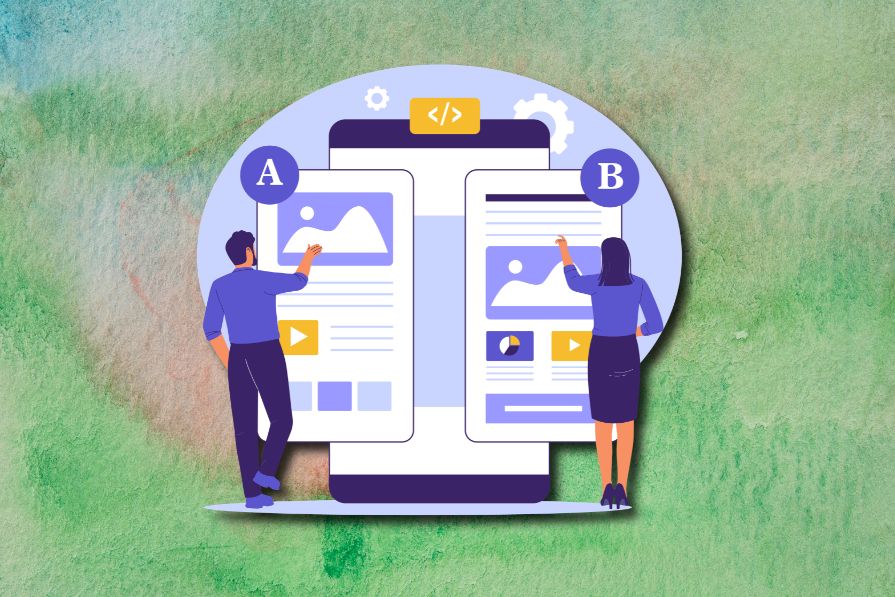
In A/B, A/B/n, or multivariate testing scenarios, using p-value with traditional null-hypothesis-based statistical analysis is so common, and most designers […]
Traditional A/B testing splits traffic evenly, but multi-armed bandits dynamically send more users to the better-performing version. Here’s how the method works, where it helps, and when UX teams should use it over classic A/B testing.


