I used to leave design presentations with a stack of changes and a heavy heart. Over 20 points to revise was normal. Most of the feedback wasn’t from users; it was subjective opinions from stakeholders. Nothing felt anchored. I’d rush through the screens, hoping the room wouldn’t ask hard questions. Then I learned to stop just showing screens and start explaining the reasoning behind them. The result was immediate: clearer conversations, fewer rounds of rework, faster buy-in, and designs that actually reflected user needs.
That skill matters even more now. AI can generate polished UI concepts in minutes, which means the screen itself is becoming less valuable as a presentation artifact. The designer’s judgment — why this problem matters, why this direction makes sense, what trade-offs it involves, and how we’ll know whether it worked — is what needs to be understood.
In this article, I’ll share the exact, repeatable approach I use to turn design presentations into structured decision-making sessions. It’s practical, battle-tested, and built to be used in real stakeholder meetings.
Editor’s note: This article was updated in August 2026 to reflect how UX design reviews and stakeholder collaboration have evolved. With AI making it easier than ever to generate polished design concepts, simply presenting a finished screen is no longer enough. We’ve updated the framework to put greater emphasis on design reasoning, evidence, trade-offs, decision-making, and validation. We’ve also clarified how to distinguish research findings from assumptions, use stakeholder feedback constructively, and connect design decisions to measurable outcomes without reducing UX to metrics alone. The result is a more practical framework for turning subjective design reviews into focused, evidence-informed decisions.
Most stakeholder feedback isn’t malicious; it’s social. People feel the need to contribute in a meeting. A team lead says, “I don’t love these cards,” and others echo them to show alignment. Without structure, one offhand comment becomes a cascade of edits.
When dozens of people have opinions, traditional ad-hoc strategies break down. And with AI making it easier to generate alternative layouts, copy, and visual directions, there can be even more ideas competing for attention.
That’s why structure matters. It transforms disconnected opinions into focused, evidence-backed discussion and makes it easier to decide what actually needs to change.
My wake-up moment was watching a senior design lead present. He didn’t open with a mockup. He walked the room through:
His narrative followed a clean arc: Context → Evidence → Insight → Design → Decision → Impact. Because every choice was tied to research, stakeholders stopped debating styles and started discussing trade-offs. They approved a budget for new imagery on the spot.
That structure is what I replicate now, but with one important addition: making the decision explicit. A strong presentation shouldn’t end with “What do you think?” It should make clear what decision needs to be made, what trade-offs are involved, and what happens next.
PS: If you want the theory behind storytelling, the comparison of Hero’s Journey vs Pixar’s story spine is a useful primer.
I treat every major design presentation like a decision-making session, not a design review.
The structure I use — Context → Evidence → Insight → Design → Decision → Impact — isn’t just about “telling a story.” It gives the conversation a clear direction and makes the decision you need from stakeholders explicit.
Each step answers a question your audience is likely to have:
In 2026, there’s another reason to stop treating the mockup as the centerpiece of a design presentation: AI can now generate a surprising number of viable design directions very quickly.
That changes what stakeholders need from designers.
If someone can generate five alternative interfaces before the meeting ends, presenting another polished screen isn’t necessarily persuasive. What matters is explaining why this direction is worth pursuing.
I use the same questions whether a design was created from scratch, generated with AI, or developed through a combination of both:
The easier design becomes to generate, the more important design judgment becomes to explain.
Below is how I presented my design work for Project CH (the case example we will be using in this article).
My intro:
“Before I show the visuals, I want to walk you through what we found in research, what users told us, what that meant, and how that shaped the designs you’ll see.”
Pause 2–3 seconds. Make people look up.
What I said:
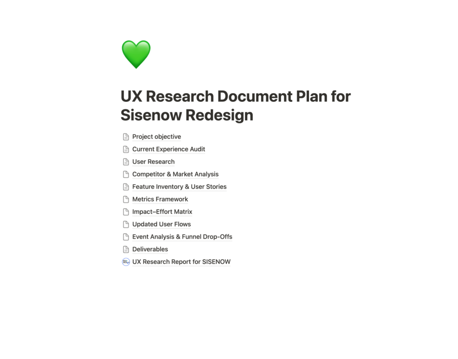
“We started this project to solve one clear problem: users land on the homepage and don’t immediately know how to take action or what the platform does. Our objective was to make the platform’s value obvious and guide users to two primary actions: Find work or Hire talent, in as few steps as possible.”
What I showed:
Why:
This frames the audience to judge the design by whether it solves a real user problem and meets the project objectives.
What I said:
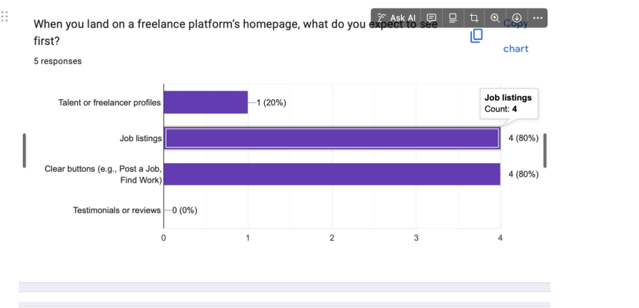
“Here’s what users told us when asked: ‘When you land on a freelancer homepage, what do you expect to see first?’”
What I showed:
Why:
Evidence moves the conversation from “I feel” to “here’s what we know.”:
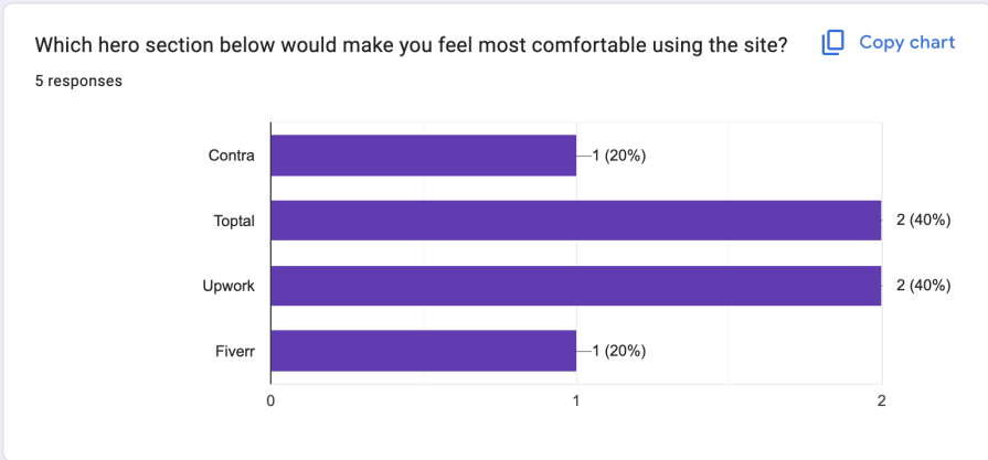
But evidence isn’t the same as proof. A survey response, usability finding, analytics pattern, or customer quote can tell you something important about the problem without automatically proving that a particular design will solve it.
I use evidence to form and explain a design hypothesis, then use testing or measurement to validate whether the solution actually works.
What I said:
“The data tells us users want action first, persuasion second. When a homepage leads with branding or abstract messaging, users hesitate and drop off. They need fast access to listings and clear next steps.”
What I showed:
Why:
This is the connective tissue between research and design. It explains what the evidence means, what user need or problem you’re prioritizing, and why your proposed direction makes sense.
What I said:
“We designed two proven directions that respond to this insight.”
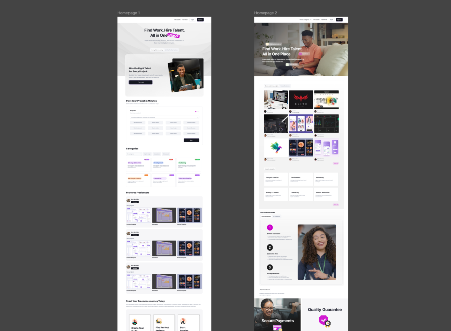
Why two? Because these weren’t arbitrary variations. Each direction represented a meaningful trade-off.
When I present multiple directions, I want stakeholders to compare decisions, not aesthetics. For example:
The goal isn’t to give stakeholders two mockups so they can pick their favorite. It’s to make the underlying trade-offs visible.
By framing two viable options, you shift the conversation from taste-based critique (“I don’t like this”) to strategic choice (“Do we value faster onboarding or deeper qualification at this stage of growth?”). That reframing elevates the room from surface-level preferences to business alignment.
Turns criticism into preference, not dismissal:
Another interesting aspect of this project I had to defend was the choice of using a video for the hero section instead of a static image:
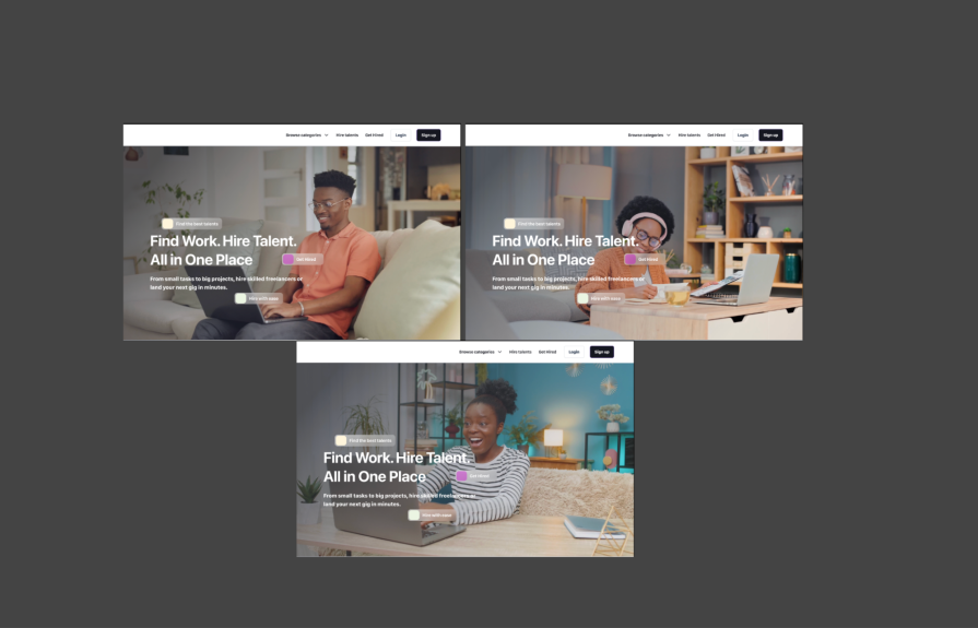
The idea was simple: we wanted to evoke a feeling, not just show a picture. From the research, we identified our target audience as young, skilled professionals looking for jobs and companies searching for agile talent. When we looked at competitors, we noticed a common pattern: most of them relied on bold, striking imagery to grab attention. It worked, but it only went so far.
Instead of repeating that, we asked ourselves: what if we went beyond an image and created an experience? That’s what led us to the video concept. A still picture can only suggest what the platform does, but a video brings it to life instantly.
In our hero section, we chose to show a freelancer, relaxed at home, smiling while working. It wasn’t just a visual of someone “doing a job.” It was a story of freedom, confidence, and joy, the lifestyle our target users aspire to. So when someone lands on the page, they don’t just see a platform. They feel what it’s like to succeed at it.
The headline: “Find Work. Hire Talent. All in One Place”, made the promise explicit, while the video made it believable.
That was how I positioned and sold the idea of using video in the hero section, not as a design flourish, but as a storytelling device grounded in research and user aspiration.
What I said:
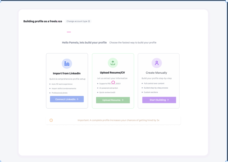
“One of the biggest pieces of feedback we got during research was about the onboarding process. Users felt it was unnecessarily complicated, and many dropped off before even getting a chance to explore the platform. A recurring suggestion from participants was simple: “Why not let me just upload my resume and get started?”
What I showed:
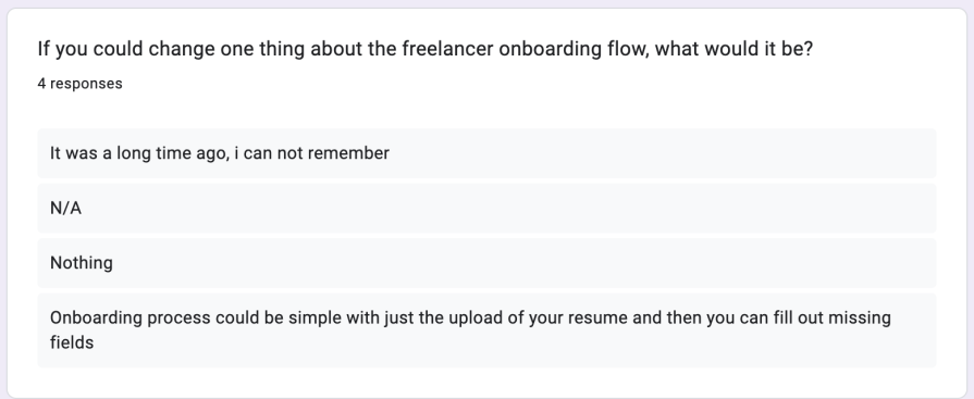
Design I showed afterwards:
So we redesigned the onboarding flow around that. Instead of a long, multi-step form, we introduced a resume upload option and other options that could automatically populate key fields.
What I went on to say:
“This change wasn’t just cosmetic — it addressed a real friction point. By simplifying onboarding, we reduced the cognitive load on new users and made the first step toward finding work or hiring talent effortless.
The expected impact is clear:
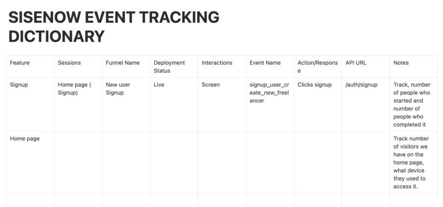
The important part is that we didn’t stop at predicting the outcome. We defined what we would measure after launch.
We also set up tracking for drop-off points across the onboarding funnel. Before launch, I’d also define the success criteria: What completion rate are we trying to improve? Which step is the primary bottleneck? What would count as a meaningful improvement? That turns “this design should perform better” into a testable hypothesis.
This way, we can measure the difference after launching the new flow. The expectation is straightforward: fix the bottleneck, increase successful signups, and fuel growth across both sides of the marketplace.
What I also showed:
If someone says, for example, “I don’t like the video; it’s too bold.”
Say:
“Thanks, can I check: is that about the tone or are you worried it distracts from the job listings? If it’s about tone, we can try alternative footage; if it’s about distraction, we can test a shorter video. Our priority is to drive first action, which of those concerns would impact that goal most for you?”
If someone starts to argue color or microcopy:
Say:
“Noted. Before we land on button color, can we agree on the priority? Right now we’re focused on first action rate and trust signals. If color is blocking the choice, we can quickly test it, but I’d like us to prioritize the things that move the business metric first.”
Redirecting subjective feedback isn’t about shutting stakeholders down. It’s about understanding the concern and connecting it to a user need, product goal, constraint, or testable hypothesis.
Instead of debating surface-level details, I use a tactic I call metric tethering: connecting subjective feedback back to an agreed outcome, user need, piece of evidence, or testable hypothesis.
Not every design decision needs a metric. The goal isn’t to turn UX into a spreadsheet; it’s to make the reasoning behind the decision explicit.
This way, the conversation never slips into personal preference; it always returns to outcomes leadership cares about.
Let me be clear: stakeholder feedback is not useless. In fact, it’s critical. Stakeholders bring deep knowledge of the business, the market, and the product vision, things that users alone may not reveal. Ignoring them would be a mistake.
The same principle applies in the other direction: user research shouldn’t be treated as a trump card that ends the conversation. A stakeholder may know about an upcoming business constraint, technical limitation, regulatory requirement, or strategic shift that isn’t visible in your research. Good design storytelling creates a space where both types of knowledge can be considered.
The problem is not the feedback itself, but the way the conversation is framed. Without a clear story, their input often drifts into surface-level opinions like “I don’t like this color” or “Can we move this card over here?” That’s when design reviews turn into endless rework.
But when you ground your presentation in context, evidence, insight, and business impact, you give stakeholders something more meaningful to react to. Their feedback becomes easier to distinguish: some comments will surface genuine business constraints, some will reveal product risks, and some will simply reflect personal preference. The structure helps you tell the difference. Instead of debating colors, they’ll ask, “Does this solve the onboarding drop-off?” Instead of rejecting a design outright, they’ll discuss trade-offs and priorities.
That’s the role of storytelling. It doesn’t replace stakeholder input; it makes it sharper, more constructive, and aligned with what actually benefits users.
I started this journey dreading stakeholder meetings. My designs regularly came back with 20+ changes, many based more on personal preference than user needs.
Storytelling changed how I approached those conversations. Instead of defending screens, I learned to explain the journey from problem to evidence to insight to design — and, most importantly, make the decision and trade-offs explicit.
That matters even more in 2026. AI can generate polished interfaces faster than ever. The value of a designer increasingly lies in knowing what to make, why to make it, what not to make, and how to determine whether the decision worked.
So the next time you walk into a stakeholder meeting, don’t just present the screens. Explain the problem, show the evidence, share the insight, make the trade-offs visible, and be clear about the decision you need.
That’s how you move a design review from “What do you think?” to “What should we decide?”
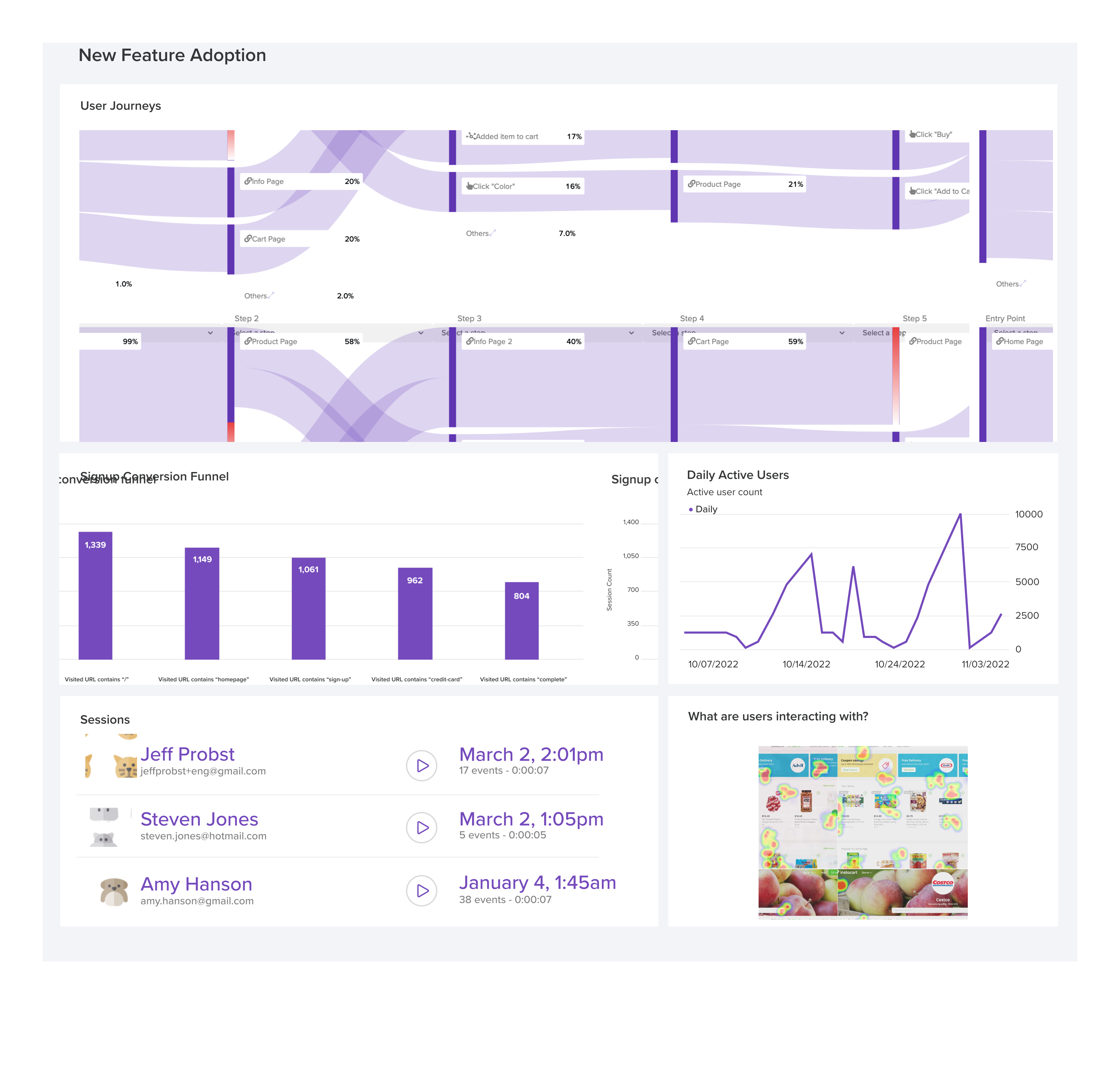
LogRocket's Galileo AI watches sessions and understands user feedback for you, automating the most time-intensive parts of your job and giving you more time to focus on great design.
See how design choices, interactions, and issues affect your users — get a demo of LogRocket today.

Brand archetypes can define your personality, but they don’t tell you what to say. The imagined speaker technique turns an abstract archetype into a real voice you can write through.
Finding the right UX research participants is hard, and AI has made verifying them even harder. Here’s how to recruit real users, screen for quality, and use synthetic participants without compromising your research.
Not every enterprise product needs to be intuitive. Complex workflows often require complexity, and trying to eliminate it can make products less powerful for experienced users. Explore why enterprise UX should balance intuitiveness with learnability, efficiency, and long-term mastery.

Open-source Figma alternatives are becoming viable for teams seeking self-hosting, open file formats, offline access, flexible AI integrations, and greater control over their design workflows. Compare Penpot, OpenPencil, Quant UX, and Open Design to see where open-source tools stand against Figma.


 Learn more →