Let’s say it’s a brand new day and you’re feeling lucky amidst this chaos. You’ve decided to block out the world’s woes by taking Gatsby for a spin. Not just because it’s fast, or because you can fetch data from anywhere, but for some peculiar reason that didn’t make it to production. So you get started.

One of the low hanging fruits of using a framework like Gatsby is that it abstracts a lot of common and redundant tasks away, replacing it with a more powerful, and relatively easy-to-use API, or thereabout. However, this bargain often comes at a cost of opinionation, and you’re often left with a hurdle to cross.
The Differing Perspectives on CSS-in-JS is real. While we all mightt— to some extent — be uptight about how styling should be applied to components, frameworks often take a different stance. To put it mildly, Gatsby is indifferent about how you style your components. But it isn’t about how you set them up, which leads to this article.
Gatsby supports a myriad of styling options and the goal is to help you get set on a handful of them. We won’t be going through an exhaustive list. Instead, a sufficient list of styling methods, including:
Before we begin our styling tour, there are some Gatsby nuances you need to acquaint yourself with.
npm packages are to Node projects. You install plugins to use with your Gatsby app so you don’t have to re-write or reinvent the wheel of some functionality.gatsby-config.js: This is the configuration file for Gatsby, much more like your .gitignore file for git, .eslintrc for ESlint, or .prettierrc for Prettier. Essentially, you are allowed some configuration power with this file.gatsby-browser.js: This is an interface between your Gatsby site and the browser.Basically, whenever we install a Gatsby plugin, we will configure it in gatsby-config.js.
To create a new Gatsby app, you need to have the Gatsby CLI installed:
npm install -g gatsby-cli // Installs the gatbsy CLI globally
Create a new Gatsby site named styling-in-gatsby:
gatsby new styling-in-gatsby // Creates a new gatbsy site named styling-in-gatsby
Change directory into the new site:
cd styling-in-gatsby // Switch directory into the new gatsby site
Run the site:
gatsby develop -p 3000 // Instruct Gatsby to run on port 3000
Refer to the documentation for more information on creating and running a Gatsby site.
If all went well, the site should be running on http://localhost:3000
To make things simple, I’ve gone ahead to create a repository for the files/folders needed. You can grab it here.
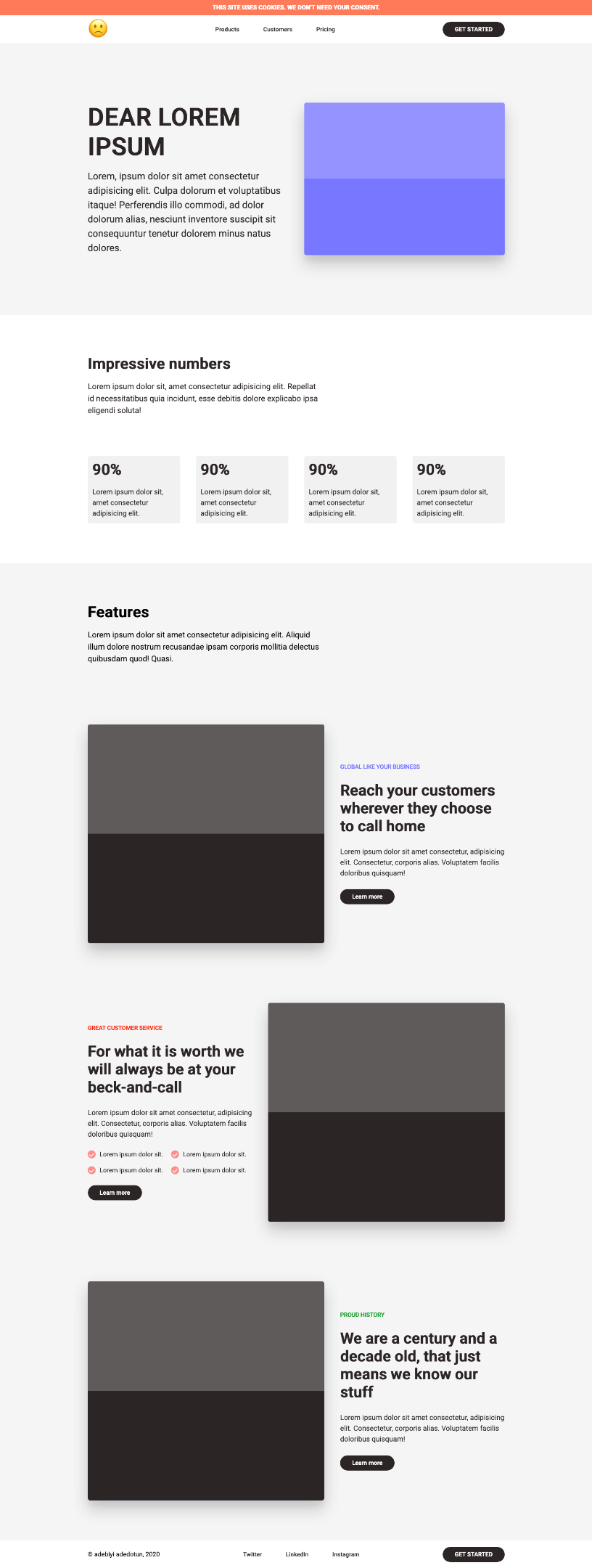
Here’s what your page should look like now:
The form we’ll be following here is quite simple. We’ll build a fictional landing page, styling different sections with different styling methods.
The end goal is this:
As we move along, there are some things you need to watch out for:
gatsby-config.js file, you’d need to kill (if it’s running) and/or restart your server with gatsby develop. Although Gatsby will automatically notice this and restart the server with your consent, I find that I sometimes need to do it manually.With that out of the way, let’s get started.
One of the common things you’d normally do when you start a new web project is to reset or normalize your CSS so there’s a uniform starting position among browsers. This is a perfect example for using Global CSS without worrying about scoping.
Update src/styles/global/reset.css with this Minimal CSS Reset:
html {
  box-sizing: border-box;
  font-size: 16px;
  font-family: "Roboto", sans-serif;
}

*, *:before, *:after {
  box-sizing: inherit;
}

body, h1, h2, h3, h4, h5, h6, p, ol, ul {
  margin: 0;
  padding: 0;
  font-weight: normal;
}

h1, h2, h3, h4, h5, h6 {
  font-weight: bold;
}

ol, ul {
  list-style: none;
}

img {
  max-width: 100%;
  height: auto;
}

a {
  text-decoration: none;
}
Import the Minimal CSS reset src/styles/reset.css in gatsby-browser.js:
import "./src/styles/global/reset.css"
You should see the changes reflect immediately.
Gatsby encourages the use of Layout Components. Basically these are wrapper components that wrap over reusable components, like Headers and Footers.
Containers (Wrappers) are an ideal fit for a layout component.
Update src/styles/global/container.css with the content:
.container {
  max-width: 1080px;
  padding: 0 16px;
  margin: 0 auto;
}
Update the <Container/> (src/components/Container.js) component:
import React from "react"
import "../styles/global/container.css"

export default function Container({ children }) {
  return <div className="container">{children}</div>
}
Learn more about containers/wrappers:
CSS modules allow component-scoped CSS. This means your styles are localized to a particular component. It works out of the box with Gatsby without any additional configuration. It is really flexible as it can be used with CSS, SASS/SCSS, Stylus, Less, as you’d see
We’d build the top banner of the landing page with it.
Update src/styles/modules/banner.module.css:
.banner {
  padding: 10px;
  text-align: center;
  background: tomato;
  color: white;
}

.banner-title {
  font-size: 15px;
  text-transform: uppercase;
}
Update src/components/Banner.js component:
import React from "react"
import bannerStyles from "../styles/modules/banner.module.css"

export default function Banner() {
  return (
    <section className={bannerStyles.banner}>
      <h1 className={bannerStyles.bannerTitle}>
        This site uses cookies. We don't need your consent.
      </h1>
    </section>
  )
}
Did you notice that the style reads
banner-titleand the component readsbannerTitle? That’s Gatsby. It converted the kebab-case (banner-title) to camel-case (bannerTitle)
Stylus is akin to SASS/SCSS in that it adds functionality to CSS: variables, mixins, operators.
We’d build the top navigation of the landing page with it.

You can install this VSCode Extension for Stylus files support
Install the gatsby-plugin-stylus plugin:
yarn add gatsby-plugin-stylus
Update the plugins array in gatsby-config.js (Rerun gatsby-develop):
plugins: [
  `gatsby-plugin-stylus`,
  // other plugins
]
Update src/styles/stylus/header.styl:
$clr-brown = #211c1c

.link {
  font-size: 15px;
  padding: 10px 30px;
  font-weight: 500;
  border-radius: 50px;
  color: $clr-brown;
  transition: background-color 0.2s;

  &:hover {
    background-color: #211c1c14;
  }

  &:nth-child(2) {
    margin: 20px 0;
  }
}

.emoji {
  font-size: 50px;
}
Update src/styles/stylus/header.module.styl:
.navInner {
  height: 70px;
  display: flex;
  justify-content: space-between;
  align-items: center;

  .cta {
    font-size: 15px;
    background-color: #211c1c;
    color: white;
    padding: 10px 30px;
    font-weight: 500;
    border-radius: 50px;
  }
}
Update the <Header/> (src/components/Header.js) component:
import { Link } from "gatsby"
import React from "react"
import NavStyle from "../styles/stylus/header.module.styl"
import "../styles/stylus/header.styl"
import Container from "./Container"

export default function Header() {
  return (
    <section id="nav">
      <Container>
        <nav className={NavStyle.navInner}>
          <div className="nav-inner__start">
            <h1 className="emoji">🙁</h1>
          </div>
          <div className="nav-inner__center">
            <Link to="/" className="link">
              Products
            </Link>
            <Link to="/" className="link">
              Customers
            </Link>
            <Link to="/" className="link">
              Pricing
            </Link>
          </div>
          <div className="nav-inner__end">
            <Link to="/" className={NavStyle.cta}>
              GET STARTED
            </Link>
          </div>
        </nav>
      </Container>
    </section>
  )
}
SCSS is akin to Stylus in that it adds functionality to CSS: variables, mixins, operators. It’s been dubbed: CSS with superpowers.
We’d build the home section of the lading page with it:
Install gatsby-plugin-sass and node-sass:
yarn add gatsby-plugin-sass node-sass
Update the plugins array in gatsby-config.js:
plugins: [
  `gatsby-plugin-sass`,
  // other plugins
]
Update src/styles/scss/home.scss:
#home {
  background-color: #f2f2f2;

  .home-inner {
    padding: 150px 0;
    display: grid;
    align-items: center;
    gap: 40px;
    grid-template-columns: repeat(2, 1fr);

    .home-inner__start {
      color: #211c1c;

      h1 {
        font-size: 72px;
      }

      p {
        margin-top: 20px;
        font-size: 24px;
        line-height: 1.5;
      }
    }

    .home-inner__end {
      height: 100%;
    }
  }
}
Update src/styles/scss/home.module.scss:
.box {
  box-shadow: 0 15px 11px rgba(20, 23, 31, 0.05),
    0 9px 46px rgba(20, 23, 31, 0.06), 0 24px 38px rgba(20, 23, 31, 0.19);
  width: 100%;
  height: 100%;
  border-radius: 5px;
  background-color: #635bff;
  background-image: linear-gradient(
    rgba(255, 255, 255, 0.2) 50%,
    transparent 50%,
    transparent
  );
}
Background-Image gotten from Lea Verou’s: Checkered Stripes Other Background Patterns with CSS3 Gradients
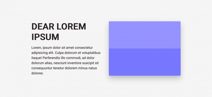
Update <Home/> component (src/components/Home.js):
import React from "react"
import HomeStyles from "../styles/scss/home.module.scss"
import "../styles/scss/home.scss"
import Container from "./Container"

export default function Home() {
  return (
    <section id="home">
      <Container>
        <div className="home-inner">
          <div className="home-inner__start">
            <h1>DEAR LOREM IPSUM</h1>
            <p>
              Lorem, ipsum dolor sit amet consectetur adipisicing elit. Culpa
              dolorum et voluptatibus itaque! Perferendis illo commodi, ad dolor
              dolorum alias, nesciunt inventore suscipit sit consequuntur
              tenetur dolorem minus natus dolores.
            </p>
          </div>
          <div className="home-inner__end">
            <div className={HomeStyles.box}></div>
          </div>
        </div>
      </Container>
    </section>
  )
}
SASS is the same as SCSS but differentiated with indentation syntax. We do not have to install anything since we’ve done that for SCSS.
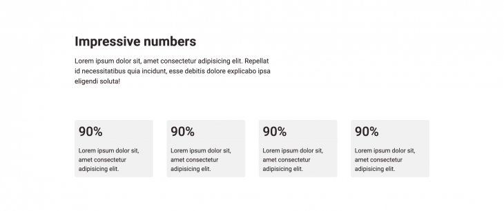
We’d build the numbers section of the lading page with it:
You can install this VSCode Extension for SASS files support
Update src/styles/sass/numbers.sass:
#numbers
  color: #211c1c
  padding: 100px 0

.numbers-inner header
  margin-bottom: 100px
  display: grid
  grid-template-columns: repeat(12,1fr)
  gap: 40px

  > div
    grid-column: span 7

  .title
    font-size: 38px

  p
  margin-top: 20px
  font-size: 20px
  line-height: 1.5
Update src/styles/sass/numbers.modules.sass:
.numbersGrid
  display: grid
  grid-template-columns: repeat(4, 1fr)
  gap: 40px

li
  padding: 5%
  background-color: #211c1c14
  border-radius: 5px

.percent
  font-size: 38px

.percent-info
  margin-top: 20px
  font-size: 18px
  line-height: 1.5
Update the <Numbers/> (src/components/Numbers.js) component:
import React from "react"
import NumberStyles from "../styles/sass/numbers.module.sass"
import "../styles/sass/numbers.sass"
import Container from "./Container"

export default function Numbers() {
  return (
    <section id="numbers">
      <Container>
        <div className="numbers-inner">
          <header>
            <div>
              <h1 className="title">Impressive numbers</h1>
              <p>
                Lorem ipsum dolor sit, amet consectetur adipisicing elit.
                Repellat id necessitatibus quia incidunt, esse debitis dolore
                explicabo ipsa eligendi soluta!
              </p>
            </div>
          </header>
          <ul className={NumberStyles.numbersGrid}>
            <li>
              <h4 className={NumberStyles.percent}>90%</h4>
              <p className={NumberStyles.percentInfo}>
                Lorem ipsum dolor sit, amet consectetur adipisicing elit.
              </p>
            </li>
            <li>
              <h4 className={NumberStyles.percent}>90%</h4>
              <p className={NumberStyles.percentInfo}>
                Lorem ipsum dolor sit, amet consectetur adipisicing elit.
              </p>
            </li>
            <li>
              <h4 className={NumberStyles.percent}>90%</h4>
              <p className={NumberStyles.percentInfo}>
                Lorem ipsum dolor sit, amet consectetur adipisicing elit.
              </p>
            </li>
            <li>
              <h4 className={NumberStyles.percent}>90%</h4>
              <p className={NumberStyles.percentInfo}>
                Lorem ipsum dolor sit, amet consectetur adipisicing elit.
              </p>
            </li>
          </ul>
        </div>
      </Container>
    </section>
  )
}
Emotion is a CSS-in-JS library and like any other CSS-in-JS, allows you to write CSS styles with JavaScript.
Let’s build a part of the features section with it.

Install gatsby-plugin-emotion, @emotion/core, @emotion/styled:
yarn add gatsby-plugin-emotion @emotion/core @emotion/styled
Update the plugins array in gatsby-config.js:
plugins: [
  `gatsby-plugin-emotion`,
  // other plugins
]
Update src/styles/emotion/FeatureStyles.js:
import styled from "@emotion/styled"

export const FeatureSection = styled.section`
  padding: 100px 0;
  background-color: #f2f2f2;
`

export const FeatureInner = styled.div`
  padding: 0;
  display: grid;
  row-gap: 150px;
`

export const FeatureHeader = styled.header`
  display: grid;
  grid-template-columns: repeat(12, 1fr);
  gap: 40px;

  > div:first-of-type {
    grid-column: span 7;
  }

  .title {
    font-size: 38px;
  }

  .subtitle {
    margin-top: 20px;
    font-size: 20px;
    line-height: 1.5;
  }
`
Update the <Features/> (src/components/Features.js) component:
import React from "react"
import {
  FeatureHeader,
  FeatureInner,
  FeatureSection,
} from "../styles/emotion/FeatureStyles"
import Container from "./Container"

export default function Features() {
  return (
    <FeatureSection>
      <Container>
        <FeatureInner>
          <FeatureHeader>
            <div>
              <h1 className="title">Features</h1>
              <p className="subtitle">
               Lorem ipsum dolor sit amet consectetur adipisicing elit. Aliquid
              illum dolore nostrum recusandae ipsam corporis mollitia delectus
                quibusdam quod! Quasi.
              </p>
            </div>
          </FeatureHeader>
        </FeatureInner>
      </Container>
    </FeatureSection>
  )
}
Styled-Component just like Emotion, is also a CSS-in-JS library that allows you to write CSS styles with JavaScript.
We’d use it for other part of the features section:
Install gatsby-plugin-styled-components, styled-components, and babel-plugin-styled-components:
yarn add gatsby-plugin-styled-components styled-components babel-plugin-styled-components
Update the plugins array in gatsby-config.js:
plugins: [
  `gatsby-plugin-styled-components`,
  // other plugins
]
Update the <StyledCopy/> (src/styles/styled-component/StyledCopy.js) component:
import styled from "styled-components"

const StyledCopy = styled.div.attrs(props => ({
  section: props.section,
}))`
  display: grid;
  align-content: center;
  justify-items: flex-start;
  gap: 5%;
  color: #211c1c;

  .tag {
    font-size: 15px;
    font-weight: 500;
    letter-spacing: -0.2px;
    color: ${props =>
      props.section === "proud-history"
        ? "#1c9724"
        : props.section === "global"
        ? "#635bff"
        : "red"};
  }

  .subtitle {
    font-size: 18px;
    line-height: 1.5;
  }

  .items {
    display: grid;
    grid-template-columns: 1fr 1fr;
    gap: 20px;

    .check-mark {
      width: 20px;
      height: 20px;
      background-color: rgba(255, 0, 0, 0.5);
      border-radius: 50%;
      padding: 5px;
      display: flex;
      justify-content: center;
      align-items: center;
      color: white;
      transform: scaleX(-1) rotate(-46deg);
      line-height: 1;
    }

    .about-item {
      margin-left: 10px;
    }

    .item {
      display: flex;
      font-weight: 500;
    }
  }

  .cta {
    font-size: 15px;
    background-color: #211c1c;
    color: white;
    padding: 10px 30px;
    font-weight: 500;
    border-radius: 50px;
    color: white;
  }
`

export default StyledCopy
Update the <StyledRow/> (src/styles/styled-component/StyledRow.js) component:
import styled from "styled-components"

const StyledRow = styled.div`
  display: grid;
  grid-template-columns: repeat(12, 1fr);
  gap: 40px;

  [class*="img-wrap"] {
    grid-column: span 7;
  }

  .copy {
    grid-column: span 5;
  }

  .img {
    display: contents;

    .img-wrap {
      height: 550px;
      width: auto;
      background-color: #211c1c;
      border-radius: 5px;
      box-shadow: 0 15px 11px rgba(20, 23, 31, 0.05),
        0 9px 46px rgba(20, 23, 31, 0.06), 0 24px 38px rgba(20, 23, 31, 0.19);
      background-image: linear-gradient(
        rgba(255, 255, 255, 0.2) 50%,
        transparent 50%,
        transparent
      );
    }
  }
`

export default StyledRow
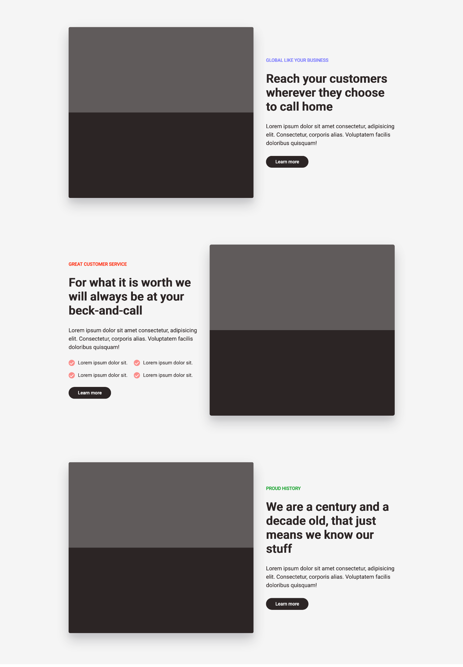
Update the <Features/> component (src/components/Features.js).
Currently, the copy-title isn’t what we need it to be, let’s style that with Bulma:
import { Link } from "gatsby"
import React from "react"
import "../styles/bulma/copytitle.scss"
import {
  FeatureHeader,
  FeatureInner,
  FeatureSection,
} from "../styles/emotion/FeatureStyles"
import StyledCopy from "../styles/styled-component/StyledCopy"
import StyledRow from "../styles/styled-component/StyledRow"
import Container from "./Container"

export default function Features() {
  return (
    <FeatureSection>
      <Container>
        <FeatureInner>
          <FeatureHeader>
            <div>
              <h1 className="title">Features</h1>
              <p className="subtitle">
                Lorem ipsum dolor sit amet consectetur adipisicing elit. Aliquid
                illum dolore nostrum recusandae ipsam corporis mollitia delectus
                quibusdam quod! Quasi.
              </p>
            </div>
          </FeatureHeader>
          <StyledRow>
            <div className="img">
              <div className="img-wrap"></div>
            </div>
            <StyledCopy className="copy" {...{ section: "global" }}>
              <span className="tag">GLOBAL LIKE YOUR BUSINESS</span>
              <h1 className="copy-title">
                Reach your customers wherever they choose to call home"
              </h1>
              <p className="subtitle">
                Lorem ipsum dolor sit amet consectetur, adipisicing elit.
                Consectetur, corporis alias. Voluptatem facilis doloribus
                quisquam!
              </p>
              <Link to="/" className="cta">
                Learn more
              </Link>
            </StyledCopy>
          </StyledRow>
          <StyledRow>
            <StyledCopy className="copy" {...{ section: "customer-service" }}>
              <span className="tag">GREAT CUSTOMER SERVICE</span>
              <h1 className="copy-title">
                For what it is worth we will always be at your beck-and-call
              </h1>
              <p className="subtitle">
                Lorem ipsum dolor sit amet consectetur, adipisicing elit.
                Consectetur, corporis alias. Voluptatem facilis doloribus
                quisquam!
              </p>
              <div className="items">
                <div className="item">
                  <div className="check-mark">L</div>
                  <p className="about-item">Lorem ipsum dolor sit.</p>
                </div>
                <div className="item">
                  <div className="check-mark">L</div>
                  <p className="about-item">Lorem ipsum dolor sit.</p>
                </div>
                <div className="item">
                  <div className="check-mark">L</div>
                  <p className="about-item">Lorem ipsum dolor sit.</p>
                </div>
                <div className="item">
                  <div className="check-mark">L</div>
                  <p className="about-item">Lorem ipsum dolor sit.</p>
                </div>
              </div>
              <Link to="/" className="cta">
                Learn more
              </Link>
            </StyledCopy>
            <div className="img">
              <div className="img-wrap"></div>
            </div>
          </StyledRow>
          <StyledRow>
            <div className="img">
              <div className="img-wrap"></div>
            </div>
            <StyledCopy className="copy" {...{ section: "proud-history" }}>
              <span className="tag">PROUD HISTORY</span>
              <h1 className="copy-title">
                We are a century and a decade old, that just means we know our
                stuff
              </h1>
              <p className="subtitle">
                Lorem ipsum dolor sit amet consectetur, adipisicing elit.
                Consectetur, corporis alias. Voluptatem facilis doloribus
                quisquam!
              </p>
              <Link to="/" className="cta">
                Learn more
              </Link>
            </StyledCopy>
          </StyledRow>
        </FeatureInner>
      </Container>
    </FeatureSection>
  )
}
Bulma is a free, open source CSS framework based on Flexbox. I like to think of it as the same category as Bootstrap, or TailwindCSS.
Install bulma, node-sass, and gatsby-plugin-sass (if you followed through the SCSS part, you already have node-sass and gatsby-plugin-sass installed. You can safely ignore them):
yarn add bulma node-sass gatsby-plugin-sass
Update src/styles/bulma/copytitle.scss:
// @import "~bulma/bulma.sass";

.copy-title {
  font-size: 38px;
  letter-spacing: -0.2px;
}
I’ve commented out the
@import "~bulma/bulma.sass"because it tampers with some of my class names, liketitle. That’s the reason we have CSS-in-JS. Feel free to uncomment it and use Bulma as much as you want.
Update the <CopyTitle/> (src/components/CopyTitle.js) component:
import React from "react"
import "../styles/bulma/copytitle.scss"

export default function CopyTitle({ title }) {
  return <h1 className="copy-title">{title}</h1>
}
It won’t be a complete Landing page if it doesn’t have a footer. Let’s do that with Less.
If you understand any SCSS/SASS, or Stylus, at all, then you already have a head-start on Less.
Less is a lot like Stylus/SCSS/SASS:
Install gatsby-plugin-less:
yarn add gatsby-plugin-less
Update the plugins array in gatsby-config.js:
plugins: [
  `gatsby-plugin-less`,
  // other plugins
]
Update src/styles/footer.less:
@brown: #211c1c;
@hoverBrown: #211c1c14;

.navInner {
  height: 70px;
  display: flex;
  justify-content: space-between;
  align-items: center;

  .link {
    font-size: 15px;
    padding: 10px 30px;
    font-weight: 500;
    border-radius: 50px;
    color: @brown;
    transition: background-color 0.2s;

    &:hover {
      background-color: @hoverBrown;
    }

    &:nth-child(2) {
      margin: 20px 0;
    }
  }
}
Update src/styles/footer.module.less:
@brown: #211c1c;

.cta {
  font-size: 15px;
  background-color: @brown;
  color: white;
  padding: 10px 30px;
  font-weight: 500;
  border-radius: 50px;
}
Update the <Footer/> component:
import { Link } from "gatsby"
import React from "react"
import "../styles/less/footer.less"
import FooterStyle from "../styles/less/footer.module.less"
import Container from "./Container"
export default function Footer() {
return (
<footer id="nav">
<Container>
<nav className="navInner">
<div className="nav-inner__start">
<p>© adebiyi adedotun, 2020</p>
</div>
<div className="nav-inner__center">
<a href="https://twitter.com/adebiyial" className="link">
Twitter
</a>
<a
href="https://www.linkedin.com/in/adebiyiadedotun/"
className="link"
>
LinkedIn
</a>
<a href="https://instagram.com/adebiyial" className="link">
Instagram
</a>
</div>
<div className="nav-inner__end">
<Link to="/" className={FooterStyle.cta}>
GET STARTED
</Link>
</div>
</nav>
</Container>
</footer>
)
}
That’s it.
If all went well, then you should have the complete landing page ready to go. It’s not responsive, you can have a go at that.
You can grab the complete code on GitHub.
It’s just the nature of what we do, there’s always more. We didn’t touch on Tailwind CSS, Styled JSX, PostCSS, and many others, because there’s only so much we can go through. I’ve chosen to leave them out because some of them require additional setup and the docs already explained this sufficiently, with better troubleshooting guides if needed.
These are direct links to the documentation
Some of these methods have their own additional configuration that you might be interested in, those are also available in the individual official documentation page. Those configs are not necessary for their corresponding CSS methods to work with Gatsby.
In my work, using Styled Components and/or Vanilla CSS (with BEM) has always worked for me, and If things seem hairy (with using so many CSS methods to build a landing page), it is because it is. This sample is meant for mechanical purposes.
You wouldn’t build an actual production application with as much CSS methods as the samples, and even if you do, just keep in mind: in the end, it’s all CSS.
Install LogRocket via npm or script tag. LogRocket.init() must be called client-side, not
server-side
$ npm i --save logrocket

// Code:

import LogRocket from 'logrocket';
LogRocket.init('app/id');
// Add to your HTML:

<script src="https://cdn.lr-ingest.com/LogRocket.min.js"></script>
<script>window.LogRocket && window.LogRocket.init('app/id');</script>

Explore 15 essential MCP servers for web developers to enhance AI workflows with tools, data, and automation.

Learn how contrast-color() automatically picks accessible text colors using native CSS, without JavaScript.

Learn how to build a harness-style AI workflow using Claude Code with specialized Dev, QE, and Ops subagents, gated handoffs, MCP telemetry, and LEARNING.md.

Learn how to build smooth staggered animations in CSS using modern features like sibling-index(), complete with practical examples, fallbacks, and accessibility tips.
Hey there, want to help make our blog better?
Join LogRocket’s Content Advisory Board. You’ll help inform the type of content we create and get access to exclusive meetups, social accreditation, and swag.
Sign up now

 Learn more →
