Vue.js is a JavaScript library built by Evan You and maintained by the core team along with more than 260 community members. It is an approachable core library that focuses on the view layer only and boasts a large ecosystem of supporting libraries to help you tackle the complexity of building and maintaining larg single-page applications.

In this post, we will walk through how to build a pricing component UI using one of the most popular Vue.js UI libraries: BootstrapVue.
This tutorial is suited for developers at all stages, including beginners. Below are a few things you should already have before going through this tutorial:
node -v
npm uninstall -g vue-cli
Then, install the new one
npm install -g @vue/cli
npm install
BootstrapVue is a Vue JS UI library that lets you build responsive, mobile-first, and ARIA-accessible projects on the web with Vue, utilizing the best parts of the biggest CSS framework available in the market, Bootstrap.
The BootstrapVue documentation is really approachable, and as readable as the Bootstrap docs themselves. It also provides adequate code samples to get you started with using any component of your choice.
Tech product user interfaces, especially for startups, almost always have a fairly similar pricing page. BootstrapVue provides an easy and intuitive way to create components, and in this article, we will use the card component to create one of these pricing pages.
If you followed this post from the start, you will have already installed the vue-canvas starter project. Start up VS Code and open the terminal. Select a new terminal and run the v``ue add command below to add the Bootstrap plugin:
vue add bootstrap-vue
When it starts installing, agree to using babel/polyfill, and it will go ahead and add the b``ootstrap-vue plugin to your Vue project after updating about four files. Now, if you navigate to the root directory of the project, you will see a new plugin folder with the Bootstrap file inside it. The contents should be exactly this:
import Vue from 'vue'
import BootstrapVue from 'bootstrap-vue'
import 'bootstrap/dist/css/bootstrap.min.css'
import 'bootstrap-vue/dist/bootstrap-vue.css'
Vue.use(BootstrapVue)
We also have to include the icons pack in the b``ootstrap-vue library, so go into the src file and import them. Your main.js file should look like this:
import '@babel/polyfill'
import 'mutationobserver-shim'
import Vue from 'vue'
import './plugins/bootstrap-vue'
import App from './App.vue'
import { BootstrapVueIcons } from 'bootstrap-vue'
import 'bootstrap-vue/dist/bootstrap-vue-icons.min.css'
Vue.use(BootstrapVueIcons)
Vue.config.productionTip = false
new Vue({
  render: h => h(App),
}).$mount('#app')
Now that you have Boostrap set up in your project, we will begin writing our pricing component in two sections: the header and the body.
I found code for a navbar component in the Bootstrap docs and modified it to suit my design. In your app.vue, file inside the template section, add the code block below inside the div tag with the app ID:
<div class="mt-0">
      <b-navbar toggleable="sm" type="light" variant="light" sticky>
        <b-navbar-toggle target="nav-text-collapse"></b-navbar-toggle>
<b-navbar-brand class="ml-0">
          <b-icon-music-player-fill class="h5 mr-0 mb-0 mt-0" style="color: #17a2b8;"></b-icon-music-player-fill>Familia
        </b-navbar-brand>
<b-collapse id="nav-text-collapse" is-nav>
          <b-navbar-nav>
            <b-nav-text class="aa" tabs align="right" v-b-modal.modal-3>Loginnn</b-nav-text>
            <b-nav-text class="ml-5" tabs align="right" v-b-modal.modal-7>FAQ</b-nav-text>
          </b-navbar-nav>
        </b-collapse>
      </b-navbar>
    </div>
You can see that Bootstrap classes are still usable in the BootstrapVue library, which is such a cool thing because you do not have to unlearn or learn anything new to use it.
The most obvious UI element we can use to create the pricing component is a card. Cards can have a header, a body, and even a footer, which is basically what we want for pricing tiers. Copy this under the header code block in app.vue file:
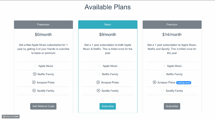
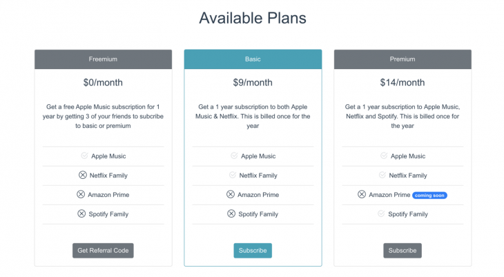
<h1 class="mt-0">Available Plans</h1>
    <b-container align-v="center" class="container">
      <div class="mt-5">
        <b-card-group deck class="mb-3">
          <!-- card 1 -->
          <b-card
            border-variant="default"
            header="Freemium"
            header-bg-variant="secondary"
            header-text-variant="white"
            align="center"
            title="$0/month"
            tag="article"
            style="max-width: auto;"
            class="mb-5 mt-2">
            <br />
            <b-card-text>
              Get a free Apple Music subscription for 1 year by
              getting 3 of your friends to subcribe to basic or premium
            </b-card-text>
            <b-list-group flush>
              <b-list-group-item></b-list-group-item>
              <b-list-group-item>
                <b-icon-check2-circle class="h5 mr-2 mb-0 mt-0" animation="fade"></b-icon-check2-circle>Apple Music
              </b-list-group-item>
              <b-list-group-item>
                <b-icon-x-circle class="h5 mr-2 mb-0 mt-0"></b-icon-x-circle>Netflix Family
              </b-list-group-item>
              <b-list-group-item>
                <b-icon-x-circle class="h5 mr-2 mb-0 mt-0"></b-icon-x-circle>Amazon Prime
              </b-list-group-item>
              <b-list-group-item>
                <b-icon-x-circle class="h5 mr-2 mb-0 mt-0"></b-icon-x-circle>Spotify Family
              </b-list-group-item>
              <b-list-group-item></b-list-group-item>
            </b-list-group>
            <br />
            <b-button v-b-modal.modal-2 variant="secondary">Get Referral Code</b-button>
            <br />
          </b-card>
<!-- card 1 ends here-->
    </b-container>
You can see that we have the header section, which says either Freemium, Basic, or Premium, along with the price and a description. Finally, there is a list of services per tier. We used icons to drive more attention to the features being offered. To add the remaining two cards, copy the code block below just under the card 1 ends here comment.
<!-- card 2 -->
          <b-card
            border-variant="info"
            header="Basic"
            header-bg-variant="info"
            header-text-variant="white"
            align="center"
            title="$9/month"
            tag="article"
            style="max-width: auto;"
            class="mb-5 mt-2">
            <br />
            <b-card-text>
              Get a 1 year subscription to both
              Apple Music & Netflix. This is billed once for the year
            </b-card-text>
            <b-list-group flush>
              <b-list-group-item></b-list-group-item>
              <b-list-group-item>
                <b-icon-check2-circle class="h5 mr-2 mb-0 mt-0" animation="fade"></b-icon-check2-circle>Apple Music
              </b-list-group-item>
              <b-list-group-item>
                <b-icon-check2-circle class="h5 mr-2 mb-0 mt-0" animation="fade"></b-icon-check2-circle>Netflix Family
              </b-list-group-item>
              <b-list-group-item>
                <b-icon-x-circle class="h5 mr-2 mb-0 mt-0"></b-icon-x-circle>Amazon Prime
              </b-list-group-item>
              <b-list-group-item>
                <b-icon-x-circle class="h5 mr-2 mb-0 mt-0"></b-icon-x-circle>Spotify Family
              </b-list-group-item>
              <b-list-group-item></b-list-group-item>
            </b-list-group>
            <br />
            <b-button v-b-modal.modal-1 variant="info">Subscribe</b-button>
            <br />
          </b-card>
          <!-- card 3 -->
          <b-card
            border-variant="default"
            header="Premium"
            header-bg-variant="secondary"
            header-text-variant="white"
            align="center"
            title="$14/month"
            tag="article"
            style="max-width: auto;"
            class="mb-5 mt-2">
            <br />
            <b-card-text>
              Get a 1 year subscription to
              Apple Music, Netflix and Spotify. This is billed once for the year
            </b-card-text>
            <b-list-group flush>
              <b-list-group-item></b-list-group-item>
              <b-list-group-item>
                <b-icon-check2-circle class="h5 mr-2 mb-0 mt-0" animation="fade"></b-icon-check2-circle>Apple Music
              </b-list-group-item>
              <b-list-group-item>
                <b-icon-check2-circle class="h5 mr-2 mb-0 mt-0" animation="fade"></b-icon-check2-circle>Netflix Family
              </b-list-group-item>
              <b-list-group-item>
                <b-icon-x-circle class="h5 mr-2 mb-0 mt-0"></b-icon-x-circle>Amazon Prime
                <b-badge variant="primary" pill>coming soon</b-badge>
              </b-list-group-item>
              <b-list-group-item>
                <b-icon-check2-circle class="h5 mr-2 mb-0 mt-0" animation="fade"></b-icon-check2-circle>Spotify Family
              </b-list-group-item>
              <b-list-group-item></b-list-group-item>
            </b-list-group>
            <br />
            <b-button v-b-modal.modal-1 variant="secondary">Subscribe</b-button>
          </b-card>
        </b-card-group>
      </div>
Now you can save this as a UI pricing component to use the next time you need one for any tech product.
In this article, we reviewed the BootstrapVue library, which lets you use Bootstrap in your Vue projects. We created a pricing component by combining cards, list groups, icons, and navbar elements in a functional way. Now you can explore the Bootstrap-vue documentation and create more UI components.
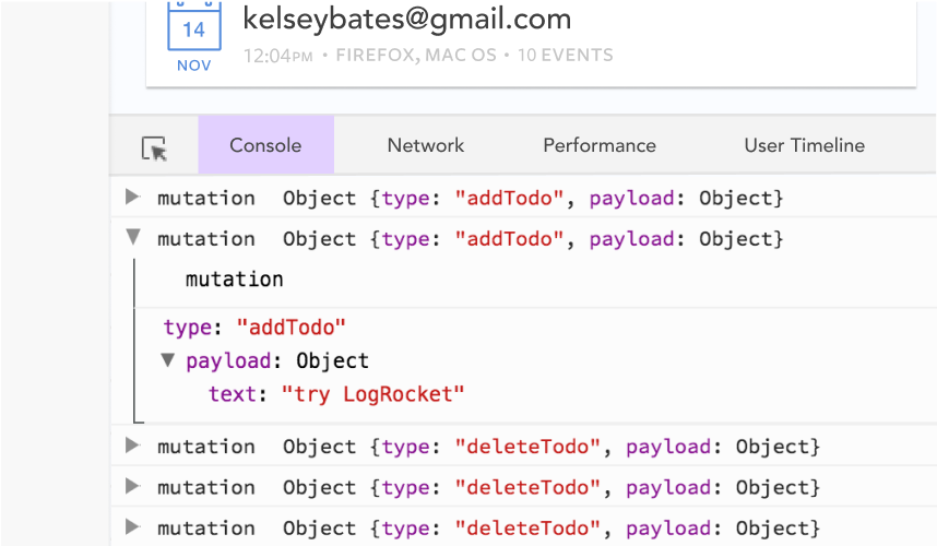
Debugging Vue.js applications can be difficult, especially when users experience issues that are difficult to reproduce. If you’re interested in monitoring and tracking Vue mutations and actions for all of your users in production, try LogRocket.
LogRocket lets you replay user sessions, eliminating guesswork by showing exactly what users experienced. It captures console logs, errors, network requests, and pixel-perfect DOM recordings — compatible with all frameworks.
With Galileo AI, you can instantly identify and explain user struggles with automated monitoring of your entire product experience.
Modernize how you debug your Vue apps — start monitoring for free.

Learn how to use Fallow to analyze AI-generated code, detect dead code, duplicate logic, and complexity issues, and integrate automated code quality checks into your AI-assisted development workflow.

Learn how to protect full-stack projects from NPM supply chain attacks with a practical security checklist.

Explore 15 essential MCP servers for web developers to enhance AI workflows with tools, data, and automation.

Learn how contrast-color() automatically picks accessible text colors using native CSS, without JavaScript.
Would you be interested in joining LogRocket's developer community?
Join LogRocket’s Content Advisory Board. You’ll help inform the type of content we create and get access to exclusive meetups, social accreditation, and swag.
Sign up now

