Interviewing can be a long and nerve-wracking process, especially in a tough job market. In an interview for a UX designer role, if you can pass the hiring manager round, you’ll likely move on to a portfolio presentation.

The portfolio presentation is where you present one or two case studies in detail. These case studies are most likely already featured on your online UX design portfolio, and presenting them allows the hiring team to get a sense of your design process, decision-making, and ability to collaborate.
Several key tips can help you deliver an outstanding presentation that’s tailored to the company you’re interviewing for and increase your chances of passing the interview round. Understanding what your audience is looking for in your portfolio presentation will help you be better prepared to tell your story.
In this article, we’ll talk about how to craft and deliver a UX portfolio presentation that keeps your audience engaged while explaining your design process clearly and concisely.
Before you jump ahead and start compiling Figma screens from your latest project, understanding what the hiring team is looking for in the open designer role is crucial to choosing the right projects to present.
Usually, the interview round with the hiring manager will give you a few minutes at the end to ask them questions. This is a good time to inquire about the specifics of the role and if there are certain skills or experience they are hiring for, such as designing products from conception to MVP launch or employing an A/B testing approach to improve success metrics.
The hiring manager’s answer can give you an idea as to which of your projects may best fit what they’re looking for.
Another good place to look for role expectations is the job description. A well-written job description will outline the required and nice-to-have skills and experience for the open role, like this example UX designer job description by Intel:
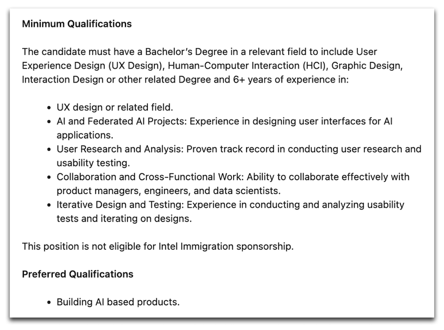
If you can showcase the nice-to-have skills in your main project, or a second project if time permits, it may strengthen your application by letting the team know about your specialties.
Time is another expectation that you should align on. The time allotted for the presentation will give you an idea of how many projects you will be able to present.
In my experience, an average project presentation can take around 30 minutes, including follow-up questions at the end. If the interview is an hour long, you can present two relevant projects.
After you’ve aligned on expectations, based on what the company is looking for, choose the projects that highlight specific skills and are most aligned with the audience’s needs.
Also, think about how relevant your project might be to the audience’s industry. A project focused on data visualization for a B2B tool may not be as relevant to a company that works on a consumer mobile app.
If you don’t have a project that showcases the specific skills they are looking for, focus on telling a story that highlights your design process well. Choose a project in which you can talk about specific challenges that you faced, a clear process to get to multiple solutions, and how you chose the final one.
Being able to communicate how you solve problems and make trade-offs can be hugely beneficial even if your experience isn’t exactly what the hiring team is looking for. Having strong UX fundamentals can sometimes outweigh industry-specific experience, as domain knowledge can be gained on the job.
Before jumping into designing your slides, lay out the structure of your presentation to ensure that you include the most important information in an order that makes sense. You can use a simple checklist to help organize your presentation in the most optimal order.
Similar to structuring a case study for your online portfolio, your portfolio presentation should follow a logical flow that takes the audience through the context, goals, challenges, and outcomes of the project. An example of a structure for a UX portfolio presentation might look like this:
Your audience may have little to no background knowledge about the domain and problem of your project, so think about what information they would need to get up to speed and follow along with your presentation.
Each project will have its unique differences depending on the challenges you wish to highlight and the specific process that you followed. It doesn’t have to be the most complex project either. Your ability to simplify complexity is the key to keeping the audience engaged.
Once your audience starts feeling lost or confused, they will become disengaged and uninterested in your presentation. This can reflect negatively on your perceived communication and storytelling skills.
We’ll discuss more presentation tips later on that can help you present your projects simply to ensure that your audience follows along.
You don’t have to include every decision that you made throughout the project. Many projects may have gone through pivots or experiments, where many decisions were made over a long period of time.
What’s important is to focus on the areas in which you made the biggest impact and walk through the process of overcoming challenges and arriving at the outcomes. A UX portfolio presentation should be a summary of your project, talking about the highlights of your contributions, but not necessarily every single detail.
Now that you’ve outlined the flow of your presentation, it’s time to gather the relevant materials to help you tell the story. Include both low-fidelity materials like wireframes and sketches as well as high-fidelity mockups and research artifacts.
It’s helpful to save these artifacts as you progress through your project so you don’t have to go digging through years of old files when you’re ready to update your portfolio presentation.
Some useful artifacts for framing the context of the project can include your team’s objectives or business goals. When speaking about research and discovery, communicate your research goals and methods, and highlight the key insights you took away from the process.
Including user interview quotes or simple charts that represent quantitative metrics can make an impression on your audience. These types of visuals help describe the current state of your users’ experiences.
A key tip to follow for creating engaging presentation slides is to limit the amount of text you display on each slide. If the audience is reading your slide, they are most likely not comprehending what you are saying. Having too much text on your slide can cause the audience to lose focus and easily get confused during your presentation.
If you’re stuck on how to design your slides, there are many presentation templates online that can help you get started, like these templates from Figma:
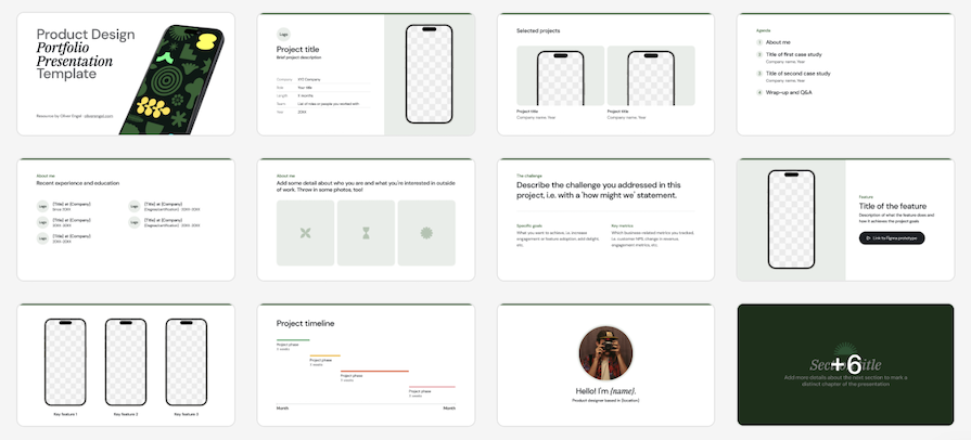
Keep your slides engaging by using visuals as supporting material for your presentation. Diagrams can help convey information architecture or complex user flows. Sketches can communicate early concepts that you explored without going into details. High-fidelity screens, interactive prototypes, or videos can showcase your design process and outcomes.
After you’ve designed your presentation slides, all that’s left to do is craft the story you want to tell. Rather than talking about each slide individually, the key to good storytelling is to craft a compelling narrative around the user and weave in each section in a way that relates to the user’s journey.
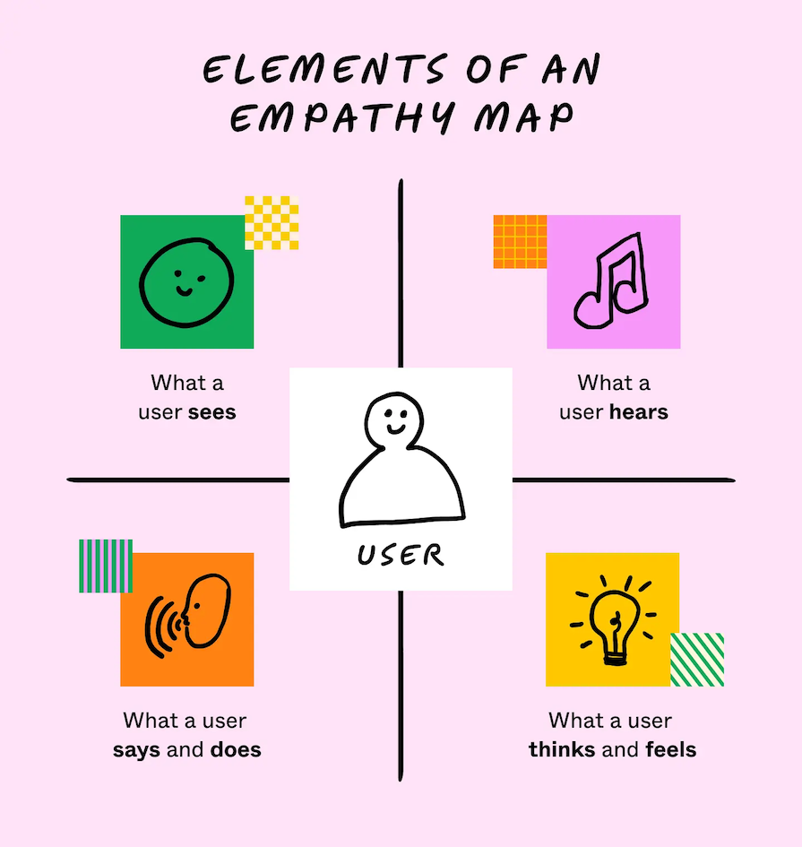
Start by framing the background and user’s current experience by leaning into the human aspect, such as the user’s goals and pain points. Empathizing with the user helps your audience relate to their emotions and understand why a problem must be solved. Empathy mapping is a great exercise to conduct to understand your user’s thoughts and feelings:
You may want to include visual cues on each of your slides, such as a title, a short bullet point, or a specific image, to keep you on track of your story. This will help you remember which part of the story to tell. If you can speak naturally without memorizing a script, your presentation will sound more engaging to the audience.
Like all good stories, ensure that the plot is clear to the audience from the beginning. A strong setup will deepen the audience’s engagement throughout your presentation.
Also, don’t be afraid to go deep into detail on significant challenges or events. In fact, prioritize speaking about how you navigated one or two major challenges rather than including less important decisions. Just remember to always tie your decisions back to the user’s needs.
Lastly, a story isn’t over without a resolution. Whether positive or negative, speak about the outcomes and impact of your contributions during the project, and how the user’s experience has changed as a result.
Remember, the hiring team is looking to see if you think about the business in addition to your users, as great designers can unlock new revenue opportunities through enhancing user experiences and creating innovative solutions that lead to increased sales and customer retention.
No matter how engaging you think your presentation will be, the average human tends to have a short attention span. Try to break up your story using interactive prototypes, video recordings, or images to induce the release of dopamine in your audience and hold their focus.
As the old saying goes, a picture is worth a thousand words, so a clickable prototype or video must be worth multiples more. These visual artifacts can support your story in a way that speaking just wouldn’t do it justice.
When practicing your UX portfolio presentation, as you get more comfortable with the words that you’ll be saying, try to speak in an engaging tone. People often tend to sound robotic or monotone when presenting a topic that they are not incredibly familiar with.
The more you practice your presentation, the easier it will become to tell your story and the more convincing you will sound when describing your thought process. If you don’t convey confidence in your own story, it will be extremely difficult to convince the hiring team to trust you in making decisions for their company.
Presentation skills are honed over time, so don’t get discouraged if your presentation doesn’t land in your next interview. Just remember to keep a slow enough pace, so that you’re not speed talking throughout the presentation. The unfamiliarity and complexity of the content may require the audience more time to process the information.
It may help to time yourself when practicing to ensure that you can comfortably cover your entire presentation in the allotted interview time.
I’ve had a few interviews in the past where the internet connection was weak and my Figma prototypes weren’t working as smoothly as I’d hoped. Always have a backup PDF copy of your presentation so that you can still present without a strong internet connection.
You may have to adjust your presentation to exclude some of the interactive prototypes or videos, but you can always send those to the hiring team in a follow-up email after the interview. The important part is that your presentation can be delivered in multiple formats in case one fails.
Now that most interviews are done remotely, ensure that you have the proper video conferencing software installed on your computer so that you aren’t left getting it set up when the interview is about to start. Make sure that you know how to share your screen so that you can virtually walk the audience through your presentation.
Lastly, don’t forget to hide any tabs or bookmarks beforehand that you wouldn’t want the interviewer seeing on your screen. This will make your UX portfolio presentation look cleaner and more professional, and can also help minimize distractions during your presentation.
The UX interview process can be tough and isn’t necessarily a reflection on your skills as a UX designer. Whether you get an offer or rejection can depend on several factors outside of your control, including the hiring company’s health, the current macroeconomic environment, or other applicants that may better align with the role’s responsibilities.
The portfolio presentation interview round plays a big role in the hiring team’s decision, so the best that you can do to prepare for your UX interview is to craft and deliver an engaging UX portfolio presentation.
Aligning on hiring expectations first will help you choose the right projects to communicate your strengths as a UX designer and the relevance of your work to the hiring team. Your presentation should be clear and impactful by leveraging visuals and storytelling techniques to engage your audience.
As with any other skill, the more you practice presenting, the better you will get at it. Eventually, your presentation skills will pay off and land you with a new job offer.
LogRocket's Galileo AI watches sessions and understands user feedback for you, automating the most time-intensive parts of your job and giving you more time to focus on great design.
See how design choices, interactions, and issues affect your users — get a demo of LogRocket today.

Zero UI works well for screenless, voice-first experiences, but most digital products still require visual interaction. Here’s why multimodal UX offers a more scalable foundation for the future of design.

Multimodal UX goes beyond designing for screens. Learn how context-aware systems, progressive modality, failover modes, and accessibility-first design create better digital product experiences.
Learn how context-aware mode prioritization and seamless transitions improve multimodal UX and reduce mode confusion.

Research is becoming more democratized, product cycles are accelerating, and AI is transforming synthesis and ResearchOps. Here are the three trends shaping UX research in 2026.