A designer opens her favorite AI-assisted design tool and generates three stunning landing page concepts in under five minutes. The layouts are polished, the typography feels modern, and the color palettes are cohesive. But when she shows them to her team, the feedback is immediate: “These buttons don’t match our design system. The spacing is off. This doesn’t feel like us.”
This tension is becoming common in design teams. AI makes it incredibly easy to generate polished UI quickly, but most teams have not decided how that work should actually be governed. Without clear ownership between product designers, design ops, and platform teams, AI can quietly bypass the guardrails that keep a product consistent.
A useful way to think about AI output is to treat it like work from an external vendor. It may look impressive, but it is not automatically production-ready. AI-generated UI should still pass through the same review stages as any other design artifact, including design system validation, accessibility checks, and product critique, before it becomes part of a real product.
This piece looks at practical ways to close that divide. Not by avoiding AI, but by building what I call governed creativity, a workflow that lets AI generate rapidly while respecting the constraints that make your product coherent.
It’s easy to blame AI for breaking brand consistency. But think about it, misalignment isn’t always one-sided. Sometimes the design system itself isn’t structured to support AI collaboration.
Many design systems are visually documented but not operationally defined. Tokens live in Figma styles but aren’t clearly structured for export, reference, or embedding into AI workflows. Brand principles may exist as abstract guidance rather than concrete constraints. Component libraries might contain visual variants without clearly defined usage rules.
AI can’t follow rules that aren’t explicit.
If spacing logic exists only in a senior designer’s head, or if typography scales aren’t documented beyond screenshots, AI will default to statistical averages from its training data. You need to make sure your design system is organised so that alignment with AI is a smooth process.
Once your system is clearly structured, the remaining misalignment reveals something else: AI’s own constraints.
AI image generators and design tools don’t understand your design system because they weren’t trained on it. They’ve learned from millions of websites, design portfolios, and visual patterns across the internet. When you ask an AI to create a dashboard, it’s pulling from a statistical average of what dashboards look like, not what your dashboard should look like.
This is also where I personally hesitate to trust AI too quickly. The first few outputs often look polished, but when I start comparing them to a real design system, the cracks show up quickly. Spacing feels slightly off, components behave differently, or a pattern appears that simply doesn’t exist in the product.
Design systems aren’t just visual preferences. They’re structured rules:
These constraints remain invisible to AI unless you deliberately surface them.
Most AI models have been trained heavily on popular design trends, portfolio sites, and common SaaS interfaces. This means they’re excellent at generating designs that look “professionally generic”, the kind of work you’d see on Dribbble or Behance. But generic doesn’t mean aligned.
If your brand uses an unconventional navigation pattern, distinctive illustration style, or specific tone of voice, AI will default to whatever is statistically most common in its training set.
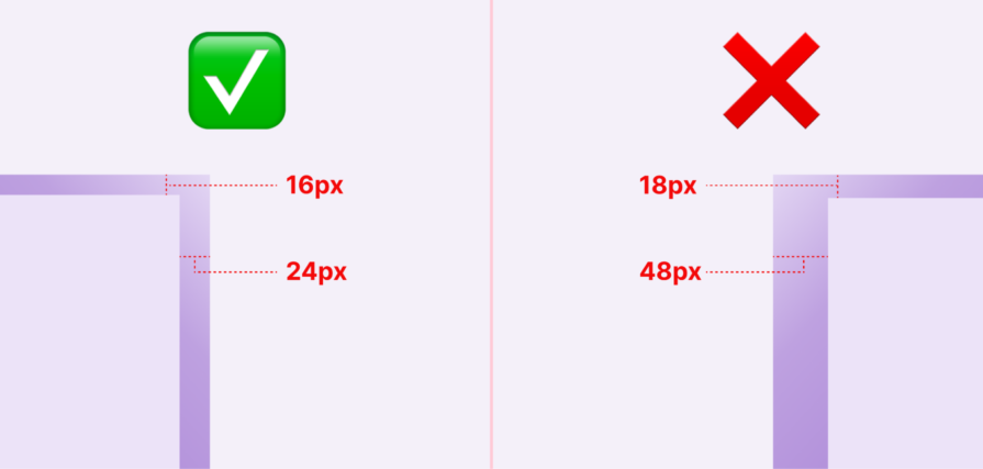
This is where AI-generated designs most obviously break down during implementation. An AI might generate a card component with 18px and 48px of padding, when your design system only defines spacing tokens at 16px and 24px.
These small deviations compound quickly. When developers get such handoffs, they’re forced to choose between shipping inconsistent spacing or rewriting it to fit system tokens.
AI tools are creative, maybe too creative. They’ll generate button variants, icon styles, or form patterns that look plausible but don’t exist in your component library.
A designer might not immediately notice that the “secondary outline button with an icon” in their AI-generated mockup isn’t actually something engineering has built. By the time this gets caught, you’ve either lost time in revisions or convinced engineering to build a one-off component that further fragments your system.
The solution isn’t to avoid AI; it’s to make AI system-aware.
This requires deliberately injecting your design system’s constraints, components, and conventions into the generation process. Different tools require different approaches, but the principle remains consistent: the more context you provide upfront, the less correction you’ll do afterward.
The simplest approach is to enrich your prompts with specific design system information. Instead of “design a pricing page,” try:
Design a pricing page using our design system: 8px spacing scale, primary button color #2563EB, font family Inter, components limited to: Card, Button (primary/secondary), Badge, Heading styles (H1-H4).
The key is to be specific about constraints rather than just aesthetic preferences.
Don’t just say “modern and clean”, specify “24px vertical rhythm, maximum 3 font sizes, cards with 16px padding and 8px border radius.”
If you’re using AI regularly, create reusable prompt templates that embed your design system by default. These act as a “system primer” you prepend to specific requests:
You are a designer working with [CompanyName]’s design system. Available components: [list]. Color tokens: [list]. Spacing scale: [list]. Typography scale: [list]. When generating designs, only use these predefined elements. If a design requires something not in this list, note it as a custom element that needs design system approval.
This is particularly powerful for teams. Store these templates in a shared doc or Notion page, and every designer starts from the same system-aware baseline.
Prompt engineering is the starting point. But for most teams, alignment still depends on disciplined review — and clear ownership of that review process.
AI design governance should not be unclear. In larger organizations, DesignOps often defines how AI outputs are reviewed because they manage tokens and system standards. In smaller teams, this may fall to the lead designer or product design manager. The key is simple: someone must be clearly responsible for enforcing the guardrails.
In practice, review usually means:
Any value that doesn’t match the system gets corrected before shipping.
AI doesn’t need a futuristic validation pipeline. It just needs to be treated like any external contribution: reviewed, mapped to system tokens, and rejected when it introduces inconsistency.
Different AI tools need different approaches:
One practical constraint: you can’t include your entire design system in every prompt. Most AI tools have input limits, and even when they don’t, too much context can confuse the model.
The solution is a tiered context. For most requests, include only the essentials: spacing scale, color palette, and available components. For more complex work, add typography rules and tone guidelines. Reserve full system documentation for when you’re generating something entirely new that needs to consider edge cases and interaction patterns
Even with a structured approach to context, problems can appear at the team level:
Even with system-aware prompts, AI outputs need validation. The goal is catching inconsistencies before they reach developers or worse, production.
For visual outputs (images, mockups), manual review is unavoidable, but you can make it systematic:
The key is reviewing with your design system documentation open. Don’t rely on memory. AI deviations are often subtle.
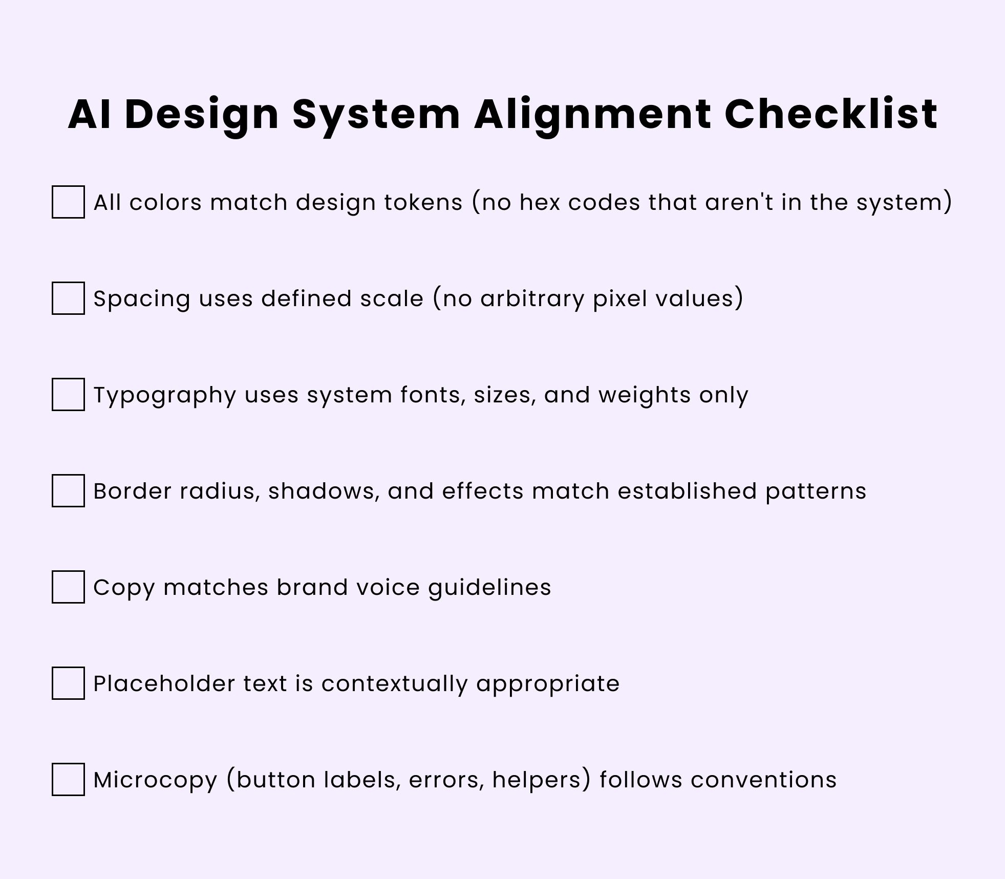
You can also use this quick checklist to run through:
AI’s value in design isn’t replacing human creativity—it’s accelerating the exploration phase and handling execution grunt work. But that value only materializes when AI-generated work can integrate cleanly into how teams actually build products.
AI shouldn’t be treated like a junior designer who gradually absorbs context and internal standards. It doesn’t build institutional knowledge over time. In practice, it’s closer to an external contributor.
The future likely involves design systems that can directly inform AI models.
Imagine uploading your Figma design system once, and every AI tool you use automatically respects those constraints. The destination isn’t reached yet, but the direction is clear—AI works best when guided by boundaries.
Until then, governed creativity is the pragmatic path forward.

LogRocket's Galileo AI watches sessions and understands user feedback for you, automating the most time-intensive parts of your job and giving you more time to focus on great design.
See how design choices, interactions, and issues affect your users — get a demo of LogRocket today.
Adaptive interfaces personalize experiences using behavioral signals and machine learning. But when personalization becomes autonomous, systems can reinforce patterns, limit discovery, and shape user behavior in ways designers didn’t intend.
Security requirements shouldn’t come at the cost of usability. This guide outlines 10 practical heuristics to design 2FA flows that protect users while minimizing friction, confusion, and recovery failures.

2FA failures shouldn’t mean permanent lockout. This guide breaks down recovery methods, failure handling, progressive disclosure, and UX strategies to balance security with accessibility.
Two-factor authentication should be secure, but it shouldn’t frustrate users. This guide explores standard 2FA user flow patterns for SMS, TOTP, and biometrics, along with edge cases, recovery strategies, and UX best practices.

 Learn more →
