Editor’s note: This article was last updated 27 April 2022 to reflect the most up-to-date version of react-native-snap-carousel, 4.0.0-beta.6+.

One of the best ways to utilize a horizontal space on your UI is with a carousel. A carousel allows users to cycle through a series of content like videos or photos either vertically or horizontally without having to scroll towards the bottom of the page. Particularly on mobile applications, carousels are great for maximizing the available space.
In this tutorial, we’ll create a carousel in a React Native mobile application with a Tinder-style swipe animation. We’ll use the react-native-snap-carousel package, which makes implementing complex carousels easy. To follow along with this tutorial, you’ll need the following:
You can also check out the source code to follow along. Let’s get started!
First, we’ll bootstrap our application with Expo. If you don’t have the Expo CLI installed already, open your terminal and type the code below to install it:
npm install expo-cli --global
After installing Expo, we can use it to initialize React Native. Navigate to a directory where you want to add your project and type the following command:
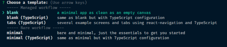
expo init ReactNativeCarouselTutorial
In the managed workflow section, choose a blank template:
After the template has installed all the necessary dependencies, navigate to the project directory in your terminal and start your project with the code below:
expo start
The command above launches Metro Bundler in your browser, giving you the option of running the application on your chosen emulator. You should be presented with a screenshot similar to the one below:

To create a carousel, open your terminal, navigate to the project directory, and run the command below:
npm install --save [email protected]
The command above installs react-native-snap-carousel, which is the package we’ll use to create the carousel. After installation, create a data.js file in your root directory and paste the code below:
const data = [
  {
    title: "Aenean leo",
    body: "Ut tincidunt tincidunt erat. Sed cursus turpis vitae tortor. Quisque malesuada placerat nisl. Donec quam felis, ultricies nec, pellentesque eu, pretium quis, sem.",
    imgUrl: "https://picsum.photos/id/11/200/300",
  },
  {
    title: "In turpis",
    body: "Aenean ut eros et nisl sagittis vestibulum. Donec posuere vulputate arcu. Proin faucibus arcu quis ante. Curabitur at lacus ac velit ornare lobortis. ",
    imgUrl: "https://picsum.photos/id/10/200/300",
  },
  {
    title: "Lorem Ipsum",
    body: "Phasellus ullamcorper ipsum rutrum nunc. Nullam quis ante. Etiam ultricies nisi vel augue. Aenean tellus metus, bibendum sed, posuere ac, mattis non, nunc.",
    imgUrl: "https://picsum.photos/id/12/200/300",
  },
];

export default data;
The data file is an array that contains mock data that we’ll use to populate our carousel. Next, create a file called CarouselCardItem.js, open it, and insert the following code:
import React from 'react'
import { View, Text, StyleSheet, Dimensions, Image } from "react-native"

export const SLIDER_WIDTH = Dimensions.get('window').width + 80
export const ITEM_WIDTH = Math.round(SLIDER_WIDTH * 0.7)

const CarouselCardItem = ({ item, index }) => {
  return (
    <View style={styles.container} key={index}>
      <Image
        source={{ uri: item.imgUrl }}
        style={styles.image}
      />
      <Text style={styles.header}>{item.title}</Text>
      <Text style={styles.body}>{item.body}</Text>
    </View>
  )
}

const styles = StyleSheet.create({
  container: {
    backgroundColor: 'white',
    borderRadius: 8,
    width: ITEM_WIDTH,
    paddingBottom: 40,
    shadowColor: "#000",
    shadowOffset: {
      width: 0,
      height: 3,
    },
    shadowOpacity: 0.29,
    shadowRadius: 4.65,
    elevation: 7,
  },
  image: {
    width: ITEM_WIDTH,
    height: 300,
  },
  header: {
    color: "#222",
    fontSize: 28,
    fontWeight: "bold",
    paddingLeft: 20,
    paddingTop: 20
  },
  body: {
    color: "#222",
    fontSize: 18,
    paddingLeft: 20,
    paddingLeft: 20,
    paddingRight: 20
  }
})

export default CarouselCardItem
The CarouselCardItem implements the look of the cards in the carousel. It returns a component that will display the item passed as props. Now, let’s create a component that will be responsible for displaying the carousel. Create a file called CarouselCards.js, open it, and enter the following code:
import React from 'react'
import { View } from "react-native"
import Carousel from 'react-native-snap-carousel'
import CarouselCardItem, { SLIDER_WIDTH, ITEM_WIDTH } from './CarouselCardItem'
import data from './data'

const CarouselCards = () => {
  const isCarousel = React.useRef(null)

  return (
    <View>
      <Carousel
        layout="tinder"
        layoutCardOffset={9}
        ref={isCarousel}
        data={data}
        renderItem={CarouselCardItem}
        sliderWidth={SLIDER_WIDTH}
        itemWidth={ITEM_WIDTH}
        inactiveSlideShift={0}
        useScrollView={true}
      />
    </View>
  )
}


export default CarouselCards
We use the Carousel component from the react-native-snap-carousel package to implement the carousel. The props accepted by the component include:
layout: Defines the way the items are rendered. The options include default, stack, and TinderlayoutCardOffset: Used to increase or decrease the default card offset in both the stack and Tinder layoutsref: Creates a reference to an instance of the carouseldata: An array of items to loop onrenderItem: Takes an item from the data and renders it into the listsliderWidth: Width in pixels of the carouselitemWidth: Width in pixels of the carousel itemuseScrollView: Uses a ScrollView component instead of a Flatlist component for performance reasonsonSnapToItem: Snaps to a carousel item programmaticallyWe can add pagination so users can skip to a certain item in the carousel without having to swipe continuously. First, we have to import the component. To do so, go to the line where we imported the carousel component:
import Carousel from 'react-native-snap-carousel'
Refactor it to look like the code below:
import Carousel, { Pagination } from 'react-native-snap-carousel'
Next, create a state to store the current pagination index:
const [index, setIndex] = React.useState(0)
After that, paste the following code below the carousel component:
<Pagination
  dotsLength={data.length}
  activeDotIndex={index}
  carouselRef={isCarousel}
  dotStyle={{
    width: 10,
    height: 10,
    borderRadius: 5,
    marginHorizontal: 0,
    backgroundColor: 'rgba(0, 0, 0, 0.92)'
  }}
  inactiveDotOpacity={0.4}
  inactiveDotScale={0.6}
  tappableDots={true}
/>
The code above renders the pagination component, which, by default, is a list of dots. The pagination component accepts the following props:
dotsLength: The number of dots to displayactiveDotIndex: Index of the current active dotcarouselRef: A reference to the Carousel component, which the pagination is linked todotStyle: Dots style to be merged with the defaultinactiveDotOpacity: The value of opacity applied to inactive dotsinactiveDotScale: Value of the scale transform applied to inactive dotstappableDots: Makes default dots tappable. When a dot is tapped, the carousel will slide to the corresponding itemAdd this onSnapToItem={(index) *=>** setIndex(index)} to the Carousel component. This callback is fired when navigating to an item:
<Carousel
  layout="tinder"
  layoutCardOffset={9}
  ref={isCarousel}
  data={data}
  renderItem={CarouselCardItem}
  sliderWidth={SLIDER_WIDTH}
  itemWidth={ITEM_WIDTH}
  onSnapToItem={(index) => setIndex(index)}
  useScrollView={true}
/>
The modified CarouselCards component should resemble the code below:
import React from 'react'
import { View } from "react-native"
import Carousel, { Pagination } from 'react-native-snap-carousel'
import CarouselCardItem, { SLIDER_WIDTH, ITEM_WIDTH } from './CarouselCardItem'
import data from './data'

const CarouselCards = () => {
  const [index, setIndex] = React.useState(0)
  const isCarousel = React.useRef(null)

  return (
    <View>
      <Carousel
        layout="tinder"
        layoutCardOffset={9}
        ref={isCarousel}
        data={data}
        renderItem={CarouselCardItem}
        sliderWidth={SLIDER_WIDTH}
        itemWidth={ITEM_WIDTH}
        onSnapToItem={(index) => setIndex(index)}
        useScrollView={true}
      />
      <Pagination
        dotsLength={data.length}
        activeDotIndex={index}
        carouselRef={isCarousel}
        dotStyle={{
          width: 10,
          height: 10,
          borderRadius: 5,
          marginHorizontal: 0,
          backgroundColor: 'rgba(0, 0, 0, 0.92)'
        }}
        inactiveDotOpacity={0.4}
        inactiveDotScale={0.6}
        tappableDots={true}
      />
    </View>
  )
}

export default CarouselCards
Go to your App.js file and refactor the code to look like the following:
import React from 'react'
import { SafeAreaView, StyleSheet } from 'react-native'
import CarouselCards from './CarouselCards'

export default function App() {
  return (
    <SafeAreaView style={styles.container}>
      <CarouselCards />
    </SafeAreaView>
  );
}

const styles = StyleSheet.create({
  container: {
    backgroundColor: '#fff',
    alignItems: 'center',
    justifyContent: 'center',
    padding: 50
  },
});
After saving, you should be presented with a screenshot similar to the one below:

Congratulations! You’ve finished your carousel.
In this tutorial, we learned how to implement a carousel in React Native using react-native-snap-carousel, which provides many options for creating carousels. We also added a pagination component for users to quickly move to a certain page without having to swipe continuously. You can also check out a Snack showcase of this tutorial.

LogRocket is a React Native monitoring solution that helps you reproduce issues instantly, prioritize bugs, and understand performance in your React Native apps.
LogRocket also helps you increase conversion rates and product usage by showing you exactly how users are interacting with your app. LogRocket's product analytics features surface the reasons why users don't complete a particular flow or don't adopt a new feature.
Start proactively monitoring your React Native apps — try LogRocket for free.

Infinite scrolling in Next.js no longer requires external libraries — Server Actions let us fetch initial data directly on the server.

Create a dynamic demo blog site using Django and React to demonstrate Django’s server-side functionalities and React’s interactive UI.

Explore how the aoi.js library makes it easy to create Discord bots with useful functionalities for frontend applications.

Evaluate Web Components, a set of standards that allow you to create custom HTML tags for more reusable, manageable code.


8 Replies to "React Native carousel with react-native-snap-carousel"
i did same changes but not able to swipe to different image. Can you help here?
Hi Jay,
The post has been updated. Follow the post again and rebuild your project. It will work now.
To swipe place your first finger and index finger on the mouse pad and then make a sweep to either left or right. The image will swipe.
Don’t forget to add this line to your Carousel component. I missed it too
onSnapToItem={(index) => setIndex(index)}
I hope it helps.
Yes, thanks. Its has been added. Thanks for the catch.
Getting below error when I followed this
TypeError: Cannot read property ‘style’ of undefined
It has been fixed. Install “react-native-snap-carousel”: “^4.0.0-beta.6”. Version 3.6 is causing the issue.
Thx a lot
Swiping works but clicking the individual dots for pagination dont work. the first dot stays highlighted when clicking the second or third one.