Editor’s note: This React Transition Group tutorial was last updated on 22 September 2022.

Transitions are among the most frequently overlooked principles of creating interactive UIs. Fortunately, over the past few years, React and other component-focused frameworks have changed the way we think about UIs and how we build them.
In this React Transition Group tutorial, we’ll show you how to use the CSSTransition and TransitionGroup components and go over some simple react-transition-group examples.
Here’s what we’ll cover:
react-transition-groupCSSTransition example: Transition a React component using CSS
CSSTransition
TransitionGroup and CSSTransition: Applying transitions to elements in a listTo follow along, you should have:
React Transition Group enables you to transition components in and out of the DOM in a declarative and efficient way and minimizes the need for boilerplate code.
Unlike many other React animation libraries, such as React Spring, React Transition Group offers simple components for defining animations. The library does not define styles itself but manipulates the DOM in useful ways, making the implementation of transitions and animations much more comfortable.
To put it simply, React Transition Group offers a more straightforward approach to animations and transitions.
react-transition-groupTo install React Transition Group to your React application, run these commands in the terminal:
# npm
npm install react-transition-group --save

# yarn
yarn add react-transition-group
Next, we’ll take a detailed look at the components available with React Transition Group and go over some practical react-transition-group examples.
CSSTransition example: Transition a React component using CSSThe CSSTransition component allows you to apply transitions to elements entering and leaving the DOM using CSS. You can achieve this by using the following props:
in, a Boolean value used to control the appearance of the elementtimeout, which indicates the number of milliseconds it will take to enter or leave the DOMunmountOnExit, which indicates that when the element disappears, it’s actually going to leave the DOM completely. Below is a code snippet of what it looks like:Consider the following code blocks, which represent the component before and after the use of CSSTransition, respectively:
Before CSSTransition:
import React, { Component } from "react";
import ReactDOM from "react-dom";
import "./styles.css";

class App extends Component {
  state = {
    showList: false
  };
  switch = () => {
    this.setState(prevState => ({
      showList: !prevState.showList
    }));
  };
  render() {
    return (
      <div className="container">
        <button className="display" onClick={this.switch}>
          List
        </button>
        {this.state.showList && (
          <div className="menu">
            <ul className="list">
              <li className="list-item">Feed the dog</li>
              <li className="list-item">Cut hair</li>
              <li className="list-item">Do the dishs</li>
              <li className="list-item">Buy grossries</li>
            </ul>
          </div>
        )}
      </div>
    );
  }
}

export default App;
const rootElement = document.getElementById("root");

ReactDOM.render(<App />, rootElement);
After CSSTransition:
import React, { Component } from "react";
import ReactDOM from "react-dom";
import cx from "classnames";
import { CSSTransition } from "react-transition-group";
import "./styles.css";

class App extends Component {
  state = {
    showList: true,
    highlightedHobby: false
  };
  switch = () => {
    this.setState(prevState => ({
      showList: !prevState.showList
    }));
  };
  listSwitch = () => {
    this.setState(state => ({
      highlightedHobby: !state.highlightedHobby
    }));
  };
  render() {
    return (
      <div className="container">
        <button className="display" onClick={this.switch}>
          Obinna
        </button>
        <CSSTransition
          in={this.state.showList}
          timeout={400}
          classNames="list-transition"
          unmountOnExit
          appear
          onEntered={this.listSwitch}
          onExit={this.listSwitch}
        >
          <div className="list-body">
            <ul className="list">
              <li
                className={cx("list-item", {
                  "list-item--active": this.state.highlightedHobby
                })}
              >
                Writing JavaScript
              </li>
              <li className="list-item"> Running</li>
              <li className="list-item"> Technical Writing</li>
              <li className="list-item"> Writing Clean code</li>
            </ul>
          </div>
        </CSSTransition>
      </div>
    );
  }
}
export default App;
const rootElement = document.getElementById("root");

ReactDOM.render(<App />, rootElement);
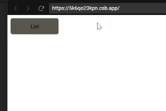
CSSTransitionIn the first code example above, we had a normal component with no transition. This rendered an ordered list as soon as the list button was clicked, with no delay and no extra CSS styling.
Here’s a GIF showing the result:
But when we decide to give a little more life to this example, we install the react-transition-group while using the <CSSTransition> tag, and pass the information in this.state.showList as props to in, which enables us to add some transitions using CSS. This is what we did with the second code block above.
Here’s the result with CSSTransition applied:
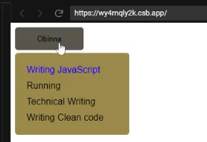
Notice how the element smoothly transitions from a hidden state to becoming fully displayed. Now let’s take a look at the code in detail.
CSSTransition timeout propThe timeout props allows us to apply a transition as the list leaves the DOM.
<CSSTransition
  timeout={400}
  // other props
>
We then head over to style.css to add some styles for the transition. CSSTransition gives us four key classNames to use for elements entering and leaving: enter, enter-active, exit, and exit-active.
/* This fires as soon as the element enters the DOM */
.list-transition-enter{
}
/* This is where we can add the transition*/
.list-transition-enter-active{
}
/* This fires as soon as the this.state.showList is false */
.list-transition-exit{
}
/* fires as element leaves the DOM*/
.list-transition-exit-active{
}
Then, in these CSS classes, we can add some awesome (yet simple) CSS in the classes to make it look like the child component grows out of the button.
/* This fires as soon as the element enters the DOM*/
.list-transition-enter {
/*We give the list the initial dimension of the list button*/
top: 0;
width: 120px;
max-height: 40px;
color: transparent;
background-color: #5a564c;
}
/* This is where we can add the transition*/
.list-transition-enter-active {
top: 45px;
width: 200px;
max-height: 200px;
background-color: #9e8949;
transition: all 400ms;
}
/* This fires as soon as the this.state.showList is false */
.list-transition-exit {
top: 45px;
width: 200px;
max-height: 200px;
background-color: #9e8949;
}
/* fires as element leaves the DOM*/
.list-transition-exit-active {
top: 0;
width: 120px;
max-height: 40px;
color: transparent;
background-color: #5a564c;
transition: all 400ms;
}
In the code demo above, you will notice list-transition-enter and list-transition-exit-active have the same values because they are the starting and ending states of the components. However, the transitions only occur when the className is active.
The initial state of the list is set to false. But what if we wanted it to display as the page is mounted to the DOM? We can achieve this by just changing the state of showList to true, but then the transition does not display using the appear prop as shown below:
<CSSTransition
  in={this.state.showList}
  timeout={400}
  classNames="list-transition"
  unmountOnExit
  appear
>
In the CSS file, the classNames styling for .list-transition-appear would be the same as .list-transition-enter and .list-transition-exit-active because it occurs when the component is mounted, and its only function is to allow the transition to show as it appears.
.list-transition-enter, .list-transition-appear {
/*We give the list the initial dimension of the list button*/
top: 0;
width: 120px;
max-height: 40px;
color: transparent;
background-color: #5a564c;
}
/* This is where we can add the transition*/
.list-transition-enter-active, .list-transition-appear-active {
top: 45px;
width: 200px;
max-height: 200px;
background-color: #9e8949;
transition: all 400ms;
}
enter and exit propsSometimes, if the application requires the transition to be disabled in some part of the component’s transition lifecycle, we can do this in the component without editing the CSS or disabling the classNames. We do this using the enter and exit props like so:
<CSSTransition
  in={this.state.showList}
  timeout={400}
  classNames="list-transition"
  unmountOnExit
  appear
  enter = {false}
>
This stops the .list-transition-active and .list-transition-enter classes from working.
<CSSTransition
  in={this.state.showList}
  timeout={400}
  classNames="list-transition"
  unmountOnExit
  appear
  exit = {false}
>
CSSTransition groupsWe can use lifecycle props to target specific times in transition phases. These lifecycles do exactly what their names imply:
onEnter fires when the button is clicked and the operation is engagedonEntering fires when the information is entering the DOMonEntered shows that the information has entered the DOMonExit essentially fires when the operation for the element exit is initiatedonExiting fires when the information is exiting the DOMonExited shows that the information has left the DOMLet’s say we need to highlight the most important activity I like to do. We can highlight the color once the list is rendered and add a delay transition before the highlight. Then, our CSSTransition component becomes:
<CSSTransition
    in={this.state.showList}
    timeout={400}
    classNames="list-transition"
    unmountOnExit
    appear
    onEntered= {this.listSwitch}
    onExit={this.listSwitch}
>
The this.listSwitch state is used to set a conditional class to the hobby we want to highlight. So when highlightedHobby is true, we’re going to get this active variant of list item:
<li
className={cx('list-item', {
'list-item--active': this.state
.highlightedHobby,
})}
>Writing JavaScript</li>
The conditional className looks like so:
.list-item--active{
  color: blue;
  transition: 500ms;
}
When it opens, we see Writing JavaScript turn blue after a delay of 500ms, which is 100ms later than the transition of the list-item, and it goes back onExit. Since this occurs so fast, we can’t see it leave; but if you inspect the element using developer tools, you’ll notice it.
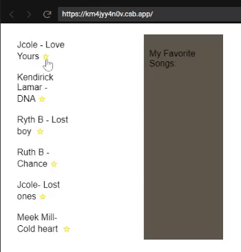
TransitionGroup and CSSTransition example: Applying transitions to elements in a listIn this react-transition-group example, we’ll demonstrate how to create interesting transitions with TransitionGroup and CSSTransition.
Consider the following code block which renders a list of my favorite music:
import React, { Component } from 'react';
import {
  CSSTransition,
  TransitionGroup,
} from 'react-transition-group';

import uuid from 'uuid';
import './lesson.css';

class App extends Component {
  items = [
    {
      name: 'Jcole - Love Yours',
      id: uuid(),
    },
    {
      name: 'Kendirick Lamar - DNA',
      id: uuid(),
    },
    {
      name: 'Ryth B - Lost boy ',
      id: uuid(),
    },
    {
      name: 'Ruth B -  Chance',
      id: uuid(),
    },
    {
      name: 'Jcole- Lost ones',
      id: uuid(),
    },
    {
      name: 'Meek Mill- Cold heart ',
      id: uuid(),
    },
  ];

  state = {
    favorites: [],
  };

  toggleInFavorites = id => {
    let favorites;
    const isItemInFavorites = this.state.favorites.find(
      favorite => favorite.id === id
    );

    if (isItemInFavorites) {
      // Item is already in favorites, remove it.
      favorites = this.state.favorites.filter(
        favorite => favorite.id !== id
      );
    } else {
      // Item is not in favorites, add it.
      favorites = [
        ...this.state.favorites,
        this.items.find(item => id === item.id),
      ];
    }
    this.setState({ favorites });
  };

  render() {
    return (
      <div className="container">
        <ul className="musicList">
          {this.items.map(({ id, name }) => (
            <li
              key={id}
              className="music"
              onClick={() =>
                this.toggleInFavorites(id)
              }
            >
              {name}
              <span className="star">
                {this.state.favorites.find(
                  favorite => favorite.id === id
                )
                  ? '★'
                  : '☆'}
              </span>
            </li>
          ))}
        </ul>
        <div className="favorites">
          <p>My Favorite Songs:</p>
          <TransitionGroup component="ul">
            {this.state.favorites.map(
              ({ id, name }) => (
                <CSSTransition
                  timeout={500}
                  classNames="fade"
                  key={id}
                >
                  <li className="favorite">{name}</li>
                </CSSTransition>
              )
            )}
          </TransitionGroup>
        </div>
      </div>
    );
  }
}

export default App;
From the code example, we can see that TransitionGroup maps over the favorite music array and returns each one with a CSSTransition component.
    <TransitionGroup component="ul">
      {this.state.favorites.map(
      ({ id, name }) => (
      <CSSTransition
      timeout={500}
      classNames="fade"
      key={id}
    >
    <li className="favorite">{name}</li>
    </CSSTransition>
    )
    )}
    </TransitionGroup>
From the above code example, we can see that the TransitionGroup component renders a component, and we can set this to render anything. It could be UL, div, p, option, etc. But when we do not want to render any component, we can set this to {null}:
<TransitionGroup component={null}>
Copy the full code above into App.js file in your React project and run the app on your browser to see the list.
Now that we have seen how to apply transitions to a list using <TransitionGroup>, let’s take a look at how to add transitions using JavaScript.
We have been using Vanilla CSS to implement our CSS transitions; now, we will refactor our CSS to become JavaScript objects. We will start by creating a styles.js file and turning our styles in objects, like so:
// Here we will turn all our Css into JavaScript Objects
const startTransitionStyles = {
top: 0,
width: '120px',
maxHeight: '40px',
color: 'transparent',
backgroundColor: '#5a564c',
};
const finishTransitionStyles = {
top: '45px',
width: '200px',
maxHeight: '200px',
backgroundColor: '#9e8949',
};
const styles = {
container: {
position: 'relative',
},
display: {
position: 'relative',
zindex: '1',
width: '120px',
height: '40px',
backgroundColor: '#5a564c',
border: 'none',
borderRadius: '5px',
outline: 'none',
cursor: 'pointer',
transition: 'backgroundColor 350ms',
},
displayActive: {
backgroundColor: '#000000',
},
listBody: {
position: 'absolute',
top: '45px',
Zindex: '1',
boxSizing: 'border-box',
width: '200px',
padding: '0 20px',
overflow: 'hidden',
backgroundColor: '#9e8949',
borderRadius: '5px',
},
list: {
padding: '0',
listStyleType: 'none',
},
listItem: {
padding: '5px 0',
},
listItemActive: {
color: 'blue',
transition: 'color 500ms',
},
listTransitionEnter: {
...startTransitionStyles,
},
listTransitionEnterActive: {
...finishTransitionStyles,
transition: 'all 400ms',
},
listTransitionExit: {
...finishTransitionStyles,
},
listTransitionExitActive: {
...startTransitionStyles,
transition: 'all 400ms',
},
};
export default styles;
The above code snippet is then imported into our refactor.js as:
import styles from './styles';
The implementation of the styles is done using InjectSheet imported from react-jss:
import injectSheet from 'react-jss';
This gives us the classes props, which we can use to access the styling in style.js, like so:
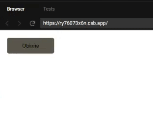
render() {
const { classes } = this.props;
return (
<div className={classes.container}>
<button
  className={classes.display}
  onClick={this.switch}
>
Obinna
</button>
<CSSTransition
  in={this.state.showList}
  timeout={400}
  classNames="list-transition"
  unmountOnExit
  classNames={{
  enter: classes.listTransitionEnter,
  enterActive:
  classes.listTransitionEnterActive,
  exit: classes.listTransitionExit,
  exitActive:
  classes.listTransitionExitActive,
  }}
>
<div className={classes.listBody}>
  <ul className={classes.list}>
    <li className={classes.listItem}>
    Writing JavaScript
    </li>
    <li className={classes.listItem}>
    Running
    </li>
    <li className={classes.listItem}>
    Technical Writing
    </li>
    <li className={classes.listItem}>
    Writing Clean code
    </li>
  </ul>
</div>
</CSSTransition>
</div>
);
Note that we use classNames here as opposed to className so we can supply multiple classNames.
The transitions are added by passing an object with enter, enter-active, exit, and enter-active keys, and they’ll refer to JSS class names.
<CSSTransition
  in={this.state.showList}
  timeout={400}
  classNames="list-transition"
  unmountOnExit
  classNames={{
  enter: classes.listTransitionEnter,
  enterActive:classes.listTransitionEnterActive,
  exit: classes.listTransitionExit,
  exitActive:classes.listTransitionExitActive,
}}
>
Smooth transitions make your application’s user experience more dynamic and welcoming to the end user. React Transition Group helps us achieve this with fewer lines of code that are easier to understand. Happy coding!
As web frontends get increasingly complex, resource-greedy features demand more and more from the browser. If you’re interested in monitoring and tracking client-side CPU usage, memory usage, and more for all of your users in production, try LogRocket.

LogRocket is like a DVR for web and mobile apps, recording everything that happens in your web app, mobile app, or website. Instead of guessing why problems happen, you can aggregate and report on key frontend performance metrics, replay user sessions along with application state, log network requests, and automatically surface all errors.
Modernize how you debug web and mobile apps — start monitoring for free.

Radix UI is quickly rising in popularity and has become an excellent go-to solution for building modern design systems and websites.

In this article, we’ll explore CSS cascade layers — and, specifically, the revert-layer keyword — to help you refine your styling strategy.

Nushell is a modern, performant, extensible shell built with Rust. Explore its pros, cons, and how to install and get started with it.

The Zed code editor sets itself apart with its lightning-fast performance and cutting-edge collaborative features.

 Learn more →

3 Replies to "Using React Transition Group to improve UI"
Does anyone have any working examples of nested animated routes using RR5.1+? I cant find any example online.
Examples are in class components, someone could translate these to functional components for newer devs who don’t know class components?
Simple CSSTransition example in functional components:
https://codesandbox.io/s/patient-https-4o48vl?file=/src/App.js